
An expert in American painting, Elizabeth Mankin Kornhauser has held a number of museum positions, including Chief Curator and Deputy Director of the Wadsworth Atheneum Museum of Art, Hartford, Connecticut. She is currently the Alice Pratt Brown Curator of American Paintings and Sculpture at the Metropolitan Museum of Art.
Tom McCarthy’s bestseller debut novel, Remainder, was published in 2005 and adapted for cinema by Omer Fast in 2015. His novels C (2010) and Satin Island (2015) were finalists for the Man Booker Prize for fiction. A fluent commentator on both written and visual arts, Tom has made guest appearances on BBC Radio 4’s Today program and writes for a wide variety of print publications, such as The New York Times, London Review of Books, and Artforum. Photo: Nicole Strasser/VISUM/Redux

Ed Ruscha’s deadpan representations of Hollywood logos, stylized gas stations, and landscapes distill the imagery of popular culture into a language of cinematic and typographical codes that are as accessible as they are profound. Ruscha has had twenty-one solo exhibitions with Gagosian since his first exhibition with the gallery in 1993. Photo: Gary Regester
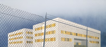
Elizabeth Kornhauser In 2005, Ed, you were asked to represent the United States at the fifty-first Venice Biennale. Dealing with the theme of progress, your installation evoked Thomas Cole’s famous painting cycle The Course of Empire (1834–36), but while Cole’s grandiose vision deals with the rise and fall of a classical civilization, your Course of Empire focuses on the industrial buildings of Los Angeles, simple, boxlike utilitarian structures with no pretension to beauty but still redolent of economic might and global reach.
Cole painted his great series after taking a grand tour of Europe in which he studied works by old master painters. He was particularly moved by the historical rise and decline of ancient civilizations, in particular Rome. Upon his return to the United States in the early 1830s, he began his magnum opus against the backdrop of President Andrew Jackson’s second presidency, and of the destruction of the wilderness through Jackson’s populist and expansionist policies.
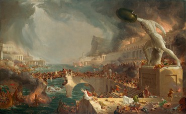
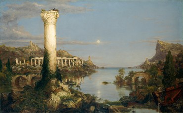
Cole began his five-work series with The Savage State, showing the beginnings of human presence in God’s pure creation. His ideal state for humans was living in harmony in an Arcadian environment, as seen in his Arcadian State. Here you see the beginnings of all of the arts, including architecture, dance, and music. Passing through the Arcadian state, we come to The Consummation of Empire, a moment of greed where humans have overbuilt the landscape in an excessive way. There’s no sign of nature any longer and the emperor figure dominates. Next is the ultimate destruction that greed leads to, where the built environment is completely destroyed; on the right you see burning buildings, with beautiful marble columns. Then finally comes desolation, where the human presence disappears altogether, nature returns, and the historical cycle begins again. Here, in typical fashion, Cole puts a smiling face on the moon—he always embedded these wonderful symbols in his works.
Tom McCarthy Yes. For me, Cole’s and Ed’s works are part of a long tradition of legible landscapes. But I’d like to start, Ed, by asking you about your Thirtyfour Parking Lots (1967). Because here you are, hovering above a landscape like Thomas Cole, though you’re in a helicopter, documenting this beautiful geometry of the lines and arrows, reading it like hieroglyphics. Can you tell us how those works came about?
Ed Ruscha If you put yourself back into the time of Thomas Cole, the only way he would have been able to look at something from the air was to be way up on a mountain. So he favored mountains. We don’t really do things like that now, we have airplanes and easily accessible photography. Curiously enough, Cole knew about daguerreotypes, and as against progress as he was, he was really in tune with them, so he may have known about the camera obscura and the camera lucida as well. Still, he was a painter who went to his site, looked over the scene, and then interpreted that scene.
I see things a little differently from Cole—I see things through the eyes of today, and photography, and aerial photography in particular, appealed to me because it enabled me to see things you weren’t conventionally able to see. I took a helicopter ride over Los Angeles one day and I noted two different things: swimming pools, just the enormous number of them, and parking lots. It was a Sunday so I saw empty parking lots, which ushered me into making this official statement for myself to photograph empty parking lots.
TM For me, one of the most important works of the last hundred years is Royal Road Test (1967), where you threw a typewriter out the window of a speeding car. This shape you’re holding here in this image, this winding strip that could be Cole’s river, is just the unspooled ribbon of the typewriter, and you hold up other broken bits too—it’s like you were literally smashing language into the landscape. The tarmac is the canvas and the letters get caught up in the bushes. Then you do this forensic retrospect, where you photograph each bit like a road-accident investigator. I’ve heard so many origin stories about this work, but I’d be really interested to know your version.
Ed Ruscha, Expansion of the Old Tires Building, 2005, acrylic on canvas, 54 × 120 inches (137.2 × 304.8 cm). Collection of Donald B. Marron, New York
ER I can’t divulge the real secret behind this [laughter], but I can talk about the beginnings of it, and it was a comedy of errors. Two friends of mine and I were driving back from Las Vegas and we had a broken typewriter in the car, one with a broken frame. It was no longer useful whatsoever. It would’ve almost been better to have a nice working typewriter to throw out the window, but we ended up tossing this out at ninety miles an hour and continuing on our way for about another forty miles or so. Then we began thinking about it and we realized that maybe there was some kind of treasure chest back there. Maybe we should revisit this place, go back, and see how it fell and came apart. So we returned. We had a little bit of trouble finding the point of impact. One of the friends was a photographer, Patrick Blackwell, so he decided to record the scattering of the elements that came apart. We looked at it almost like a crime scene, recording and measuring between each location. Then we gathered all the parts together, not really knowing why, and put them into a big box, a box larger than the actual typewriter, and brought it back to Los Angeles. We took the box to a typewriter-repair man [laughter] and had this man identify each piece by name. Each one of those little screws and fittings had its own name in the typewriter world.
We didn’t know what to do next, but my friend Mason Williams and I thought there might be a book here. We put the box of typewriter parts outside the back door of his apartment and his maid threw it out. So we lost all the parts but we had the photographs. It just grew from there.
Ed Ruscha, Blue Collar Trade School, 1992, acrylic on canvas, 54 × 120 inches (137.2 × 304.8 cm). Neda Young, New York
TM You’ve also done a lot of photography at street level. And you’ve talked about how words and landscapes to you are similar: they’re both horizontal, and letters follow one another with spaces and pauses and then more letters, just like houses and storefronts. Letters are like houses and storefronts, and houses and storefronts and vacant lots are like letters and words, with gaps in between. So landscape for you is a kind of syntax. And you’ve talked about the idea of the ribbon—in your Every Building on the Sunset Strip book (1966) the whole of the Sunset Strip is a ribbon, and you’ve said streets are like ribbons, and you’ve made these ribbon-word drawings and ribbon-word paintings. What suggested the ribbon form to you, and what led to it serving as a metaphor, a material, and a medium all at once?
ER I think it goes back to traveling on a highway. I did a lot of hitchhiking and driving across the United States, just driving and looking. I became interested in the idea of the landscape, and the left-to-right vision that happens. Things that were long and skinny appealed to me—they were sort of like a tail with a beginning and an ending, and I thought that was something I needed to get down on paper or on canvas.
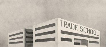
Ed Ruscha, The Old Trade School Building, 2005, acrylic on canvas, 54 × 120 inches (137.2 ×304.8 cm). Whitney Museum of American Art, New York, Gift of The American Contemporary Art Foundation, Inc., Leonard A. Lauder, President
TM Or on tarmac, right?
ER Yes.
TM To me it seems loaded with symbolism. The typewriter was not an Olivetti or a Remington, it was a Royal; and the word “royal” has appeared a lot in your work. Already this is course of empire: you’re showing sovereignty, kings and kingdoms getting trashed. This is about the downfall of royalty, right? Or is that just totally an accident?
ER No, I want people to read into it [laughter]. Any idea is acceptable.
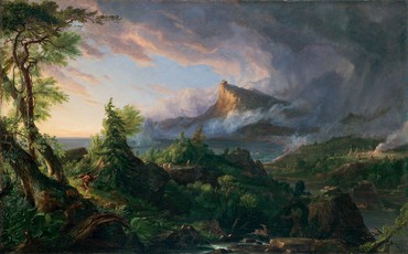
Thomas Cole, The Course of Empire: The Savage State, c. 1834, oil on canvas, 39 ¼ × 63 ¼ inches (99.7 × 160.6 cm). New-York Historical Society, Gift of The New-York Gallery of the Fine Arts
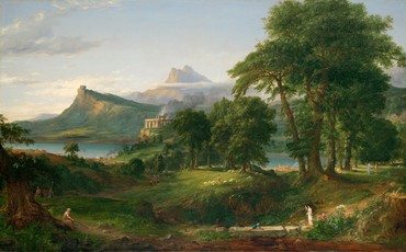
Thomas Cole, The Course of Empire: The Pastoral or Arcadian State, c. 1834, oil on canvas, 39 ¼ × 63 ¼ inches (99.7 × 160.6 cm). New-York Historical Society, Gift of The New-York Gallery of the Fine Arts
TM Well, let’s talk about your actual Course of Empire. When did you first come across Cole? When did you decide to do this kind of reprise?
ER I stumbled across these five paintings in the New-York Historical Society in the 1980s. They stopped me in my tracks, especially when I realized what they were and what they meant as a narration, a series put together to tell a story. I would visit them every time I came to New York and I’d always find something new. This progression of the passage of civilization seemed really profound. And then I wondered how many artists in the course of art history had tackled this subject, and it was hard to think of anyone else who had done that up to the time of Thomas Cole. There might be, but I don’t think so.
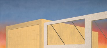
In the early 1990s, I had done a series of black and white paintings of boxes with words on them that got me thinking about traveling in industrial parks and visiting places that were cold and turned-off-ish. Later on those paintings began to itch in the back of my mind. And then I thought about what’s actually going on with these works, and that they have a life of their own. They can grow and change. So I made them grow and change in little isolated, individual imaginations.
I would visit [Cole’s paintings] every time I came to New York and I’d always find something new. This progression of the passage of civilization seemed really profound.
Ed Ruscha
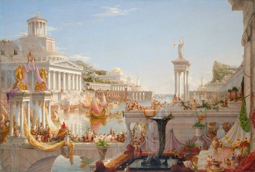
Thomas Cole, The Course of Empire: The Consummation of Empire, 1835–36, oil on canvas, 51 ¼ × 76 inches (130.2 × 193 cm). New-York Historical Society, Gift of The New-York Gallery of the Fine Arts
TM You made the black and white paintings in 1992, and then the color ones in 2004–05, right?
ER Yes.
TM In each case, it’s as if you’re painting (in the second iteration at least) desolation over and over again. In each case, the place is run down, the phone booth is gone, the trade school is fenced up . . . which is interesting because it seems to come straight from Cole. All of the structures appear to be industrial units. The critic Mary Richards calls them minimalist boxes. It strikes me that an industrial unit is like a double box: it’s a box itself, and it’s there for making boxes and putting things in boxes. It’s a box that boxes. It’s totally abstract and at the same time it embodies an economic, political disquisition on globalization and capitalism. Is this all instinctive or are you trying to work through ideas about economic cycles?
ER Maybe it’s a combination of all those things. I’m not trying to come up with any educational concept; this is only a trial by imagination, not something I’m driving a point with, as maybe Cole is with his five paintings.
TM Let’s talk about titles. I’ve learned that “course” comes from the Latin word cursus, which means literally “flow.” The Italian Enlightenment philosopher Giambattista Vico had this idea of history moving in corso and ricorso, flow and reflow. It was cyclical. This was important for Nietzsche, Marx, and James Joyce: they get all their ideas about cyclical time from Vico. But what’s interesting about his word ricorso is, it doesn’t mean repetition. It’s more like a reenactment, a repeat loop that’s aware of the last one, so there’s a kind of forensic, historical thing happening. Joyce built the whole of Finnegans Wake around this idea of ricorso or reflow. And then I read an interview with you where you were asked what your favorite poem is and you said any random page of Finnegans Wake.
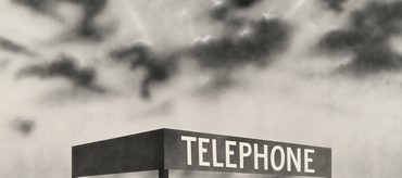
Ed Ruscha, Blue Collar Telephone, 1992, acrylic on canvas, 54 × 120 inches (137.2 × 304.8 cm). Museumsstiftung Post und Telekommunikation
ER Finnegans Wake is a tumble and it’s difficult, to try to get through it is perplexing, but nonetheless, it’s provocative. These things you don’t understand have properties of importance.
TM One of your earliest works, 3 Standard Envelopes (1960), is a tribute to Marcel Duchamp’s 3 Standard Stoppages (1913–14), in which he cut the string and let it find its bending shape on the canvas. So, through their repetition of the same word, which the envelope work has already flagged up or staked out, your beautiful Standard gas stations seem to be reprising a moment of European visual modernism. Is this ongoing working-through itself worked through, or does it find its path more intuitively?
ER I get my inspiration from just about everything, even things I hate, and they all combine into a Mixmaster of thought and activity. My pictures come out of this Mixmaster, they’re tumbling when they come out, and they can be difficult to grasp and understand. But they are still pictorial to me. I’m making a painting, I’m making a picture, just like Thomas Cole made a picture. I don’t analyze it. When I’m driving a car, I might have the radio tuned to any given channel, but it’s a soundtrack to what I’m seeing out my windshield. I imagine that all paintings could have a soundtrack, and if they did, Cole’s might be religious music. My soundtrack might be something like the overlapping of two unlikely radio stations that produce crackle and aggravating noise.
EK I’m struck by the panoramic quality of Cole’s work—he was very influenced by the popular panoramas of the day, large circular paintings, installed in purpose-built buildings in major cities including London and New York, where viewers were surrounded by landscapes of great natural wonders, such as Niagara Falls, or major urban centers, including London. Your Course of Empire works are even more exaggerated panoramas. What inspired Cole’s sense of panoramic sweep was the seemingly endless wilderness of the United States, but also the idea of unfolding stories across time.
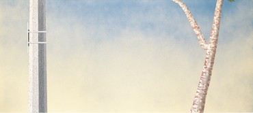
Ed Ruscha, Site of a Former Telephone Booth, 2005, acrylic on canvas, 54 × 120 inches (137.2 × 304.8 cm). Collection of Joan and Irwin Jacobs
ER He opened up a viewing chasm. My intrigue here came about through movies, through seeing a train coming out of the lower-right-hand corner of the screen and zooming through the picture. They use that technique often in movies, it shows travel and movement. Somehow that cinematic format worked for me, and I began to see it as a zoom effect in my work.
TM I want to bring up another type of temporality. We talked about repetition and cycles, which connect to how Cole saw everything and also feature in your work. Another way of thinking about time would just be degradation.
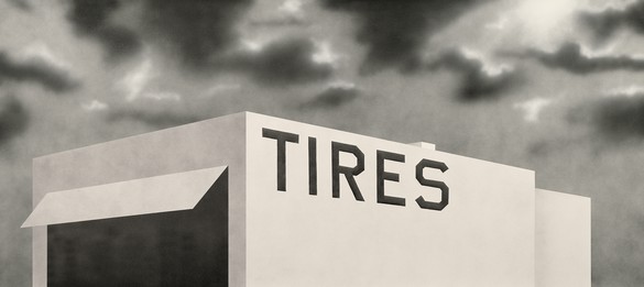
ER Well, Blue Collar Tires (1992) depicts a stand-alone building on the highway out near Palm Springs that I would pass every time I went to the desert. It was so lonely, and it seemed forgotten. It said “tires” on it but it didn’t look like it was in business. So it became iconic to me to get this down and make it official in a painting.
TM How do Self-Portrait of My Forearm—1960 (1960, printed 2013) and Self-Portrait of My Forearm—2014 (2014) play with temporality?
ER When I was in high school, I came to class a little late and I was leaning on a friend’s shoulder and I stiff-armed the door, which had panels of glass in it. I was stunned—my hand went right through the door and smashed it. I healed up, life went on, and a few years later I photographed my wrist, where I had a big scar. I’ve stared at this picture for fifty years and thought about the passage of time. So I reenacted the photograph in 2014. I’ve been doing a lot of jumping in time. I’m not sure I learned anything from it, but the man that started this thinking was Thomas Cole. Somehow I’ve picked up on this, repeated or extended it in different ways, tried to lasso it in or to have some discourse that emphasizes the passage of time.
Thomas Cole, The Course of Empire: Destruction, 1836, oil on canvas, 39 ¼ × 63 ½ inches (99.7 × 161.3 cm). New-York Historical Society, Gift of The New-York Gallery of the Fine Arts
Thomas Cole, The Course of Empire: Desolation, 1836, oil on canvas, 39 ¼ × 63 ¼ inches (99.7 × 160.7 cm), New-York Historical Society, Gift of The New-York Gallery of the Fine Arts
EK Well, you had mentioned really liking Cole’s binary paintings of before and after, for example the artist’s pair of paintings The Past and The Present (both 1838). You know, he did many examples of these works.
ER Yeah. These Course of Empire paintings of Cole’s—I know the flagship painting is the third one, the one in the middle, which is larger than the other four. But I began seeing the remaining four as stand-alone paintings, paintings unto themselves, so that made the middle painting, The Consummation of Empire, which is actually the more important painting, not such a good painting.
EK It’s so interesting you say that—Cole had a hard time with that painting. It took him almost two years to finish. He had to abandon it at a certain point, just for relief from struggling with it. It’s much larger than the other four and it was a subject he’d never worked on before, a very complex architectural port scene with literally thousands of figures. So you’re tapping into Cole’s mind here because he ended up walking away from it to paint The Oxbow (1836), which he painted in six weeks, and then returned to finish Consummation.
ER The Consummation painting, with all its glory, power, and people, reminds me of the paintings of Canaletto, and of the other Venice artists who painted buildings ad infinitum. For that reason I felt the middle painting, while it’s a very significant painting, does not stand alone. Though of course it’s absolutely necessary for the narration, it’s not that great of a painting because so many artists have done things in this manner, glory stories on canvas.
EK It’s a noonday sun and he used a really hot orange brown ground for this painting. We’ve discussed the underdrawing beneath it—you can see the struggle he had.
I get my inspiration from just about everything, even things I hate, and they all combine into a Mixmaster of thought and activity.
Ed Ruscha
TM What about this beginning-to-end arc? The final painting in the series is Desolation, but in your paintings the cycle’s beginning again. Is Expansion of the Old Tires Building (2005) optimistic or pessimistic? It’s expanding, it’s growing, the sky is blue. But then again, it’s empty. There’s nothing.
ER It’s empty, it’s nothing yet, but it shows you that time marches on. And it’s very democratic in its position—at least there’s change. There’s probably some of my cynicism involved in it too.
TM Well, you do paint “the end” again and again. Does Ruscha time move in a loop? Or does it just degrade, like Samuel Beckett time?
ER Well, I always liked the abstractness of movies that had scratches on the film, these little blips and mistakes that occur when a film goes through a projector. In doing these things, I’m kind of stating some of my history of seeing these movies and liking their abstract quality. I don’t care what the movie’s about, I really like the physicalness of the scratches. It’s funny because it means something to me today, but ten years from now, young people are not going to know what this is at all. They’re going to say, “What?” There’s no such thing as scratches on film anymore. It’s going to pass on into history.
Artwork by Ed Ruscha © Ed Ruscha; photos: Paul Ruscha