
Blake Gopnik is an art critic based in New York. He is a regular contributor to The New York Times and is the author of Warhol, a comprehensive biography of the Pop artist (Ecco, 2020).
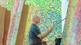
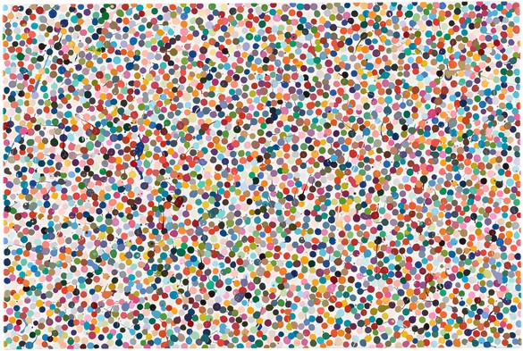
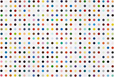
Some four years ago, Damien Hirst began to produce a new body of paintings. Typically he took big fields of white or black paint and packed them tightly with messy little dots of colored enamel, all jostling against each other and often even overlapping. Hirst has titled them the Colour Space paintings, but I prefer to think of them as the “dots.” The virtue of that name is that it brings them into close contact with Hirst’s more famous Spot paintings, those thousand or more paintings of perfectly regular, evenly spaced circles of color that he started making in the late 1980s. But the new name also implies that, for all their similarity, there is some kind of notable difference between Spots and “dots,” old and new. I hope the name suggests, at least, that to confuse the two bodies of works is to commit that cardinal art historical sin, pseudomorphism—imagining that two works that look quite alike also and necessarily have similar meanings. Instead, in the terms of classic semiotics, the new “dots” in fact become what they are by virtue of not being Spots.
The Spots were fundamentally about abstraction as reduced to its most basic components: color, form, and placement. You could say that they represented an attempt to reach Abstraction Degree Zero.
The “dots,” on the other hand, are all about representation. They may not actually depict anything, but as a field of messy marks on a surface each one stands for the most basic component in a traditional art of depiction—the simple act of applying a dollop of paint. That act is the Degree Zero that depictive art is built upon. And when I say that Hirst’s “dots” stand for depiction, I mean it: since his marks are all laid down by a team of assistants, they aren’t mere examples of Hirst the painter at work, like the brushstrokes in a Hals or Rembrandt. Instead, the dots in Hirst’s new paintings are a subject he wants to point to, and he has to keep them at arm’s length in order to do that pointing. You might think of these paintings as handmade readymades, “found” by Hirst in his studio and then held up for our study as art, in the tradition of Duchamp’s urinal-turned-sculpture. Except that where Duchamp was pointing to an actual object in the world, Hirst uses his assistant-made “dots” to point to the immaterial idea of representation. Hirst’s “dots” symbolize the presence of an artist’s viewing eye and mind coming to grips with the world via an extended hand and brush, even though, with the “dot” paintings, no such single viewer or thinker has actually extended his hand to make them.
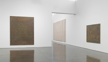
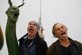
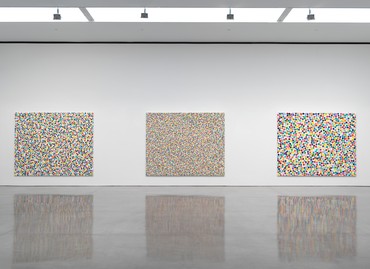
Installation view, Damien Hirst: Colour Space Paintings, Gagosian, 555 West 24th Street, New York, May 4–August 10, 2018
The “dot” paintings’ quite normal-sounding titles—derived from the names of domestic housepaints—help establish their representational ethos: Reed, Morning Dew, Black Thistle don’t actually describe anything each particular painting can be said to depict, but they imply that the paintings are playing at normal depiction. If all you saw were these titles, you’d imagine they came from a show of conventional parlor art. Whereas with the titles of his Spots, based on the names of chemical compounds—Iodomethane-13c, Erbium Oxide, L-Isoleucinol—Hirst could not have done less to evoke a normal subject for depiction. When you speak a chemical’s name, all that comes into your mind’s eye is some kind of nondescript powder or pill.
Damien Hirst, Isonicotinic Acid Ethyl Ester, 2010–11, household gloss on canvas, 99 × 147 inches (251.5 × 373.4 cm)
The formats of the “dot” paintings sometimes do the same work as their titles. Several of these works are arranged as triptychs, with a big center canvas between two narrower “wings,” instantly calling to mind Renaissance altarpieces from the West’s ur-moment of depiction. Hirst’s triptychs may not actually show us any scene, but they imply the fundamental act of scene-showing. Imagine a Fra Angelico triptych so damaged in an earthquake that its fragments of colored paint could be glued back on only at random and you’re imagining something close to these Hirsts. None of his orderly Spot paintings ever struck that particular note.
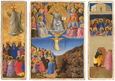
Fra Angelico, Corsini Triptych (Ascension, Last Judgment, Pentecost), c. 1447–48, tempera and gold on panel, in 3 parts, overall: 21 ¾ × 29 ½ inches (55 × 75 cm), Galleria Nazionale d’Arte Antica di Palazzo Corsini, Rome. Photo: Scala/Ministero per i Beni e le Attività culturali/Art Resource, New York
Even the white and black grounds of Hirst’s “dot” paintings have deep roots in depiction. Those are the two grounds that traditional painters have used as the foundation for their picture making, either building up from a dark ground to the lightest moments in a scene or placing darks over a light ground that is allowed to function as the scene’s brightest point. Hirst’s two grounds stand for the grounding of the “dots” in the history of representation.
There was another light-dark binary that structured most Western paintings before the dawn of gas lamps and light bulbs: it was the choice all artists had to make between painting a subject as seen by day or one viewed at night. Without ever depicting any subject at all, seen by any light at all, the entire body of Hirst’s “dot” paintings can be split between nocturnes and sunlit scenes.
***
To back up into art history for a moment, the French Impressionists and Pointillists of the late nineteenth century were the most obvious and committed of dotters in Western art. They held up the single dab of paint as the fundamental unit of representation, and also as the fundamental unit of vision—and of visible reality—that representation had to copy. (With the usual fog around just what such “copying” was all about.) But as has often been noted, their approach came with a rich prehistory of dottiness, from the visible brushstrokes of Titian, who was the great pioneer of the dotted surface, to the virtuosic dabs of Hals and Rembrandt. In one major strand of Western art, visible paint has stood for a larger commitment to rendering the visible in art.
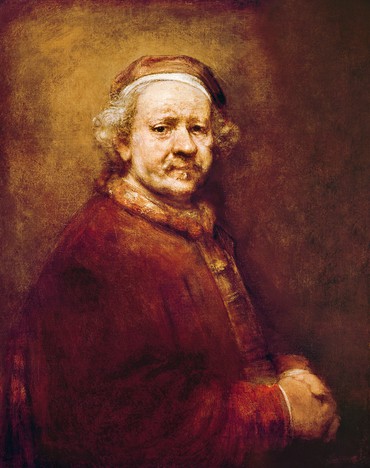
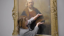
Rembrandt van Rijn, Self Portrait at the Age of 63, 1669, oil on canvas, 33 ⅞ × 27 ¾ inches (86 × 70.5 cm), National Gallery, London. Photo: Bridgeman Images
But that strand did not have a lock on the dot as representation’s most vital unit. Around 1420 the Netherlandish realists helped kick off Western painting’s other main strand, which favored the licked, highly finished, unpainterly surface, though even in that strand, light itself, vision’s basic medium, was captured in tiny flecks of white paint that stood for light’s reflection off gleaming candlesticks and glossy eyeballs. Later, in polished Dutch still lifes by the likes of Willem Claesz Heda, and most especially in the gleaming interiors of Johannes Vermeer, the tiny circles of white paint that were used to render such moments of reflection came more than ever to convey the artist’s larger commitment to the real. You could argue that, bottom line, dots—the dots that are the central subject of Hirst’s recent paintings—stand for Truth in Art.
In Vermeer’s case, there’s a quite particular reason for this intense belief in the dot. The particular kind of dot he deployed is actually (and only) an artifact of his era’s proto-photographic equipment. (“Circles of confusion” is the term in optics for such lens-made blobs of light.) Although Vermeer’s glowing dot did not actually render anything that comes to us straight from nature, it carried all the authority of the new optical technologies that were just then unlocking nature’s secrets.
Even without the appeal of technology, this dotty artifact might have struck Vermeer as natural because of a belief lurking deep within the Western tradition, and possibly within all human minds, that the truth can be found in the small. We seem to feel that the way to achieve knowledge is to break the world—including its most immaterial ideas and systems—into ever-smaller components.
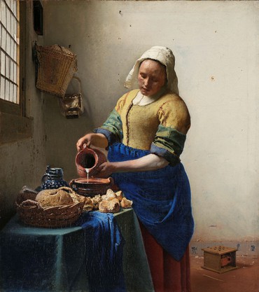
Johannes Vermeer, The Milkmaid, c. 1660, oil on canvas, 18 × 16 ⅛ inches (45.5 × 41 cm), Rijksmuseum, Amsterdam. Photo: Art Resource, New York
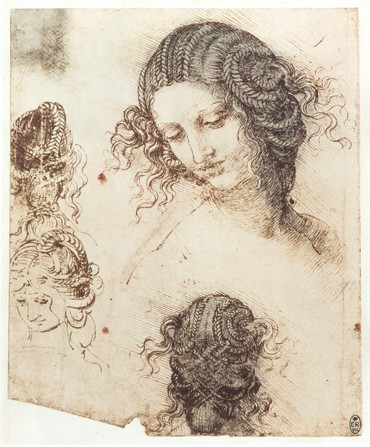
Leonardo da Vinci, The head of Leda, c. 1505–08 (facsimile), Gabinetto dei Disegni e delle Stampe, Uffizi, Florence, Italy. Photo: Scala/Art Resource
That belief was already present two millennia before Vermeer, among the Greek atomists—if only as an article of faith, or at least as the product of philosophical reasoning, rather than because they had any particular interest in minute observation, let alone in depiction. In explaining their world, it seemed only natural to gravitate to some notion of tiny parts, and it still seems that way. So much of modern physics is built around the idea of the “elementary particle” and the assumption that it helps reveal the profoundest truth about nearly everything—even though any particle physicist will tell you that an electron or a quark, not to mention a photon, is hardly a “particle” in any commonplace sense of the term.
In art, a similar reductionism took hold around 1500, in Italy, when representation was making some of its most impressive strides. Leonardo da Vinci and others were forever zooming in closer and closer on the subjects they wanted to render. In a drawing by Leonardo, the head of hair he needs to include in a portrait becomes the study of a single curl, even if it’s not always clear that the part will help in rendering the whole.
In the nineteenth century, this same kind of thinking—and maybe some of the actual discoveries being made in physics—must have helped convince the Impressionists and Pointillists that their predilection for dots had some basis in science. Those artists were convinced, that is, that dabbed-on paint yielded not just a new way of depicting reality but a better way of getting at its fundamentals. And then with Paul Cézanne, and even Pablo Picasso, when the deconstructed, broken-down image seemed to head away from any credible realism, it was still often justified as the “scientific” painter’s latest attempt at getting closer to the truth.
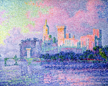
Paul Signac, Le château des Papes, 1909, oil on canvas, 28 ⅞ × 36 ⅛ inches (73.3 × 91.9 cm), Musée d’Orsay, Paris. Photo: Bridgeman Images
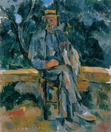
Paul Cézanne, Seated Man, 1905–06, oil on canvas, 25 ½ × 21 ½ inches (64.8 × 54.6 cm), Museo Thyssen-Bornemisza, Madrid. Photo: Museo Nacional Thyssen-Bornemisza/Scala/Art Resource, New York
Which at long last brings us back to Hirst and his new “dots.” They represent a world—and an art world—made up entirely of tiny details, like the universe in its early moments when matter and energy were spread in an even spray across the vast expanse of all Being. Each of Hirst’s dots, you could say, represents an atom, or maybe a photon, or possibly a moment, that needs to be accounted for in our catalogue of things. Or it could also be that his dots, and the paintings he builds from them, represent, each and every one, a different work of art or even an artistic thought: “artoms,” we could call them, and declare them the most basic unit of creativity.
If some of the dots in Hirst’s paintings are bigger than others, they register as the same phenomenon that we happen to be viewing at different magnifications. Shoot could easily be a close up of Fruit Salad, and this is true of many other pairings among Hirst’s “dot” paintings. If the brushstroke-size dabs in Morning Dew have a natural and necessary messiness, when they are enlarged in Manganese to circles several inches wide, their messy edges get preserved. Although it would in fact have been just as easy to render these larger dots as perfect circles, the principles of Hirst’s dottiness demand that mess should prevail. Artistic representation is an inherently casual and improvisational process compared with the tidy order that can prevail in abstraction—in Hirst’s orderly Spot paintings, just by way of example.
Damien Hirst, Horizon Grey, 2016, household gloss on canvas, 120 × 96 inches (304.8 × 243.8 cm)
Installation view, Damien Hirst: Colour Space Paintings, Gagosian, 555 West 24th Street, New York, May 4–August 10, 2018
Magnification isn’t just a conceit in the “dots.” The paintings really do evoke microscopic vision. Their white and black backgrounds recall the light-field and dark-field options in microscopy. And because we’re in the art world and talking art, they especially recall the microscopic imagery we’re used to seeing in a conservator’s enlarged pigment samples. Hirst’s dots can easily stand for the tiny fragments of pigment, afloat in the void, that are the truly fundamental units of Western painting.
And yet magnification might not be quite what’s at stake here. In the normal artistic course of things, a change of scale involves an increase in information: when Orson Welles zoomed in on a scene, it was almost always to reveal something new. That never seems to happen with Hirst’s “dots.” When he changes the size of his “artoms,” there’s nothing new to be learned from his zoom.
So you could say that Hirst’s “dots,” unlike his Spots, are essentially portrayals of failure. If the Spots worked fine as abstract decoration, the “dots” don’t work at all as true representation. They are portraits of noise, not of communication. But then a similar “failure” is present in so much of the greatest modern art, from Picasso on down. Modern art likes to set up grand schemes and goals that it can never fulfill, and to revel in the ambition and especially the absurdity of its failure. Failing, grandly, is modern art’s best recipe for success.
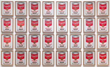
Andy Warhol, Campbell’s Soup Cans, 1962, acrylic with metallic enamel paint on canvas, in 32 parts, each: 20 × 16 inches (50.8 × 40.6 cm), Museum of Modern Art, New York © 2020 Andy Warhol Foundation for the Visual Arts, Inc./Licensed by Artists Rights Society (ARS), New York. Photo: Museum of Modern Art/Licensed by Scala/Art Resource, New York
The art historian Jeffrey Weiss has written, in The Popular Culture of Modern Art (1994), about the importance of the absurd joke—of blaguisme—in modern art, and Hirst’s “dots” work in that tradition. You could say that there are red clown noses hidden among his colored dabs. Works like Horizon Grey and Humpty Dumpty and Hunter Dunn, each painted on the same size canvas, with the same size dots, have such similar effects on a viewer that there seems to be some kind of jest involved in proposing them as different artistic objects. But of course it’s the same jest that’s there in Yves Klein’s great blue monochromes and in Andy Warhol’s multiple soup cans and Jackies and flowers. It’s a profound one, probing the very nature of objects and artworks and their endless profusion across the artistic universe—like colored dots spreading out in every direction.
As with so much great clowning, modern art’s blague also strikes a tragic note. Glorious failures are inevitably heartrending as well; trying to map the universe through a field of colored dots qualifies. You can add an altarpiece’s wings to a twenty-first-century painting, but it will never deliver salvation.
Damien Hirst: Colour Space Paintings, Gagosian, 555 West 24th Street, New York, May 4–August 10, 2018
All artwork by Damien Hirst © Damien Hirst and Science Ltd. All rights reserved, DACS 2020