Jordan Carter, curator at Dia Art Foundation, sits down with artists Alteronce Gumby and Amanda Williams to discuss the profound significance of color in their work, as well as the intersections between art and architecture.
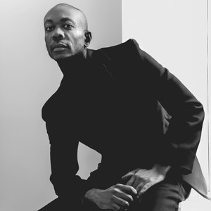
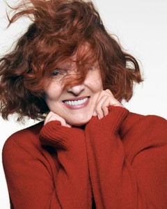
Jordan Carter joined the Dia Art Foundation as curator and co-department head in 2021. His forthcoming projects include presentations of the work of Lucas Samaras and Keith Sonnier, a multipart commission by Cameron Rowland, and an exhibition of new and historical works by Renée Green, all opening at Dia Beacon in 2024–25. Photo: Gabriela Herman
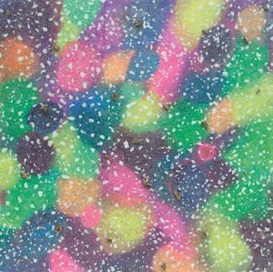
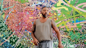
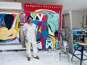
Alteronce Gumby is an artist and local of New York City. His practice includes painting, ceramics, installation, performance, and film. Gumby earned his BFA from Hunter College, and his MFA from Yale School of Art. His inspirations include the cosmos, and he is an active member of the Amateur Astronomers Association and the Planetary Society. He is currently preparing for his next solo exhibition at the Nicola Vassell Gallery, New York, in November 2024.
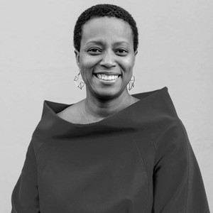
Amanda Williams is an artist who uses ideas around color and architecture to explore the intersection of race and the built environment. Through an interdisciplinary practice that brings spatial and aesthetic theory to bear on real social problems, Williams is clarifying the role of the artist in reimagining public space. Whether thinking about the latent value of vacant houses, the expansive palette of Blackness, the speculative beauty of tulip bulbs, or the social currency of childhood candies, Williams has an ongoing practice of elevating seemingly mundane objects and spaces to a renewed and often reformulated status of importance. She lives and works in Chicago.
Jordan CarterI’m curious to hear how and when you both came to color. In your practices, color functions as more than a medium or form; it’s the subject matter as well.
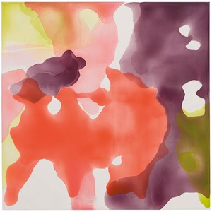
Amanda WilliamsAge four. No [laughter]. I think for as long as I can remember, color was always the central component of my work—I just associated color with art. So when I was making the transition from my full-time architectural practice to an artistic practice, I jokingly asked myself, What is my motivation? I realized it was this deep search for color, and in the last five years, this kind of interrogation of individual colors or palettes has really been driving that interest forward.
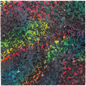
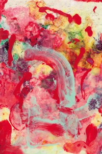
Alteronce GumbyI think for me, in art, it came later, but in life, it happened at a very young age. In kindergarten, when the teacher asked everyone to say what their favorite color was, and why, I stood up and said my favorite color was black. Before I could say why, this student behind me said, “Oh, your favorite color is black because you’re Black.” And I was like, “No, it’s because my favorite superhero is Batman, the Dark Knight” [laughter]. So I was a little confused by that as a five-year-old, because I was like, My pants are black but I’m a nice honey umber. It messed me up a bit.
It wasn’t until I went to my first Venice Biennale, in 2015, and saw some beautiful monochromatic works by Korean artists from the ’70s that my eyes were really opened to the history of monochromatic abstract painting. Here I was in grad school, just then hearing about this group of artists. I began to research how other artists had approached this aesthetic of the monochrome and worked to find my way, my voice, within it. I found myself in Paris looking at the work of Ad Reinhardt, Kazimir Malevich, and all these European male painters who had their own perspective on, say, the color black, addressing it maybe as a void or a vacuum. And I was thinking about it as a cultural influence, my heritage, the way I’ve identified here in America. Then I really tried in my own work to move beyond that, beyond these definitions and terms in which I perceive color.
JCAmanda, you mentioned your transition, if you will, from architecture into visual art. You’ve used color as a way of transforming architectural space, as in your Color(ed) Theory [2014–16] series on the South Side of Chicago, using various culturally charged colors that you found to paint houses that were about to be demolished.
AWYeah, in the Color(ed) Theory houses and my other projects I oscillate between media, with architecture being a material medium in that instance. I was asking, What are architecture’s limits? What are its unexpected opportunities? When you have the scale of a house, you have to deal with not just light but the sun itself, and other elements, and color takes on a different meaning. In school we studied Josef Albers, we studied modernism, we studied Western conceptions of color theory, and then I’m trying to sync that with 79th Street on Chicago’s South Side. How do you leverage both of those? I feel super fortunate that I can be making projects in real time with both sorts of references. The What Black Is This, You Say? project for the Storefront for Art and Architecture, New York, in 2021 was also like that. It started with thinking about color in a two-dimensional conceptual framework. Then the Storefront for Art and Architecture, a nonprofit that has tried to generate public-art provocations around issues of space and equity and power, approached me during the pandemic to make the façade of their storefront black. What does it mean for architecture to be black and Black?
JCAs you were working on that project, I imagine you were thinking a lot about that specific place and that particular architecture. And I have a question for both of you, which is, Do you have site-specific relationships to color? Do particular geographic coordinates or memories of built environments inform the ways you think about color?
AWLately, I’ll think about experiences or memories with some kind of location attached to them and think about the palettes associated with it. My CandyLadyBlack series [2020– ], for example, comes from my memories of “the candy lady,” which is a particular experience of going into a stranger’s house and buying candy from their table. That memory will conjure images of the kitchen, or of the extended mothers in your community, or of ’70s bungalow-style houses. So my mind associates different colors with these memories and they go into the series. The number of people who are like, “Oh, green apple, I remember”—those colors can be very literal but they can also evoke something much bigger. That’s starting to be a conscious way of working for me: thinking of a place and its palette versus starting with a color and then working backward. It takes longer because you get into memory rabbit holes.
AGI agree; I think memory adds to the palette. I was making this white painting the other day. It wasn’t really white; it was really light pinks and oranges and greens and stuff like that. I grew up in a church—my mother’s a pastor—and sometimes in a Pentecostal church, the church mothers will sit in the front wearing all white. The painting started to remind me of hearing and watching my mother speak in tongues and shout in church, so I added this extra texture or sensibility to the paintings that I don’t think would have been there if I hadn’t had that experience.
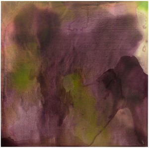
It goes both ways as well. For my show Dark Matter at the Allentown Art Museum in 2023, I made a series of paintings that you saw in two different kinds of light: you would see them in regular incandescent light and then you also saw them under UV light. The colors shifted, the experience shifted from one palette to the next, but it was still the same painting. I was trying to expand my awareness of the different phases and sources in which color could exist out in the world. Our relationship to the way we see color is completely celestial. It’s based on one star, the sun. We’re all born on this planet Earth and all of our eyes, our cones, are adjusted to see color and light as it relates to the sun. If I go into my mind’s eye and I try to imagine myself on a distant planet in another solar system with another star, what colors would I see? The rainbow would be completely different. Would the sky be blue or orange or purple? I don’t know. I’m trying to bring that kind of imaginary space into my work.
AWThat’s beautiful.
JCWhat you brought up is really powerful in terms of the limited range of our chromatic perception, which for me raises a larger sense of the politics of color, the politics of perception, the connotations we bring to color. And in that regard I’m curious whether you could talk about your work in terms of a “politics of color,” whatever that means to you.
We as human beings have radicalized color. In nature, color is just what it is, an absorption and reflection of light. Being the intellectual beings that we are, we’ve taken color and given it these signifiers, these definitions, these themes, these moods, these emotions.
Alteronce Gumby
AWI mean, I think being Black is political. We don’t have any choice. Everything we do, there’s a politics. But there’s a difference between my provocation within a neighborhood and conversations that Faith Ringgold, say, and other artists of an older generation were trying to have: to overtly establish political positions in their art, and sometimes just trying to stay alive. I think there’s a relative privilege that our generation is enjoying. We’re still making work about Blackness, but there’s a full range of ways to engage these politics, whether directly through the work or through other types of advocacy. The Storefront project is an example of a certain kind of confrontation. A good friend of mine, Andreas Hernandez, challenged the organization and said, “Once you go black you never go back.” Now the project is over but my black façade is still there and there’s very little graffiti on it, which I’m shocked by. There’s a kind of reverence for it that you have to assume is because of what it’s “saying.” The storefront was designed in 1993 by the starchitect Steven Holl and the artist Vito Acconci. By applying blackness to it, there are now all these layers of complexity. I wasn’t necessarily sitting down saying, “I’m going to challenge Western conventions of space,” you know? But this is what it’s doing.
AGWe as human beings have radicalized color. In nature, color is just what it is, an absorption and reflection of light. Being the intellectual beings that we are, we’ve taken color and given it these signifiers, these definitions, these themes, these moods, these emotions. As a Black man in America, as a millennial making art, I feel like in some ways I’m carrying all of these things, especially when I’m making these colored or monochromatic paintings. I’m just trying to exist as a human being in this world and not necessarily have to make a political statement within each painting I’m making.
AWWe can go between working through issues around the complexity of Blackness and transcending them.
JCHow do you begin to think about your titles?
AGI grew up listening to hip-hop; as a teenager I wrote poetry and songs. I’ve always enjoyed wordplay in my work. In the titling of my paintings I just want to add another layer of context to the work. I want to name my kids, in a way. So certain titles have been a little provocative, I’d say, especially early on; there was one series that was titled My President’s Black but My Painting’s Still Blue [2015–18]. That was a series, a running title for a while. I think the last one was My President’s Orange but My Painting’s Still Blue. It was a color play [laughter].
AWI was going to blame and/or credit hip-hop too. I’m Gen X, not millennial. I listened to hip-hop 1.0, as we call it in my house. Titles can be a necessity for a kind of communication, but I think they also sometimes become a crutch—maybe that’s too strong a word, but it’s like sometimes the titles outdo the pieces in my mind. There’s a discomfort for me that the work’s not doing enough for the title. They have to do each other justice.
JCIn one of your titles, Alteronce, there’s a homage to the artist Sam Gilliam, which has me wondering who some of the artistic forebears are that you both think about when you’re in the studio?
AWAlthough you would never look at any of my works and make the correlation, I think if I were thinking strictly color, Jacob Lawrence was probably my first huge influence. I was able to spend a lot of time with Raymond Saunders when I lived out in the Bay Area. Coming from Chicago, obviously, I think about Africobra and the work that they did and still do—the balance of heavy politics and levity and just having the gumption to do it at a time when that wasn’t popular. Then in the present day, obviously someone like a Kerry James Marshall has been hugely influential for me. But there’s no one, I don’t think, where you could make a one-to-one correlation between their work and mine. It’s more an understanding of their process, or trying to deconstruct how they come to color.
AGWho am I looking at in terms of color? Monet is definitely someone I go to a lot for a palette. Stanley Whitney, yes, Sam Gilliam, but I’ve been looking a lot outside of art for color inspiration as well. I’ve been looking at nasa’s images from the James Webb telescope, the Hubble telescope, of these nebulae and celestial spaces that are out there in the universe. Over the past year I’ve been working on a documentary, Color, that looks at color from cultural and natural standpoints. This has taken me to New Orleans, to Mardi Gras, looking at the floats; to a Holi celebration in India; to looking at color underwater, scuba diving at the Great Barrier Reef, going to Alaska to look at the northern lights. Being a city boy and living in New York for almost eighteen years now, I feel like I’ve had a detachment from nature; I’ve been living in a concrete jungle. Traveling to these places and getting in touch with nature have brought back a different sensibility of color for me. Color comes from nature; chemists and scientists and paint-makers and people in ancient civilizations started going out and finding different plants and minerals, grinding them up and turning them into pigments. That’s where our golden palette comes from today.
JCLet’s talk about this intersection of color and material history more broadly. Amanda, you showed us this blue vial, and if I understand correctly, this is an Egyptian blue pigment patented by none other than George Washington Carver that you’ve been researching. It’s interesting to think about color as something that could be patented, to think about color in terms of ingenuity. In this instance it’s an example of the history of Black innovation and invention.
AWWell, you have this person, George Washington Carver, in the early 1900s who was just great at everything. In addition to being an agriculturalist, he’s crocheting, dancing, making art, doing tons of stuff. And like fifteenth on the list of great things was, “I guess we can patent this blue color I created.” He actually worked on two different blues. There’s the Egyptian blue, which Terry Adkins did quite a bit of work with, almost electric, and then the one Carver actually patented, the one I showed you, a Prussian blue. It had to do with the high iron content in the red clay that’s ubiquitous in Carver’s part of Alabama, around Tuskegee and Montgomery. I actually just went two weeks ago to the archive, and it’s mind-blowing: first of all it feels like you’re walking back in time, it’s like 1952. You think about the number of things that people at the Tuskegee Institute were pioneering and creating from nothing.
It’s mind-boggling that no one questions Yves Klein’s connection with a color. He was just sitting around and was like, “I’m going to be known for blue. I’m going to go down in history and when you say blue, somebody will say, ‘Yves Klein.’” And that’s what happens, right? I tell someone I’m working on blue, they’re like, “Yves Klein.” I’m like, “George Washington Carver!” Through this research I’m interested in how we can disrupt the narratives in that way. But I’m also interested in how can we just geek out on pigment. This is pigment; it’s not yet paint. It’s the raw material, the building blocks.
Jordan Carter joined the Dia Art Foundation as curator and co-department head in 2021. His forthcoming projects include presentations of the work of Lucas Samaras and Keith Sonnier, a multipart commission by Cameron Rowland, and an exhibition of new and historical works by Renée Green, all opening at Dia Beacon in 2024–25. Photo: Gabriela Herman
Alteronce Gumby is an artist and local of New York City. His practice includes painting, ceramics, installation, performance, and film. Gumby earned his BFA from Hunter College, and his MFA from Yale School of Art. His inspirations include the cosmos, and he is an active member of the Amateur Astronomers Association and the Planetary Society. He is currently preparing for his next solo exhibition at the Nicola Vassell Gallery, New York, in November 2024.
Amanda Williams is an artist who uses ideas around color and architecture to explore the intersection of race and the built environment. Through an interdisciplinary practice that brings spatial and aesthetic theory to bear on real social problems, Williams is clarifying the role of the artist in reimagining public space. Whether thinking about the latent value of vacant houses, the expansive palette of Blackness, the speculative beauty of tulip bulbs, or the social currency of childhood candies, Williams has an ongoing practice of elevating seemingly mundane objects and spaces to a renewed and often reformulated status of importance. She lives and works in Chicago.