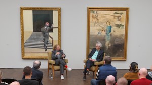
In response to questions prepared by Kara Vander Weg, September 2013
Kara Vander WegDo you remember when and how you first saw Willem de Kooning’s work? What was your first impression?
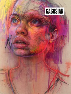
Jenny SavilleWhen I was growing up there was a reproduction of Woman I [1950–52] on my wall, but the first encounter I had with his work in the flesh was when I came to New York at the age of twenty. Easter Monday [1955–56] was hanging at the Metropolitan Museum of Art and I remember it was so striking that it caused my head to literally jolt backward. It was an immediate and overwhelming feeling of recognition, a moment when I realized “this is something, this is really good.” It was as powerful and full of tension as works by the greatest old-master figurative painters in Europe, except it was abstract. It was just paint and human movement, but it was so much more of a painting in the flesh than I could have ever expected. The paint was right on the surface—it had dexterity, strength, and it felt urban. I knew that he was going to be important to my work. Picasso was very much a European figurative painter, Jackson Pollock was a quintessential American abstract painter, and de Kooning was this great bridge between the two. He represented a freedom of movement; he didn’t want to be tied down to a singular style or refuse the figure. So, instead of accepting a painting dogma, he spent his life saying, “Why not? Where will this lead me?” He followed his own logic.
KVWWhen did you first see the 1980s pictures? Has your appreciation for the work changed or grown since that time?
JSThere was a de Kooning show David Sylvester curated with Marla Prather in 1994–95 [Willem de Kooning: Paintings] that included some later works. But at that time I was so excited by his earlier work that I didn’t spend much time considering the late work. I was at a stage in painting when I wanted to put everything in—I didn’t realize how good it could be to take away, too.
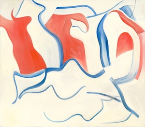
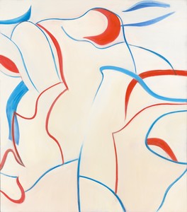
The Gagosian show in Chelsea during spring 2004 [A Centennial Exhibition] was what turned me on to the later works. I was lucky enough to spend a few days in the gallery alone, before the show opened. I’d move back and forth between the gallery rooms and through the journeys he’d made in his life. The limited palette in the early- to mid-1980s was so liberating. It was like Japanese haiku poetry. Red, yellow, blue, white, and black are the bare essentials for painting. They’re the bases you can potentially mix everything from. Then he limited the colors again to the elemental colors of fire/blood and water/sky. I really like the freshness of the 1982–83 works, where he uses white paint and a scraper like it’s erasing in drawing. Through the scraper he can bleed the pigmented ribbons, cut them off, bury them under white, or almost erase them to a whisper. It’s the most satisfying sensation to paint fluid white paint into a stronger pigment or vice versa with a soft housepainter’s brush. He had the knowledge to get the consistency of paint just right so he could nudge the brush into the color and accent the tone. White paint becomes the carrier of space. He tries to give form to nothingness. Are you looking at form or space? Everything’s flowing and on the move. You can never quite fix your coordinates. It’s like he’s painting the offcuts or the space around Matisse’s cutouts. After 1983 he doesn’t seem to paint through forms so much, but around them, and the lines are the natural arc of his arm across the surface.
KVWYou have talked about how your large work has been influenced by the grand scale of Venetian painting. Many of de Kooning’s paintings, especially the later works, are executed on a large scale—77 by 88 inches or 70 by 80 inches. Have these canvases impacted you in some way?
JSThe relationships between the grand scale of de Kooning’s gestures to the scale of his canvas and the human body have been influential.
KVWYour last exhibition of drawings and paintings [Jenny Saville: Continuum] featured a number of images that had multiple lines and perspectives, suggesting the movement of your sitters, but also perhaps the gestures of your making. Is the gesture that is so clearly visible in de Kooning’s work—although certainly less so than in the 1980s pieces—something that you think about in relation to your own?
JSIt’s the play of time and space through pigment and gesture that I’ve found so interesting. Through the movement of a mark you can travel to the innards of the painting or drawing and then follow the movement right back out. When you keep the paint wet and run other pigment through it, the gesture is forever frozen in a moment of becoming. It’s as though the paint is still live, even after it dries. I try to use these possibilities in the painting of figures, for example to get that feeling of delicate skin underneath the eye socket by running two or three tones wet into wet. By working like this and keeping the paint fluid, you create multiple nuanced tones that would be impossible to mix individually. The gesture and movement of painting actually creates those color tones. It’s exciting to work like that, because you work from the nature of the medium and the nature of yourself, in the moment.
De Kooning’s good at building space through contradiction. He often paints against the forms that he previously laid down in order to grow the space. I think this process he used for years shifts in the work of this show. He’s not creating by working against himself so much, and is instead playful with his language.
KVWYou have spoken about the “visual wrestling” in de Kooning’s earlier works, including Woman I, and how the pictures appear to be struggling to find form and space. Do you read these later canvases as more sedate and less angst-filled, or as more complex and layered?
JSThey feel like flesh in heaven. They make me think of W. B. Yeats’s poem “Sailing to Byzantium” and the line “Into the artifice of eternity.”
De Kooning described these later paintings as like bones—his ’70s paintings were all flesh without bones and the ’80s paintings were bones without flesh. It’s like he’s entered a kind of Shambala—the valleys or sensory pathways of an inner mind, outside of time and place. The way he paints is like stroking a cat all the way along its spine to the tip of its tail.
KVWDe Kooning almost always incorporated drawings, both technically and conceptually, into his paintings. Do you think about his use of drawing in relation to your own?
JSI like to draw in paint, and when I’m drawing with a dry medium I seem to try to make the marks look like they’re fluid. Over the last few years my drawing and painting have become more interchangeable. I like the flatness and ability to build and erase that paper gives you. It’s so easy to start over on top, because the surface remains flat. When you look at all the Woman pastels de Kooning did in the early ’50s, you can see how vital they were to his paintings. To some degree, you can begin to preempt what the paint might do without clogging up a painting. I get a similar kick from putting energy into my mark making. De Kooning likes to move and swing a mark. When you take a thickish piece of charcoal and run it at a certain speed—run it toward you and push it away from you, it’s fluid and creamy and starts to behave like paint. Soft pastels are good too, as they can glide in a similar way.
KVWDe Kooning was known throughout his career as someone who had a masterful command of color, and you have remarked upon this in the past. While his tones in these later pictures are less “fleshy,” and there is less of a tactile quality to the paint, is his use of color in these later pictures meaningful for you?
JSHis colors in these paintings are like those described in ancient creation myths. In ancient Egypt, white was considered sacred due to its lack of color, and symbolized omnipotence and purity. The name of the holy city of Memphis means “white walls.” Red is the color of blood, fire, and life and blue represented the sea/sky and rebirth with the flood of the Nile Delta. The gods in ancient Egypt were even said to have hair made of lapis lazuli. So although the 1980s paintings seem incredibly modern and related to Mondrian or Miró’s simplicity, they’re also ancient and universal.