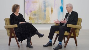
On the occasion of the exhibition Pittura/Panorama: Paintings by Helen Frankenthaler, 1952–1992, at the Museo di Palazzo Grimani in Venice, Italy, art historians John Elderfield and Pepe Karmel discuss the concept of the panorama in relation to the artist’s work. Their conversation traces developments in Frankenthaler’s approach to composition, the boundaries and conventions of abstraction, and how, in many ways, her career continually challenged established theories of art history.
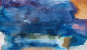
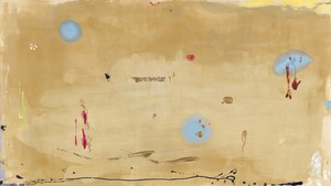
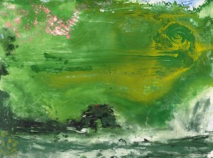
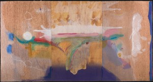
Helen Frankenthaler, Riverhead, 1963 (detail), acrylic on canvas, 82 ¼ × 143 inches (208.9 × 363.2 cm)
Helen Frankenthaler, Riverhead, 1963 (detail), acrylic on canvas, 82 ¼ × 143 inches (208.9 × 363.2 cm)
John Elderfield is chief curator emeritus of painting and sculpture at New York’s Museum of Modern Art and was formerly the inaugural Allen R. Adler, Class of 1967, Distinguished Curator and Lecturer at the Princeton University Art Museum. He joined Gagosian in 2012 as a senior curator for special exhibitions.
Pepe Karmel teaches in the Department of Art History, New York University. His book Picasso and the Invention of Cubism was published by Yale University Press in 2003. He has curated or cocurated many exhibitions and has contributed to numerous exhibition catalogues, as well as to publications including Art in America and the New York Times.
John Elderfield In the initial stages of planning for the Palazzo Grimani exhibition, and through looking at Helen’s work, particularly the very horizontal works from the 1970s, I became interested in the idea of panorama painting and the differences between that and mural or frieze painting. Panoramas are understood to be spatialized images, unlike mural paintings or friezes, which are both meant to read as flat. My thinking about this developed through an encounter with works by Puvis de Chavannes—I was struck by how flat his pictures are. It’s this quality, I believe, that makes people think of them as mural paintings. Puvis was enormously influential in his time, precisely because his paintings are so flat and mural-like. The author Willa Cather was a great admirer of Puvis. Her wonderful book Death Comes for the Archbishop, from 1927, is organized in chapters, and the same characters appear in each chapter, but there isn’t a lot of narrative connection. She liked Puvis’s work because of the way subjects are stretched out across the plane, each separately conceived. There’s a couple of people embracing on one side, and then there’s something else occurring on the other; there’s no attempt to unify them. She liked that flat affect, free of any impulse toward comprehensive unification, and that’s how she wrote as well.
Pepe Karmel Everything is so gray in Puvis’s work, so middle value with very few shadows, a quality that tends to accentuate flatness. Added to this is a sense of stasis among the figures, as if they’re posing for eternity, never interacting.
Thomas Hart Benton, in his 1926 essay “Mechanics of Form Organization in Painting,” argued that once a composition got to be long enough, you could no longer create a single unified scene. He said a work must have a series of vertical axes, with groups organized around each axis. Among these groups there is no particular relationship. This point is often invoked apropos Jackson Pollock’s Blue Poles [1952].
What do you think distinguishes something as a panorama? What are the characteristics that led you to associate that term with Frankenthaler? It’s certainly more nuanced than the simple fact that the works have very long horizontal dimensions. You’ve mentioned their spatiality—
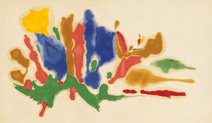
JE The progression into a panoramic spatiality relates in part to her treatment of the canvas. At the end of the 1950s, Frankenthaler starts to paint on primed rather than unprimed canvas, in part because she could get more vivid color with a strong white ground. That said, by the time she gets into the 1970s, and certainly by the mid-1970s, something else is happening: there really is a sense of the canvas being one material and the paint being another. This differs significantly from the way the soak-stain paintings are often written about, including by me: these works, as well as the works of Kenneth Noland and Morris Louis, are often discussed in terms of the staining becoming one with the canvas. Of course we could argue the opposite as well.
With a painting like For E.M. [1981] Frankenthaler is certainly pushing the way soak-stain paintings are understood. By this point you see the paint film as a unit. In a way, it’s a lot like a traditional picture plane. In the Palazzo Grimani exhibition, For E.M. will share a room with Riverhead [1963], which, in retrospect, seems anticipatory of what she would do later on.
PK Speaking of Riverhead, and the question you raised of whether it all merges as one thing or whether the paint stands out from the canvas, I’ve been looking carefully at that work, and it’s striking the way the passages of bare canvas work as colors on par with the parts that are actually painted. You have to get quite close to tell what’s painted and what’s not because they’re so fully integrated. It’s remarkable. Italian Beach [1960] is a work that’s primed, and it’s striking how the paint stands up on that work. It’s brilliantly colored; it seems to leap off the canvas.
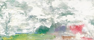
Helen Frankenthaler, New Paths, 1973, acrylic on canvas, 54 ¾ × 109 inches (139 × 276.9 cm)
JE And when it gets thin, it doesn’t stain. It’s a wash.
PK It is, aggressively, a brush-painted picture. It feels quite different from the stained pictures.
JE Yes, and New Paths from 1973 is interesting in that the white area is almost like a pretend stain.
PK Definitely. In the lower part of the picture, where the white paint goes over the black paint, it feels like it’s stained into it, but it’s just been thinned and is running over.
JE The appearance of dark grounds in her work is I think really fascinating.
PK Oh yes. Do you remember the 2013–14 Georges Braque retrospective in Paris and Houston? One of the things that the show reinforced was my awareness of Braque’s use of colors on dark grounds. We’re all conditioned by Impressionism to think that white makes colors brighter; I don’t think that’s always right—white makes paintings brighter, but it actually evens out the colors a little because there’s so much light coming through them. Braque figured out that to make the chroma more powerful, you put the color on top of a dark ground and then the actual hue leaps out at you. And of course what Frankenthaler’s done in New Paths is make white into a hue. Paradoxically, it looks whiter on black than it looks on white.
JE Well, in the early 1970s she made paintings where she started by tinting whole canvases with one color. This was a new technique for her at the time. She left slivers of the bare canvas exposed, so the canvas works as a color along with the painted areas. There’s been a lot written about white canvas starting to become common in Impressionism, but less has been written about the use of colored grounds. Degas used colored grounds, and he had his pupils each work from a ground of a different color—“You get blue, you get red, you get yellow.”
PK That was standard old master practice. Once you get to the sixteenth century, people work on a mid-value ground. Often it’s a brown, but it can be other colors. You think of drawings on red paper, drawings on blue paper. The idea is you already have a color and then you work up to the lights and down to the shadows. So what we’re seeing is a rediscovery of that for modern art.
JE Cézanne was using dark grounds in the 1860s and he eventually—really because of Camille Pissarro, I think—stopped using them. It’s interesting that Frankenthaler is engaging in various ways, across her career, with these different approaches to the ground of her paintings.
PK In the late 1970s and the ’80s she reengages with Titian, Édouard Manet, and a series of old masters; she begins to use their techniques to make abstract paintings. This is often done with an oblique reference to a motif that she’s borrowed, which, in her process, disappears and becomes an abstraction. Thinking about this, it astonishes me, because our canonical history of abstraction has no room for this kind of thing. If you go from Clement Greenberg to Michael Fried and so forth, it’s all about flatness, purity, and some idea of what the picture plane supposedly demands. The richness and sophistication of Frankenthaler’s later work goes way beyond that very limited discourse. I think it’s been hard for critics to deal with it.
Helen Frankenthaler, Brother Angel, 1983, acrylic on canvas, 66 ¼ × 117 inches (168.3 × 297.2 cm)
JE Yes, because people think of it as traditional. And it is, but—
PK But it’s not traditional for abstract painting. It’s radically innovative for abstract painting. Another tenet of Greenberg’s that Frankenthaler’s work brings into question is opticality. There’s this narrative arc that goes from the putative opticality of Pollock to the even greater opticality of Frankenthaler and then Noland and Louis, but where, really, is the opticality in those works? I mean, Pollock is intensely material. If you get within five or six feet of the surface, you see how incredibly gnarled and material they are. That opticality argument, I think, is untrue to the actual experience of looking at a Pollock, because you don’t just stand back and look. You stand back and then you move close.
JE Yes.
PK There’s typically a long interaction where you confront the material quality and then you back away from it. And much the same thing happens when looking at these paintings by Frankenthaler.
JE Yes, I think it’s the same. The contrast of proximate and distant viewing has long been a matter of critical interest, producing the famous 1877 critic’s joke about Pissarro’s landscapes: “Seen up close they are incomprehensible and hideous; seen from a distance they are hideous and incomprehensible.” More recently: have you ever been to Willem de Kooning’s studio on Long Island? The chair from which he looked at his paintings was at a distance where you couldn’t possibly see the materiality of the pictures. He would sit and see them as nonmaterial things, then walk up to them, do something, and then go back.
PK That doesn’t mean, however, that he wanted to dematerialize them.
JE No. I think he wanted both.
PK You need to get pretty far back to see a whole composition. In looking at these Frankenthalers, I’ve been acutely aware of this debate. I’m hypnotically drawn to get up close and look at details, but then to find out what the whole picture looks like, I have to go back ten or fifteen feet and really see the effect.
JE And even if going back means you lose some sense of the relief quality of the painterliness, the form of the painterliness tells you that it’s in relief.
PK Plus you remember it. Fried argued that the best possible abstract painting was one that you could take in instantly; for him a perfect work didn’t require protracted examination. Perhaps that’s true for Noland at a certain moment, but it’s not true for lots of other artists. It’s certainly not true for Frankenthaler. You want to look at the paintings over a long period of time.
JE It’s not true for Rembrandt.
PK No, exactly. In some ways I see Frankenthaler as an artist who has the freedom to take all of art history as her model for making abstraction. She’s reopening and reappropriating everything that was there before, which is a glorious approach.
Helen Frankenthaler, Maelstrom, 1992, acrylic on canvas, 46 ½ × 107 ½ inches (118.1 × 272.9 cm)
JE The availability of the past is something one hears more about from representational artists, of course. When I went to art school, one of my teachers said, “You know, it’s all one art school, really.” This was someone who had studied with Walter Sickert, who had been a pupil of Degas, and Degas had admired Ingres, and on. He would say, “You’re all part of that.” I remember thinking, “Oh no. Does that mean I’m supposed to learn to draw like Ingres? I’ll never achieve that.” But that sense of availability, where one can take from history whatever one needs—I agree with you, there seems to be an unwillingness to allow that in abstract art. And it’s therefore been customary to explain away things that could be thought to be making use of traditional forms.
I’ve been looking carefully at [“Riverhead”], and it’s striking the way the passages of bare canvas work as colors on par with the parts that are actually painted. You have to get quite close to tell what’s painted and what’s not because they’re so fully integrated. It’s remarkable.
Pepe Karmel
PK Since the ’90s, abstract artists, to some extent following in Frankenthaler’s path, have gone back toward complexity and reference. I organized a show some years back with Valerie Jaudon, Peter Halley, David Reed, and a whole group of painters for whom abstraction was about life and the world and experience. The critic and curator Katy Siegel pointed out recently how a contemporary painter like Mary Weatherford can look back to Frankenthaler with an openness to the past, a willingness to say, “I’m going to take something and make it new, make it my own,” which is very much a hallmark of abstraction in our time.
Let’s turn to the question of abstraction and figuration, which I think also brings us back to the idea of the panorama. In describing this group of Frankenthaler paintings selected for Venice as panoramas, you’ve spoken of their spatiality. This comes very close to suggesting that they’re allied to representational landscapes. Do I understand this correctly?
JE Well, there’s a good argument to be made that any pictorial imagery that uses cursive forms is bound to be allusive. This is a long-standing argument that I don’t think we can settle, but Cecily Brown, for example, has made the argument that you can’t paint a curved line without triggering some memory of a shoulder or a thigh or whatever. In some way we’re programmed to respond to human imagery, and we’ll see it wherever we can find it. In terms of paint spread in a spatialized way, the work’s going to have some kind of reference to the natural world. It just seems inevitable; we look at landscapes, we look at skies, we look at water, and we, I think, are programmed to see these things even in abstract representations.
PK How do we get from the kind of mark that evokes the human figure to the kind of mark that evokes a landscape? Is it a different kind of mark? Is it a different way of putting those marks together?
JE Well, one good example is New Paths. The marking is extremely graphic, linear, and therefore more descriptive of a body than of a landscape. On the other hand, because it spans space, and because of the way it describes space as it goes back around, it definitely invokes landscape associations. There’s the sense of space moving from the foreground to the background, which is similar to our perception of landscape spaces.
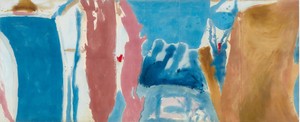
Helen Frankenthaler, Open Wall, 1953, oil on unsized, unprimed canvas, 53 ¾ × 131 inches (136.5 × 332.7 cm)
PK Okay, so let’s discuss those two formal qualities that point to landscape. The more obvious one seems to be that it sprawls out sideways, which human beings don’t do unless they’re lying down. But you’ve also just brought up another point, which is that the internal structure of the lines and colors suggests a recession into space. There’s a spatiality that’s different from what you see in the human figure, which is more parallel to the picture frame.
JE It doesn’t have to be only a movement from foreground to background, either; with a work like For E.M., the spatiality moves in and out through the composition. It’s ambiguous in terms of how one would read it. For instance, it’s possible to hold an image where the dark is distant, but then it’s equally plausible to see that dark area as being in front of other parts of the composition.
I believe that Frankenthaler was fully interested in pushing and pulling the space in that way. When she was a student of Hans Hofmann very early on, that push-pull thing was already there.
PK It’s fascinating that you chose For E.M. as an example. I was struck by the fact that it does indeed feel like a landscape, even though we know that the inspiration for it was a still life—Manet’s painting of a carp [1864]. As a landscape, it reminds me, for instance, of Martin Johnson Heade’s Approaching Thunder Storm [1859]. That band of darkness at the top of For E.M.: in a still life I can simply read that as darkness behind the table, or a distant wall somewhere, but in a landscape context it becomes a dark sky against a brightly lit patch of ground in the foreground. When the natural relationship of light sky over a darker earth gets reversed and you have a dark sky over a lighter earth, there’s a sense of drama and a little frisson of terror. It’s exciting, it’s scary, and it’s a landscape experience.
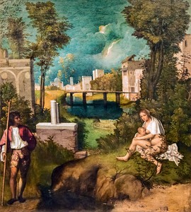
Giorgione, The Tempest, c. 1506–08, oil on canvas, 30 ¾ × 28 ½ inches (82 × 73 cm), Gallerie dell'Accademia di Venezia, Italy
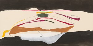
JE Last year I was working on various Cézanne projects and it got me thinking about landscape, and specifically about the basic modes that get repeated throughout art history. While the manner of painting can be changed radically, as it was in Cézanne’s work, in many cases he’s using conventional forms and techniques that had been used since the sixteenth century. It’s as if certain of these things are just wired into artists’ minds, whether they’re aware of it or not. For instance, repoussoir remains present across landscape paintings. Kenneth Clark’s Landscape into Art from 1949 was crucial in my thinking on this. One of his eureka moments is Giorgione’s Tempest [c. 1506–08], where Giorgione had this bright idea of pulling the composition apart, placing the view onto the landscape at the center. The figures got moved apart as well, of course. Later compositions tend to have a repoussoir only on one side, usually the left, but Giorgone’s double-repoussoir composition lies somewhere behind Frankenthaler’s Open Wall [1953].
PK Yes, of course. It struck me that the warm colors seem to have been painted first in that work—the salmon-colored flume rising upward, and then the pink one next to it, and then the ocher shade at the extreme right. The blues between them are clearly painted later. Try to imagine the painting without that section of blue: it would have had an opening in the middle. It wouldn’t be that old-fashioned perspective, but as you’re suggesting, it would open up and yield into the distance in the near-middle.
It’s helpful to look at the difference between Open Wall and New Paths. Open Wall has a series of vertical forms that certainly keep the canvas from receding at the top. It doesn’t go back into the distance except in that blue passage just right of center. It’s very frontal. It even has a somewhat friezelike quality, to go back to a term we used before. New Paths, to my eye, with the dark band at top and bottom, brings back that feeling of a landscape, as it’s got a dark sky over a dark ground with a band of white sky or openness in the middle, which opens to a kind of indefinite distance. The lines do suggest things moving back in space toward the kind of green splotch just below the black. There’s a sense of openness and recession quite different from the flatness of Open Wall.
Helen Frankenthaler, Overture, 1992, acrylic on canvas, 70 × 94 inches (177.8 × 238.8 cm)
JE Frankenthaler had six of her paintings included in the 1966 Venice Biennale, and the catalogue includes a short essay by William Rubin. He talks about the early work having veiled poetic allusions to landscape and organic forms that, though never literally represented, “lurked naturally” in the metrics of the more draftsmanly pictures. What does the adverb “naturally” mean here?
PK I think he means inevitably, though it’s fun to think of something lurking unnaturally.
JE Exactly. Anyhow, “lurking” doesn’t seem quite the way to put this—
PK Well, it speaks to a persistent unease that people felt about this question between 1955 and 1970. Remember there was that show in 1958 at the Whitney called Nature in Abstraction; we’re not the first people to see nature in this kind of painting. I think the New York art world was divided between people who were happy to find nature in abstraction and others who were radically upset, who felt that the claim to true abstraction—the claim to critical validity—depended on banishing all forms of reference. Some of that tension might be registered in Rubin’s use of the word “lurking.” It may be there, but it’s bad.
JE Yes, exactly.
PK In Françoise Gilot’s Life with Picasso [1964], there’s an anecdote that has Picasso pointing out a squirrel in one of Braque’s paintings. Braque kept trying to paint it out, but it took him weeks to get rid of it. He would repaint the picture and the squirrel would still be there and he’d have to rework it all over again. And Cubism seems like a useful point of reference for this conversation, not formally—though Frankenthaler’s very much aware of Cubism—but in that sense of suspended reference. In the sense that, okay, maybe there’s a woman with a mandolin or a table with bottles and wine glasses or a guitar in there somewhere, but that’s not the point of the picture. If you get too worked up trying to identify the objects, you’re not looking properly at the picture. On the one hand, Picasso and Braque tease us with their titles or little clues, but Cubism is a paradigm for the picture that’s suspended between figuration and nonfiguration. It’s deliberately not totally abstract, but it’s also no longer figurative in any conventional way. There’s that peculiar, particular pleasure of feeling the presence of the real world without quite being able to see it.
JE This makes me think of all the Cézannes that include brushstrokes, placed on the surface, with no representational function. Nonetheless, they have a semantic function; they’re part of the meaning of the picture.
PK In his painting there’s also continual transition. So in, say, Turning Road at Montgeroult [1898] at MoMA, the houses up top are completely sharp and legible, like a Pissarro, but then the landscape, the hillside, and the vegetation just dissolve into pure brushwork in the lower part of the picture, which is gorgeous. You know that they generically represent bushes or trees, but it’s also just the sensation. That is a touchstone of modernist experience; we want to have a sensation of the real world without being burdened with a particular image of it. Perhaps this looks forward to a certain kind of French literature of the 1940s and ’50s—the nouveau roman, or even Jean-Paul Sartre’s Nausea [1938] and Nathalie Sarraute—with its attempts to capture the phenomenology of lived life while bracketing out the real world, or narrative, or character, or any of those things you usually find in fiction. What’s the texture? What’s the sensation of being alive? That’s an important theme at a certain moment in modern literature; it also seems like a theme in these paintings by Frankenthaler. They have a tremendous sense of lived experience, a phenomenological experience, you could say, without having a fixed, recognizable image behind it.
John Elderfield is chief curator emeritus of painting and sculpture at New York’s Museum of Modern Art and was formerly the inaugural Allen R. Adler, Class of 1967, Distinguished Curator and Lecturer at the Princeton University Art Museum. He joined Gagosian in 2012 as a senior curator for special exhibitions.
Pepe Karmel teaches in the Department of Art History, New York University. His book Picasso and the Invention of Cubism was published by Yale University Press in 2003. He has curated or cocurated many exhibitions and has contributed to numerous exhibition catalogues, as well as to publications including Art in America and the New York Times.