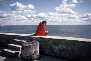
Helen Frankenthaler at the Clark Art Institute
Phyllis Tuchman on the critical role of scale in Frankenthaler’s art practice.
August 8, 2018
John Elderfield shares part of his lecture, prepared on the occasion of the exhibition Abstract Climates: Helen Frankenthaler in Provincetown, curated by Lise Motherwell, a stepdaughter of the artist, and Elizabeth Smith, founding executive director of the Helen Frankenthaler Foundation. Frankenthaler worked in Provincetown briefly in 1950, then regularly through the summers of 1960 through 1969. This talk focuses on the development of her paintings from 1960 through 1967, most of those mentioned made in the Massachusetts beach community.

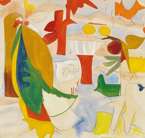
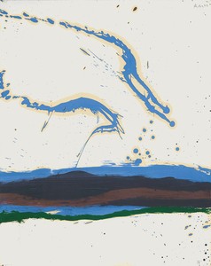
Helen Frankenthaler, Italian Beach, 1960, oil on sized, primed linen, 67 ⅛ × 82 ¼ inches (170.5 × 208.9 cm)
Helen Frankenthaler, Italian Beach, 1960, oil on sized, primed linen, 67 ⅛ × 82 ¼ inches (170.5 × 208.9 cm)
To begin, let us look at what happened through four paintings, one a year from 1960 to 1963.
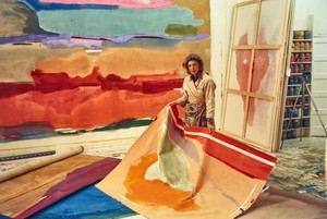
In the summer of 1960, on vacation with her husband Robert Motherwell in Alassio, Italy, Helen painted the almost six-foot-tall Italian Beach. It came out of the blue: Her characteristic soak-stain canvases of the 1950s had been, in the main, softly painted in pale colors. Nothing prepared for Italian Beach, with its crisply graphic format and its vivid, nameable, industrial colors seemingly assembled on the canvas.
Being an inductive leap into unfamiliar territory, it was disconnected from what preceded it, and in 1961 Frankenthaler stepped back a little in order to connect it with the kind of painterly art that she had been making earlier. Hence the loosely painted framing device set within the edges of the canvas of Swan Lake I, a painting about seven and a half feet in height, made that year in New York.
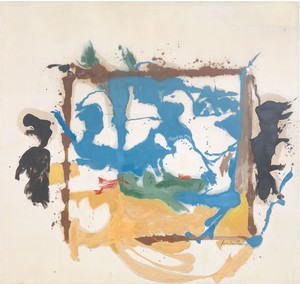
Helen Frankenthaler, Swan Lake I, 1961, oil on canvas, 89 ⅛ × 91 ¾ inches (226.4 × 233 cm)
However, Swan Lake I also steps forward from Italian Beach, which may be thought to have been intuitively composed, one part after and responding to another. In contrast, Swan Lake I suggests some amount of preplanning—at least, a decision to paint a blue lake, leaving unpainted shapes for the swans that swim in it, with yellow the color of sand below it; then a second decision to square it off with the loosely painted frame that echoes the shape of the canvas.
Seascape with Dunes, some six feet tall, painted in Provincetown in 1962, similarly looks backward and forward at the same time. It is effectively a pulled-apart version of a Swan Lake painting, comprising irregular but rhyming blobs, broad trails, and small islands of colored paint, freed from geometry, and with an implied animation that recalls the joy and freedom of her canvases of the later 1950s. And, while the color is brighter and sharper than in such works, it is still soft in feeling (softer than in Italian Beach), and further softened by the haloes of turpentine that have soaked out of the oil paint into the unprimed cotton duck.
At the end of 1961, Frankenthaler had talked of wanting to move from a “very thin stain” to paint that, while still allowed to “get into a pool,” was “thicker and more compact,” producing “a harder edge rather than a blotted edge.” Seascape with Dunes shows that her wants were somewhat ahead of her paintings.
Helen Frankenthaler, Seascape with Dunes, 1962, oil on canvas, 70 × 140 inches (177.8 × 355.6 cm). Grey Art Gallery, New York University Art Collection. Gift of the Artist
But in that same year, 1962, she—and Motherwell—began to use water-soluble acrylic polymer emulsion paint instead of turpentine-thinned oil paint, because “it fights painterliness,” she said. The liability of acrylic, she added, was that it can be “often very cold and often without feeling,” but she “would rather cope with the lack of sentiment” than an excess of it.
She instinctively knew that, sentimentality being a failure of feeling, a lack of it was a very good thing—a message nicely delivered in Elizabeth Bishop’s beautiful early poem “The Map,” in which she cautions of danger “when emotion too far exceeds its cause.”
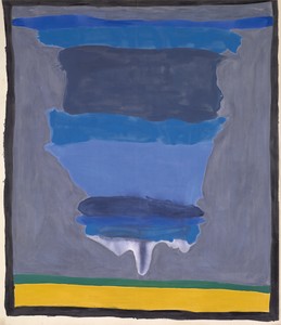
The Bay, painted in acrylic in 1963, shows the result. I think it is clear enough how Frankenthaler has pulled together the geometry of the square canvas of Swan Lake I with a soft island shape like those of Seascape with Dunes, but massively expanded, as if we are closer to it—and yet, given the size of the painting, at almost seven feet square, asking us to move further away. This is a big change for her, seeming at once a view onto a bay and a map of a bay.
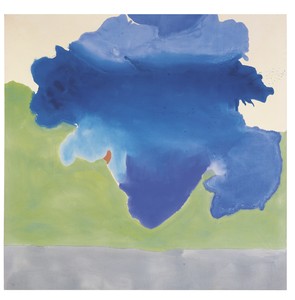
Helen Frankenthaler, The Bay, 1963, acrylic on canvas, 80 ¾ × 82 ⅛ inches (205.1 × 208.6 cm). Detroit Institute of Arts, Michigan
The latter implication associates it with the title of Bishop’s “The Map,” which itself affords the dual interpretation. Hence, the poem begins with the view:
Land lies in water; it is shadowed green.
Shadows, or are they shallows, at its edges
Showing the line of long sea-weeded ledges
Where weeds hang to the simple blue from green.
Bishop’s words are consonant with what Lise Motherwell said of paintings like The Bay in a recent interview, while speaking of summers in Provincetown with her sister, father, and stepmother:
Helen’s studio spaces were pretty open, and one on Commercial Street had a great view of the water. When you were standing on the second floor, you could see the colors emerging as the tide went out, the green of the eelgrass in the water, the sand underneath. Helen’s paintings really capture that experience—the feeling of looking down into that.
There is not space here for a full comparison between Helen’s and her husband’s paintings made in Provincetown, but in order to come closer to what Helen was doing, I need to compare Lise’s description to what her father wrote of painting there:
For years my summer studio has been on the bay in Provincetown. . . . There is a 900-foot tidal flat, and . . . at high tide the sea in a high wind breaks against the bulkhead in violent spray. In the “Beside the Sea” series [of 1962], I painted the spray with such physical force that the strong rag paper split, and it was only when I found rag paper laminated with glue in five layers that the surface could take the full force of my shoulder, arm, hand, and brush without splitting. One might say that the true way to “imitate” nature is to employ its own process.
Jack Flam, the principal author of the catalogue raisonné of Robert Motherwell’s work, nicely explains the implications of this statement:
Both the colors and the forms of the paintings in this series occupy a terrain that is somewhere between description and metaphor. The skeins of splashed paint that rise above the horizontal strokes suggest water whipped by the wind, just as the ochres and blues of the horizontal lines frequently suggest—but do not quite describe—the colors of sand and water.
Robert Motherwell, Beside the Sea No. 18, 1962, oil on paper, 329 × 23 inches (73.7 × 58.4 cm) © Dedalus Foundation, Inc./Licensed by VAGA at Artists Rights Society (ARS), NY
Following this interpretation, we might say that Frankenthaler, looking at water behaving in a quieter, slower manner as the tide recedes, also imitates it by employing a quieter, slower process in painting it. And that for her, too, the colors and the forms of her paintings occupy a terrain that is somewhere between description and metaphor—neither solely a pictorial likeness of a view of nature, nor solely a pictorial analogy of it created by imitating the process that formed it.
What needs adding, though, is this: Not only is the descriptive side of the terrain different for Motherwell and Frankenthaler, because they take different versions of nature as their subjects: high tide and low tide. And not only is the metaphoric side of the terrain different, too, because it necessarily is in accord with the description: Motherwell’s evocative of the violence of the incoming tide—of the height of the storm—and Frankenthaler’s of its quieter retreat—after the storm has passed. In addition, these metaphors open onto another pair of metaphors: of immediacy (Motherwell) and of retrospection (Frankenthaler). The question is: Which do you prefer?
The correct answer was famously provided by Wallace Stevens:
I do not know which to prefer,
The beauty of inflections
Or the beauty of innuendoes,
The blackbird whistling
Or just after.
The beauty of the storm. Or the beauty of its waning.
Helen Frankenthaler, Flood, 1967, acrylic on canvas, 124 ¼ × 140 ½ inches (315.6 × 356.9 cm). Whitney Museum of American Art, New York
Remember what Lise said after describing what it was like to look down from the second-floor studio onto the water as the tide went out. She said: “Helen’s paintings really capture that experience—the feeling of looking down into that.” Whether intended or not, the final ambiguous “that” nicely captures Frankenthaler’s double experience: first, looking down into that scene; and second, looking down into that experience—into what she feels when looking down into that scene—painting not, as Motherwell did, the beauty of inflections, but the beauty of innuendoes.
Turning back for a moment to Bishop’s “The Map,” we find, toward the end of the poem, the couplet “Mapped waters are more quiet than the land is / Lending the land their waves’ own conformation.”
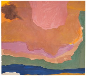
The year after painting The Bay, Frankenthaler made a sequence of even larger canvases, among them Cape (Provincetown), about nine feet square. These do evoke framed charts of mapped waters to hang on a wall; quiet, flat records of what it felt like looking down into the shallow water of the bay.
Helen Frankenthaler, Cape (Provincetown), 1964, synthetic polymer paint and resin on canvas, 109 ⅝ × 93 ⅜ inches (278.5 × 237.2 cm). National Gallery of Victoria, Melbourne, Australia
Frankenthaler’s most famous maritime image, Mountains and Sea of 1952, had evoked the experience of the artist, and the viewer, being within the water. These new paintings placed both the artist, and the viewer, above it. And Frankenthaler was, of course, above the paintings (as well as above the water) when she made them on her studio floor.
She would have long known of Monet’s late Nymphéas paintings—and there was a big Monet exhibition at the Museum of Modern Art in the spring of 1960, explicitly designed to link his work to Abstract Expressionism. However, the comparison of a typical Nymphéas painting with Cape (Provincetown) only emphasizes the difference between an oblique view across water and a flat chart.

Helen Frankenthaler, Mountains and Sea, 1952, oil and charcoal on unsized, unprimed canvas, 86 ⅜ × 117 ¼ inches (219.4 × 297.8 cm). Helen Frankenthaler Foundation, New York. On extended loan to the National Gallery of Art, Washington, DC
The critic Leo Steinberg famously wrote of the “flatbed picture plane” (borrowing from the name of the horizontal flatbed printing press) as the characteristic picture plane of the 1960s. He contrasted this to the concept of the picture plane of Old Master and subsequent paintings that represented the natural world as a vertical field associable with human posture. The flatbed picture plane, he proposed—whether or not lifted to the vertical—makes “symbolic allusion to hard surfaces such as tabletops, studio floors, charts, bulletin boards.”
He was arguing for its particular applicability to the work of Robert Rauschenberg, and claimed that it was specific to art whose subject was the man-made rather than anything belonging to the natural world. However, if we are willing to acknowledge that Frankenthaler’s 1960s paintings of water make a symbolic allusion to charts, we will notice their flatbed quality. But the balancing acts that they perform when seen vertically, in orientation to human posture, are not diminished by that quality, but enhanced by it, just as (I think) are Rauschenberg’s.
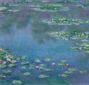
Claude Monet, Water Lilies, 1906, oil on canvas, 35 ⅜ x 37 ⅛ inches (89.9 x 94.1 cm). Art Institute of Chicago
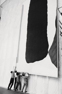
Jumping ahead to the climactic canvas of this period, the enormous, ten-by-twelve-foot Flood of 1967, we are invited to see the overlapping layers of paint both as flooding the flatbed picture plane from distant to near, in evocation of a succession of incoming waves across the big tidal flat, and as falling—or, better, suspended from falling—from the top edge to the bottom of a vertical field. Or as blowing sunset clouds over a landscape above the water. Or as something fleshy, warm, and corporeal swelling over something thinner and cooler. A work such as this has many intimations.
We see that Frankenthaler has returned to the idea of The Bay, only to move closer to—and to move us further from—the “waves’ own conformation.” And the hint of fussiness in The Bay (in the excessive care with which the contour of the blue shape is formed) is thrown off with bravura. It is a breathtaking painting that moves from the reminder of Florentine drawing in the paintings of the earlier 1960s to the Venetian sumptuousness of a Veronese.
Helen Frankenthaler seaside, Shippan Point, Stamford, Connecticut, 1982. Photo by Inge Morath
This sets the pattern for the big, generous paintings of sky, land, and water that Frankenthaler will paint later in her career. In fact, the latter part of her career—spent living and working on the Long Island Sound at Stamford, and then at Darien, in Connecticut—was dominated by pictures inspired by water. And, since painting Mountains and Sea back in 1952, she had known that the art of painting was, at its most basic, a matter of moving colored watery liquid over a flat surface.
Text © John Elderfield. Artwork © 2018 Helen Frankenthaler Foundation, Inc./Artists Rights Society (ARS), New York. Abstract Climates: Helen Frankenthaler in Provincetown, Provincetown Art Association and Museum, Provincetown, Massachusetts, July 7–September 2, 2018. Traveling in an expanded form to the Parrish Art Museum, Water Mill, New York, from August 4 through October 27, 2019. Not all of the works illustrated here are featured in the exhibition. Special thanks to Elizabeth Smith, Lise Motherwell, Jeanne Collins, Lauren Mahony, the Helen Frankenthaler Foundation, and the Provincetown Art Association and Museum.

John Elderfield is chief curator emeritus of painting and sculpture at New York’s Museum of Modern Art and was formerly the inaugural Allen R. Adler, Class of 1967, Distinguished Curator and Lecturer at the Princeton University Art Museum. He joined Gagosian in 2012 as a senior curator for special exhibitions.
Phyllis Tuchman on the critical role of scale in Frankenthaler’s art practice.
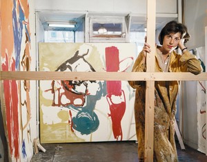
John Elderfield and Lauren Mahony discuss Helen Frankenthaler and her work from 1959 to 1962.
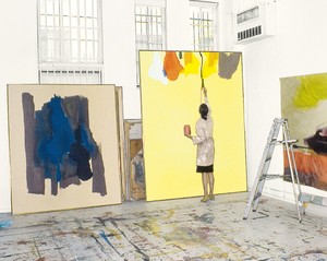
To mark the occasion of the exhibition Line into Color, Color into Line: Helen Frankenthaler, Paintings, 1962–1987, the Helen Frankenthaler Foundation and Gagosian produced a video of rare archival footage of Frankenthaler on the subject of line and color.
Art historian Katy Siegel discusses her recent exhibition at the Rose Art Museum and publication “The heroine Paint”: After Frankenthaler with Gagosian’s Alison McDonald.
Helen Frankenthaler—the largest exhibition of the artist’s paintings to originate in Europe and her first institutional solo show at Kunstmuseum Basel in Switzerland—is now on view through August 23, 2026. Curated by Anita Haldemann, this monumental exhibition, spanning fifty paintings, offers a unique opportunity to examine Helen Frankenthaler’s immersive and atmospheric approach to color and abstraction. The presentation proposes a dialogue between Frankenthaler’s “paraphrases” of old master paintings and the original works on which her paintings are based. Here, Haldemann speaks with Filip Jakab about Frankenthaler’s transhistorical engagement, formal innovation, and enduring influence.
John Elderfield and Lauren Mahony of Gagosian speak with the National Gallery of Art’s Harry Cooper about the new and expanded version of Elderfield’s 1989 monograph on Helen Frankenthaler that Gagosian, in collaboration with the Helen Frankenthaler Foundation, will publish this summer. The conversation traces Elderfield’s long interest in Frankenthaler’s work—from his time as a young curator at the Museum of Modern Art, New York, to the present—and reveals some of the new perspectives and discoveries awaiting readers.

Richard Armstrong, director emeritus of the Solomon R. Guggenheim Museum and Foundation, joins the Quarterly’s Alison McDonald to discuss his election to the board of the Helen Frankenthaler Foundation, as well as the changing priorities and strategies of museums, foundations, and curators. He reflects on his various roles within museums and recounts his first meeting with Frankenthaler.
In conjunction with the exhibition Drawing within Nature: Paintings from the 1990s at Gagosian in New York, Carol Armstrong and John Elderfield discuss Helen Frankenthaler’s paintings and large-scale works on paper dating from 1990 to 1995.
Inspired by the recent retrospective of Helen Frankenthaler’s woodcuts at the Dulwich Picture Gallery, London, William Davie writes about the artist’s innovative journey with printmaking. Davie illuminates Frankenthaler’s formative collaborations with master printers Tatyana Grosman and Kenneth Tyler.

Broadcaster and art historian Katy Hessel; Matthew Holman, associate lecturer in English at University College London; and Eleanor Nairne, curator at the Barbican Art Gallery, London, discuss Helen Frankenthaler’s early training, the development of her signature soak-stain technique and subsequent shifts in style, and her connections to the London art world.
On the occasion of four exhibitions in London exploring different aspects of Helen Frankenthaler’s work, Lauren Mahony introduces texts by the sculptor Anthony Caro and by the artist herself on her relatively unfamiliar first body of sculpture, made in the summer of 1972 in Caro’s London studio.
The Summer 2021 issue of Gagosian Quarterly is now available, featuring Carrie Mae Weems’s The Louvre (2006) on its cover.