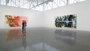
We visit the artist’s California studio as she prepares for her exhibition I’ve Seen Gray Whales Go By. She speaks with Jennifer Peterson about her new paintings, her studio process, and the artists who have inspired her.
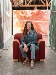
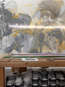
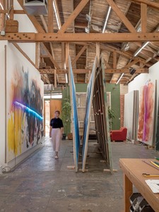
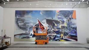
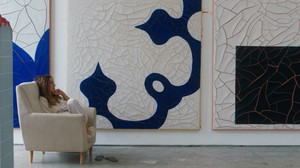
Mary Weatherford in her studio, Los Angeles, July 2018
Mary Weatherford in her studio, Los Angeles, July 2018
Jennifer Peterson is a film historian and a critic of art and culture. Her academic articles have been published in Cinema Journal, Camera Obscura, The Moving Image, and the Getty Research Journal, among others. She is an Associate Professor and Communication Department Chair at Woodbury University, Los Angeles.
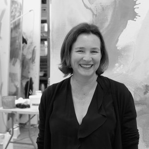
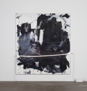
Mary Weatherford makes paintings comprising grounds of spontaneously sponged paint on heavy linen canvases, often surmounted by one or more carefully shaped and placed colored neon tubes. The surface of the paint ranges from matte and velvety to transparent and translucent. The canvas is at times densely filled, reading as a painterly continuum; at others, it shifts in color from edge to edge; and at yet others it contains clusters of marks set in relatively bare surroundings. Photo: Antony Hoffman
Jennifer Peterson This new show is a collection of big paintings. Can you describe your working process?
Mary Weatherford To start from the beginning, I’ve seen the fields where flax is grown in Belgium. And from flax is made linen. I have the linen woven for me at a mill in Belgium, so it’s a very special linen, it’s rough. There are hills and valleys to it. I’m leading you through from the ground up, as it were.
JP Starting with the materials.
MW We could do an entire interview on linen and why it’s special to me. I grew up sewing. I learned a lot about fabrics from my mother. The first time I saw this linen, at New York Central Art Supply in the 1990s, I thought, “I don’t have to do much to this to make a good painting, because it’s already incredibly beautiful.”
JP But then of course you do prepare it, extensively.
MW I got John Zurier’s secret formula for doctoring up the gesso. I want the paintings to have the transparency of my ink drawings. So this ground has an absorbency to it, but if I make it too absorbent, the colors are dull, and if I don’t make it absorbent enough, the colors sit on the surface.
JP Some of the paintings are the same size and double-square format as your commission for Claremont McKenna College in 2014.
MWFrom the Mountain to the Sea, the painting for the dining room at the college’s Athenaeum. I love dining room paintings. There was one in the cafeteria at the LA County Museum of Art when I was a kid. I would sit there and eat coconut cream pie after my art class and look at the big painting. What’s the most famous cafeteria painting of all time?
JP I’m not sure.
MWThe Last Supper.
JP That’s some cafeteria.
MW There’s a [José Clemente] Orozco at Pomona College that was painted in situ. Prometheus. The students eat with this incredible mural. Looking at paintings in museums is sometimes such a rip-off, I don’t get to exist with them for long. I have a technique: if there’s a bench and not many people around, I try to just take a nap and then wake up and see the painting. I try to have the experience of looking away and coming back. If I go to a museum, especially in Europe when I know I’m only going to be there once, I visit the gift shop, look at the postcards, determine which paintings in the museum are the great paintings, then go into the galleries and look at the paintings, and then I go back to the gift shop. I read up. Then I go to the café; then I go back to the museum. It’s a whole long process. The best thing would be a painting in your dining hall, like the Picasso that used to be at the Four Seasons.
JP So you’re giving a durational aspect to painting, which isn’t usually thought of as a durational medium in the way that, say, film is.
MW Yes.
JP But in fact painting is durational. There are so many open-ended kinds of experiences you can have with paintings. But we don’t always get to have food with paintings, and you’re saying you particularly like eating as an experience that goes with painting?
MW Definitely. I was in somebody’s apartment and they had Dubuffets in their dining room. What a great thing. I have a painting in my kitchen that I’m so fond of that I sit and eat and look at.
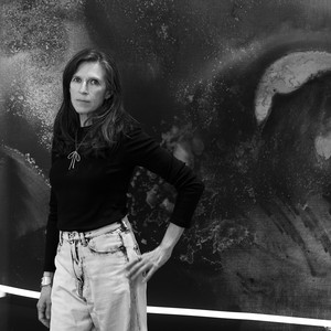
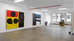
Mary Weatherford studio, July 2018
JP You’ve said your paintings aren’t landscape paintings. I think they resonate more with history painting.
MW These are getting figurative. I kept trying to say they weren’t landscape paintings, and now I’m proving it. I love history painting, like Veronese’s Wedding Feast at Cana. I made this one about Teotihuacán —
JP This silver-and-yellow painting?
MW — after a symposium at LACMA about the discoveries there. Mayan and Aztec cultures showed up in the picture. Teotihuacán was a grand city. A population of a hundred thousand, trading with other cultures down on the coast, on the peninsula.
JP The Yucatán.
MW Yes. They found turquoise in Teotihuacán. The closest turquoise mine is in New Mexico.
JP You were thinking about the history of Teotihuacán?
MW Yes. I think there were a couple of things: history, and I’d already made some bright paintings and needed to make a gray one.
JP Something to absorb or give a pause.
MW Yes. If you look at a Matisse or a Gauguin, or any bright-colored painting, the way they keep it from being garish is to use gray. Your eye doesn’t realize, “Oh there’s some gray in it,” but what gray does is, it quiets down parts of the painting so that the very bright parts can sing. And that holds true for an exhibition as well.
JP What other historical elements were you thinking of? Tell me about these shapes.
MW These all seem to be magical creatures. I want to see a jaguar there. The jaguar is important in the Yucatán, in pre-Columbian art. I saw all that stuff at the Museo Antropología with my ninth-grade Spanish class.
JP The Museo Antropología in Mexico City? A field trip?
MW We were really turned loose there. It was a trip that kids couldn’t take today. I mean, I went to the bazaar in Mexico City by myself. We had a free day and —
JP That is amazing. It definitely wouldn’t happen today.
MW I still have the dress I bought.
JP Well, this is part of your landscapes —
MW And we went to the pyramids. Back then they had a light show. I mean, it was really the 1970s.
JP This is part of what I think is distinctive about your work. You’re informed by European art history, but your work features a different geography in your references to California. And now you’re talking about Mexico.
MW I think so. New York painters are more attached to Europe.
JP Color is one of the things I wanted to ask you to talk more about. You say red is hard to paint in. I can’t think of a color that would not be difficult to work with, really.
MW Blue.
JP Tell me why blue might seem more manageable to you?
MW There’s a painting for the show that’s 100 percent cobalt blue, with a little corner of a more lavender blue. I conceived it when I was in bed for ten days with a terrible flu. It was the first of these big, double-square, mural-sized paintings in the series. I thought, “I’m going to make a completely cobalt blue painting. Just straight cobalt blue, that’s what it’s going to be.” And I came in—I was probably still sick—but I came in and worked all day. I put a lot of water in it. And it’s just—just beautiful. I thought that it was going to be difficult to coax a painting out of one color that wasn’t black, because with black you can go all the way from white through all the tones —
JP The grays.
MW Essentially, I was cutting off the piano keyboard below middle C. If you’re using just cobalt blue, you’re operating from middle C all the way on up.
JP Right, because the blacks aren’t in there.
MW So you take out the bass. A lot of times I think of colors as musical notes. I think of paintings as chords, trying to hit an emotional chord. That’s the reason colors can so easily be thought of as notes. That’s an Agnes Pelton thing.
JP Yeah.
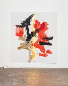
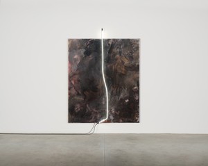
Mary Weatherford, The Gate, 2018, Flashe and neon on linen, 112 × 103 inches (284.5 × 261.6 cm)
MW And the reason they can be thought of as notes so easily is that color is relative. Even the white you put down counts. Every color hits an emotional note. But the note, the color with another color next to it, then makes a chord. So you can have a major chord or a minor chord or a seventh chord or—you know the famous Leonard Cohen song, “Hallelujah”? I think everybody loves that so much because he’s demonstrating what going through that chord progression feels like. So when I’m making a painting, what I’m doing is demonstrating what the chord progression feels like.
JP Right. This is so fantastic. There is, of course, a long tradition of this, from experiments with color organs in the nineteenth century, where artists would play a piano and a note would correspond to a color. There’s a tradition of so-called visual music. Vasily Kandinsky was interested in that.
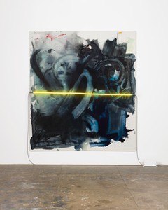
MW Kandinsky! Yes. Exactly. Then it gets into, of course, the lights. This Red Writing painting, with the blue light: when I paint the paintings, sometimes I go all the way, but then sometimes I paint a picture knowing that there’s something left out. I knew when I made Red Writing that the light would be the other color. It’s the third color, because the ground is slightly gray, honestly. The red is a medium cadmium, and then the light is turquoise. So that’s a beautiful chord. I have another painting right here that’s that turquoise blue with cadmium red, which is always a super-wonderful combination. And then there are paintings that surprise me, like this painting which I love, the Cosmos painting.
JP It doesn’t have the neon on it yet.
MW I used a lot of colors that are sort of like undergraduate mistakes. When you’re an undergraduate, it seems that somehow everything ends up purple. You end up using too much alizarin crimson, which is really transparent. Everything mixes together into purple mush before you learn what paint does, actually physically, and not in theory. Color theory is taught as theory —
JP Right.
MW — and then there’s the actual dirt that you’re painting with. And how to get that dirt to match what you have in your head, as in blue plus red equals violet. Well, what kind of blue? What kind of red? And then what violet are you looking for? And then mixing grays, which Stephen Westfall taught me to do. I substituted for him at one of his classes at the School of Visual Arts twenty-five years ago, and the students had to mix up dove gray and bird-shit gray using opposite colors. So cobalt orange and cerulean blue make a beautiful gray, and then you add white. Another gorgeous gray is burnt umber and white. Learning how to make the grays is ground-zero colorist stuff. You can study it by looking at Chardin. It’s all Western-canon stuff.
JP Right.
Mary Weatherford, Bird of Paradise, 2018, Flashe and neon on linen, 117 × 104 inches (297.2 × 264.2 cm)
MW Watching the progression of color through the history of Western art is fascinating. Getting up to the candy pinks of Fragonard and Bonnard. You know what’s really interesting color, because it looks like there isn’t any, is Rembrandt. You know that saying, “Well she’s no Rembrandt!” You can stand in a room full of paintings and go, “Now that’s a good painting!” And you walk up to it, and it’s a Rembrandt. A Rembrandt jumps off the wall.
JP Yeah, they’re stunning.
MW They’re just bananas! That creamy white that he uses for the lace.
JP You think of Rembrandt as being so dark, but then the little bits of color he uses are so powerful.
MW I wouldn’t call him a tonal painter. It’s all in the browns and the greens. . . . Rembrandt you just think of as glowing gold.
JP Because it’s about the light he captures.
MW All that beautiful gold. I have a reproduction of a painting of his son Titus on my bathroom door, and Titus just has the most lovely pink cheeks.
JP Nice.
What gray does is, it quiets down parts of the painting so that the very bright parts can sing.
Mary Weatherford
MW Goya is a wonderful colorist. Even in the Black Paintings. There’s a picture in my show that’s a political painting straight out of the Goya Black Paintings. Even though all the paintings in the show are political in their way.
JP Which painting?
MW See the evil floating figures? Like the Goya, with the figures floating in the air? These figures have a jubilant stupidity to them, but evil, deeply evil, in their kind of dancing and their movements. It’s a scary painting.
JP So all of these works are political.
MW Well, everything always is. I thought about Guernica a lot this spring. In fact, here are pictures that I’ve printed out when I’m painting.
JP What were these used for?
MW We have Picasso’s Guernica; we have a Gauguin of a gray horse, a Gauguin of a yellow Christ; then versions of The Rape of the Sabine Women —
JP Oh yes.
MW — which has different titles.
JP Part of the Art History I canon. Poussin, Rubens, David . . .
MW That subject matter was popular, right?
JP Yes.
MW Mass rape. Mass abduction.
JP Of women.
MW So there’s a lot of drama to capture.
JP Does that painting have an animal in it?
MW This one was so beautiful the way it happened, because every morning—I’m sure it was a subconscious thing—there’s a rooster that crows in the canyon here. But really, this painting started because on my drive down here to the studio, I see these beautiful toyons.
JP Oh, the trees!
MW The toyon trees —
JP Those are gorgeous.
MW Right there on Museum Drive.
JP Yes! I’m fascinated by these bushes, because they have red berries. There’s a theory that Hollywood is called Hollywood because of those berries. The native toyon trees look like holly.
MW That makes sense.
JP So it’s a native plant.
Mary Weatherford studio, July 2018
MW There’s a particular toyon tree that I see when I drive from my house to my studio. It must be the particular amount of sun and the particular amount of shade, because the bowers of red berries are extraordinary. The color of the toyon leaf is a deep bluish green. I thought, “Okay, I’m going to paint this toyon bower. That’s what I’m going to do today.” Then I got to the studio and there’s this big blank canvas, and I worked very hard to mix up paint that was the color of the toyon leaves. So I put that in, and then I went to put in the red bowers, and I got this far and I thought, “My God, that looks like a chicken.” And it struck me that it was just this incredible image. You and I have talked about animals in film.
JP Yes.
MW So I left it. I stopped. It answers the classic question “How do you know when you’re done?” Well, I’m done when there’s something so compelling that I don’t want to lose it.
JP It strikes me that at this point that you know when you’re done in a very confident way.
MW There’s a violence to this painting that’s extraordinary.
Mary Weatherford studio, July 2018
JP In this painting it’s as much about what isn’t there as what is there. Have you painted animals before?
MW Cats. Cats are magical creatures. I’ve titled paintings things like Supernatural, or made paintings that have to do with the supernatural, or astrophysical slippage. Cats seem complicit in that kind of thing. They have a way of disappearing. They’re there but not there, like an image can be there and not there.
JP How did the neon first enter into your work?
MW I was driving around Bakersfield trying to think about the paintings for a show there. I saw old neon signs for restaurants and factories that hadn’t been taken down, mainly the Padre Hotel. As I was driving around, the sun started setting and I saw the color of the sky. Who doesn’t love the sight of the sky turning color and the lights of the city coming on at night? That moment. So I decided to paint the experience of driving around Bakersfield. After that it occurred to me, that’s how I could paint about people’s lives. They became paintings of cities, and paintings of places where I’d lived, namely New York and Los Angeles.
JP Have you been thinking about New York while painting the works for this show?
MW There was one painting where I wanted to use every color, and I just started, and I didn’t really have any other plan. And then it was just so exciting because it was so urban. Someone even said, “This is the most like graffiti writing I’ve seen you do.” It reminds me, in a really beautiful way, of how the subway trains looked when I got to New York.
JP In the 1980s.
MW So this one has got to be called A Train. The famous Duke Ellington song —
JP Yes, “Take the A Train.” Speaking of titles, the upcoming exhibition is called I’ve Seen Gray Whales Go By.
MW Seeing a whale is one of the best things in life. Whales are there, and glorious, then they’re gone, under the water, on their way.
Jennifer Peterson is a film historian and a critic of art and culture. Her academic articles have been published in Cinema Journal, Camera Obscura, The Moving Image, and the Getty Research Journal, among others. She is an Associate Professor and Communication Department Chair at Woodbury University, Los Angeles.
Mary Weatherford makes paintings comprising grounds of spontaneously sponged paint on heavy linen canvases, often surmounted by one or more carefully shaped and placed colored neon tubes. The surface of the paint ranges from matte and velvety to transparent and translucent. The canvas is at times densely filled, reading as a painterly continuum; at others, it shifts in color from edge to edge; and at yet others it contains clusters of marks set in relatively bare surroundings. Photo: Antony Hoffman