Now available
Gagosian Quarterly Winter 2020
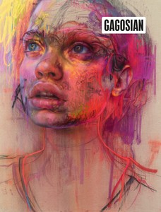
The Winter 2020 issue of Gagosian Quarterly is now available, featuring Jenny Saville’s Prism (2020) on its cover.
Winter 2018 Issue
With preparations underway for his 2018 exhibition at Gagosian in London, Phyllis Tuchman visited the artist’s studio in Long Island City, New York, to learn more about this new body of work.
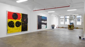
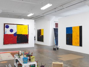
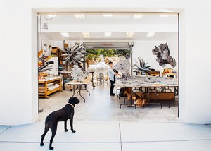
Joe Bradley’s studio, New York, 2018
Joe Bradley’s studio, New York, 2018
Unlike lots of postpainterly abstractionists, particularly those associated with the Color Field movement, Joe Bradley works with oil-based pigments, and has since 2010. He finds the color richer and more intense than those of acrylics. Oil takes longer to dry than acrylic, but Bradley doesn’t mind the delay; it gives him time to consider what he’s done and where he’s headed. “The way I approach painting,” he told me recently as a sudden rainstorm forced him to close windows in his Long Island City studio, “is that it involves a lot of waiting around.” As he puts it, “There will be a flurry of activity followed by a period of just looking. Waiting for the moment to strike.” He’s learned to be patient because nothing, it seems to him, happens quickly.
Bradley also applies paint straight from the tube to his canvases. He doesn’t mix his own colors because he’s not interested in that type of nuance. Instead, the New York–based artist wants his palette to refer to nothing other than itself. “I want my red to be the red you see when you look it up in the dictionary,” he explained to me.
As it is, Bradley might begin a painting by depicting a recognizable image on a canvas that’s lying directly on the floor. During my visit to his studio, he told me that had I come by a year ago, I might have found some reclining figures. “In the early stages of a painting,” he said, “there might be more overt figuration. I usually begin by painting a figure or something. This typically gets buried in the course of making a picture.” Sometimes a few body parts remain.
Bradley is a reluctant abstractionist. He is aware, though, that viewers respond differently to abstract art. “When you stand in front of a Rothko,” he said, “It’s like hitting pause. The chatter in your head fades and you are left with just the painting.”
Joe Bradley’s studio, New York, 2018
It’s amazing that Bradley got to this point in his career as quickly as he did. Growing up in the coastal town of Kittery, Maine, as one of nine siblings—he was born in Georgia in 1975—he was more familiar with cartoons than with old master paintings. “My first exposure to art,” he told his friend Dan Nadel a few years ago, “was through comic books when I was really young, like eight or nine years old . . . and when I was in high school I got turned on to R. Crumb and his contemporaries.” If you gave him a pencil, he’d sit quietly and draw. His talent did not go unnoticed.
After a gap year spent as a dishwasher, Bradley ended up at the Rhode Island School of Design. “I was just sort of devouring art history because I didn’t know that much about it, which was really exciting,” he has recalled. As an art student, he was intrigued by the Chicago artists Roger Brown and the Hairy Who group. He discovered late Philip Guston, too—“a big deal for me,” he has said.
Nevertheless, Bradley wanted to make his own mark. He also told Nadel that “at a certain point, I got frustrated because I thought I would be chasing these guys around forever.” For a painter who now works on large canvases, he started small. Initially, he painted pale-colored landscapes measured in inches rather than feet, much less yardsticks. Some are scenes as if rendered by a Minimalist. Reproduced in a catalogue published by the Albright-Knox Art Gallery in 2017, you’ll find a painting of a calm, placid lake or pond beneath a big sky with a geometric sun.
During the years in which Bradley went from student to exhibiting artist, he also painted small checkerboards more reduced in size than their real-life, tabletop counterparts. And with acrylic he executed a few creamy, patterned camouflage works that were a far cry from Andy Warhol’s much enlarged silkscreen treatments of the same theme.
Bradley would have continued to make landscapes, except he became, in his words, “more interested in painting as an object.” “The subject,” it seemed to him, “was arbitrary.” He also felt that the brushstrokes became “a distraction.” He briefly stopped painting and became, for lack of a better term, a process artist. He remembers feeling as if he were fabricating a sculpture, but ironically enough, he was still making paintings except they weren’t executed with pigments from tubes or jars. Working from preparatory drawings, including some sketched on graph paper, he stretched and attached sheets of vinyl to multiple stretchers. The material came in a range of colors, including the primaries of red, blue, and yellow as well as orange, magenta, black, and brown. Large, broad-planed, and stick-figure-like, some configurations of panels look like robots escaped from a video game; others evoke the sculpture of Joel Shapiro. Because it was difficult to make the vinyl taut, there are lots of creases.
Joe Bradley’s studio, New York, 2018
These stacked, modular paintings were well received. In the New York Times, critic Ken Johnson called them “surprisingly sweet and mysteriously resonant.” They garnered the fledgling artist an invitation to show in the 2008 Whitney Biennial. On view in the Breuer building, his vinyl pieces impressed a reviewer for Time magazine with their “ferocious colors and color contrasts [that] give his work a weirdly commanding presence.” But as Bradley told the artist Dike Blair, a former professor of his at RISD, in a conversation published in Bomb magazine in 2009, “My studio practice was starting to resemble manual labor, just staple gunning all day. I felt like someone else’s assistant!”
Bradley has never been afraid to try new approaches, even if they make him seem all over the place. Take the Schmagoo series (2008–09). Instead of continuing to work with vinyl, the emergent artist began floating giant line drawings on fields of somewhat distressed canvas. These paintings might have been—and perhaps still are—among the oddest bodies of work put on exhibition a decade ago, not to mention when they were included a few years later in The Forever Now: Contemporary Painting in an Atemporal World, at the Museum of Modern Art in 2014. For starters, “schmagoo” is a ’50s slang expression for heroin. If nothing else, they present images seen from a child’s perspective, and they are yet another group of canvases that defy conventional definitions of what constitutes a painting. With grease pencil on somewhat soiled, loosely stretched canvas drop cloths, Bradley drew large, awkward symbols, one per picture: an unruly cross. The Superman logo. A wavy line. An upside-down car. The number 23. These works will never be confused with technically adept pictures by someone like Thomas Kinkade, or even run-of-the-mill painters exhibiting at a gallery in a local strip mall. Still, they call to mind Pablo Picasso’s comment that it took him years to learn how to draw like a child.
Bradley made yet another one-off series after the Schmagoo paintings when he silkscreened eight-foot-tall black silhouettes, loosely styled after Egyptian wall reliefs, on untreated canvas grounds. The bathers and dancers he depicted became the last hurrah to date of overt figuration in Bradley’s corpus. Today, representational images are more explicit in his drawings. “The imagery,” he said recently, “tends to be buried in the paintings.”
Working with the canvas on the floor allows me to approach the painting from all angles.
Joe Bradley
Once again, Bradley was back at square one, needing to determine what to do next. His solution? Two-sided abstract paintings. He initially spread distressed drop cloths rather than standard canvases on the floor, so that making a painting wouldn’t seem like a precious activity. “Working with the canvas on the floor allows me to approach the painting from all angles,” he told me. “I don’t get bogged down thinking about composition—how upper-left corners look.” When he noticed that a surface had gotten muddled up, Bradley flipped the picture over. “I’m a frugal guy,” he has claimed. Since the original canvas was still wet, pigments stuck to the floor. Consequently, the anomalous colors attached themselves to fresh surfaces when they rested on top of them. Bradley thought the “incidental marks were exciting and led to unexpected twists in how I resolved a painting.” He started to intentionally work on both sides of his works. When he stretched these canvases, he chose which picture was the primary one.
This body of work is rife with unfettered colors, many of them floating freely on the canvas grounds. For the most part, broad passages of pigment assume relatively undefined shapes. There are few lines, curved, straight, or angular. Sometimes you’ll find a footprint. Viewers are essentially greeted by works of art that project a refreshing, improvisatory character.
Then, Bradley noticed that one section of a painting might look better if it were attached to a different picture. Consequently, he decided to cut out substantial parts, say a quarter—or a bit more or less—from an unfinished canvas. After purchasing an industrial sewing machine, he attached the homeless parts together. On occasion he just added a blank area. His method of mix-and-match engendered an inventive form of collage on a scale never dreamt by Picasso, Georges Braque, or Juan Gris.
Besides introducing new themes and colors with this latest type of collage, Bradley has incorporated the edges of the additional canvases variously. Sometimes he has fashioned them as assertive lines. The auxiliary material in some sections hangs down as inches-wide flaps. Whatever the situation, this became just the sort of thing that Bradley knows “you wouldn’t get if you farmed out your work.” Between incorporating migrating paint from his studio floor into the surfaces of his canvases and pioneering the use of an industrial sewing machine to create collaged effects, the artist ended up with, as he has described it, “a way of creating unexpected results.”
Joe Bradley’s studio, New York, 2018
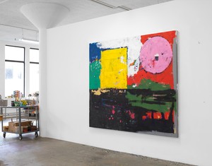
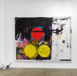
For the past two years, Bradley has been executing tidier, layered paintings with casual geometric divisions. He continues to be intent on “building a painting rather than composing one.” These days he uses oil pigments rather than unusual materials.
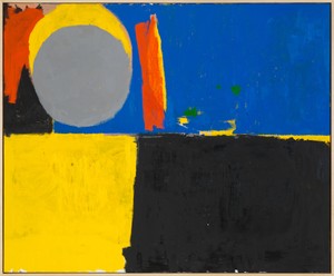
Bradley still paints on the floor. He still waits patiently for the ever increasing number of layers to dry. But now he divides the topmost surface into quadrants, sometimes halves, sometimes quarters. One recent canvas has a large square of yellow with two black discs that rest below a red rectangle containing a more exacting circle, while on the right, a chunk of black stretches from the top of the canvas to its bottom. Another stunning panel has a block of blue next to a less wide slab of white; highlights of yellow, red, and blue are visible in areas where he has scraped away paint.
Because of their networks of patches, Bradley’s latest surfaces resemble sunlit, shimmering water. You might even be reminded of some of Claude Monet’s expansive water lily panels. Wherever your glance falls, it meets an intriguing detail or highlight. You’re also made aware of the places where the blocks of color meet, be it a point or a lengthier stretch of canvas.
Bradley titles his works carefully. He even keeps a preliminary list of phrases handy. How he names a work, like much else about his art, is not arbitrary for him. He sees a title as being “helpful for setting a tone. It’s like an olive branch to the viewer.”
The recent paintings relate to city life. That’s why Bradley has called two of them Inner City and High Rise. Although he constructs abstractions, he is fascinated by the mysteries of the everyday world. He knows that nonrepresentational art can be more inclusive than was ever suspected possible as modernism evolved. With color and skewed geometries, Joe Bradley has brought us back to the origins of abstraction and then returned us to a joyful, vibrant present day.
Artwork © Joe Bradley; photos: Rob McKeever
Phyllis Tuchman writes for artnews.com, Artforum, and the New York Times. In summer 2018 she curated the exhibition Ellsworth Kelly in the Hamptons for Guild Hall, East Hampton, and lectured on Helen Frankenthaler at the Provincetown Art Association. She is currently working on This Is the Land: The Life and Times of Robert Smithson.
The Winter 2020 issue of Gagosian Quarterly is now available, featuring Jenny Saville’s Prism (2020) on its cover.
The Winter 2018 issue of Gagosian Quarterly is now available. Our cover this issue comes from High Times, a new body of work by Richard Prince.
Joe Bradley talks with Carroll Dunham on the occasion of his first mid-career survey in the United States.
Lauren Mahony reflects on the themes and artworks presented in the artist’s mid-career survey at the Albright-Knox Art Gallery.
This video presents a behind-the-scenes look at Jia Aili’s studio in Beijing. He elaborates on his in-progress works, the complexity of his compositions, as well as his philosophies of and motivations for painting.
Join Adriana Varejão at her studio in Rio de Janeiro as she prepares for her upcoming exhibition at Gagosian in New York. She speaks about the inspirations for her “tile” paintings, from Portuguese azulejos to the Brazilian Baroque to the Talavera ceramic tradition of Mexico, and reveals for the first time her unique process for creating these works.
Setsuko Klossowska de Rola and Benoît Astier de Villatte, of the Astier de Villatte atelier in Paris, first met at the Académie de France in Rome’s Villa Medici, where Setsuko lived when her late husband, the painter Balthus, was the school’s director. Here they discuss Setsuko’s newest body of terra-cotta works, produced at Astier de Villatte, with Gagosian’s Elsa Favreau.
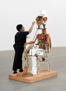
The artist tells Negar Azimi about her interest in the monstrous, the influence of science fiction on her practice, and her recent rooftop commission at the Metropolitan Museum of Art, New York.
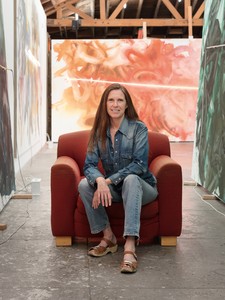
We visit the artist’s California studio as she prepares for her exhibition I’ve Seen Gray Whales Go By. She speaks with Jennifer Peterson about her new paintings, her studio process, and the artists who have inspired her.
Join Sarah Sze in her studio as she prepares for an exhibition of new work in Rome.
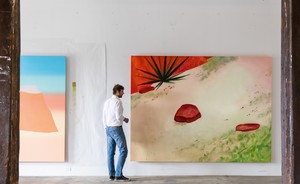
We visit the artist’s studio in Brooklyn, New York, to get a behind-the-scenes glimpse of his new series of Desert paintings while he prepares for an upcoming exhibition in Beverly Hills. Text by Ben Eastham.
In the summer of 2017, Laura Fried took a trip to Nancy Rubins’s awe-inspiring studio in Topanga Canyon, CA. In this essay, she recounts her visit, detailing Rubins’s latest sculptures and the history of the studio.