Christopher Wool: Part One
Christopher Wool and his unlikely heroes or conceptual or not? Text by Richard Hell.
Winter 2019 Issue
Gray turns to pink or his twenty-first century, much of it in Texas. Text by Richard Hell.
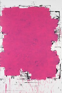
Christopher Wool, Untitled, 2018, oil and silkscreen on paper, 44 × 30 inches (111.8 × 76.2 cm)
Christopher Wool, Untitled, 2018, oil and silkscreen on paper, 44 × 30 inches (111.8 × 76.2 cm)
It took me a couple of years to fully appreciate Wool’s notorious early black-and-white paint-roller and stencil-figure pattern paintings and giant panels of black-enamel-letter stencilings on white-painted aluminum spelling such phrases as run dog run. When I encountered them in the mid-’90s, ten years after he’d begun making them, I was innocent of recent painting. But I soon came to love them. They looked flat, like street signs or graffiti, and seemed preconceived—the act of painting them was apparently a formality once they were planned—and the graphic content was minimal. They felt aggressive but impassive and intelligent, while also often funny on levels. Wool made them for fifteen years. One might have assumed that this was his fundamental aesthetic. Then, around the turn of the century, he started making big, complex, black/white and gray, smeared and whorled and spray-paint-looped canvases that were partly about improvisation and largely about sophisticated composition—“the gray paintings.” As time goes on, things become less black and white.
The paintings of the first two or three decades of Wool’s career had a particular, consistent, unusual quality, by my lights: they were uncanny. Almost all of them were black/white/gray; they seemed to eschew the sense of a human hand producing them. Even the smeary and graffiti-esque, highly elaborated gray paintings often used as their ground, or even their entire content, silk-screened photos of previous gray paintings, and after all, the reduction of all color to black and white and gray is not exactly humanistic, so to speak (though there’s always been humor in every period of Wool’s work). To me the paintings felt as if they’d simply appeared—like the writing on the wall, or like the world before you know anything about it—rather than painted by a person in time, despite the drips and the layering.
I have to tell this story about a trippy twist on the experience of seeing that Wool enabled for me. For a year across 2006–07 I visited his studio every week to work with him at a computer monitor on a set of images we were creating together to make a book. In the process I was more and more humbled by his visual sense, the way he seemed to always know what looked interesting. I’d thought that the concept of a “visual person” was sloppy and goofy, like being a “feelings person” or an Aquarian or the beneficiary of “crystal power” or something. Being visual, I thought, was just a matter of educated taste. But Christopher had something extra, something innate, it seemed.
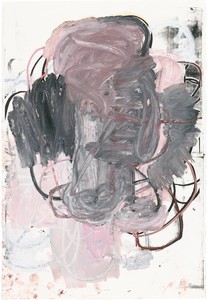
Christopher Wool, Untitled, 2015, enamel and silkscreen ink on linen, 108 × 78 inches (274.3 × 198.1 cm)
Then, one late afternoon, returning home from working with him, I was walking through Tompkins Square Park in the East Village when the contents of my field of vision suddenly lost all meaning. There was no signification to anything before my eyes, just pattern and shape. A tree wasn’t a tree, it was a shape, and a building wasn’t a building, it was a pattern. Dimensionality was changed too, flattened, or made unnoticed, and color also diminished in effect. It was thrilling but also frightening. It was uncanny. It only lasted for a few seconds, but I felt like maybe this kind of seeing was part of what comprised a “visual person,” and that maybe it was in Christopher’s repertoire and helped explain his abilities. (The other paintings I’ve noticed reminding me of that walk in the park are Cézanne’s. It’s as if he wasn’t painting what he knew was there, but rather painting what he saw sans any influence of previously acquired information about it: it’s not an apple, it’s an area occurring in his field of vision.)
A strange sidebar semisupport of this occurred in an interview I recorded with Christopher in advance of something I was writing. He said of his painting, “You could almost say I’m picturing something in a nightmare, or a dream. . . . You know how nightmares can be so unbelievably powerful without really being about anything? Sometimes I have these terrible nightmares and I wake up and Charline asks, ‘Well, what were you dreaming?’ And I was sitting in the park and there was something—it was the scariest thing that ever could have happened. But nothing happened.”
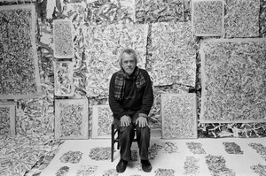
In the first years of the new century Wool began making the gray paintings, and he continued focusing on those up through the planning of his 2013–14 Guggenheim Museum retrospective in New York. In the mid-aughts he spent a period in Marfa, Texas, as an artist in residence at the Chinati Foundation, the complex of exhibition and installation spaces created there by Donald Judd, which opened to the public in the ’80s. Wool liked the environment. His wonderful-painter wife, Charline von Heyl, scored a residency too, and soon they decided to buy a house on the outskirts of town. So by 2010 they were spending a large part of the year in Texas. They continue to divide their time between New York and Marfa.
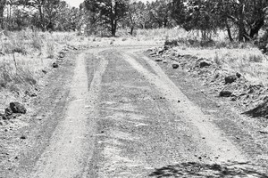
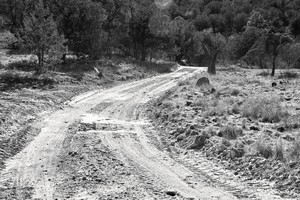
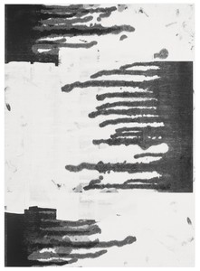
Christopher Wool, selections from Road, 2017
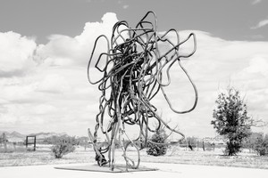
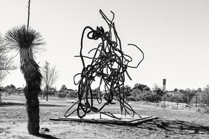
Wool started organizing the Guggenheim exhibition with curator Katherine Brinson in 2011. During that period he also made his first large bronze sculpture. It was finished just in time to be installed in front of the museum for the show. He continues to make sculpture; to date he’s created ten large ones, two smaller, editioned works, and a piece in found barbed wire. The large sculptures are reminiscent of some of his canvases of loose spray-painted loops, but they were suggested to him by the lengths of discarded wire common in ranch country. The sculptures began as fencing wire that he bent and twisted into loose bundly shapes, though he was always conceiving of them as much larger pieces.
Oddly and probably not really relevantly, my mother had always picked up odd pieces of wire—often coat hangers—on the streets of Chicago. When I was first at Chinati I found a piece of wire that looked exactly like my drawing line only better and I thought it was funny to take this baroque piece of wire off the Judd landscape, so I sent it to my mother. As I started to find more pieces of wire that were like drawn line, I started saving them, for no particular reason. It was only years later that it dawned on me that these flattened balls of wire could be reconfigured in a three-dimensional way.
The most recent part is realizing how important scale and setting are to sculpture—as opposed to the usual situation around painting. This led to the notion of designing sculpture for a specific environment—Marfa—and installing pieces around the property so I could try to see how these issues might work in situ. In the ’70s, sculptors, especially so-called modernist sculptors, were making work with the idea that what was important was internal formal dynamics; they tended to ignore setting or environment. And this came to be known derogatorily as plop sculpture for the seemingly casual way the sculptures looked once installed, often in urban plazas. With works like Tilted Arc Richard Serra and other sculptors of his generation specifically addressed the environment around the sculpture as part of the work, calling this idea site specificity, where sculptures didn’t exist as full works if they were removed from the specific site itself. And the appeal of thinking and working this way is pretty obvious, but much more complicated to actually accomplish than it sounds. Tilted Arc [on display in downtown Manhattan from 1981 to 1989, when complaints by some users of the site led to the work’s forced removal] was just blocks from my Chinatown loft and it really was a brilliant piece.
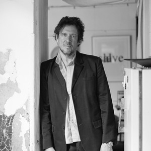
Christopher Wool, 2017
Christopher Wool, 2018
But—the construction of the sculptures. . . . It’s not what I consider a great way of working, making something small and blowing it up. And in the past, until you could do it digitally, as things got larger they got more and more rounded at the edges and less and less detailed because you were basically doing it the Renaissance way, with a little thing moving here connected to a little bigger thing moving there, a rough mechanical enlargement. But now it can be done digitally with almost no loss of detail, which brings it back to a kind of handmade feeling. I left all the welds so you can see the process of assembly, and that, to me, is a lot like looking at a silk-screen painting where you can see that it’s handmade but it’s a mechanical hand. I really didn’t want them to look mechanically enlarged. And by leaving the welds and dispensing with patina, there’s really no way of seeing that they came from something small, which I think is important.
They do tend to be quite flat, as much relief as sculpture. I’ve had trouble learning to work in three dimensions. They don’t stand up when they’re flat so there’s incentive to make them three-dimensional. I’m still a beginner. I’m a painter making sculptures, that’s clear.
Personally, I love best the way the sculptures look in the wide-open Texas spaces, without any busyness crowding them or their internal view-framing. In the stolid glory of the Texas plains, they’re like funny tumbleweed, or doodles grown up, looming in droll homage like the landscape’s benevolent imps of the perverse, or its jesters.
Early in my Marfa visits, pretty much contemporaneously with finding the wire, I had this strong notion that all the space and openness in Texas was kind of an ideal environment for sculpture. Just in the sense that sculpture is so much more physical than painting, and the landscape and access to material were almost calling for this. And that’s when I started taking pictures of things in the area that were sculptural, in a sense, without actually being art. Or at least not until I might have designated them as art. These photos—basically notes on sculpture—became the book Westtexaspsychosculpture [2017]. I took those photos over eight years before I put them together in a book. By then I had discovered what I could do with the wire and had opened that can of worms.
The Texas photographs and the artist’s books in which they’re collected have things in common with, but are also strikingly different from, Wool’s prior photo books, such as Absent without Leave (1993) and East Broadway Breakdown (2003). East Broadway Breakdown was in part a tribute to Wool’s New York of the ’80s and ’90s. All the pictures were taken at night in the industrial/derelict neighborhood between his studio and his apartment. They’re grainy and cloudy but high contrast, black-and-white—all his photos have been black-and-white—and he shot them with flash without even looking through the viewfinder, then printed them via drugstore development services (though he adjusted for contrast in Photoshop afterward). There are no people in the pictures—just streets, puddles, garbage, buildings, fencing, battered cars, stains, and poles, reflecting flashbulb light at night. A stray dog or cat here and there. (Absent without Leave is similar in approach and technique, but was shot on Wool’s travels overseas.)
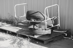
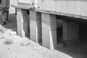
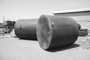
Christopher Wool, selections from Westtexaspsychosculpture, 2017
The Texas photos are also all exteriors and devoid of people, but they were deliberately framed with a digital camera in bright sunlight and then computer adjusted for clarity and emphasis with meticulous care. They’re radiantly crisp and subtle. As Wool said, his original motive was to conceive his choice of the clutter, debris, stackage, and storage around the small town of Marfa as sculpture, rather as Martin Kippenberger treated stray objects and specialized structures as buildings in his 1988 photo book Psychobuildings, or as Robert Smithson imagined industrial landscapes as sculpture. Another of Christopher’s Texas photo books, Yard (2018), combines images, as if doubly exposed, from the Westtexaspsychosculpture pictures and manipulates their tones to make intricate compositions. A third, Road (2017), is all photos of rutted, winding, rocky West Texas desert and mountain roads, and a fourth, Swamp (2019), combines pictures, as in Yard, but uses a wider variety of them and also adds a rust-brown color to areas of each image. These large books, with much white space per page to isolate the photos, are formatted and printed to the acknowledged highest standards, whereas his earlier books were done carefully but within a statement of values that downplayed classical “quality” picture-taking and printing. All the pictures in Absent without Leave, for instance, were photocopied for publication, degrading them extremely.
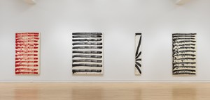
Wool has also completed about forty large paintings in the last five or six years, as well as a series of smaller ones on paper and in oil paint, which medium is a radical departure for him, as is these works’ variety of mostly pastel colors, an outbreak of tint that may be an even greater departure. The large paintings are vintage Wool, but also, to me, seem done with a lighter touch than before. There’s humor: drips go sideways; a series uses arrangements of silk-screened typography that are then blotted and overpainted in a way that feels elegantly playful; Wool secretly includes his own profile in a silk-screened blot. If these paintings are less austere and impassive than his first couple of decades of paintings, the multicolored oil paintings on paper are positively sensuous. As is common with him, the papers underlying the oil paintings are silk-screens (of previous paintings) and etchings of his. The oil imagery is also recognizably Wool in its line, technique, and aesthetic, but newly warm and lush. There’s a little of the way Philip Guston handled paint in his later, cartoony, pink and gray works, though there’s no figuration in the Wools—they’re strictly abstract compositions, strong and lovely oil abstractions.
So this twenty-first-century middle period of Wool’s is distinguished by a turn toward concentrating on deep composition, and toward the more warm and amused and serene—in contrast to the austere, aggressive, often gridlike appearance of much of his earlier work—without any loss in power or level of interest.
Artwork © Christopher Wool, courtesy the artist and Luhring Augustine, New York
Richard Hell and the Voidoids’ 1977 LP Blank Generation was rereleased in 2018 by Sire/Warner in a remastered facsimile edition. Hell’s books include two novels, Go Now and Godlike; his autobiography, I Dreamed I Was a Very Clean Tramp; and the 2015 essay collection Massive Pissed Love. He lives in New York and is at work on a new novel.
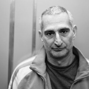
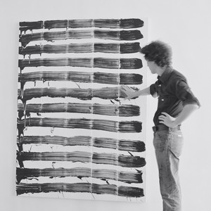
Christopher Wool may be best known for his paintings of large, black, stenciled letters on white canvases, but he actually works in a wide range of styles and with an array of painterly techniques, including spray painting, hand painting, and screen printing. Wool’s work sets up tensions between painting and erasing, gesture and removal, depth and flatness. He was born in 1955 in Chicago and lives and works in New York. Photo: Aubrey Mayer
Christopher Wool and his unlikely heroes or conceptual or not? Text by Richard Hell.

Jonathan Griffin traveled to Marfa to see the second iteration of Christopher Wool’s See Stop Run exhibition and to talk with the artist about his latest work, and about the photography series and sculptures that grew from his time in the Texas town.
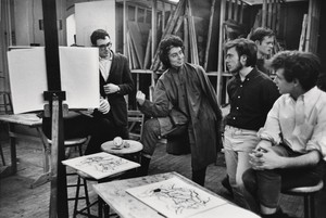
Lauren Mahony and Michael Tcheyan pay homage to the founder of the New York Studio School.
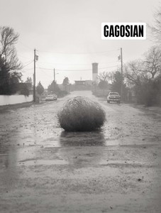
The Winter 2019 issue of Gagosian Quarterly is now available, featuring a selection from Christopher Wool’s Westtexaspsychosculpture series on its cover.
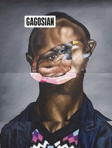
The Fall 2019 issue of Gagosian Quarterly is now available, featuring a detail from Sinking (2019) by Nathaniel Mary Quinn on its cover.
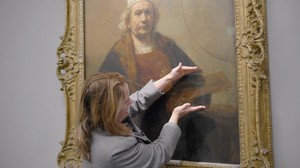
Jenny Saville reveals the process behind her new self-portrait, painted in response to Rembrandt’s masterpiece Self-Portrait with Two Circles.
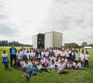
Meredith Mendelsohn discusses the impact of Free Arts NYC and its mission to foster creativity in children and teens, on the occasion of its twenty-year anniversary.
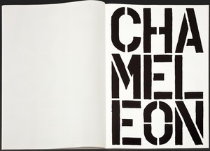
Christopher Wool’s Black Book (1989) was selected by Douglas Flamm, a rare-book specialist at Gagosian, for a special focus. Text by Anna Heyward.
In this video, Christopher Wool, Katy Siegel, and David Reed discuss Reed’s paintings and memories of the New York arts scene in 1975.
Katy Siegel and Christopher Wool discuss David Reed’s paintings and the New York art scene in 1975.

Ahead of Alex Israel’s exhibition of four new Fin sculptures at Gagosian, London, the artist spoke with Susan Casey, author of The Wave: In Pursuit of the Rogues, Freaks, and Giants of the Ocean (2010), about the ocean, surfing, and Los Angeles.
On July 9, Simon Hantaï: the last studio opens at Gagosian, Gstaad. Curated by Anne Baldassari, the show comprises sixteen of the artist’s dernier atelier (last studio) paintings of 1982–85. The exhibition is accompanied by an illustrated catalogue, copublished by Gagosian and Skira, which features an essay by Baldassari and an extensive portfolio of previously unpublished photographs by Édouard Boubat. Here, we share the introductory chapter from the publication.