Now available
Gagosian Quarterly Winter 2020
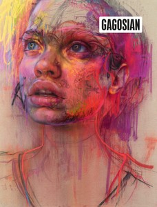
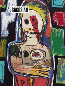
The Winter 2020 issue of Gagosian Quarterly is now available, featuring Jenny Saville’s Prism (2020) on its cover.
Summer 2017 Issue
Lauren Mahony reflects on the themes and artworks presented in the artist’s mid-career survey at the Albright-Knox Art Gallery.
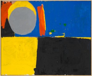
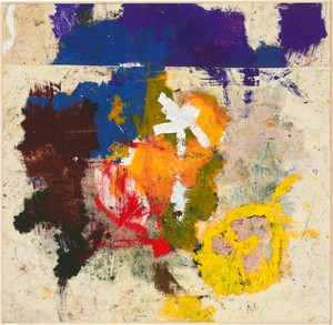
Joe Bradley, Mother and Child, 2016, oil on canvas, 83 × 101 inches (210.8 × 256.5 cm). Photo by Rob McKeever
Joe Bradley, Mother and Child, 2016, oil on canvas, 83 × 101 inches (210.8 × 256.5 cm). Photo by Rob McKeever
This June, American artist Joe Bradley will be the subject of a mid-career survey, his first US museum exhibition, organized by Albright-Knox Art Gallery in Buffalo, New York, which will travel in the fall to the Rose Art Museum at Brandeis University. Bradley was born in 1975 in Georgia, raised in Maine, and has been a fixture on the New York art scene over the past decade, regularly showing new bodies of work, ranging from “modular” works and silkscreens to painterly abstractions and sculpture. These shows were punctuated by a well-received debut at the 2008 Whitney Biennial and by inclusion in The Forever Now, the exhibition of contemporary painting organized by Laura Hoptman at the Museum of Modern Art in 2014–15. In 2014, a large exhibition at Le Consortium in Dijon covered much of Bradley’s mature career, but a survey of that type has not yet been staged in the United States. The upcoming show will be the first opportunity for American audiences to observe the full breadth of his diverse oeuvre, making apparent the themes and sources that overlap across seemingly incongruent bodies of work and allowing a clearer understanding of his distinctive approach to abstraction.
Given this sustained interest in Bradley’s art, it is a perfect moment to look at the whole body of work and its arc over the last decade. Cathleen Chaffee, Senior Curator at the Albright-Knox and organizer of this summer’s exhibition, has followed Bradley’s work since the Whitney Biennial, saw the show in Dijon, and was surprised that an exhibition had not been attempted at an American museum. This realization prompted her to propose one for the Albright-Knox, a project she has been working on since 2014. Chaffee recalls of that experience,
I was struck then, as I’ve always been struck, by the diversity of his practice, by the different directions that he takes, and it’s something a lot of writers and curators have grappled with, trying to place his different approaches into a framework. Joe is so engaged with abstraction’s relationship with figuration, the idea of presenting his work here made a lot of sense within the context of the museum’s collection, given the Albright-Knox’s extraordinary history with Abstract Expressionism. He is very much an inheritor of the legacy of numerous Abstract Expressionist painters—but he approaches them in his own way, his own synthesis, or struggle.1
Indeed, the Albright-Knox’s stellar permanent collection of works by Abstract Expressionist masters, in particular Philip Guston, Willem de Kooning, and Clyfford Still, will serve to enhance viewers’ understanding of Bradley’s various approaches to abstract painting and of his devotion to and understanding of its history. When the show travels to the Rose, which also has a strong collection of postwar American art, Bradley will make a selection of works from that collection to be displayed in an adjacent gallery.
Joe Bradley, The Fisherman's Friend, 2005, acrylic on canvas, 105 ½ × 36 inches (268 × 91.4 cm). Photo courtesy the artist
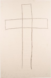
Joe Bradley, On the Cross, 2008, grease pencil on canvas, 100 × 65 inches (254 × 165 cm). Photo by Canada, LLC
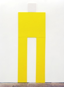
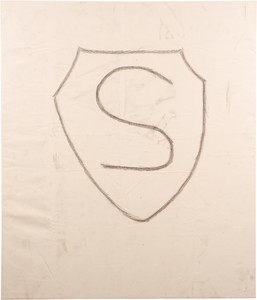
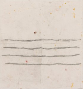
What struck Chaffee when she saw the exhibition in Dijon was the difficulty of showing Bradley’s diverse bodies of work together in one exhibition, how to “thread that needle.” (It has been said that a retrospective of Bradley’s work “would look like a group show,”2 though Chaffee smartly points out the same could be said of many artists.) It is true that on first glance Bradley’s different modes of working might not seem entirely related and contain contradictions, but that is the challenge and pleasure of organizing an exhibition of complex and interesting work. His modular paintings (first shown in the exhibition Kurgan Waves, at the Canada gallery, New York, in 2006) are composed of single-color canvases installed to create geometric, often overtly figural forms, such as the long-legged, slicker-and-galoshes-wearing The Fisherman’s Friend from 2005, one of the earliest works in the exhibition. This series was followed in 2008–09 by the Schmagoo series, in which simple forms are drawn in grease pencil on bare, sometimes slightly dirty canvases, elevating sketches to paintings through their scale and support. Bradley has described the Schmagoo series as “setting the reset button . . . a natural progression in some way,”3 and that attitude seems to apply wholly to his transitions between styles. The silkscreen paintings, which followed, employed dark silhouettes of figures against white grounds and have strong connections to both the Schmagoo paintings and Bradley’s drawings. These are the most literally figural works within an oeuvre dedicated to abstraction of the figure in different modes. Meanwhile, the large-scale, gestural abstract canvases are painterly and messy in a way the modular paintings and silkscreens refuse to be. Their built-up layers of paint and collage elements make them the most time-consuming works Bradley produces, as does the sculptural, three-dimensional way in which they are painted: on the floor, tacked to the wall, and on the back of the canvas, picking up studio detritus along the way. Bradley’s sculptures, ranging from tabletop works inspired by found materials to large modular pieces, will also be represented in the Albright-Knox show.
Chaffee will demonstrate connections across these wide-ranging bodies of work by articulating Bradley’s intentions behind them. She finds a remarkable consistency in the place the work comes from—each piece is an essential part of the larger puzzle: “For Joe, abstraction and the comic are the materials he keeps coming back to.” She further explains that his various series are interrelated because the artist needs them all, each one informing the rest: “He enjoys having bodies of work that he can go to almost to clear his head, after the hard work, and the very messy work, of making these abstract paintings.” Further, they all come from similar source material, even if “aesthetically, they are not easy to square.” While Bradley looks intently at the art of the past, his sources also include pop-culture and mundane references that can be identified across series: comic books, high school yearbooks, an instructional book on break dancing, underground music and slang, as well as QSL cards, which CB radio operators used to share their handles and were especially popular in the 1970s. Bradley’s often humorous titles make the conceptual connections among these works more apparent.
Joe Bradley, Superman, 2008, grease pencil on canvas, 70 × 60 inches (170 × 152 cm). Photo by Canada, LLC
The most recent paintings, shown in the Krasdale exhibition last year at Gagosian on Madison Avenue, New York, and earlier this year in Eric’s Hair at Gagosian in Beverly Hills, take Bradley’s abstraction in a different direction, but with a sense of summation. Made on stretched canvases, works like Mother and Child (2016), with its horizon line and eclipsed celestial bodies, have a strong relationship to landscape (a genre that greatly interested the artist in his student years at the Rhode Island School of Design), as well as to the modular paintings, with their strong geometric forms painted and primary colors.
The Albright-Knox survey will offer an opportunity to revisit the modular paintings, which introduced Bradley to the larger public, and to think about them differently, especially in terms of the work that followed. The modular paintings have often been described as send-ups of Minimalism, or as references to video-game icons, but these connections were not intended.4 Kim Conaty, curator at the Rose Art Museum and a contributing author to the substantial catalogue that will accompany Bradley’s museum exhibition, found the artist’s reading of these works entirely unexpected and it informed her writing on the paintings as a whole. Rather than thinking of them in terms of Minimalism, she remembers, he told her they were “about the discomfort he felt in figuring out how two colors can rest next to each other on a canvas, and solving it in the most explicit way possible”: using colored vinyl as a readymade material, stretching it into rectilinear shapes, and composing based on color and formal relationships.5
Joe Bradley, East Coker, 2013, oil on canvas, 100 × 102 inches (254 × 259.1 cm). Photo courtesy the artist
the forthcoming exhibition promises to be revelatory in its depth and breadth, highlighting the similarities across distinct bodies of work.
Lauren Mahony
The modular works are the only paintings for which Bradley makes color studies, where composition is key, in stark contrast with the way the abstract paintings are made. The lessons from these paintings, removing the artist’s gesture and juxtaposing colors in the most direct way, are then applied to the abstract paintings, which share similar forms ensconced in thick layers of impasto, still vaguely suggesting figures. Conaty, who worked at the Whitney at the time of the Biennial and has therefore been familiar with the modular works for some time, found these motivations revelatory, and they serve as the basis for her catalogue essay, which examines his palette and use of readymade color—vinyls or unmixed tube paints—as a through line for works made using vastly different techniques. His choice of colors—mainly primary colors, different fleshy tones, browns, and blacks—contribute to the figural readings of the works, regardless of how they are made.
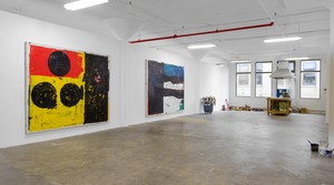
At the Albright-Knox, Bradley’s work will be installed in a Beaux-Arts permanent exhibition space of nine galleries, selected to best showcase each type of work on its own. Chaffee plans to give over an entire gallery to the modular paintings, so they can be experienced in isolation; a gallery each for the Schmagoo paintings, the silkscreens, and the drawings. Sculptures may be scattered throughout and at least three grand galleries will be dedicated to the large-scale, gestural abstract paintings. At the Rose, the show will be installed in the large Foster Gallery, which will be configured into smaller galleries for a similar effect. Chaffee and Conaty emphasize that the openness of the exhibition space, and the sight lines between the galleries, will be important to the final layout of the show at each venue, making these connections between Bradley’s bodies of work even more apparent. The Bradley show also continues the Rose’s tradition of presenting an artist’s first museum exhibition: Bruce Conner, Louise Nevelson, and Dana Schutz all had their first US shows there.
The experience of looking back has prompted Bradley to revisit earlier series, some of which he hasn’t engaged with for some time. He is making a new modular painting, new silkscreens, some small sculptures.
Joe Bradley, Untitled (Schmagoo), 2014, graphite and oil on canvas, 52 × 48 inches (132.1 × 121.9 cm). Photo by Thomas Müller
The exhibition catalogue will feature essays by Chaffee, on the dialogues among bodies of work; by Conaty, on the paintings; and by writer and curator Dan Nagle, who will focus on the drawings. It will also contain an interview between Bradley and Carroll Dunham. Until recently there has been an unfortunate lack of good scholarship on Bradley, which will be rectified with this important collection of texts, as well as by Gagosian’s just-published catalogue of the 2016 Krasdale show, which features essays by Sir Norman Rosenthal and Anne Pontégnie. Even for those familiar with Bradley’s work, the forthcoming exhibition promises to be revelatory in its depth and breadth, highlighting the similarities across distinct bodies of work in ways not previously possible.
1 All quotes from Cathleen Chaffee are from an interview with the author on March 3, 2017.
2 Kenny Schachter, “Kenny Schachter on Joe Bradley’s Unlikely Rise to Art World Eminence,” Artnet News, Jan. 11, 2016.
3 Joe Bradley, quoted in Phil Grauer, “Joe Bradley,” The Journal, no. 30 (2011), p. 60.
4 See “Dike Blair and Joe Bradley,” Bomb Magazine, Summer 2009, p. 81.
5 All quotes from Kim Conaty are from a telephone conversation with the author on March 7, 2017.
Artwork © Joe Bradley

Lauren Mahony is a director in the publications department at Gagosian, where she has worked on exhibitions and publications devoted to Willem de Kooning, Helen Frankenthaler, Brice Marden, and David Reed, among others, since 2012. She previously worked as a curatorial assistant in the department of painting and sculpture at the Museum of Modern Art, New York. Photo: Rob McKeever
The Winter 2020 issue of Gagosian Quarterly is now available, featuring Jenny Saville’s Prism (2020) on its cover.
With preparations underway for his 2018 exhibition at Gagosian in London, Phyllis Tuchman visited the artist’s studio in Long Island City, New York, to learn more about this new body of work.
The Winter 2018 issue of Gagosian Quarterly is now available. Our cover this issue comes from High Times, a new body of work by Richard Prince.
Joe Bradley talks with Carroll Dunham on the occasion of his first mid-career survey in the United States.
Ahead of Alex Israel’s exhibition of four new Fin sculptures at Gagosian, London, the artist spoke with Susan Casey, author of The Wave: In Pursuit of the Rogues, Freaks, and Giants of the Ocean (2010), about the ocean, surfing, and Los Angeles.
On July 9, Simon Hantaï: the last studio opens at Gagosian, Gstaad. Curated by Anne Baldassari, the show comprises sixteen of the artist’s dernier atelier (last studio) paintings of 1982–85. The exhibition is accompanied by an illustrated catalogue, copublished by Gagosian and Skira, which features an essay by Baldassari and an extensive portfolio of previously unpublished photographs by Édouard Boubat. Here, we share the introductory chapter from the publication.

Adam D. Weinberg has been working with Giuseppe Penone on an exhibition of the artist’s new sculptures, The Reflection of Bronze, that opens at Gagosian, New York, on April 22. The works explore the character and possibilities of bronze. Here, Weinberg considers Penone’s enduring engagement with the alloy and addresses the conceptual underpinnings of the exhibition’s three-room structure.
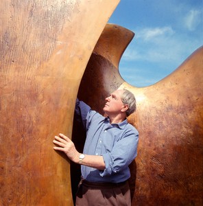
Laura Bruni writes about a major exhibition celebrating the work of the British sculptor Henry Moore at the Royal Botanic Gardens, Kew, London.
On the occasion of Baselitz: AVANTI! at the Museo Novecento in Florence, Italy, Holly EJ Black considers the roots and reverberations of Georg Baselitz’s printmaking.
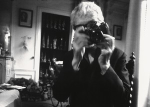
Christian House celebrates the generation-spanning and formally inventive photographs of Jacques-Henri Lartigue.
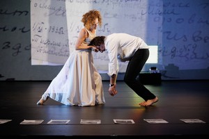
Mark Franko considers how Emily Coates resurrects the spirit of George Balanchine’s American beginnings through archival research, spoken dialogue, and movement in her performance Tell Me Where It Comes From.
Carlos Valladares wades through the discourse around the musician and actress Charli XCX’s mockumentary, guiding us through its myriad references, from the Spice Girls to Andy Warhol.