David Reed and Katharina Grosse met at Reed’s New York studio in the fall of 2019 to talk about his newest paintings, the temporal aspects of both artists’ practice, and some of their mutual inspirations.
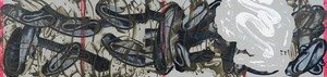
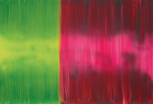
David Reed, #714, 2014–19, acrylic, oil, and alkyd on polyester, 28 × 118 inches (71.1 × 299.7 cm)
David Reed, #714, 2014–19, acrylic, oil, and alkyd on polyester, 28 × 118 inches (71.1 × 299.7 cm)
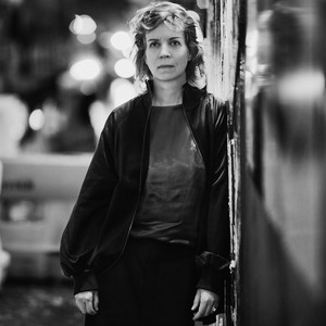
Katharina Grosse is a German artist who lives and works in Berlin. Embracing the events and incidents that arise as she paints, Grosse opens up surfaces and spaces to the countless perceptual possibilities of the medium. While she is widely known for her temporary and permanent in situ work, which she paints directly onto architecture, interiors, and landscapes, her approach begins in the studio. Photo: Max Vadukul
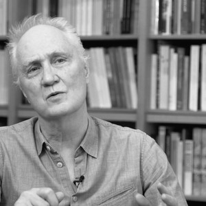
David Reed is a contemporary artist whose career spans decades and mediums. Known for his large-scale abstract paintings, Reed plays with the dynamics of brushstroke, light, and color. The artist hails from San Diego and attended the Skowhegan School of Painting and Sculpture and Reed College before moving to New York, where he studied at the New York Studio School under the tutelage of Philip Guston and Milton Resnick. Reed lives and works in New York.
Katharina GrosseWe’ve been discussing our thoughts around the practice of painting in terms not only of the paintings themselves, but also how we put them in the space. Are you concerned about the arrangement of these new paintings in the gallery space?
David ReedYes, these paintings are very different from one another and sometimes they don’t play well together. They can fight when in close proximity.
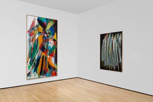
They may need a lot of white walls around them. Also, I want to juxtapose paintings that have a lot of color with others that are black and gray. Combined they look good.
KGWe aren’t used to black-and-white images anymore. Nearly everything is color. When we see photographs or movies: color. There’s not really that black-and-white vision anymore.
DRI’d love to see a painting of yours that’s black and gray.
KGAre you using colored pigments in your grays?
DRNo, just different black and gray pigments. Payne’s Gray is very cold, almost blue. Davy’s Gray is a neutral and in the right context can seem very reddish. I’m experimenting with Mars Black and Lamp black and Charcoal Grey. There seems to be an infinite number of different possible grays.
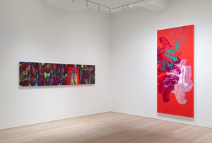
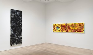
David Reed: New Paintings, Gagosian, 980 Madison Avenue, New York, January 10–February 22, 2020
KGThis reminds me of the show you did with Katy Siegel and Christopher Wool in 2017, Painting Paintings (David Reed)1975. In the fifth-floor gallery were paintings by Joyce Pensato, Cy Twombly, and Wool; they all use black and white, in their full range of tonalities and in very different ways.
DRI’ve thought a lot about the Twombly that was downstairs [Untitled (New York City), 1967]. I’m thinking about him often while preparing for the upcoming show. In that painting, he made marks, with what I think was a wax crayon, while the paint was still wet. Then, when the paint was dry, he made an additional layer of crayon marks. So you have the marks into wet, and then dry on dry. This difference made the whole painting come to life.
KGYes, that second, dry mark seems to draw the painting into an experience of everyday reality, whereas the wet on wet is more in the reality of the painted surface. I find your description of the painting poignant, because you’re separating the different characteristics of what makes painting the illusionistic art—its potential with hue, tonality, movement, shape. You don’t separate tonality in real life.
DRIt’s such a simple distinction between marks into wet and on dry, and I didn’t realize how important that difference was; seeing both at the same time, you make all kinds of distinctions.
KGIt’s also a time lapse. You can’t make the second gesture until the first has settled, but they exist together in the final outcome. It gives the viewer the experience of knowing that something has happened in between . . . or not happened in between.
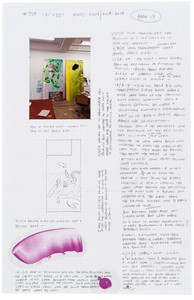
David Reed, Working Drawing for #709 (For Jeremy Blake and Theresa Duncan), 2005–09/2018–19, mixed media on graph paper, 1 page of 14 pages, 17 × 11 inches (43.2 × 27.9 cm)
DRYou really appreciate how Twombly uses time in his work. You wrote about that a while back, correct?
KGYes. It continues to fascinate me.
DRI didn’t realize how singular the use of time is in his work until I read your essay.1
KGIs that aspect of time or speed something you think about in relation to your own work?
DROh my goodness, yes.
KGIt has a different quality from Twombly’s, I think.
DRYes, it’s different. I’ve had a strange experience with time in my work, Katharina, perhaps you can recognize what I’ve been through. I was first inspired by post-Minimal sculpture, so my idea was to make paintings in which the process was completely clear—a viewer could see exactly how the painting was done and how much time it took. I wanted my paintings to be in literal time: it took exactly this much time to pull a brush mark across the painting, this much time for the drips to go down. That was my goal. But now the surfaces of my paintings look photographic. One can’t tell how they were done. Time is hidden in the paintings; sometimes it even seems as if the paintings could only have been made if time were reversed. I’ve ended up doing the exact opposite of what I originally intended to do [laughter]. I don’t know what happened. I keep trying to figure it out.
KGDoing it made you experience time differently, perhaps—I think painting offers exactly that possibility of going backward in time. You can reverse time any time you want, in a way.
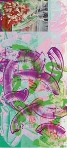
David Reed, #709 (For Jeremy Blake and Theresa Duncan), 2005–09/2018–19, acrylic, oil, and alkyd on polyester, 121 × 55 inches (307.3 × 139.7 cm)
DRI used to think that photography and film changed how I saw painting. Those media hide their processes. But what you say sounds right: it’s the nature of painting to manipulate time, to make different kinds of time. Lately, when I make marks, I often go against the direction of the previous marks. I thought it was a kind of canceling out, but it’s more as if I want to go back earlier in time.
KGI think painting over something—adding a second layer, third layer, fourth layer—has a lot to do with actualizing what you’ve done before. In the beginning, I always thought that when I painted over something I had to paint a new painting. It took me a while to understand that what’s underneath has a tremendous effect on the next layer. How you read your relationship to your previous activity tremendously influences how you move forward.
DRIt’s so much fun to work on these paintings. I’ve thought about them for a long time. I don’t have to consciously think about what I’ve done before. My hand seems to remember and to know what to do. I’ve also been having fun experimenting with painting around the sides of the canvases. Looking at the paintings from the sides as well as from the front causes another kind of time. At first I thought using stencils emphasized the flat, frontal surface, but a stencil can easily be made to wrap around the side of the canvas. Then it looks like a projected image, not flat at all.
Time is hidden in the paintings; sometimes it even seems as if the paintings could only have been made if time were reversed.
David Reed
KGJo Baer’s paintings have always been very influential for me, especially early on. I was particularly impressed with how she showed them: remember her Radiator paintings from the early ’70s?
DRYes! I often think of Jo Baer. She uses the sides of her paintings so beautifully.
Something else I’ve been obsessed with is changeant color, a conceptual use of color that started in the Italian Renaissance. It’s basically about modeling with hue rather than with value. Andrea del Sarto is one of the inventors of this kind of color. There’s a painting of his in the Metropolitan Museum of Art, The Holy Family with the Young Saint John the Baptist [c. 1528], which includes a phenomenal use of changeant color: the loincloth of the Christ child is modeled in incredible blues and magenta pinks. I kept asking myself why the loincloth is painted in this way. Finally I saw that the colors were a kind of camouflage: Mary’s hand is on the loincloth and she’s holding the Christ child’s penis, under the cloth—showing it to us. He’s fully human but also the son of God, sexual and otherworldly at the same time. I heard Leo Steinberg give a talk at the Studio School on his notorious subject, the sexuality of Christ, and read his book when it came out. I should have recognized what was going on in the painting sooner than I did.
KGThe painting flips between materiality and spirituality?
DRYes, I think so. The term changeant is French and comes from a way that cloth can be woven to be one color when seen from one side and a different color when seen from the other. The English term is “shot color.” Some art historians have written well about the use of color in Renaissance, Baroque, and Mannerist painting. Marcia Hall’s books are especially good: she writes about practical matters and why issues of color meant so much to painters. Lisa Yuskavage recently spoke of Hall’s writing about changeant color in another talk at the Studio School. Since I’ve been remembering and thinking about Italian painting and talking about Hall, perhaps we should be using the Italian term that she uses, cangiante.
David Reed: New Paintings, Gagosian, 980 Madison Avenue, New York, January 10–February 22, 2020
KGI remember when I was young, the green–orange contrasts in Pontormo’s and del Sarto’s work were very important to me. When you put them together, you have a flicker of materiality, in a sudden way—they merge, and that adds a sense of unfinishedness to the painting. David, your works are always in progress. Does the idea of a finished painting have any relevance for you at all?
DRI don’t ever want to finish these paintings.
KGIt’s a continuum. It’s amazing that you work on a painting for, how long did you say? Ten years?
DRI’ve worked on a few of these paintings for fifteen years.
KGWhat amazes me is that it looks like it’s just happened in a snap. And what I also find special is that you don’t make twenty of those—you don’t exploit your findings, you just go to the next.
DRI try to make a new discovery in each painting. I think that’s something painting can provide. I never want to repeat myself.
It’s wonderful to show them to you and to talk. I’m very much alone when I’m painting—I wonder if you feel that way? I can listen to suggestions, but I have to make decisions myself and to feel that they are right. Talking with you about my plans for the show reminds me of working with a curator: I learn about my paintings when I see how others install them, and I can use what I’ve learned in other paintings later on. Installing is a way of opening myself up to different possibilities. Katy and Christopher did a much better job installing those paintings of mine from the 1970s than I would have. I tend to install in too regular a way, grouping like paintings with like; in their installation they put that unusual painting with the diagonals right in the midst of all the others with horizontal brushmarks. Fantastic!
1Katharina Grosse, “C.T. S.T.,” in Jonas Storsve, ed., Cy Twombly, exh. cat. (French edition, Paris: Centre Pompidou, 2016; English edition, Munich: Sieveking, 2017).
Katharina Grosse is a German artist who lives and works in Berlin. Embracing the events and incidents that arise as she paints, Grosse opens up surfaces and spaces to the countless perceptual possibilities of the medium. While she is widely known for her temporary and permanent in situ work, which she paints directly onto architecture, interiors, and landscapes, her approach begins in the studio. Photo: Max Vadukul
David Reed is a contemporary artist whose career spans decades and mediums. Known for his large-scale abstract paintings, Reed plays with the dynamics of brushstroke, light, and color. The artist hails from San Diego and attended the Skowhegan School of Painting and Sculpture and Reed College before moving to New York, where he studied at the New York Studio School under the tutelage of Philip Guston and Milton Resnick. Reed lives and works in New York.