Game Changer
Mercedes Matter
Lauren Mahony and Michael Tcheyan pay homage to the founder of the New York Studio School.
March 1, 2020
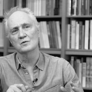
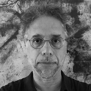
Curator and critic Jeffrey Weiss joins David Reed for a public tour of the artist’s exhibition New Paintings at Gagosian, New York. Here, we present an edit of their conversation, which tracks the works’ influences from Mannerist and Baroque art to Hollywood films and screen light.
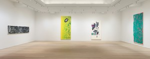
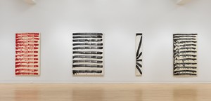
Installation view, David Reed: New Paintings, Gagosian, 980 Madison Avenue, New York, January 10–February 22, 2020
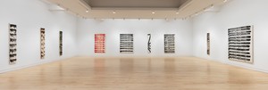
Installation view, David Reed: New Paintings, Gagosian, 980 Madison Avenue, New York, January 10–February 22, 2020
Jeffrey WeissI’m thrilled and honored to be here with David to discuss his new paintings. For me, it’s the continuation of an exchange that we’ve been having for a number of years about painting. One of the things that I find so interesting about his work concerns how we talk about abstraction throughout the twentieth century as being either “pure” or “impure.” And I put David on the impure side—partly because his painting comes from multiple places. It draws from outside of painting and then transforms some of those other elements, other interests into something pictorial. That’s a recurring strategy in David’s work.
I thought it would be good to start with some orientation with respect to the historical circumstances of the show; some of the paintings are new and some were begun a long time ago but only recently completed.
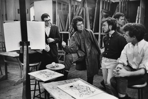
David ReedFirst, I love this room [the sixth-floor gallery of 980 Madison Avenue]. Christopher Wool and Katy Siegel curated a show of my paintings from the 1970s in this room and I learned so much about those works seeing them here, because the room is like a magnifying glass. It makes you notice things you hadn’t seen before. I was very excited to get to show new paintings here. I used as my model one of Cy Twombly’s shows, which was of the Bacchus paintings, where he installed very large paintings tightly into the corners of the room—big red paintings. I thought I’d make paintings that were too big, too tall, too wide to fit easily into the space and see if this space—because it’s both grand and intimate—could expand for these big paintings and make them look intimate anyway. And I think it has.
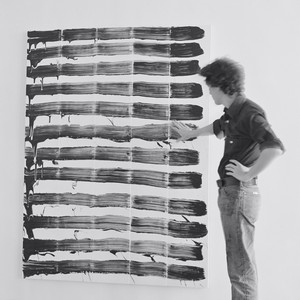
Installation view, Painting Paintings (David Reed) 1975, curated by Katy Siegel and Christopher Wool, January 17–February 25, 2017, Gagosian, 980 Madison Avenue, New York
JWI’m curious, then, with respect to personal and historical orientation, if you could talk about when these paintings were made and in what context regarding the prospect of this show?
DRWhen I knew I was going to have a show in this room, I remembered that I had several vertical canvases that I’d started in about 2005 and abandoned in 2008 or 2009. There were maybe eight or nine of them; two of these paintings are in this gallery, and two other tall paintings are downstairs. Those paintings have these strange dates of maybe 2005 to 2008, and then a slash, and then 2018, when I resumed work, to 2019, when they were finished.
JWHow does one, as a painter, think about paintings that have been left behind, and whether they are worth returning to?
DRBack then, I was having technical problems with the paintings. I wasn’t using stencils yet, so I could only put marks within rectangles in the painting. I could isolate areas, but I couldn’t pull a mark out and have it bring its background along with it the way I can now, using stencils. A mark makes a space around itself. I want the mark to be the most important, meaningful thing. If the mark is in a smaller rectangle, it determines the rectangle. But using a stencil, I can take the background with it, I can use it in a different way.
JWWould you explain the stencil as a tool?
DRThey are sheets of plastic. We do a scan of a brush mark I’ve made in a painting—it’s photographic. We run it through the computer and turn it into an image that we can manipulate. We make it in several layers, so we make an equivalent of the image of that brush mark out of the stencil’s layers. And we can vary it, we can make it whatever size or color we want. It then becomes a real tool to work with. It’s been a dream of mine to be able to do this.
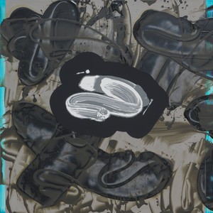
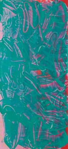
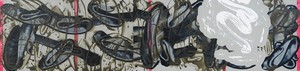
David Reed, #720 (The Prodigal Son), 2013–19 (detail), acrylic, oil, and alkyd on linen, 40 × 180 inches (101.6 × 457.2 cm)
JWOf course, with the idea of the stencil, everything becomes replicable to a degree. Which presumably goes against the idea of the spontaneity of the gesture. Earlier, you mentioned a historical precedent for that. Can you tell us about that?
DRWhen I was a young painter, people said [Robert] Rauschenberg had destroyed Abstract Expressionism because he showed, in Factum I and Factum II [both 1957], that he could repeat the same gestural mark in two paintings and therefore show that what the earlier artists were doing was phony, that they were pretending to make unique marks when they weren’t.
I didn’t like that Rauschenberg was critical of the painting that I loved, and it didn’t seem like him to do this. But I thought that these art historians must be correct, and that’s what everybody said. Then I saw Factum I and Factum II in person and said, “Oh, wait a minute, they aren’t the same at all. They’re very different.” And you can see that right away. Instead of showing that gesture is dead, I think Rauschenberg shows in those paintings that gestures will live forever, because they’re never exactly the same. They’re always different, and they always have the possibility of a new life. I think Rauschenberg did just the opposite of what the criticism was saying at the time.
JWIt could be taken both ways. That’s kind of the genius of it. And it goes to this question of impurity. I think it’s important for people to know that you were devoted to Abstract Expressionist painters. We can look at your latest work and think of painting from the middle of the twentieth century, with respect to that generation of painters. On the other hand, of course, you’re engaging with them in a way that has nothing to do with imitation.
DRAnd it’s good we get to this subject because it’s the crux of my work, I think, that I love Abstract Expressionist painting, but I understand that you can’t repeat it. You have to go on and let it lead you somewhere else.
JWIt’s an idea that was hard-won over the course of twentieth century art. And that’s one of the ways in which an artist of your generation could retain a deep commitment to painting yet also overturn the old assumptions about purity of medium—about which we were speaking before—and that opens an additional door to another history of painting that’s impure in a way.
David Reed, #721 (For Hitchcock and del Sarto), 2008–09/2018–19, acrylic, oil, and alkyd on polyester, 110 × 50 inches (279.4 × 127 cm)
You and I have had a long-running, intermittent conversation about the formats of your work, which are often extreme in either their horizontality or their verticality—narrow but very long or very tall. But one thing I wanted to interject in relation to this idea of abstraction and representation in pictorial space concerns Mannerist painting, which I know you also love—well, you are a student of painting from many periods, but Mannerist and Baroque painting are of high interest to you. Mannerist painting uses the format of tall and narrow, and deliberately, we think, as a way to shift the ground of pictorial space from the regularity of Renaissance perspective, which is filled with figures for whom there appear to be no obvious place to move around in, to live. There’s a contradiction there, a fairly striking one, between the flatness of the painting and the idea of the volumetric kind of presence of the body in pictorial space. Is that relevant to you?
DRI think it’s very relevant because in my paintings, I want it to be the gesture that’s made to control everything, the space, its own size, its placement, as if it determined everything in the painting. It’s difficult to give this effect if the gesture is made toward the end of the painting. Mannerist painting does the same thing. The gesture of the figure, the size of the figure determines how it fits into the painting, and it’s awkward and strange and does things particular to Mannerist painting. It’s very unusual. A lot of paintings kind of fit things into the painting, but Mannerist painting doesn’t try to do that.
All kinds of things came into my work in relation to media, to film and TV. The color and the light from all of that came into my work. And I think it’s because painting is so good at absorbing new visual experiences.
JWCan you talk about your interest in Technicolor and the history of color in Hollywood films?
DRI’d become obsessed with Alfred Hitchcock’s Vertigo (1958). In that film, he uses two main colors. There’s a rose red and a cobalt teal or turquoise. The turquoise is for Judy, the female character, and the red is for Scottie. And it’s like an opera. There’s music that goes with it and the colors that go with it as you see the film. It makes for a particularly dreamy atmosphere.
JWWhat is it about color in a film like Vertigo that distinguishes it from what painting used to be?
DRI think it’s because it’s all light, and it’s all light coming at you through a screen. In Baroque paintings, the light is directional. It comes from God, it comes from above, and you move within it. In films, the light comes through the whole screen and you, in the theater, live within it. I’m thinking more and more about the way the light in film covers the actors and changes their skin so that they seem part of the color of the film. And then the same thing happens to us when we’re in the audience watching a film on the big screen. We can see it on our neighbors and we’re all a part of that light in a way that only happens with film.
JWI’ve never heard you put it that way before. It’s very true, and Vertigo, in particular, almost stages that, with the use of the neon light in the hotel sign outside the window that infiltrates the room at a key dreamlike, transformational moment, illuminating the characters in a way that is both real and irreal.
DRI think Hitchcock was very conscious of the use of light in this way, and I think I’m just beginning to understand it now—how much that light is a part of us and our imaginations.
JWIn that context, can we talk about black and white versus color in your paintings?
DRThis is an interesting thing that has happened to me with this show. I had noticed in my studio that the color paintings looked great if there was a black painting next to them, and I imagined a room of all colored paintings and I didn’t think it would look good. I decided I wanted half the paintings in the show to be black. I didn’t quite make it; I made it to about a third. And I did it so that they would be in juxtaposition. But instead, something else happened. The black paintings have a new quality for me that really interests me. I thought they would be simpler—that because there was no color, it would be easier to see them. But people kept looking at them and telling me they looked complex, so I had to look at them again. And I think there are complications of drawing that are harder to see in the colored paintings—that are easier to see in the black paintings. It makes me now want to do more of the black paintings and investigate this. It’s a surprise result from the show that I really want to follow up on.
JWThere is an idea in Italian Renaissance painting, cangiante, which you mentioned to me, and I wondered if you wanted to say something about that, because it has to do with the role of value—of dark and light—in relation to the identity of color.
DRCangiante is when you model with hue rather than value. It was invented by Michelangelo and Andrea del Sarto. It’s a conceptual use of color that I like.
JWWhich is to say that instead of darkening a color to create a shadow, which muddies the clarity of the color, you shift colors.
DRYes. And it allows for certain emotional connotations that are very different. It works in Mannerist painting. And there’s also another term they call sfumato, which is the darkness and the dark light, which is what’s in this painting. I was thinking a lot about a painter from Siena named Domenico Beccafumi, who used both cangiante and sfumato together. And they’re very moody, very strange paintings. I feel his work is behind a lot of the inspiration for this painting.
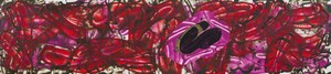
David Reed, #715 (For Beccafumi—His Fall of the Rebel Angels), 2017–19, acrylic, oil, and alkyd on polyester, 26 × 117 inches (66 × 297.2 cm)
I was going to say the other thing we didn’t cover, Jeffrey, that we talked about earlier—one of the things in terms of color that I was thinking is I kept also having an image of a kind of bruising in these paintings. There’s a certain kind of strangely distorted color that goes from cangiante to something with the opposite connotation, emotionally. In a lot of old master paintings, there are several flesh tones for figures in the same painting, often someone alive and someone dead. The painters make very careful distinctions. And even paintings about—[laughs] I’m getting too gruesome now.
JWIt’s all part of the picture, so to speak.
DRA body dying, you see it changing color, and then other bodies coming to life, through erotic excitement or other things, and all of that is shown through the colors of flesh. There’s a whole history of flesh colors in painting, and that’s something I want to deal with in some way.
JWThat’s fascinating, especially in the context of works that don’t at first appear to be related to the body. But, of course, they deeply are.
DRAnd maybe I have something to close. I think these are my funniest paintings. [laughter]
JWPlease explain that. [laughter]
DRIt came up because I was thinking about John Baldessari and his passing, and he taught me how important humor is to art. Also, through him, I understood how humor is such an individual quality that we all have as humans. His sense of humor is completely different than anybody else’s, and each artist who’s funny is funny in a different way. My idea was that one’s most unique quality as an individual is a sense of humor. If I were to start a church, it’d be a church of the sense of humor, because each of us has a different one. And I think these paintings are edging into humor in some ways.
Artwork © 2020 David Reed/Artists Rights Society (ARS), New York.
Photos: Rob McKeever
David Reed: New Paintings, Gagosian, 980 Madison Avenue, New York, January 10–February 22, 2020
David Reed is a contemporary artist whose career spans decades and mediums. Known for his large-scale abstract paintings, Reed plays with the dynamics of brushstroke, light, and color. The artist hails from San Diego and attended the Skowhegan School of Painting and Sculpture and Reed College before moving to New York, where he studied at the New York Studio School under the tutelage of Philip Guston and Milton Resnick. Reed lives and works in New York.
Jeffrey Weiss is an independent curator and critic living in Brooklyn. Weiss holds a PhD from the Institute of Fine Arts, New York. Between 2010 and 2018, he was a senior curator at the Solomon R. Guggenheim Museum, New York, where he co-organized the Panza Collection Initiative, an eight-year study project devoted to the museum’s vast holdings in Minimal and Postminimal art. Between 2000 and 2008, Weiss was head of the Department of Modern and Contemporary Art at the National Gallery of Art, Washington, DC. The recipient of various fellowships and awards, he has also been an adjunct professor at the Institute of Fine Arts.
Lauren Mahony and Michael Tcheyan pay homage to the founder of the New York Studio School.
David Reed and Katharina Grosse met at Reed’s New York studio in the fall of 2019 to talk about his newest paintings, the temporal aspects of both artists’ practice, and some of their mutual inspirations.
In this video, Christopher Wool, Katy Siegel, and David Reed discuss Reed’s paintings and memories of the New York arts scene in 1975.
Katy Siegel and Christopher Wool discuss David Reed’s paintings and the New York art scene in 1975.
Ahead of Alex Israel’s exhibition of four new Fin sculptures at Gagosian, London, the artist spoke with Susan Casey, author of The Wave: In Pursuit of the Rogues, Freaks, and Giants of the Ocean (2010), about the ocean, surfing, and Los Angeles.

On April 16, the Institute of Contemporary Art, Boston, opened the first midcareer survey of Derrick Adams’s multidisciplinary practice. Covering over twenty years of work, the exhibition, titled View Master, brings together the artist’s painting, sculpture, collage, performance, and video, as well as a vibrant new commission created for the museum’s façade. Ahead of the opening, Adams met with Tessa Bachi Haas, cocurator of the survey, to discuss his formative experiences with television, the impact of his work in arts education on his practice, and the importance of taking a more complex, more joyful, and more expansive approach to Black American life and culture.

Jeff Koons tells Alison McDonald about his appreciation for the pioneering artist and thinker Marcel Duchamp.

The Singular Experience at Gagosian’s Le Bourget gallery is the largest exhibition of Walter De Maria’s work in France in several decades. Organized by Donna De Salvo, senior adjunct curator at Dia Art Foundation, the exhibition marks the first time De Maria’s final sculpture, Truck Trilogy (2011–17), is being shown outside of the United States. Here, De Salvo speaks with artist Lucy Raven about her evolving kinship with De Maria and more.

Ed Ruscha sits down with the author and explorer Erling Kagge to discuss existence.
Following the debut of her Fall/Winter 2026 collection at Dia Chelsea, New York, Ulla Johnson met with Sarah Godfrey to discuss her recent collaborations with the Helen Frankenthaler and Lee Krasner foundations, her upbringing in and dedication to New York City, and her nonhierarchical approach to collecting.
Andrew Durbin’s dual biography, The Wonderful World That Almost Was: A Life of Peter Hujar and Paul Thek, published by Farrar, Straus and Giroux, tracks the convergences and divergences in the lives of the two artists, from their first meeting in Coral Cables, Florida, in 1956 through their generative romantic and creative partnership in New York, Italy, Fire Island, and beyond. Ahead of the release, Durbin met with the Quarterly’s Wyatt Allgeier to speak about the development of the project, the sublime noncompliance of these two artists, and the motifs of love, death, and rebirth that weave through the telling of their story.

On March 28, a major exhibition of Jenny Saville’s work opened at Ca’ Pesaro–Galleria Internazionale d’Arte Moderna in Venice, bringing together nearly thirty paintings from the 1990s to the present. The exhibition is curated by Elisabetta Barisoni, head of the museums division at Venice’s Ca’ Pesaro, Museo Fortuny, and head of MUVE in Mestre. Saville’s monumental canvases are set in dialogue with the great Venetian artists of the past, creating a unique encounter between contemporary painting and the city’s artistic heritage. Here, the artist speaks with Stefania Ventra, professor with Ca’ Foscari University of Venice, about her early trips to Venice, the radicality of Titian’s painting, and depicting emotional truth.