The artist speaks with Laura Fried about her most recent paintings, the symbol of the serpent, and her evolving relationship to color.
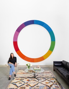
Jennifer Guidi in her Los Angeles studio, 2020
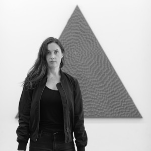
Jennifer Guidi in her Los Angeles studio, 2020
Laura Fried is a curator and writer living in Los Angeles. She has produced screenings, exhibitions, interventions, and performances with a wide variety of artists. She was the artistic director of the Seattle Art Fair (2016 and 2017) and is a co-founder and director of Active Cultures, a nonprofit organization that explores the confluence of food and art in contemporary life. Fried has written for Flash Art International, Frieze, Mousse, and the Los Angeles Review of Books.
Jennifer Guidi creates paintings notable for their luminosity, texture, and sculptural presence. Her swirling, mandala-like compositions oscillate in color and texture, inspiring shifts in perceptual awareness to forge new sensory horizons. Each painting is methodically executed through a unique process—at once systematic and organic—which reflects the connection of her painting practice to strains of Minimalism that privilege attention to detail and repetition. Her sculptural markings evoke an intensely meditative sense of narrative and spiritual votive.
Laura Fried It was such a pleasure to visit the studio and grasp the full scope of your current project. From the exhibition model to the paintings at various stages of completion—to me, it all revealed how your attention to light penetrates nearly every facet of production, form, layering, and exhibition design. A critical underpinning of your upcoming show in New York, and of your practice, it seems, is to reveal the visceral and even metaphysical charge that light both contains and emits, particularly through color. In particular, the light here on the West Coast, which we love, is approached through the forms of nineteenth-century color theory and chakra methodologies.
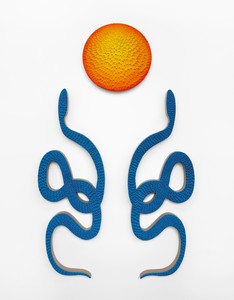
The tone for your show is set at the start with the introduction of the serpent, which visitors will first encounter from the street, through the window next to the gallery’s entrance. You told me something about how the snake surfaced in the studio: can you talk a bit more about how it came to be?
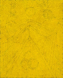
Jennifer Guidi When I was painting my first abstract dot paintings, in 2012, they were small, textural dots of white oil paint on black grounds and their surfaces were similar to snakeskin. The first time the snake itself surfaced in the studio was when I began making black-and-white snake stick sculptures, in 2013. My favorite sculptures at the time were Jim Lambie’s psychedelic soul sticks and André Cadere’s colorful wooden bars. I’d always loved the idea of sticks as sculptures propped up against the wall. Many cultures have used sticks to symbolize strength, power, and healing; if you think of walking canes, prayer sticks, and magic wands, these objects contain an unknown power and mysticism.
Jennifer Guidi, To Protect and Hold You Up, 2019, sand, acrylic, and oil on linen, overall: 96 × 58 inches (243.8 × 147.3 cm); snakes: each 66 × 23 inches (167.6 × 58.4 cm); circle: 24 inches (61 cm) diameter
LF What is the relationship of the serpent to this show?
JG In many histories, serpents represent fertility and a creative life force, they’re symbols of rebirth, transformation, immortality, and healing. I like these concepts and ideas, but for me, serpents are also a way to play with line and shape.
LF As we enter the first gallery, we begin with a series of paintings ordered in the hierarchy of the seven chakras. Have you always played with the spectrum of colors in the way you do here?
JG This is the first time I’m lining up a series of paintings in this order. In past exhibitions I’ve played with rainbow colors, thinking about how color occurs in nature and how we’re affected by color and light. This series of diptychs is the first time I’m thinking of these works as specific sources of energy. Chakras are energy centers within the human body—there are seven along the spine. The word “chakra” in Sanskrit translates to “wheel” or “circle”; I like the idea of circular energy sources, and I visualize them during meditation. But although I’m attracted to this type of symbolism, and to thinking of the triangles as pyramids or mountains and the circles as suns or moons, I’m also just exploring geometric shapes and the color spectrum.
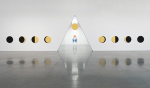
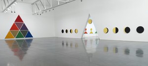
Installation view, Jennifer Guidi: Gemini, Gagosian, West 24th Street, New York, February 28–April 4, 2020. Photo: Rob McKeever
LF Can you talk a bit about your interest in theories of color, and about the role they play in the exhibition?
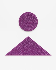
JG For this exhibition I’ve transformed two color-theory illustrations, Johann Wolfgang von Goethe’s triangle and Ignaz Schiffermüller’s color circle, into large paintings. Rooted in both nature and science, they act as anchors on either side of the large gallery. Goethe’s nine-colored triangle is a diagram of the human mind, linking color combinations with emotions, and he felt that it was the artist’s responsibility to take each color into account. Schiffermüller, a naturalist who mainly studied insects, believed that nature produces all colors. His twelve-color circle was the first image that arranged complementary colors opposite each other. For me, these two paintings tie together color, shape, nature, and philosophy. I like how the colors in the charts are charging us externally and internally. I translate these colors into works every day. On an intuitive level, I’m guided by the colors in nature.
When I’m in front of one of these paintings I want to feel rooted, and to look up at it as if I were searching the night sky.
Jennifer Guidi
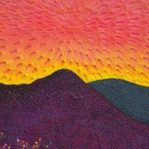
LF I’ve been thinking about the two large landscape paintings in your studio, about our discussion of California light, and about Goethe’s color triangle. All this has called to mind a painting by J. M. W. Turner from 1843, Light and Colour (Goethe’s Theory)—the Morning after the Deluge—Moses Writing the Book of Genesis. There’s a serpent at the center of Turner’s painting, and, religious subtext aside, he’s so attuned to the transience of natural phenomena, all in service of the sun. Whether color for Turner was biblical or analytical, we’ve discussed how for you it’s tied to the innate fundamental characteristics of the natural world. In various ways, each body of work in the show seems conditioned to these taut moments where light breaks through—more explicitly in the phases-of-the-moon paintings, more subtly in the vibrations that emanate from the black monochrome sand paintings. How do you approach the qualities of—and conversely the perception of—light in each disparate body of work?
JG Light is constantly coming and going, whether it’s the sun rising and setting, as in the two landscape paintings, or the moon waxing and waning in the phases-of-the-moon paintings. The hours of light and the hours of darkness that we have in a day are in constant flux. I’m searching for a certain light or contrast, a mood or a feeling. In the landscape paintings I’m using color, mark-making, and texture to evoke a certain atmosphere. I’m influenced by the color and the light of Los Angeles, a light like no other. I try to capture those fleeting moments of the bright colors in the sky, how the colors of the mountains change, how the light reflects off the buildings. These are the moments that capture my interest and resonate with me.
Jennifer Guidi, Third Quarter Moon, 2020, sand and acrylic on linen, 36 inches (91.4 cm) diameter
Jennifer Guidi, A Thousand Petals (Crown Diptych), 2019, sand, acrylic, and oil on linen, overall: 54 × 58 inches (137.2 × 137.2 cm; circle: 24 inches (61 cm) diameter; triangle: 24 × 58 inches (61 × 147.3 cm)
LF I imagine that mirroring will be powerful in experiencing the black paintings—their reflection in the high-gloss floor will make them seem to be melting onto the surface. Yet the physicality of these mandala-like paintings is arresting: your mark, your gesture, persists in them. What struck me in these black monochromes was not only how much the subtle tonal shifts in their bright underlayers reminded me of the glitching seriality of Andy Warhol’s Shadows [1978–79], but also how strong qualities of texture and opacity lead to incredible translucency and light. Can you tell me more about these paintings?
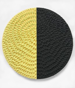
JG The black sand paintings at first glance seem monochrome, but on closer inspection they also contain the color of the chakras. These paintings echo Goethe’s theory that black is not an absence of color but dark mingling with light to create color. The viewer encounters a dark wall of seven large paintings. At first there seems to be an absence of color, but as one gets closer the colors reveal themselves in the underpainting, the raised tips that rise around the indentions, and the dots. Although each painting is made the same way, no two are alike. My intention is for each one to seem all encompassing, so that one can feel completely immersed. When I’m in front of one of these paintings I want to feel rooted, and to look up at it as if I were searching the night sky.
Installation view, Jennifer Guidi: Gemini, Gagosian, West 24th Street, New York, February 28–April 4, 2020. Photo: Rob McKeever
LF Can you say a bit about the qualities of symmetry and reflection you were after in your approach to the exhibition?
JG For me, symmetry creates a peacefulness and a calmness, which I feel a person needs to sit and reflect and think. There are literal symmetries in the exhibition—the paintings reflect off the floor, the light reflects off the water in the landscapes—as well as more symbolic and psychological symmetries: the show’s title, Gemini, comes from the twins of the zodiac, and the viewer’s introduction to the exhibition is a set of two snakes that reflect one another, like identical twins mirroring each other.
There are other symmetries at play: night/day, light/dark, sunrise/sunset, new moon/full moon. The phases of the moon are shown in a complete cycle, from full moon to new moon and back again. We are all connected and affected by the lunar cycle and the influence of gravitational pull; moon phases, like color, affect our behavior, so there’s a common thread running through the exhibition.
Laura Fried is a curator and writer living in Los Angeles. She has produced screenings, exhibitions, interventions, and performances with a wide variety of artists. She was the artistic director of the Seattle Art Fair (2016 and 2017) and is a co-founder and director of Active Cultures, a nonprofit organization that explores the confluence of food and art in contemporary life. Fried has written for Flash Art International, Frieze, Mousse, and the Los Angeles Review of Books.
Jennifer Guidi creates paintings notable for their luminosity, texture, and sculptural presence. Her swirling, mandala-like compositions oscillate in color and texture, inspiring shifts in perceptual awareness to forge new sensory horizons. Each painting is methodically executed through a unique process—at once systematic and organic—which reflects the connection of her painting practice to strains of Minimalism that privilege attention to detail and repetition. Her sculptural markings evoke an intensely meditative sense of narrative and spiritual votive.