Anne Baldassari reflects on the art historical influences and radical breaks reflected in the artist’s work with color.
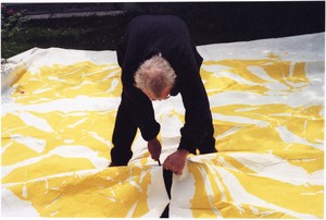
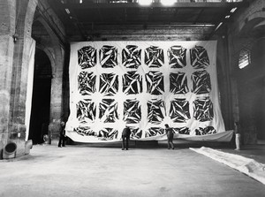
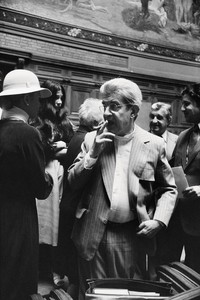
Simon Hantaï cutting out Tabulas works, Meun, France, 1995. Photo: Antonio Semeraro
Simon Hantaï cutting out Tabulas works, Meun, France, 1995. Photo: Antonio Semeraro
Anne Baldassari entered the French Ministère de la Culture in 1983, where she was responsible for a program of support and innovation in contemporary art. In 1985 she joined the Musée National d’Art Moderne, Centre Pompidou, Paris, and in 1991 was appointed to the Musée national Picasso, Paris, where she was a curator, director, and then president of the museum until 2014. In 1992 she published the complete catalogue of Simon Hantaï’s work in the collection of the Musée National d’Art Moderne, Centre Pompidou. Baldassari curated Simon Hantaï: The Centenary Exhibition at the Fondation Louis Vuitton, Paris, in 2022.
With pliage [folding], it is the problem of modernity [in] painting that is being addressed; for me, [the] two extremes of contemporary modern painting [are], on the one hand, the decentered space of [Jackson] Pollock, and on the other, [Henri] Matisse’s paper cutouts, in which drawing is totally absorbed by color. . . . I was thinking that I needed to see how Matisse’s color could be introduced into the random space of Pollock and what would happen when it was. . . . Paradoxically, the method of pliage is based on the fact that canvas stops being a projection screen and becomes a material . . . ; and [I needed] to consider just this new relation to the canvas: never again will we be face to face with the canvas, never [again] will we be able to control [it], never [again] will it be possible for its [visual] preconception to be [the matrix] of its construction.
—Simon Hantaï, 1981
The exhibition Simon Hantaï: Les blancs de la couleur, la couleur du blanc (The whites of color, the color of white), at Gagosian, New York, in January 2022, was the second part of a diptych of shows begun with Les noirs du blanc, les blancs du noir, at Gagosian, Le Bourget, in 2019–20.1 At the two extremes of the visual spectrum—prismatic color on one end and the theory-based bichromy of black and white on the other—these exhibitions explored the question of color and of its extinction. They aimed to reflect the winding, sometimes paradoxical paths of Hantaï’s experiments in achieving the “immaterial colors” described in Goethe’s Theory of Colours of 1810.
In an earlier article for the Quarterly on Les noirs du blanc, les blancs du noir, I showed how Hantaï effected a deliberate reduction of pictorial means through the absolute contrast between the noncolors of black and white.2 His goal was to bring about a limitless extension of the phenomena elicited by that binary contrast, an extension of its optical effects and of its psychic consequences for the beholder. Hantaï effectively placed himself in the heritage of Matisse and Pollock, a key frame of reference for him. Ignoring color, relying simply on the vibration of filamentary lines in black and white, these artists had approached and sometimes obtained the psychic and optical appearance of purple, mauve, and lavender. Matisse’s experience of designing the Chapelle du Rosaire in Vence, in 1947–48 (conception) and 1949–51 (construction), was central to his experimentation with and understanding of this “immaterial” dimension of color. Pollock knew about the Vence chapel, in particular from an article in Vogue in 1949,3 and it could have been a model and inspiration for the ceiling and windows he designed for a church conceived (but never realized) by Tony Smith, and on which Pollock worked with Smith and Alfonso Ossorio.4 Hantaï was also interested in Henri Michaux’s experiences with mescal, which induced the artist to see subtly colored clouds above a cluster of marks he had made in india ink.
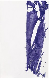
Simon Hantaï, Laissée, 1981–95, acrylic on canvas, 118 ⅛ × 107 ⅞ inches (300 × 274 cm). Photo: Thomas Lannes
In the monumental Études (Studies, 1968–71), the Laissées (Leftovers, 1994–95), and the Sérigraphies (Silk-screen printings, 1996–97), Hantaï conjured immaterial worlds, leaving the field open for the appearance of novel perceptual phenomena. He saw that it was the relation and interaction between the gouache cutouts that Matisse began to produce in the 1940s and their white grounds—the wall or the space of the room—that ensured both the purity and the intensity of their color. Without that relationship, color was weakened—“killed,” as they say in painters’ studios—by its juxtapositions and proximities. Returning to this dialogue between form and ground introduced by Matisse’s cutouts, Hantaï applied its principles to the procedure of pliage but refused visual euphoria. Like Barnett Newman, he opposed “choreographic” jubilation and its risk of decorativeness.
In these works of Hantaï’s, it is the quality and density of white that institutes color. White models color and ensures its radiance, its full existence. Furthermore, what gives each color its dimension and full expression is white light—a spinning synthesis of all the colors mixed together—not its simple pigmentary transposition into the white of the canvas or the wall, which gives each color its full expression and dimension. Hantaï’s bichrome reductions in black and white are accompanied by their contrary, by strategies of color excess: whether polychrome or monochrome, pure pigments drown and overrun the surface of the painting, attacking it from its edges or its center. The Études and then the Blancs (Whites, 1973–74) thus systematically examine the alternating and complex modalities of the pure color/white ground relation.
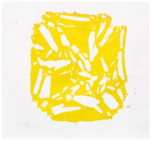
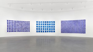
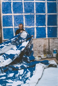
The Tabulas series of 1972–76 and 1980–82 are programmatic in character. Here, Hantaï deepened his observation of color. Formed of grids obtained by tying the canvas into knots set at regular intervals, covering it edge to edge in monochrome paint, then untying and unfolding the knots, the Tabulas end up looking crinkled with multiple “gussets.” The texture of the knots was stiff, resilient to the painter’s brush. Never was the act of painting “on canvas” more exact.
Simon Hantaï, Tabula, 1975, acrylic on canvas, 92 ½ × 210 ⅝ inches (235 × 535 cm). Photo: Thomas Lannes
The epistemological fault line of the Tabulas lilas (Lilac tabulas, 1982) lies at the convergence of the chromatic and the bichromatic modes. The achromy of their white paint on white grounds, interacting with the white space of the gallery and the white light from its overhead windows, provokes the appearance of an infinitesimal degree of color, color at the limit of perception. Perhaps that is the reason for their name: “lilac” adds to that color the ineffable perfume of sensations glimpsed, buried, and forgotten.
Simon Hantaï: Les blancs de la couleur, la couleur du blanc presented eighteen paintings from the Études, Blancs, Tabulas, and Laissées series. They were united by the principle of primary and complementary colors and by the ternary sequence derived from cyan/magenta/yellow: yellow/purple, red/green, and blue/orange. The exhibition applied the opposition and complementarity of colors to the selection and hanging of the paintings. According to Goethe, the confrontation of opposites heightens the visual effects engendered by their contrast. Accordingly, red and bright-green Tabulas, rhythmically punctuated by the white walls, reflected and opposed each other. When the eye sees a red Tabula, the retina automatically invents a reverse, “green” image equivalent in power to this red source. It is a kind of optical phantom, floating and sliding through space and back-projecting itself, particularly onto white and gray surfaces. In Les blancs de la couleur, la couleur du blanc, its aura finally suffused the green Tabula hung opposite it. This play of chromatic echoes between primary and complementary colors also produced more specific phenomena: the fissured, white-spangled grids of the Tabulas vibrated and were haloed with their complementary colors. Hantaï quotes Matisse on Goethe: “The most beautiful, most fixed, most immaterial hues are obtained without their actual material expression. For example, pure white becomes lilac, ibis pink, Veronese green or angelica blue simply because of the proximity of their opposites.”5
In 1982, representing France at the fortieth Venice Biennale, Hantaï created a theoretically based installation of large-format Tabulas that contrasted with and complemented each other: a cyan-and-magenta Tabula on the center wall (four rows of large squares), and a lemon-yellow Tabula (eight rows of small squares) and a bright-green Tabula (nine rows of small squares), hung opposite two polychrome Tabulas (five rows of large squares) on either side of the room’s entrance. Here, color imposed its arbitrary rule while the grids, now taut, now loose, either regulated or broke down the gaze. These panels were in no way intended to be decorative, yet that function is always hard to avoid when color starts to play its often hazy score of optical seduction or irritation. To avoid this trap, Hantaï emphasized the mathematical side of the installation. If the gallery was read from left to right—the usual Western mode—the Tabulas were seen in this order: polychrome, yellow, magenta, blue, green, and polychrome again. We went from one side of the spectrum to the other, and from warm to cold, with the polychrome acting both as an opening and a closing, tracing an open space of multiple possibilities. In this way the chromatic plan of the French Pavilion avoided any kind of will to prettify, to arrange, instead affirming the brute fact of color and the effectiveness of the setup, which enjoined the visitor to look, perceive, record, and feel, here and now, the terribilità of color.
Simon Hantaï, Laissée, 1981–95, acrylic on canvas, 69 ⅜ × 43 ¼ inches (176 × 111 cm). Photo: David Bordes
Although made using completely different pictorial means, the group brought to mind the four manifesto paintings that Newman painted in 1966–70, collectively titled Who’s Afraid of Red, Yellow and Blue?, which shocked and angered both the public and the critics. Hantaï repeatedly expressed interest in Newman’s work, and there are clear affinities between his pliage and Newman’s zips. The radicality of the unfolding that reveals the white of the ground in the Tabulas can be related to the tearing away of the vertical strip of masking tape that divided Newman’s big panels into distinct chromatic sequences. For Newman, though, the point of the zip was not division but the emergence of a singular state of consciousness from the depths of the painting. The title of his first zip painting, Onement I of 1948, effectively conveys the notion of separation, loss, and unification:
The painting should give man a sense of place: that he knows he’s there, so he’s aware of himself. In that sense he relates to me when I made the painting because in that sense, I was there. . . standing in front of my paintings you [have] a sense of your own scale. . . . To me, the sense of place not only has a mystery but has that sense of metaphysical fact. I have come to distrust the episodic, and I hope that my painting has the impact of giving someone, as it did me, the feeling of his own totality, of his own separateness, of his own individuality and [at] the same time of his connection to others, who are also separate.6
Newman thought of expanse, its interruption, and the scale of perception as the indissociable terms of his painting. He ultimately moved from a colored zip on color to a zip left in reserve, revealing the bare canvas ground. These “streaks of light,” as he called them, striated the surface of the painting with their brightness.7
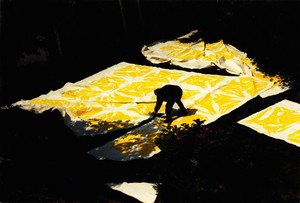
Simon Hantaï cutting out a monumental yellow Tabula (1981), Meun, France, 1995. Photo: Antonio Semeraro
With the Laissées, Hantaï returned to Matisse’s cutouts, combining them with a radical variation on Newman’s zip: he literally cut into the canvas with a box cutter, following the grid lines that had crisscrossed the Tabulas, surrounding their unfolded knots, and subdividing it into individual paintings, detached monochromes that highlight their primary or complementary colors through their intrinsic starlike spangling. The overall invasion of the optical and sensory field effected by the monumental Tabulas gives way to the random figure of a fold whose bulging scale overruns the eye and carries it toward the generic perception of an eye-body whose awareness is created in and through painting.
“This is to say,” Hantaï told an interviewer,
that a completely different palette comes into the field [opened up] by the work: I know that yellow works in a certain way, that it will overflow into lilacs in certain conditions, not in any old conditions. . . . Or that green will [overflow] into pinks, etc. When Matisse was asked what the future of painting would be, he no longer said color, he said light. We must make the distinction by which the function of color is essentially linked to light, not to matter. Since this perspective struck me as quite dazzling, it’s the only thing that interests me. In the pliages, as I was painting, the white, the unpainted, appeared increasingly active—in the end, it was almost the only active element. Everything that [interests me in this respect relates] at once [to] a material history, an optical and at the same time and above all a spiritual history, to a question of soul and poetry. On the material, absolute level, light is necessarily the foundation of the world. It is, precisely, the sign and symbol of another infinity. If you get to the bottom of it, you are bound to be in a hole, which is the opening. And it is necessarily an opening onto infinity. I don’t want an answer that assures me of something, in fact I don’t want any answers; I want the absolute nonanswer—that is, infinity.8
2 Anne Baldassari, “Simon Hantaï,” Gagosian Quarterly, Summer 2020, pp. 124–29.
3 Rosamond Bernier, “Matisse Designs a New Church,” Vogue, February 15, 1949, pp. 131–32.
4 See E. A. Carmean, “Les peintures noires de Jackson Pollock et le projet d’église de Tony Smith,” in Daniel Abadie, Jackson Pollock, exh. cat. (Paris: Centre Georges Pompidou, 1982), pp. 54–77.
5 Henri Matisse, “Propos sur la couleur,” in Henri Matisse: Aquarelles, dessins, exh. cat. (Paris: Galerie Jacques Dubourg, 1962), repr. in Matisse, Écrits et propos sur l’art, ed. Dominique Fourcade (Paris: Hermann, 1972), p. 207.
6 Barnett Newman, in an interview with David Sylvester, 1965, repr. in The Grove Book of Art Writing (New York: Grove Press, 2000), p. 537.
7 See “Interview with Emile de Antonio,” 1970, in Barnett Newman: Selected Writings and Interviews, ed. John P. O’Neill (New York: Alfred A. Knopf, 1990), p. 306.
8 Hantaï, in an interview with Pierre Desfons for Expressions: Simon Hantaï, a program for the TF1 television channel, 1981.
Anne Baldassari entered the French Ministère de la Culture in 1983, where she was responsible for a program of support and innovation in contemporary art. In 1985 she joined the Musée National d’Art Moderne, Centre Pompidou, Paris, and in 1991 was appointed to the Musée national Picasso, Paris, where she was a curator, director, and then president of the museum until 2014. In 1992 she published the complete catalogue of Simon Hantaï’s work in the collection of the Musée National d’Art Moderne, Centre Pompidou. Baldassari curated Simon Hantaï: The Centenary Exhibition at the Fondation Louis Vuitton, Paris, in 2022.