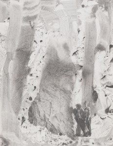
Back to the Cave
Dorothy Spears writes on mountains and caves in the work of Mark Tansey, exploring themes of perception and process.
Winter 2025 Issue
The artist speaks with the Quarterly’s Alison McDonald about his painting Triumph of the New York School, from 1984.
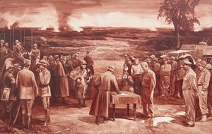
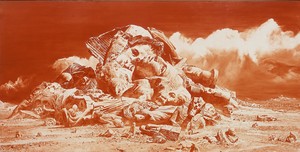
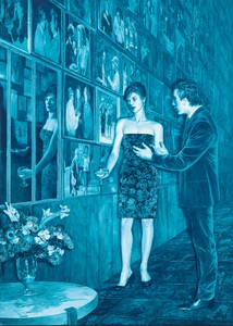
Mark Tansey, Study for “Triumph of the New York School,” 1984, oil on canvas, 42 × 66 inches (106.7 × 167.6 cm) © Mark Tansey
Mark Tansey, Study for “Triumph of the New York School,” 1984, oil on canvas, 42 × 66 inches (106.7 × 167.6 cm) © Mark Tansey
Alison McDonaldI was recently able to spend time again with Mark Tansey: Visions and Revisions, the book Arthur Danto wrote on your work in 1992. He was so brilliant, and the way he looked at art was so enlightening from a philosophical perspective. It’s a great book, bringing a philosopher’s knowledge and expertise to your work, which really benefits from prolonged and insightful readings.
Mark TanseyThank you. Working on that book was a wonderful experience and even today it’s still a helpful tool. I wrote a commentary in the back, which includes important points that are still relevant and that I refer to a lot.
AMLet’s discuss a pivotal work from 1984, Triumph of the New York School, a fascinating painting in the collection of New York’s Whitney Museum of American Art. Perhaps you can share a bit about your perception of the art world in New York back then—over forty years ago now—as a way to contextualize how the work you were making stood out against the scene. What were you seeing in galleries? What motivated you to make a picture like this? It doesn’t really look like anything else that was being made at that moment.
MTWell, in 1984 I was working as an art handler at the Whitney during the day and attending night classes at Hunter College, where I was studying with Robert Morris, Ron Gorchov, and Rosalind Krauss. During my time at Hunter I was introduced to the notion of the Greenbergian avant-garde. I was interested in understanding the avant-garde pressure toward formalist work, and the critique of representation, yet I was a representational artist by choice, and I’d decided that I would use representation to critique the critiques that were persistent around representational art. The critique of representation was articulated most clearly by Clement Greenberg and by the avant-garde he defined, which put up prescriptions and prohibitions. Which is why I took that on. Representational art can speak for itself, and I wanted to do what I could.
AMThe painting brings together artists from the School of Paris and artists from the New York School. In the early decades of the twentieth century Paris was the center of the art world, up until the 1940s, when World War II created endless upheaval and turmoil in Europe. Then, in the 1940s and ’50s, the New York School became more central, and made the embrace of “pure” abstraction a central focus. What was the impetus for you to bring these two groups of painters together in this scene?
MTThe wonderful contradiction and clash between art history and history. In history we fought on the side of the French against Germany. Art-historically, after World War II, Greenberg was talking about the New York School as the American avant-garde displacing the School of Paris. It was an almost comical contradiction between art history and history. And then Irving Sandler talked about the abandonment of American realist traditions in his book The Triumph of American Painting [1970].
AMYou chose to depict these painters on a battlefield. The ground is still smoking, the treaty is not yet signed. It’s a pivotal moment.
MTYes, it’s an ongoing battle. It’s complex. In the ’80s, when I made the painting, there were several competing avant-gardes—Minimalism, Color Field, and Conceptual art, for instance, with structuralism, semiology, and criticism wanting to replace art practice with critical practice. These amazing conflicts, an ongoing battlefield.
When you bring in a painting from another time and culture, it becomes a metaphor, and it’s repeatable over and over again in different ways and adaptable to different situations.
Mark Tansey
AMThe School of Paris artists are wearing French uniforms from an earlier era, World War I; the New York School artists are wearing American uniforms from World War II. You have a tank on the American side; on the French side you included cavalry, men on horseback carrying lances. It’s quite a clear organization of facts that you’ve layered together to reinforce a narrative.
MTThen and now. There’s the past, the old avant-garde, and the idea of a “forever modern” having triumphed. Yet at the moment I was making the painting, that too had passed. The function of Triumph of the New York School is to historicize the modern.
AMIt seems to me that you were thinking about World War II and the devastation that brought an end to that “forever modern” moment. Especially since so many artists had to flee Europe and quite a few made their way to America. Was the military theme a critical part of the composition from the very beginning? Or was it a device you encountered in a later stage of putting the composition together? How central was it?
MTIt was part of the original metaphor that I chose to work with, and that metaphor, the military, kept opening up again and again. Then the interaction between the historical and the art historical started developing into this parody, this arguing among opposites and changes. It was the interaction that interested me, the interlacing of these opposites.
AMHow did you prepare for the composition? Did it begin with sketching, drawing, or collaging? How long did it take to prepare? In the ’80s, were you using a photocopier to make your collages?
MTYes, I was making collages with a photocopier, and the ideas would evolve during the process of creation. The changes were unpredictable, and that was the freedom of it. As the composition gradually took shape, the oppositions and contradictions emerged in a rhythmic way, an almost vaudeville-like rhythm that started taking its own course. After I had the collage on paper, I could project it onto a small canvas. Painting the study was a reversal, a performative process that explored what a final painting might be. For instance, the color could change. In fact the study is more brown than the final painting, which is an intense red. These kinds of choices were made all along the way.
AMIt sounds like when you painted the study, that’s where the magic happened, because you were discovering things and it was the first time you were seeing it come to life.
MTThat’s right.
AMAnd then the application to the final painting was more deliberate and controlled? Though I’m sure there’s always an element of chance to be embraced.
MTThe final painting was more like copying. The study for Triumph is quite large, almost six feet wide, it’s a size that demands a lot of unknown articulation, which is done by hand. The eye, mind, and hand work together.
AMAnd you went from making the collage as a preparatory tool directly to painting the study? There were no sketches or drawings?
MTFor me, the collage functions as a drawing, because the wonderful thing about the copy machine is you can just make another copy and paint it over. It’s destructible, it’s disposable, you can always make another copy and try again. I still use the copier even now. I prefer it to any other technology, because it’s wonderfully conducive to a physical process.
AMThe scene has strong references to Diego Velázquez’s c. 1635 painting The Surrender of Breda. What was it about that painting that inspired you to incorporate it into this new composition?
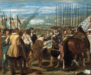
Diego Rodríguez de Silva y Velázquez, The Surrender of Breda, c. 1635, oil on canvas, 121 × 146 ¼ inches (307.3 × 371.5 cm), Museo del Prado, Madrid
MTI particularly admire Velázquez, and Surrender of Breda embodies that whole issue of triumph and surrender. I just mirrored that theme, which stands out as a theme that humanity repeats over and over again with every new war and battle that takes place. So it’s a classical frame, a thematic frame, for so many things. It’s a key picture in that sense.
AMIt really speaks to how history repeats itself, and how we can’t seem to learn from our mistakes.
MTThat’s right, and that’s why I brought it in. It’s a historical frame. It’s true that it’s a metaphor: When you bring in a painting from another time and culture, it becomes a metaphor, and it’s repeatable over and over again in different ways and adaptable to different situations.
AMThe title of the work is Triumph of the New York School, which recalls Leni Riefenstahl’s Nazi-propaganda film Triumph of the Will [1935] and, as you mentioned earlier, Irving Sandler’s book The Triumph of American Painting. At what point did you decide to give it that title?
MTWell, I was reading Greenberg’s Art and Culture [1961] and his prescriptions and prohibitions for the notions of the avant-garde and the purity of concerns. That title just seemed so apt. It mainly comes from him and his very militaristic notion of the hierarchy of the avant-garde.
AMYour pictures slowly reveal themselves to a dedicated viewer, someone spending a lot of time with the picture, understanding who the figures are, and questioning what they’re seeing. Would you agree that your works include clues within the picture that allow the viewer to make layers of connections?
MTWell, it’s a matter of seeing, and it’s the opposite of the modernist, purist, reductionist kind of painting where you see it all at once. It’s something that unravels as you go through the various levels, metaphors, historical details, textures, and stylistic structures. A picture starts making sense or contradicting itself on all levels, and that’s all part of the experience of finding out what it’s about.
AMIn the center of the picture you depicted a photojournalist documenting the scene. I know in your works there’s often someone looking back at the viewer, or there are multiple layers of perspective. Is there something in that figure that’s different from the other figures in the painting?
MTIt’s an offshoot of the idea that art of that modernist period is self-reflective, self-analyzing. The photographer is taking a picture of the viewer viewing the painting. In a sense he’s reframing the whole picture. There’s also a humor that goes with that kind of reversal.
AMFrom the inside out. And of course there’s the monochromatic color. It recalls sepia-tone photographic imagery, which I don’t think is exactly what you’re trying to depict, but it did make me think about fact and fiction. And I was wondering if there’s anything in the picture that resonates for you in terms of fact versus fiction, and realistic documentation?
MTThe whole picture is a language. I’m using the idea of painting as plausible representation—plausible on different levels, not in absolute terms by any means, to test the limits of those contradictions.
AMAt its core this is a representational picture celebrating an art-historical moment when pure abstraction took hold. There’s an element of humor in that.
MTThat’s right. It’s representation historicizing the modern moment of anti-representation, the critique of representation, the insistence on doing away with subject matter, as Greenberg proposed.
AMBut by the time you were making this, the treaty was already old news, because representational art was continuing to have a real presence—in this very painting, among others.
MTYeah, realism expanded in many unpredictable ways in my generation, especially in the ’80s. And today, we’re going through another kind of revolution, culturally, technologically. You can’t predict what the future holds or what representation will mean in that context.
AMThis painting is also about power, and about the people who have historically held roles of power and influence. There are no women or people of color anywhere in sight.
MTThis parody was directed toward those who were critiquing representation. I wouldn’t direct this critique at people of color or at women. It was directed at the hierarchy that was pushing for a certain kind of modernism at the exclusion of everything else. At one point I thought about including Helen Frankenthaler—I was once her studio assistant—but it didn’t feel like a fair critique.
AMThat’s an important point in the painting, that it’s a critique of power. Those figures of power happen to be within a male-dominated art history, but it’s really about men on a battlefield, fighting over something that twenty years later will be meaningless because another battle will have been fought and something else will be dominating.
MTThat’s right.
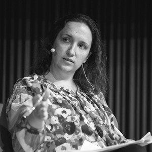
Alison McDonald is the chief creative officer at Gagosian and has overseen marketing and publications at the gallery since 2002. During her tenure she has worked closely with Larry Gagosian to shape every aspect of the gallery’s extensive publishing program.
Mark Tansey was born in San Jose, California, and received his BA in 1972 from the Art Center College of Design, Los Angeles. He completed his graduate studies in painting at Hunter College, New York, in 1978. Tansey’s work has been the subject of numerous museum exhibitions. He currently lives and works in Portsmouth, Rhode Island, and New York. Photo: DPA Picture Alliance Archive/Alamy Stock Photo
Dorothy Spears writes on mountains and caves in the work of Mark Tansey, exploring themes of perception and process.
A 1994 exhibition hosted by Mark Tansey in his New York apartment foregrounded a dynamic approach to realism taking shape on the margins of an art world preoccupied with conceptualism. On display were works by four Chinese artists—Chen Danqing, Ni Jun, Yu Hong, and Liu Xiaodong.
The exhibition Figurative Diaspora, cocurated by Mark Tansey and Peter Drake, presented paintings by five Chinese artists alongside work by six Russian artists, all of whom create “unofficial,” subversive, non-state-sanctioned art, thus tracing the influences of art across borders.
Curated by Mark Tansey and Peter Drake of the New York Academy of Art, Figurative Diaspora presents works of “unofficial art”—subversive, non-state sanctioned art—created by five Soviet artists and five contemporary Chinese artists.
Alexander Wolf guides us through a multilayered new painting by the celebrated artist.
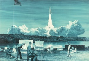
Ahead of Alex Israel’s exhibition of four new Fin sculptures at Gagosian, London, the artist spoke with Susan Casey, author of The Wave: In Pursuit of the Rogues, Freaks, and Giants of the Ocean (2010), about the ocean, surfing, and Los Angeles.

On April 16, the Institute of Contemporary Art, Boston, opened the first midcareer survey of Derrick Adams’s multidisciplinary practice. Covering over twenty years of work, the exhibition, titled View Master, brings together the artist’s painting, sculpture, collage, performance, and video, as well as a vibrant new commission created for the museum’s façade. Ahead of the opening, Adams met with Tessa Bachi Haas, cocurator of the survey, to discuss his formative experiences with television, the impact of his work in arts education on his practice, and the importance of taking a more complex, more joyful, and more expansive approach to Black American life and culture.

Jeff Koons tells Alison McDonald about his appreciation for the pioneering artist and thinker Marcel Duchamp.

The Singular Experience at Gagosian’s Le Bourget gallery is the largest exhibition of Walter De Maria’s work in France in several decades. Organized by Donna De Salvo, senior adjunct curator at Dia Art Foundation, the exhibition marks the first time De Maria’s final sculpture, Truck Trilogy (2011–17), is being shown outside of the United States. Here, De Salvo speaks with artist Lucy Raven about her evolving kinship with De Maria and more.

Ed Ruscha sits down with the author and explorer Erling Kagge to discuss existence.
Following the debut of her Fall/Winter 2026 collection at Dia Chelsea, New York, Ulla Johnson met with Sarah Godfrey to discuss her recent collaborations with the Helen Frankenthaler and Lee Krasner foundations, her upbringing in and dedication to New York City, and her nonhierarchical approach to collecting.
Andrew Durbin’s dual biography, The Wonderful World That Almost Was: A Life of Peter Hujar and Paul Thek, published by Farrar, Straus and Giroux, tracks the convergences and divergences in the lives of the two artists, from their first meeting in Coral Cables, Florida, in 1956 through their generative romantic and creative partnership in New York, Italy, Fire Island, and beyond. Ahead of the release, Durbin met with the Quarterly’s Wyatt Allgeier to speak about the development of the project, the sublime noncompliance of these two artists, and the motifs of love, death, and rebirth that weave through the telling of their story.