Rare-book specialist Douglas Flamm and curator Michael Cary sit down to discuss the varied publishing projects and passions of Yves Klein.
Yves Klein, Triptyque de Krefeld, 1961 (detail), gold leaf on cardboard, 12 ⅝ × 9 inches (32 x 23 cm)
Yves Klein, Triptyque de Krefeld, 1961 (detail), gold leaf on cardboard, 12 ⅝ × 9 inches (32 x 23 cm)
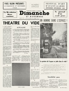
Douglas Flamm Maybe we can begin with Dimanche—Le journal d’un seul jour, from November 27, 1960. It really encapsulates a lot of the ideas that Yves Klein was seeking to express in the other publications we’re going to discuss. I think there are two things that come to mind immediately with Klein: one is the color blue, and the other is—
Michael CaryLeap into the Void.
DF Exactly. The Dimanche broadsheet is the first time the Leap into the Void image is published. And it’s right there, directly on the front cover.
MC Interestingly, while the monochromes are a series of very similar works, this is not, right? He didn’t make more photographs of this kind.
DF Correct. There are the photos that were made to create this image, since it is in truth a montage, but this isn’t part of a series. The final image, the one published in Dimanche, shows Klein leaping into space, and it looks like he’s soaring into flight. But it was two images combined. In the unmontaged image, friends of his are standing below him to catch him with a tarpaulin. The street was photographed on its own, without those friends, and then combined into a straightforward montage under the headline “Un homme dans l’espace” (A man in space), with a subtitle exclaiming “Le peintre de l’espace se jette dans le vide!” (The painter of space leaps into the void!). Klein hired the photographers Harry Shunk and János Kender to both create and, in turn, document this event. So in this one image Klein asks the viewer to think through space, images, the concept of the void, sky, and more. I’ve always seen this as sort of a case in point of Klein as an artist who uses photography, rather than being a photographer. I mean, he has no interest in simply documenting something, but he’s really interested in creating an image, and he just happened to use photography in this case. I guess more specifically Shunk and Kender created the photograph but under the direction of Klein.
Yves Klein, Dimanche—Le journal d’un seul jour, November 27, 1960, newsprint, 22 × 15 inches (56 × 38 cm)
Yves Klein, Dimanche—Le journal d’un seul jour, November 27, 1960, newsprint, 22 × 15 inches (56 × 38 cm)
MC And it’s a powerful, challenging image. It’s also available for a political reading: by 1960 I imagine most of the world was aware of Stalin erasing contemporaries out of photographs. There’s a history of altering photographs for propaganda purposes.
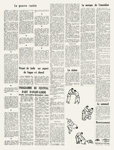
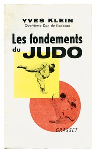
DF Yes, of course. And Dimanche is a full broadsheet, so he goes on and writes all the articles throughout. On the last page there’s an article on judo, which comes back full circle to his first publication, Les fondements du judo (The foundations of judo), from 1954. I think the notion of ephemera as something beyond just sort of collectible paper work continues through Klein’s work from beginning to end.
MC Did Klein publicize that he was going to publish the paper and distribute it around Paris?
DF Well, Dimanche was really just a part of his Theâtre du vide performance. It was essential to him that the broadsheet be available to the general public at newsstands that morning, along with the other daily papers, but the project was also announced at a press conference at 11 a.m. at the Galerie Rive Droite. That’s how collectors and gallery-goers, people interested in contemporary art at the time, would have known about it.
Yves Klein, Les fondements du judo (Paris: Éditions Grasset, 1954)
MC I find it fascinating that the front page of the newspaper also illustrates a Klein monochrome. Of course it’s reproduced in black and white with benday dots—a strange way to reproduce a monochrome, to say the least.
DF It’s true! When you think about the whole creation of his International Klein Blue—this search for the perfect vehicle to carry the pigment in the most pure and true sense—and then compare it to the reproduction, it does get strange.
MC However strange, we can be sure it was done in complete seriousness. Everything I've ever read about Klein indicates that he was extraordinarily earnest about everything he did. He took things very, very seriously, beginning with judo: the studying, the practicing, the going to study in Japan at the source—he did not take it lightly. It wasn’t a hobby, it was this intense discipline and genuine engagement with ideas, with physicality, with materials.
DF When the reviews came out after the 1961 show at the Museum Haus Lange in Krefeld, the German and US press wrote him off as a prankster, so it doesn’t seem like they were taking his work all that seriously. I have a sense that that probably really affected him, because come 1962, he wound up in New York at the Chelsea Hotel, in a dark time for him. It’s where he wrote the Chelsea Hotel Manifesto. I don’t know the causal relationship between these things, but it does make me think he absolutely did not want to be considered a prankster.
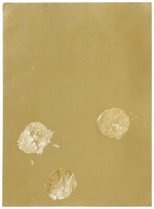
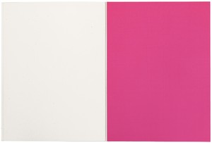
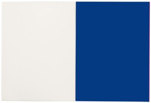
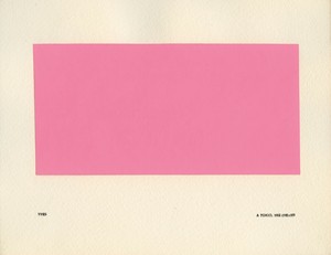
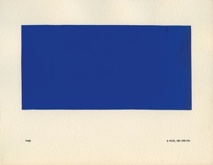
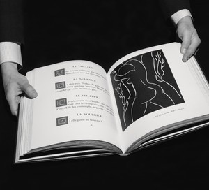
Speaking of the Krefeld exhibition, another crucial part of Klein’s work was the use and concept of fire. That show, Yves Klein: Monochrome und Feuer (Monochrome and fire), was critically important in that regard: he really expanded on the use of fire by including a “fire wall” and two “fire fountains” outside the museum. The “fire fountains” were two shooting flames that were triggered at certain times along with the “fire wall,” which was created by constructing a grid of fifty Bunsen burners. The catalogue for the show investigated fire in another way, through the inclusion of a triptych of monochrome blue, pink, and gold sheets.
Yves Klein, pages from Triptyque de Krefeld, 1961, pigment on paper, 12 ⅝ × 9 inches (32 x 23 cm)
Yves Klein, pages from Triptyque de Krefeld, 1961, pigment on paper, 12 ⅝ × 9 inches (32 x 23 cm)
MC Yes, those colors are the levels of flame—blue base, pink center, golden tips.
DF Exactly. It’s a very slender catalogue—not much of a reference book—but the beauty of it is those sheets. The pink and the blue are silk screens, and then the gold is a foil with a gold-leaf appliqué added by Klein himself.
MC So that’s funny, because that seems like the exact opposite of making his ephemeral newspaper. You know, if you want a catalogue to document an exhibition, you want it to last. A special edition is precious, and with a gold-leaf insert it’s even more so. And this is the opposite of Dimanche, a broadsheet available on newsstands. But you can tell Dimanche involved a lot of work—setting up photo shoots, writing over fifteen articles, printing, distributing—so strangely enough, there’s a lot more work put into something that could possibly be discarded in the waste bin than for an exhibition catalogue that’s boiled down to three leafs and a minimal amount of text. What other books did Klein publish?
DF Well, there’s the famous exhibition catalogue called Yves Peintures, from 1954. I think that’s definitely a shining moment in terms of the books that he published himself. Yves Peintures was a conceptual exhibition, insofar as it both never took place and included paintings that didn’t exist. But Klein created a catalogue as if real paintings were being shown in a real space. He gave dimensions for those works, though in the loosest possible way, leaving open the question of whether they were in centimeters or meters. And supposedly that book was published in an edition of 150 copies, though some people have said that maybe only ten were actually made. The only copy I’ve ever seen is in the Bibliothèque nationale in Paris. There’s been a recent facsimile, but as twentieth-century artist’s books go, it’s quite rare and high on the altarpiece for artist’s-book collectors.
Yves Klein, Yves Peintures, 1954, printed paper boards and glued papers, 7 ½ × 9 ⅝ inches (19 × 24.5 cm)
Yves Klein, Yves Peintures, 1954, printed paper boards and glued papers, 7 ½ × 9 ⅝ inches (19 × 24.5 cm)
MC Is it the rarity of the book that makes it so elevated? Or is there something about how the book was made, the printing or the binding?
DF Well, it was exquisitely made, with high-quality paper stock and precise printing, but the most intriguing thing is the conceptual underpinning. An imaginary exhibition of imaginary paintings: in today’s world I don’t think anyone would get out of bed for it, but in 1954 it paved a lot of ground.
MC So in 1954, he’s already thinking about books as a vehicle and as a medium. The idea taking precedence over the thing is already front and center. In fact, this was one of the first artworks he made—one of his early artworks is a false exhibition catalogue, the exhibition catalogue as work of art. And then he makes a false newspaper, and the false newspaper is part of a performative work of art. It’s not reporting on works of art, it’s not recording, it is the work of art.
DF Right. Performance is a large part of Klein. Think of the Anthropométries paintings, for which he directed what he called “living brushes.”
MC Even his 1958 exhibition at Iris Clert in Paris, Le Vide (The void)—empty gallery, white walls—but it wasn’t just an empty gallery or white walls, it was the 2,000 people who showed up, all crammed into the space. Perhaps that performative impulse, that physicality, can be traced back to one of his first loves, which is judo.
DF Well, the same year Yves Peintures was published in Spain, he published Les fondements du judo in Paris. The interesting back story on that book is that he was frustrated because the French judo academy wouldn’t let him in, so he went to Tokyo to study from the source. He goes to Tokyo and receives a fourth-degree black belt, which is the highest degree a Westerner could achieve. And I think when he came back to Paris, he wanted to assert himself with the fondements book.
MC Yes, the idea of teaching judo was important to him. He thought he would come back to France and have a career as the greatest living judo teacher in Europe, right? He would be hailed and lead the judokas of Europe into glory. And in fact he was completely rejected.
DF Despite that rejection, he continued. I think from judo he learned this fighting spirit that’s seen continually in his work—this spearhead desire to take an idea and realize it, regardless of the hurdles he’d have to overcome. That sense of discipline and structure is evident throughout his work.