Artists’ Magazines
Gwen Allen recounts her discovery of cutting-edge artists’ magazines from the 1960s and 1970s and explores the roots and implications of these singular publications.
Spring 2021 Issue
A conversation between Adam McEwen and Bob Monk.
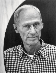
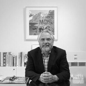
Richard Artschwager, New York, 1991. Photo: Chris Felver/Getty Images
Richard Artschwager, New York, 1991. Photo: Chris Felver/Getty Images
bob monk In 1983, Richard was around the age you are now, in the mid-fifties-to-sixtyish range. I started looking at some of his work from that year; it was an interesting time for him, just as I think it’s an interesting time for you.
adam mcewen Yes. He is unusual in that he started late, but he really kept digging and finding new seams for such a long time and to such an unusually extended degree. It gives one hope.
bm As you mentioned the other day, it was in that period in the early 1980s that he made Tower III (Confessional) [1980]; that remains one of my favorite sculptures. It’s this beautiful structure like a Catholic confessional, but instead of the red-leather part on which you would kneel in a church, it’s red Formica with this beautiful wood latticework. By that point, in the early and mid-1980s, he was reinventing the whole meaning of what he was after.
amce Yeah—I don’t know exactly when I first saw that, but I very clearly remember seeing the show at the Saatchi Collection in London in 1991. It really stuck in my mind, that particular piece—maybe because I was brought up Catholic and it was very easy for me to relate to it, but it just seems, as a sculpture, directly to the point. And yet it’s also extremely personal for him, clearly. It’s that kind of sweet spot he finds.
It’s funny that he depicts an object that’s made of wood in real life—and maybe leather or velvet, as you say—but he decides to make only the soft parts in Formica. By that point he’d made many representations of wooden objects using Formica to mimic wood. So it’s clever that, with that piece, he decides he doesn’t need to use Formica for the wood. He keeps the real wood.
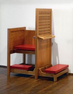
Richard Artschwager, Tower III (Confessional), 1980, Formica and oak, 60 × 47 × 32 inches (152.4 × 112.4 × 81.3 cm). Photo: Glenn Steigelman; Leo Castelli Gallery records, Archives of American Art, Smithsonian Institution
bm He used his brilliant woodworking skills, which was how he supported his family before he began to exhibit his art. In a profound way, once you really start thinking about it, this sculpture riffs on Minimalism. Yet that personal aspect of a tower confessional really brings you back to the object.
amce There’s a strange, maybe not humor, but a sort of wry questioning: he doesn’t make an object that aspires to meaning, or to being art with a capital A. Which, in the end, a lot of Minimalism does. I think Minimalist works are often simply objects, but there’s this caveat that they are going to cleanse you in some heightened way.
That little block of Formica that has a chopped corner, revealing a flat pale color of the material [Corner, 1967, affectionately known as Corner Alveryd], is a plain art object that looks like Minimalism and yet takes a 180-degree turn. Although it looks like a sculpture, it absorbs everything about what a sculpture is meant to be and then questions it in this very calm, low-key way, which is, I find, not what Minimalism tends to do. And you get the same sense with the confessional. It asks, Where does he really stand on the import of this object? And the fact that he doesn’t answer the question means that you’re able to be sent somewhere else. It’s great because it means that it’s constantly walking ahead of you or sending you on. An amazing quality—it’s a slow burn.
Richard Artschwager, Corner, 1967, Formica on wood, 4 ⅜ × 12 ⅝ × 14 ⅞ inches (11 × 32 × 38 cm)
bm I think even before the Pictures generation, Richard was looking for a way out of that whole Minimalist stricture and was so interested in so many different things that he put them all together. His work is unique because of the way it fits into the art field but questions it at the same time.
amce His work seems to fit so easily, again and again, into these pigeonholes. People tried to typecast it as a Pop art thing or a Minimalism thing, but it’s always sliding out. It’s never really quite what you think it is. I think he writes somewhere that it’s the kiss of death for an artist to be “school of” anything, and it’s amazing how nimble he is at avoiding that. That means there’s always this cloud of mystery following the work, and that gives it legs for me. It’s crazy how those early Celotex paintings make you think of Gerhard Richter, and then there’s the kind of classic Minimal pieces that seem to be in the same land as Donald Judd. But actually he’s always sidestepping what you want to push on him.
bm The other day, you and I were discussing the painting Tract Home [1964], which we both said we were really attracted to.
amce Yes, it’s great.
bm It’s painted from an advertisement for one of those homes that GIs could buy for like $12,000. In the ad it looked like an idyllic cottage, but I’m sure this was a totally prefabricated kind of dream. Then he made out of it this beautiful painting with a giant Formica frame. Different people see it in different ways, which I think is one of the things every artist wishes for. Of course many of Richard’s objects, in painting especially, come from images in the New York Times, which he read every day.
amce I think it’s very different from Pop art: he’s not pointing to the ordinary and reveling in its banality. It’s more that he takes the ordinary and peels away a layer from around it, and thereby releases the ordinary. So the ordinary becomes something much more loaded than you were able to sense at first sight.
He said he liked Giorgio Morandi for showing him that everything is important, nothing is unimportant. I think basically all artists relate to that, because you walk around and you look at stuff and you see, if you’re lucky, a kind of meaning in anything. So when Artschwager makes a sculpture of a table, it’s very different from Roy Lichtenstein, for instance. He shows you that a table is kind of levitating, you know—it’s miraculous, and once you start looking at the world like that, then everything is amazing.
The other thing about Tract Home is the frame you mentioned. I think we should talk about frames—how Artschwager deals with frames is genius and revealing.
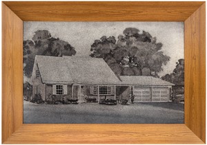
Richard Artschwager, Tract Home, 1964, acrylic on Celotex, in Formica and wood artist’s frame, 48 ¼ × 68 ½ × 5 ½ inches (122.6 × 174 × 14 cm)
bm It is, from those beautiful big heavy frames to the really thin aluminum frames that shine and, as you look at the painting, have a movement to their reflections. They’re really activated, his frames, whether visually or if they do something to the world around the painting, or bring the world into the painting.
amce That’s right. Those Celotex paintings with those shiny metal frames around them—they negotiate the boundary between the work and the world.
bm They’re not passive. With the whole second generation of AbEx, there was no frame and you hung it on the wall and you know, had Frank Stella’s “It is what it is” kind of thing. By making these incredible frames as part of the work, Artschwager was moving on to something new. He wasn’t going to paint on Celotex, which is a commercial fiberboard, and just hang it on the wall like you would a Helen Frankenthaler painting.
And then when he got older, he began to work again with woodwork frames. He started painting his frames with some of the most beautiful colors, and he’d really revel in mixing the color. His romance with frames lasted his entire career.
amce I think it’s the same thing as questioning what an object is, or even what “ordinary” is. There are also frames that are painted quite loosely by hand to look like wood grain.
bm That was an incredible body of work, right before the crates.
amce I think the wood grain is like another tool. It makes me think of late René Magritte, when he knows he can do this style of painting that only needs to be good enough. Obviously there’s very tight Magritte, but it’s like this dry humor about virtuosity. It’s both being funny about genius and being generous, because it allows the viewer in. It’s very welcoming; it wants the viewer to be able to participate.
he takes the ordinary and peels away a layer from around it, and thereby releases the ordinary. So the ordinary becomes something much more loaded than you were able to sense at first sight.
Adam McEwen
bm What are you thinking about right now as far as the work that you’re making?
amce I don’t find it an inspiring time. But the ground is so fluid, and in that sense it’s a really incredible time to be alive. Things are shifting so deeply—not just the lockdown but a cultural shift, the way America’s looking at itself and the kind of agony that entails.
But to think one could say something about that feels to me, at this point, ludicrous. So I’m just trying to work out how you speak in a time like this: what you want to say, not to the world, but really to yourself. And you look at Richard’s work and you really get the sense that he’s making art for himself. He’s trying to work out where he’s coming from, his German background and his New Mexico desert background. And it’s quite humble and honest in that sense. He’s really not sure of anything except that this is what he’s got. A sculpture like the confessional, or a painting of a Southwestern landscape—it’s from his childhood.
So I feel like that’s what I’m trying to work out. I think it’s more important than ever at the moment. And it’s not easy, at least not for me.
bm No, I can imagine. Did you ever meet Richard?
amce Yeah, I did. I met him quite a few times in the last few years before he passed away. I didn’t know him well, but he always seemed very open and amused.
bm Yeah, that was Richard at the end. He was a delight. And we at the gallery all appreciated working with him, installing exhibitions. He was really brilliant. The other thing about him was that he had this whole musical background.
amce Yeah, he played piano, didn’t he?
bm He was actually quite good and never showed off. I think it’s interesting because his art, in a funny way, is so radical and his piano playing was so classical. I don’t like using the word “genius,” but I always thought he was such a multitalented artist and person, and I always appreciated that about him.
As you said, he was very modest and he did the work for himself. As Dieter Schwarz has written, the whole idea was just to look at things and experience them and not have to have the caption or the explanation for everything one sees in this specialized art world. He wanted people to experience the joy of looking, I would say.
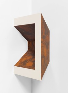
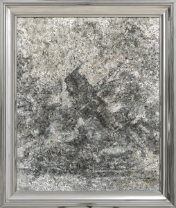
Richard Artschwager, Untitled, 1967/1984, Formica on wood, 26 ⅞ × 19 ¾ × 10 ¾ inches (68.2 × 50.3 × 27.3 cm)
amce I think he says somewhere that art is not an object, it’s an event. It’s the transaction or the translation that goes back and forth between the viewer and the work. I don’t mean in a kind of poststructuralist way, but rather, every time it happens with good artworks, an engine starts and a motor runs.
A lot of that process includes language, to express how you think. And he kind of says, through his work, “Yeah, but the language is really just one part of it. It’s really not that interesting.” He’s so funny about it: he makes a sculpture of a door and there are huge wooden parentheses stuck on the wall around the door, or there’s a doorway with two inverted commas on each side of it. It’s kind of silly, but it’s also deep: he’s amused by the way we function. He’s saying, Language is just a poor cousin to sensation. You can say to that poor little cousin, Come in, you’re part of the party and we love you and here you are. But actually what’s going on is much bigger than that. And I used to not like those exclamation points of his because I was like, well, this seems so literal. Then, over the years, I’ve found that I admire works like that more and more, because they’re doing something ambitious but in a deadpan way.
I find he gets more interesting to me over time and I wasn’t really expecting that. And other art that I was expecting to be on the mountain of Parnassus—expecting that I’d always look up at it—I’m actually beginning to think it’s less interesting, which is not a feeling I want. You want your heroes of artworks to be there forever, but not that many are. With Richard, it’s amazing, because this stuff is still going and it continues to be weird, which is a big compliment.
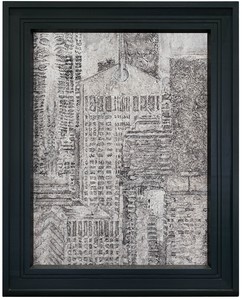
Richard Artschwager, AT&T Building in the Year 2000, 1978, acrylic on Celotex, in painted wood artist’s frame, 54 ⅝ × 43 ¾ inches (138.7 × 111 cm)
bm There’s a very famous Artschwager painting of the interior of Frank Lloyd Wright’s Johnson Wax building where you see all those beautiful architectural details, and the grisaille Celotex makes you appreciate that building more than anything else I’ve ever seen. The way Artschwager renders it is neutral, but there are all those beautiful lily-shaped columns—
amce The Celotex has that effect—it’s like a vortex, and anything you place in it is seen under a completely different set of rules. Whether it’s a tract house, which is very still and ordinary, or a big building being blown up, which is much more Warholian, it doesn’t really matter. Somehow he managed to make a context and then he could put anything he wanted into that context. That’s enviable, I think, to have found that little machine that’s his, that he can then just put things inside.
bm I agree. You know that toward the end of his life, he received a letter from the Celotex company saying “Dear Mr. Artschwager, we have really great news. Through our research, we are now able to make Celotex panels with no texture.” Celotex was used in homes as a fire retardant; at one point people liked the pattern and texture. It was like the beautiful tin ceilings on the Lower East Side. But then people outgrew that completely.
So Artschwager began to make his own supports, with sugarcane bagasse, water, and cotton fibers. He used the same materials the Celotex company was using, but because he was doing it in the studio with an assistant, using a screen with water and stuff, you would actually see the filaments of the sugar cane. It became a funny struggle for him because there was no more Celotex, except for scraps he had around in the studio.
amce It worked all the better for Richard, the ugly materials. He found ways for those materials to open doors so that you can get somewhere else. You suddenly forget about the ugliness. Formica, or Celotex, or rubberized horsehair—these materials initially trigger a feeling of disgust, and then amazement. He gets you in an uncomfortable place in order to then do something else to you.
Artwork © 2021 The Estate of Richard Artschwager/Artists Rights Society (ARS), New York
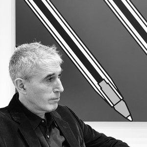
Adam McEwen was born in 1965 in London, England. He received his BA in 1987 from Christ Church, Oxford, and then received his BFA in 1991 from the California Institute of the Arts, Valencia. His multifarious practice includes obituaries of living subjects such as Bill Clinton, Greta Thunberg, and Grace Jones, alongside sculptures in various media and paintings on canvas and sponge. McEwen currently lives and works in New York City. Photo: Andisheh Avini
Bob Monk was a director at Gagosian, New York, for over twenty years, working closely with Ed Ruscha and Richard Artschwager. He curated numerous Gagosian exhibitions, including the multivenue Ed Ruscha: Books & Co., and worked with the Whitney Museum of American Art, New York, on the production of the artwork it commissioned from Artschwager for the museum’s elevator interiors.
Gwen Allen recounts her discovery of cutting-edge artists’ magazines from the 1960s and 1970s and explores the roots and implications of these singular publications.
On the occasion of the exhibition Richard Artschwager: Primary Sources, recently on view at Gagosian, New York, Bob Monk and Maggie Dougherty explore the artist’s use of reference materials as the impetus for his paintings.
The Spring 2019 issue of Gagosian Quarterly is now available, featuring Red Pot with Lute Player #2 by Jonas Wood on its cover.

Ahead of Alex Israel’s exhibition of four new Fin sculptures at Gagosian, London, the artist spoke with Susan Casey, author of The Wave: In Pursuit of the Rogues, Freaks, and Giants of the Ocean (2010), about the ocean, surfing, and Los Angeles.

On April 16, the Institute of Contemporary Art, Boston, opened the first midcareer survey of Derrick Adams’s multidisciplinary practice. Covering over twenty years of work, the exhibition, titled View Master, brings together the artist’s painting, sculpture, collage, performance, and video, as well as a vibrant new commission created for the museum’s façade. Ahead of the opening, Adams met with Tessa Bachi Haas, cocurator of the survey, to discuss his formative experiences with television, the impact of his work in arts education on his practice, and the importance of taking a more complex, more joyful, and more expansive approach to Black American life and culture.

Jeff Koons tells Alison McDonald about his appreciation for the pioneering artist and thinker Marcel Duchamp.
The Singular Experience at Gagosian’s Le Bourget gallery is the largest exhibition of Walter De Maria’s work in France in several decades. Organized by Donna De Salvo, senior adjunct curator at Dia Art Foundation, the exhibition marks the first time De Maria’s final sculpture, Truck Trilogy (2011–17), is being shown outside of the United States. Here, De Salvo speaks with artist Lucy Raven about her evolving kinship with De Maria and more.

Ed Ruscha sits down with the author and explorer Erling Kagge to discuss existence.
Following the debut of her Fall/Winter 2026 collection at Dia Chelsea, New York, Ulla Johnson met with Sarah Godfrey to discuss her recent collaborations with the Helen Frankenthaler and Lee Krasner foundations, her upbringing in and dedication to New York City, and her nonhierarchical approach to collecting.

Andrew Durbin’s dual biography, The Wonderful World That Almost Was: A Life of Peter Hujar and Paul Thek, published by Farrar, Straus and Giroux, tracks the convergences and divergences in the lives of the two artists, from their first meeting in Coral Cables, Florida, in 1956 through their generative romantic and creative partnership in New York, Italy, Fire Island, and beyond. Ahead of the release, Durbin met with the Quarterly’s Wyatt Allgeier to speak about the development of the project, the sublime noncompliance of these two artists, and the motifs of love, death, and rebirth that weave through the telling of their story.

On March 28, a major exhibition of Jenny Saville’s work opened at Ca’ Pesaro–Galleria Internazionale d’Arte Moderna in Venice, bringing together nearly thirty paintings from the 1990s to the present. The exhibition is curated by Elisabetta Barisoni, head of the museums division at Venice’s Ca’ Pesaro, Museo Fortuny, and head of MUVE in Mestre. Saville’s monumental canvases are set in dialogue with the great Venetian artists of the past, creating a unique encounter between contemporary painting and the city’s artistic heritage. Here, the artist speaks with Stefania Ventra, professor with Ca’ Foscari University of Venice, about her early trips to Venice, the radicality of Titian’s painting, and depicting emotional truth.
Daniel Roseberry, the creative director of Schiaparelli, met with the Quarterly’s Derek C. Blasberg at the maison’s historic headquarters at 21 place Vendôme, Paris, following the Schiaparelli Fall/Winter 2026–27 ready-to-wear show. Since taking the helm in 2019, Roseberry has been credited with advancing the heritage of the house through unpredictable sculptural designs that carry Elsa Schiaparelli’s Surrealist spirit into a new century. The pair discuss the much-anticipated exhibition Schiaparelli: Fashion Becomes Art, now on view at the Victoria & Albert Museum, London, as well as Roseberry’s early exposures to art, his continued dedication to drawing, and the enduring legacy of Elsa Schiaparelli’s daring vision.