
In the Studio: Jonas Wood
Eli Diner visits Jonas Wood in his Los Angeles studio as the artist prepares for an exhibition of new paintings in London.
Spring 2026 Issue
Following a recent visit to Jonas Wood’s Los Angeles studio, Justin Beal thinks through the artist’s paintings of tennis courts—the subject of an exhibition at Gagosian, Beverly Hills—examining their relation to the game, color theory, and the rewards of practice.
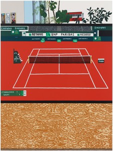
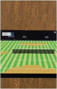
Jonas Wood, French Open with Wood Grain, 2025, oil and acrylic on canvas, 88 × 66 inches (223.5 × 167.6 cm)
Jonas Wood, French Open with Wood Grain, 2025, oil and acrylic on canvas, 88 × 66 inches (223.5 × 167.6 cm)
A tennis match could theoretically go on forever. There is a clock, but the elapsed time has no implication for the match; in theory, two perfectly paired opponents could go in and out of deuce, game after game, forever. As I left Jonas Wood’s studio recently, the thought occurred to me that the same might be true of his series of tennis court paintings, bound as they are by rules and parameters that seem to allow for endless repetition with infinite different results. These rules are clearly important to Wood. So too is the practice, a word so debased by overuse in art discourse that I hesitate to evoke it but for the fact that I do so here in the more literal, more athletic sense: to get the reps in, to get better, to optimize performance in the studio. I will return to this idea of practice later, but first, the rules.
Wood’s tennis court paintings are neither paintings of tennis courts nor paintings of tennis courts on television. They are paintings of images (sometimes straight photographs, sometimes collages) of tennis courts on a television in Wood’s studio and home. In that sense they are more about watching tennis on television, often while painting, than they are about playing or watching tennis in person. The first rule therefore is the frame.
On television, tennis is usually seen through a camera positioned overhead and behind one baseline. In his 2006 New York Times essay “Roger Federer as Religious Experience,” David Foster Wallace describes this specific geometric condition in painterly terms: “You, the viewer, are above and looking down from behind the court,” Wallace explains, and “this perspective, as any art student will tell you, ‘foreshortens’ the court.”1 This forced vantage point, from which the long rectangle of the court appears nearly square in perspective, is Wood’s point of departure. As a result, in many of these tennis court paintings we see a rectangle cut into smaller boxes and alleys by white lines, surrounded by an out-of-bounds, filmed from its shorter end so that it appears squarish, broadcast within the horizontal frame of a television, and more often than not photographed on a vertically oriented iPhone. In other words, each of these paintings begins with a vertical rectangle foreshortened within a horizontal rectangular frame within a vertical rectangular frame. The dimensions of the court and the respective aspect ratios of the screens establish the specific geometry of the series and connect it to the art-historical reference of Josef Albers’s Homage to the Square (c. 1950–76).
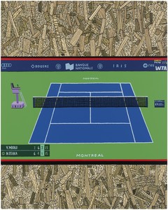
Jonas Wood, Canadian Open, 2025, oil and acrylic on canvas, 50 × 40 inches (127 × 101.6 cm)
Albers had his rules too: Each painting contained three or four concentric squares built with paint applied directly from the tube with a palette knife. The concentric frames of multiple squares functioned for him, as tennis courts and screens do for Wood, as fields on which to experiment with the interactions of color. Tournament-level tennis is particularly conducive to this exercise because of the various surfaces and textures on which it is played. The red-brick clay at the French Open, the neatly trimmed Wimbledon grass, and the blue hard courts of the US and Australian Opens, for example, comprise the Grand Slam quartet that were the subject of Wood’s first tennis court paintings fifteen years ago.
Television broadcasting is largely responsible for the chromatic range that makes contemporary tennis such a fertile ground for experiments in color theory. The International Tennis Federation started using the now ubiquitous yellow ball in 1972, not for the players’ benefit but because this specific shade of yellow, called “optic yellow,” is easier to see on television than the traditional white tennis balls. Following suit, major tournaments saw an opportunity to use colored courts as a means of distinguishing themselves. The (nearly blue) “Pro Purple” surface at the BNP Paribas Open (Indian Wells, 2025), for example, was designed to be the exact spectral opposite of optic yellow. The women’s final in Riyadh (WTA Finals Riyadh, 2025) is played on a brilliant purple court inside charcoal gray. A similar charcoal gray is used for the entire court at the Laver Cup in its various locations, which I particularly like because it reminds me of the final scene of Michelangelo Antonioni’s Blow-Up (1966), in which a troupe of mimes play tennis without a ball. Wood has not painted the Laver Cup court, though, I assume because it is only an exhibition tournament, so that’s another rule. The National Bank Open (Canadian Open, 2025) uses a more traditional blue court surrounded by green, while the Abierto Mexicano Telcel is played on a monochrome field of blue (Mexican Open, 2025). The Erste Bank Open and Swiss Indoors Basel (both of which are painted in this show) use their own shade of blue inside the lines and another slightly lighter one out of bounds. The calendar of international tournaments provides a succession of ready-made exercises in color theory.
In his essay “Green or Yellow,” Nicholas Fox Weber, director of the Josef & Anni Albers Foundation, discusses the color theory of the tennis ball in relation to specific examples of Albers’s Homage to the Square that use a similar shade of acid green inside squares of blue and gray.2 Indeed, the color looks different each time, just as an optic yellow ball likely appears more yellow rising off the blue court at Arthur Ashe in New York and greener against the clay at Roland Garros in Paris. The green or yellow question is not of great relevance to Wood’s tennis court paintings, which do not include balls. That’s a rule. So too are no players, no players’ benches, no umpires, no ball crews. The crowd, if shown, is reduced to an abstraction, the kind of graphic pattern that might appear in a vintage video game, which, incidentally, is also the subject of a painting in this show (Nintendo 3, 2025). The only three-dimensional object on the court, other than the net, is the umpire’s chair, which occurs regularly but not always and which, I suppose, serves as a symbolic reminder of Wood’s rules.
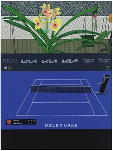
Jonas Wood, Melbourne, 2025, oil and acrylic on canvas, 48 × 36 inches (121.9 × 91.4 cm)
The absence of figures in these paintings shifts the courts from scenes of action to sites of abstraction. Sometimes a scoreboard tells us who is playing and where they are in the match, but for the most part the atmosphere is one of time suspended—no players, no weather, no shadow. Wood talks about removing the athletes from the court in these paintings as a way of emphasizing the flat expanses of color. The erasure reminds me of two other works that grapple with the narrative space of televised sports, Paul Pfeiffer’s ongoing series Four Horsemen of the Apocalypse and Douglas Gordon and Philippe Parreno’s 2006 film Zidane: A 21st Century Portrait, though instead of isolating the solitary figure, Wood turns his focus to the geometric puzzle of the empty field of play.
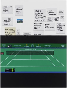
As with much of Wood’s work, the tennis court paintings often include glimpses of the studio in which they were made: Plants and printouts and patterned surfaces fill the space surrounding the screen. In Shanghai Masters (2025), a television monitor shows the first set of a match between Jannik Sinner and Novak Djokovic. On the wall behind the television is a collection of notes and postcards, including ideas, lists of things to do, and motivational messages like “Relax and have fun” or “Finish strong.” Wood is open about his interest in self-help and notes like these can be found throughout the studio. When I first saw them on the wall, I was reminded of a scene in the 2004 documentary Metallica: Some Kind of Monster when the record label brings in a performance coach accustomed to working with professional football players to help James Hetfield and Lars Ulrich work through a period of creative impasse.3 The session does not go well, but the scene forever changed the way I think about creative performance in relationship to sports psychology.
Shanghai Masters also reminds me of Andre Agassi’s autobiography, Open (2009), written in collaboration with Pulitzer Prize–winner J. R. Moehringer. Open rises above the sports-memoir genre in part because of Agassi’s remarkable candor about his struggles with mental health, family dynamics, and self-image.4 In a field crowded with triumphantly self-congratulatory memoirs, Open is a book about how hard being really good at something can be.
Jonas Wood, Shanghai Masters, 2025, oil and acrylic on canvas, 88 × 66 inches (223.5 × 167.6 cm)
Tennis is a good metaphor for the creative process and there happens to be some extraordinary writing on the topic by authors in addition to those already mentioned, including Geoff Dyer, John McPhee, Vladimir Nabokov, Claudia Rankine, and Álvaro Enrigue, whose 2013 book Sudden Death imagines a match between the poet Francisco de Quevedo and Caravaggio.5 In the penultimate chapter of Speak, Memory (1951), Nabokov, an avid tennis player, famously wrote that “the pleasure of writing is not unlike that of playing tennis.” I have always read some irony in the statement, or at least a wry implication of that specific kind of hard-won pleasure that can only be derived from enormous effort. (Other writers, including Wallace and Dyer, who also compares tennis to writing in his 2016 Harper’s article “Tennis Lessons,” are more candid about how frustrating both can be.)
Tennis, like writing or artmaking, is largely an individual enterprise. You need an opponent to play, but it is a cliché in tennis writing that the player’s true adversary is not on the other side of the net. “The true opponent, the enfolding boundary, is the player himself,” Wallace writes in Infinite Jest (1996). “Tennis’s beauty’s infinite roots are self-competitive.”6 All of this is to say that to be good, you must be so disciplined that your play is nearly automatic while you also remain distinctly yourself. It is this tension between discipline and style, for example, that animates the masterful back and forth of McPhee’s book Levels of the Game (1969), about the 1968 US Open match between Clark Graebner and Arthur Ashe. This delivers me to the point that I have been slowly building up to all along, which is that perhaps these paintings are less about tennis than about painting itself.
Jonas Wood, Wimbledon with Wood Grain, 2025, oil and acrylic on canvas, 102 × 66 inches (259.1 × 167.6 cm)
In a conversation published in the 2021 catalogue 24 Tennis Court Drawings, Wood frames his approach to this series in terms of self-improvement: “The way I think about this is, how can I keep practicing something I like, and continue to get better at it?” These empty tennis courts are spaces for Wood to sharpen a style, to refine a discipline, to practice. To find freedom within a set of constraints. This seems to be what is happening in a trio of new paintings in this show. In Paris Olympics with Crying Girl (2025), Dubai with Nude with Blue Hair (2026), and Hamburg Open with Girl (2026), the mise-en-scène of the studio or the flat field of black background has been replaced by rendered details of Roy Lichtenstein prints (Crying Girl (1963), Nude with Blue Hair (1994), and Girl [from the 1¢ Life portfolio, 1963], respectively). There is something different about these paintings: The frame of the television screen has flattened into the plane of the canvas, the depth of the studio has collapsed into two-dimensional space, and the figure has returned in the graphic but undeniably corporeal form of Lichtenstein’s women. These paintings feel like both part of the series and something entirely new.
The final rule is that there are no rules. A careful student of Wood’s tennis court series will find exceptions to nearly all of the rules I have enumerated in this essay—an errant racket or a jumbo ball. The exceptions become a game within the game. The rules exist, nonetheless, to get you to those fleeting moments when they no longer apply, when you are totally loose and free and open. It is the breaks in the rules that allow the series to generate new energy and encounter new possibilities. Wallace concludes his description of tennis’s enfolding boundary in Infinite Jest as follows: “You compete with your own limits to transcend the self in imagination and execution.”7 If someone has written a better single-sentence description of the process of writing or making art, I have never read it.
1 David Foster Wallace, “Roger Federer as Religious Experience,” New York Times, August 20, 2006. The difference between live tennis and televised tennis was a topic of obsession for Wallace, who in the same essay proposed the analogy “that TV tennis is to live tennis pretty much as video porn is to the felt reality of human love.”
2 “Green or Yellow” is included in Nicholas Fox Weber’s book The Art of Tennis (Boston: Godine, 2025), which I found underwhelming for reasons I touch on below.
3 It seems worth mentioning here that there happens to be a line in Wallace’s “Roger Federer as Religious Experience” describing Federer as “Mozart and Metallica at the same time.”
4 Andre Agassi’s relationship to self-image was undoubtedly complicated by the success of his ubiquitous “Image Is Everything” campaign for Canon Rebel cameras, which makes him a particularly interesting case study in the intersection of sports and visual culture.
5 For all the good writing about tennis, there is very little good art about tennis. I am sure some readers will take issue with this statement and I have my own list of exceptions—George Bellows’s languid 1920 painting Tennis Tournament, Roe Ethridge’s 2019 still life Penn and Wet Butt, or Reggie Burrows Hodges’s In the Service of Others series—but in my experience, those works that take tennis as subject inevitably get bogged down in the aesthetics of class and leisure.
6 Wallace, Infinite Jest, 1996 (repr. ed. New York: Back Bay Books, 2006), p. 95.
7 Ibid.
Jonas Wood, Gagosian, Beverly Hills, March 12–April 25, 2026
Artwork © Jonas Wood; photos: Marten Elder
Justin Beal is an artist and writer based in New York. His first book, Sandfuture, was published by the MIT Press in September 2021 and his writing has recently appeared in Harper’s, Frieze, and the New York Review of Architecture.
Eli Diner visits Jonas Wood in his Los Angeles studio as the artist prepares for an exhibition of new paintings in London.
Join Jonas Wood on a virtual tour through the creation of his first solo exhibition in Hong Kong. Wood narrates the genesis and development of the new paintings, drawings, and wallpaper.
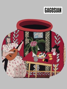
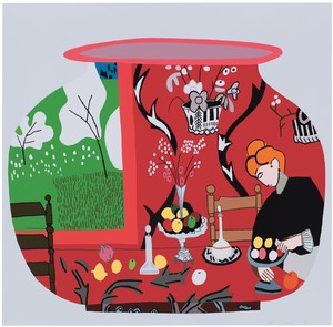
The Spring 2019 issue of Gagosian Quarterly is now available, featuring Red Pot with Lute Player #2 by Jonas Wood on its cover.
On the occasion of Jonas Wood’s first survey of prints, the artist spoke about the development of his printmaking practice and its influence on his paintings with legendary Los Angeles–based printmaker Jacob Samuel.
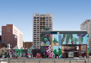
In Los Angeles, the Museum of Contemporary Art’s 5,400-square-foot façade now hosts a vibrant mural by one of the city’s own artists. Meredith Mendelsohn reports on the impact the mural has on revitalizing the museum’s exterior and downtown.
Ahead of Alex Israel’s exhibition of four new Fin sculptures at Gagosian, London, the artist spoke with Susan Casey, author of The Wave: In Pursuit of the Rogues, Freaks, and Giants of the Ocean (2010), about the ocean, surfing, and Los Angeles.
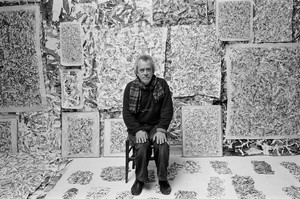
On July 9, Simon Hantaï: the last studio opens at Gagosian, Gstaad. Curated by Anne Baldassari, the show comprises sixteen of the artist’s dernier atelier (last studio) paintings of 1982–85. The exhibition is accompanied by an illustrated catalogue, copublished by Gagosian and Skira, which features an essay by Baldassari and an extensive portfolio of previously unpublished photographs by Édouard Boubat. Here, we share the introductory chapter from the publication.

Adam D. Weinberg has been working with Giuseppe Penone on an exhibition of the artist’s new sculptures, The Reflection of Bronze, that opens at Gagosian, New York, on April 22. The works explore the character and possibilities of bronze. Here, Weinberg considers Penone’s enduring engagement with the alloy and addresses the conceptual underpinnings of the exhibition’s three-room structure.
Laura Bruni writes about a major exhibition celebrating the work of the British sculptor Henry Moore at the Royal Botanic Gardens, Kew, London.
On the occasion of Baselitz: AVANTI! at the Museo Novecento in Florence, Italy, Holly EJ Black considers the roots and reverberations of Georg Baselitz’s printmaking.
Mark Franko considers how Emily Coates resurrects the spirit of George Balanchine’s American beginnings through archival research, spoken dialogue, and movement in her performance Tell Me Where It Comes From.
Carlos Valladares wades through the discourse around the musician and actress Charli XCX’s mockumentary, guiding us through its myriad references, from the Spice Girls to Andy Warhol.