Ed Ruscha and Erling Kagge: Silence, Slowness, Exploration
Ed Ruscha sits down with the author and explorer Erling Kagge to discuss existence.
September 4, 2020
Lisa Turvey examines the range of effects conveyed by the blurred phrases in recent drawings by the artist, detailing the ways these words in motion evoke the experience of the current moment.
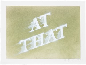
Ed Ruscha, AT THAT, 2020, dry pigment and acrylic on paper, 11 ⅛ × 15 inches (28.3 × 38.1 cm). Photo: Fredrik Nilsen
Ed Ruscha, AT THAT, 2020, dry pigment and acrylic on paper, 11 ⅛ × 15 inches (28.3 × 38.1 cm). Photo: Fredrik Nilsen
“My ‘romance with liquids’ came about because I was looking for some sort of alternative entertainment for myself,” Ed Ruscha said in a 1982 interview, reflecting on his “liquid word” works of the late 1960s.1 Some two dozen paintings and a few drawings, this comparatively small series shows single words as if formed of spilled, poured, or puddled fluids. The liquid words were a turning point for Ruscha, a departure from the bold typefaces of the sign-like canvases that had established him as a primary exponent of West Coast Pop. The irregular contours of their letters signified, he said, “an alternative from the rigid, hard-edge painting of words that had to respect some typographical design. . . . It was my sandbox to play in.”2
The liquid words were also a terminus in at least two ways. They occasioned a yearlong hiatus from painting and—more consequentially—their depiction of words as inexact or disintegrating was a short-lived endeavor. For the next four decades, Ruscha’s drawn, painted, and printed words would “respect some typographical design.” This fidelity took various forms—from the sans serif, modernist, Futura-like typeface that was a mainstay of the 1970s, to the lop-corner directness of Boy Scout Utility Modern, a typeface of Ruscha’s devising that he has employed continuously since the early 1980s, to the unembellished capitals used as roadway labels in map-like works of the 1990s and 2000s—but all detail words with clean, identifiable edges. Even the words in the more fanciful “ribbon” drawings of the 1960s and 1970s, which look as if they are composed of strips of paper, have distinct outlines. And while Ruscha’s adoption of the airbrush in the mid-1980s imparted a slight fogginess to his words, the fog is uniform, a thin, even mist that envelops the letters.
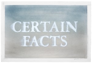
Ed Ruscha, CERTAIN FACTS, 2020, dry pigment and acrylic on paper, 15 × 22 ⅜ inches (38.1 × 56.8 cm). Photo: Fredrik Nilsen
In the past decade, however, and increasingly in the past five years, Ruscha has been producing work that makes the liquid words seem less a detour than a premonition. In a few paintings and dozens of drawings (the mode in which he is both most prolific and most experimental), he has been presenting words and phrases in ways that might well be described with the terms that reviewers fifty years ago used to assess the liquid words: they appear to be “melting” or “dissolving”; they are “diffusely spelled out,” as if “liquified skywriting”; they “seem to have been frozen instantaneously by an especially fast camera shutter.”3 The words in this recent work are applied with a spray gun through a stencil, but Ruscha then drags a sheet of foam, of the sort found in packing crates, over the still-wet acrylic letters, smudging and blurring them. “Typographical design” is maintained, yet this is type in distress, or motion, or both—the type of the out-of-register print, the film stuck in the projector, the sign as seen from a moving car (I am not using these examples as metaphors, or as metaphors only; all have deep ties to Ruscha’s practice). This drag technique, scarcely seen prior, generates a range of effects.4 The texts of Ours (2014) and Certain Facts (2020) have a delicate, consistent feathering, while those in Cash for Tools (2015) and Loose Wire (2019) are completely overlain by thick swipes. In a few drawings, including Is (2016) and Won’t (2020), certain letters are so indistinct as to be nearly illegible. The words of Digit Drama (2014) and Itsy (2015) look to be dripping downward, as if they are deliquescing; the runoff in Apartment (2017) and Step Downs (2018) extends into the works’ wide white margins, as if it can’t be bound by pictorial confines. The drawings’ backgrounds, put down first, are usually one or two shades of softly layered, minimally modulated dry pigment. Some of them, as in Suddenly Spastic (2015) and Figure It On Out (2017), feint toward Ruscha’s signature horizons, but most are, as he has put it elsewhere, “anonymous backdrops for the drama of words.”5
this is type in distress, or motion, or both—the type of the out-of-register print, the film stuck in the projector, the sign as seen from a moving car.
Yet if the portrayal of language losing its shape in this newer work is a thematic atavism, it is not a procedural one. The virtuoso trompe l’oeil of the liquid words was methodically planned in sketches plotting the arrangement of their droplets and the highlights of their bubbles. Indeed, the majority of Ruscha’s output is preconceived, his preference for leaving little to chance long having permitted him greater creative leeway, not less. As he said in 1988, in a statement that is almost koan-like in its counterintuitive formulation, “it was an enormous freedom to be premeditated about my art.”6 The recent work is hardly improvisatory—the backgrounds were prepared, the phrases chosen, the stencils cut, the acrylic sprayed, and the foam dragged in a given, iterative sequence—but more is left contingent than in much of Ruscha’s previous work. In some drawings, the process yields an orderly runoff around the words, fringing them in horizontal lines so regular one wonders if they were, in fact, limned with the tiniest of rulers and an even tinier brush. In most, however, the impossibility of accurately predicting the outcome of scraping a sheet of foam over wet paint results in uneven buildup around individual letters, short scores of acrylic adjacent to longer swaths, smudges that betray heavier densities of airbrush spray, smears that indicate paint left over on the stencil, and so on. The effects are, Ruscha says, “always a little different.”7 From an artist known for his crisply perfect surfaces and exacting details, much of this work feels loose, blasé, and even, in the most modest of ways, a bit unruly.
For the first time in decades, Ruscha tips his hand (pun intended) as to process. The “tricks and devices” and “smoke and mirrors” he has repeatedly named as working methods were means of obfuscating facture, from the gunpowder selected as a drawing medium because it concealed streaks and flaws, to the knocking out of words through a reverse-stencil technique that elides the distinction between figure and ground, to the airbrushed, successive layers of masking that eliminate manual marks and vestiges of making in any number of works.8 The apparent straightforwardness of Ruscha’s art is deceptive. For all of its disarming humor and forthright imagery, it is often quite difficult, especially since the late 1960s, to ascertain precisely how a drawing or painting came to be. In this newer work, though, there is no illusionism, no “smoke and mirrors.” Discerning process is a nonissue: it is plain that a stencil of words has been laid on a ground, paint applied through the stencil, and the words subsequently manipulated. The overt use of the stencil, and the blurs and swipes, index the history of the works’ creation in a way that was formerly rare in the artist’s oeuvre. Ruscha is essential to any history of Pop, and, thanks to his photographic books, to Conceptual art, yet with this recent work, one remembers that it was against the behemoth of Abstract Expressionism, its eminence then only just on the wane, that he cut his artistic teeth.
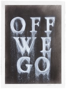
Ed Ruscha, OFF WE GO, 2020, dry pigment and acrylic on paper, 15 × 11 ¼ inches (38.1 × 28.6 cm). Photo: Fredrik Nilsen
Laying bare the movements involved in making this work underscores how the words themselves appear to be in motion, or as if their motion has just been halted, the paint out of which they are formed still drying or just dry. Ruscha’s technique animates his words, causing a sort of optical flicker that is intensified by the contrast of acrylic sheen against more matte dry pigment grounds (or, in the handful of paintings in this style, acrylic against a neutral linen support). A few phrases, as in Other People Ruin Everything (2015), Flashback Structure (2015), and At That (2020), are arrayed as if taking off, in the lower-left-to-upper-right trajectory that is Ruscha’s usual compositional shorthand for intimating passage through space; some others are italicized, emphasizing the kinetic sense. Still others, including those of Thermal Jolt (2015) and Jinx (2020), feature drips and streams above their letters, as if they have fallen into the pictorial field from overhead. A number of works name the very speed they picture: Thick & Fast (2014), First of All Rush (2015), Quick Action (2015), Muscle in Motion (2019), Fast From (2019), PDQ (2019), Line Speed (2020), Deep Speed (2020), Semi Fast (2020), and Off We Go (2020). Crucial as titles are to Ruscha, it is important not to overestimate these coincidences of phrase and motif (to wit: one drawing of 2014 spells out No Go). He has used so many words, over such a long time, that myriad thematic and semiotic categories might be adduced to harness them. In this work, indeed, additional enduring Ruscha enthusiasms surface. There are well-worn expressions, now freshly strange (Rule of Thumb, 2015, Living Daylights, 2015, Dull Roar, 2015, About Face, 2019, Iron Clad, 2020); words alongside other words that contain them, drawing attention to their status as plastic matter (This Is, 2014, It Fits, 2020); rhymes or near rhymes, which do the same (Repo Depot, 2015, Spouse in House, 2018, Blouse Clown, 2018, Odd Ad, 2020); and winsome, inscrutable word pairings (Urban Burps, 2018, Stubby Stacks, 2019, Factory Bubble, 2020). What sound like snippets of overheard or interjected speech also emerge (Mind If I . . . , 2014, Pfssst, 2016, Do Tell, 2018), so too reoccurring Ruscha words and phrases (So, 2016 and 2018, “Co.” in Company, 2014 and 2016, Baby Jet, 2017) and fragments from favorite writers (Two-Fisted Loafer, 2015, is Dashiell Hammett; “The Ancients Stole All Our Great Ideas,” lettered in The Ancients, 2017, is Mark Twain). And of course there are the expected nods to Los Angeles (Pico and La Brea, 2015) and its car culture (Gasoline, 2014, Motor Yard, 2017, Rebuilt Engine, 2017, Car Parts, 2020)—one of the artist’s descriptions of the trailing lines in this work, along with “drags,” “scrapes,” and “swipes,” is “skid marks,” only the latest of many reminders of how profoundly the experience of driving shapes his approach.9 Doubtless more through lines in Ruscha’s current phrases could be identified; the point here is that these phrases seem newly mobile and, in turn, newly charged.
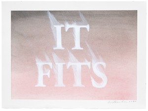
Ed Ruscha, IT FITS, 2020, dry pigment and acrylic on paper, 11 ⅛ × 15 inches (28.3 × 38.1 cm). Photo: Fredrik Nilsen
The shift to showing words in motion, through motion, is accompanied by a second noteworthy and relatively recent addition, one of typeface. The letterforms in this work are a version of Garamond, characterized by elegant proportions and classical serifs. A foil to the unassuming Boy Scout Utility Modern—which Ruscha has described as “a typeface that doesn’t say anything” that he developed “to escape the stylishness of preestablished typefaces and enter the world of ‘no style’”—Garamond, designed in the sixteenth century, is the most “old style” typeface he has consistently used in decades.10 The mismatch between its refinement and the depicted diffusion of the words is just one of the lovely formal (and typically Ruscha) paradoxes that the work sustains. Others follow from his particular use of stencils. While Ruscha has long blocked out his drawn and painted words, the use of the stencil is newly obvious in this work, though its look and function are invoked only to be counteracted. He negates the stencil’s usual duty to create neat, bounded letter edges and easily readable text by smearing the words; bypasses its expedience as a reusable device by hand cutting a different template for each work; and suppresses its public, impersonal, and industrial connotations in favor of fine-spun renderings of enigmatic phrases. When Leo Steinberg asked Jasper Johns, in a 1961 interview, why he chose “coarse, standardized, unartistic” letters and numbers, Johns replied, “That’s how the stencils come.”11 Integral as Johns was to Ruscha’s decision to abandon commercial art for fine art, and despite Ruscha’s inclination, especially early on, to represent subjects “how they come” (objects at actual size; straight photographs), Ruscha’s readymade is more language itself than the means of its depiction.
Ruscha’s technique animates his words, causing a sort of optical flicker that is intensified by the contrast of acrylic sheen against more matte dry pigment grounds.
The relevant lead here is not Johns, nor those Cubists who employed utilitarian letterforms to articulate the flatness of the support, nor any number of Conceptualists who prized stenciled texts for their associations of neutrality—though all are, elsewhere in Ruscha, productive contexts—and any connection to contemporary artists who have made use of stencils only to undermine their expected legibility, among them Christopher Wool and Glenn Ligon, are tenuous. Instead, the idea of type as moving or suspended in motion originated for Ruscha in cinema, specifically projected text: the skid mark works might be considered an outgrowth of his extensive series of “The End” paintings and drawings. While his art had long admitted the latent influence of film, that series, begun in the early 1990s and continuing to the present, takes cinema as explicit topic in depicting a film’s final title card. Summoning nonspecific old movies, often in black and white, Ruscha’s slightly blurry renderings of the words “The End” suggest deteriorating celluloid or out-of-focus projection.
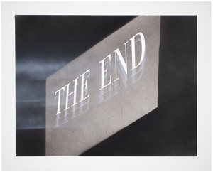
Ed Ruscha, The End #61, 2005, acrylic and ink on museum board, 24 × 30 inches (61 × 76.2 cm). Photo: Paul Ruscha
One might chart a formal evolution from drawings such as The End #61 (2005) and The End #76 (2007), in which horizontal light beams stretch from an unseen projector to the contours of the letters, illustrating their extension through space, and The End #49 (2004) and The End #58 (2005), which show the end title repeated, ghostlike, as if seen in double or triple vision, to the skid mark works. Gone, except in one drawing, is a screen or source of illumination (although a few read “The End”). Rather, Ruscha has taken his cinematic conception of words moving, being arrested in motion, and trailing a residue, and applied it to different and varied phrases. Even the Garamond-like typeface in the newer work relates to the “The End” series; he began to regularly use it for his end title cards in 2002, gradually replacing the Gothic script previously preferred for them.
His bleary phrases mime the dizziness that information overload can induce, and so too its consequences, ones acutely felt over the past six months.
Begun on the eve of film’s transition from 35mm to digital, which was underway by the dawn of the twenty-first century and complete, for most mainstream filmmakers, by about 2010, the “The End” works were out of their time and, in this anachronism, ironic in a way that Ruscha’s art rarely is (but is often claimed to be). They picture those flaws endemic to celluloid, the “scratches on the film” and “hair in the gate,” that digital filmmaking eliminated.12 (Ruscha was aware of the inevitable obsolescence of the theme: “I realized that people five years from now, ten years from now, are not going to understand what those things are, because there are not going to be any scratches or imperfections.”13 ) The skid mark works, by contrast, feel contemporary, even urgent. In registering a shift from static to mobile text, they evoke how many of us encounter words these days, in seemingly endless swiping and streaming—as news scanned on a computer or running television ticker, as books scrolled on e-readers, as ads on phones or changing billboards. Their blurs conjure the farsightedness that can follow staring at a small screen for too long; it is not by chance that these works are intimately sized, while Ruscha’s larger recent paintings and drawings show their subjects (mountains, mattresses) as if seen from a distance, in sharp, even focus. “It makes you dizzy,” Ruscha said a few years ago, alluding to the glut and speed of text and image transmission that digital media has brought on, noting, “the information is so abundant today, there’s so much of it, and it’s very confusing.”14 His bleary phrases mime the dizziness that information overload can induce, and so too its consequences, ones acutely felt over the past six months: that despite, or because of, their rapid profusion, read—and especially screened—words can distract even as they absorb, obscure even as they expose, deteriorate even as they proliferate, and numb even as they engage. Pessimistic as that sounds, and probably is, this is work made for its moment.
A note on the title: “Things Fall Apart” is the depicted phrase in two “skid mark” drawings of 2017. I do not know (and would not ask) if Ruscha was quoting the Yeats poem and/or Chinua Achebe title, or expressing a general postelection sentiment, or none of those things. The phrase is, however, at once an apt description of the words in the new work and of the moment of its making.
1 Patricia Failing, “Ed Ruscha, Young Artist: Dead Serious About Being Nonsensical,” Artnews 81, no. 4 (April 1982), p. 79. Ruscha has made a few liquid-word-like works since 1969; all are commissions.
2 Failing, “Ed Ruscha, Young Artist,” p. 79.
3 Respectively, Joachim Neugroschel, “Edward Ruscha at Iolas,” Arts 44, no. 4 (February 1970), p. 59; David Bourdon, “A Heap of Words About Ed Ruscha,” Art International 15, no. 9 (November 1971), p. 27; Neugroschel, “Edward Ruscha at Iolas,” p. 59; Emily Wasserman, “Edward Ruscha, Iolas Gallery,” Artforum 8, no. 7 (March 1970), p. 78; Bourdon, “A Heap of Words About Ed Ruscha,” p. 28.
4 The paintings Big Inventions That Make a Big Difference (P1984.18), Global Misfits (P1989.35), So Study (P1995.43) and So-So (P1995.44), six Hero Studies (P1995.45–.49, P1996.01) and Hero (P1996.02), and Woo (P2002.35) all feature words that were smudged or feathered while still wet; the catalogue numbers in parentheses refer to Edward Ruscha: Catalogue Raisonné of the Paintings, vols. 3, 4, 5, and 6 (New York: Gagosian Gallery/Göttingen, Germany: Steidl, 2007, 2009, 2012, and 2013). Ruscha occasionally explores a motif or technique in passing only to extensively develop it years, and sometimes decades, later.
5 Bill Berkson, “Ed Ruscha” (1988), republished in Ruscha, Leave Any Information at the Signal: Writings, Interviews, Bits, Pages, ed. Alexandra Schwartz (Cambridge, MA: MIT Press, 2002), p. 277.
6 Fred Fehlau, “Ed Ruscha,” Flash Art, no. 138 (January–February 1988), p. 70.
7 Conversation with the author, August 21, 2020.
8 Paul Karlstrom, “Interview with Edward Ruscha in His Western Avenue, Hollywood Studio” (1980–81), in Ruscha, Leave Any Information at the Signal, p. 190; Margit Rowell, “Cotton Puffs, Q-Tips®, Smoke and Mirrors: The Drawings of Ed Ruscha,” in Cotton Puffs, Q-Tips®, Smoke and Mirrors: The Drawings of Ed Ruscha, exh. cat (New York: Whitney Museum of American Art, 2004), p. 11.
9 Conversation with the author, August 21, 2020.
10 Suzanne Muchnic, “Getting a Read on Ed Ruscha,” Los Angeles Times, December 9, 1990, Calendar, p. 3; Rowell, “Cotton Puffs, Q-Tips®, Smoke and Mirrors,” p. 20.
11 Leo Steinberg, “Jasper Johns: The First Seven Years of His Art,” in Steinberg, Other Criteria: Confrontations with Twentieth-Century Art (London: Oxford University Press, 1972), p. 32.
12 Kerry Brougher, “Living in Hollywood Backwards: A Conversation with Ed Ruscha,” in Ed Ruscha and the Great American West, exh. cat. (San Francisco: Fine Arts Museums of San Francisco; Oakland: University of California Press, 2016), p. 39; Kerry Brougher, “Words as Landscape,” in Ed Ruscha Paintings, exh. cat. (Washington, DC: Hirshhorn Museum and Sculpture Garden; Oxford: Museum of Modern Art; Zurich: Scalo, 2000), p. 173.
13 Brougher, “Living in Hollywood Backwards,” p. 39.
14 Yan Céh, “On Experiment” (interview), Crash (Paris), Summer 2015.
Artwork © Ed Ruscha
Lisa Turvey is editor of the catalogue raisonné of Ed Ruscha’s works on paper.
Ed Ruscha sits down with the author and explorer Erling Kagge to discuss existence.
Gillian Pistell writes on the loaded symbol of the American flag in the work of postwar and contemporary artists.
Jacoba Urist profiles the legendary collector.
Against the backdrop of the 2020 US presidential election, historian Hal Wert takes us through the artistic and political evolution of American campaign posters, from their origin in 1844 to the present. In an interview with Quarterly editor Gillian Jakab, Wert highlights an array of landmark posters and the artists who made them.
Gwen Allen recounts her discovery of cutting-edge artists’ magazines from the 1960s and 1970s and explores the roots and implications of these singular publications.
Ed Ruscha tells Viet-Nu Nguyen and Leta Grzan how he first encountered Louis Michel Eilshemius’s paintings, which of the artist’s aesthetic innovations captured his imagination, and how his own work relates to and differs from that of this “Neglected Marvel.”
London’s River Café, a culinary mecca perched on a bend in the River Thames, celebrated its thirtieth anniversary in 2018. To celebrate this milestone and the publication of her cookbook River Café London, cofounder Ruth Rogers sat down with Derek Blasberg to discuss the famed restaurant’s allure.
The Fall 2019 issue of Gagosian Quarterly is now available, featuring a detail from Sinking (2019) by Nathaniel Mary Quinn on its cover.
In conjunction with his exhibition VERY at Louisiana Museum of Modern Art in Humlebæk, Denmark, Ed Ruscha sat down with Kasper Bech Dyg to discuss his work.
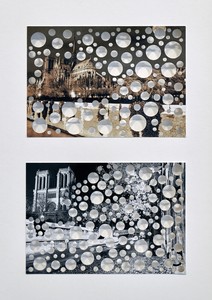
An exhibition at Gagosian, Paris, is raising funds to aid in the reconstruction of the Cathédrale Notre-Dame de Paris following the devastating fire of April 2019. Gagosian directors Serena Cattaneo Adorno and Jean-Olivier Després spoke to Jennifer Knox White about the generous response of artists and others, and what the restoration of this iconic structure means across the world.
An exhibition at the Broad in Los Angeles prompts James Lawrence to examine how artists give shape and meaning to the passage of time, and how the passage of time shapes our evolving accounts of art.
Ed Ruscha sat down with Tom McCarthy and Elizabeth Kornhauser, curator at the Metropolitan Museum of Art, to discuss the nineteenth-century artist Thomas Cole, whose Course of Empire paintings inspired a series of works by Ruscha more than a century later.