Ed Ruscha and Erling Kagge: Silence, Slowness, Exploration
Ed Ruscha sits down with the author and explorer Erling Kagge to discuss existence.
October 27, 2020
Against the backdrop of the 2020 US presidential election, historian Hal Wert takes us through the artistic and political evolution of American campaign posters, from their origin in 1844 to the present. In an interview with Quarterly editor Gillian Jakab, Wert highlights an array of landmark posters and the artists who made them.
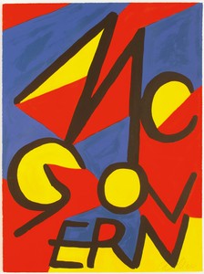
Alexander Calder, McGovern, 1972, lithograph, 34 ½ × 23 ¾ inches (86.4 × 58.4 cm) © 2020 Calder Foundation, New York/Artists Rights Society (ARS), New York. Photo: Calder Foundation, New York/Art Resource, New York
Alexander Calder, McGovern, 1972, lithograph, 34 ½ × 23 ¾ inches (86.4 × 58.4 cm) © 2020 Calder Foundation, New York/Artists Rights Society (ARS), New York. Photo: Calder Foundation, New York/Art Resource, New York
Gillian JakabYou’re the author of two books on presidential campaign posters, George McGovern and the Democratic Insurgents [2015] and Hope: A Collection of Obama Posters and Prints [2009]. They’re both gorgeous publications, filled with stunning rare images and gatefolds revealing full posters. What draws you to study campaign posters as a historian and to share them with readers?
Hal WertThank you. I do love bells and whistles—they’re really hard to get published! I was very pleased my editor agreed to have the jacket of the Obama book fold out into a poster.
I’ve always been fascinated with campaign posters, ever since I was a kid. I grew up in a political family, comprised of both blue-dog Democrats and liberal Republicans. We lived in a small town in Iowa, a Maytag company town, which was divided politically between blue-collar workers and white-collar workers. My mother worked on the [Dwight D.] Eisenhower campaigns and later my grandmother did too. But they were not happy about [Barry] Goldwater in 1964. They were Rockefeller Republicans.
They were the ones who got me interested. I collected a few campaign posters, but mostly campaign buttons. I was teaching at the Kansas City Art Institute and one of my friends there, Carl Kurtz, a well-known calligrapher, kept saying, “You need to start writing and talking about posters.” So, with his encouragement, I did. I decided in 2008 that I would really go with the Barack Obama posters.
GJWhen did you start noticing them?
HWDuring the Iowa caucuses. Of course, Obama was not picked to win. Searching around on the Internet one night, I saw up near the state capitol building, on the window of the headquarters, this really cool poster. So, I called them on the phone the next day and they said, “Well, this really nice man came through and put it up for us.” I said, “Do you know his name?” They didn’t. I said, “All it says on the poster is CRO.” It was a Ray Noland poster. He didn’t put his name on anything because, like many outsider artists, he wanted anonymity during the campaign. Shepard Fairey came on a little later. But Ray was out there on a skateboard with wheat paste in the middle of the night, slapping up posters [laughs]. I was never able to figure out who some of these artists were, but I found out that CRO stood for Creative Rescue Organization and it was Ray Noland who had been putting them up in Chicago. I got hold of him and we started to really connect—he ended up writing the introduction to the Obama book.
So that’s how I became involved with campaign posters. I decided, okay, I’ve got to stay with the Obama poster phenomenon, though I had no idea it was just going to turn into a tsunami.
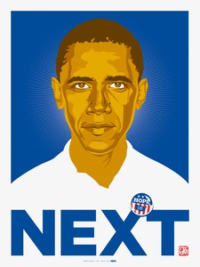
Ray Noland, Next, 2008, four-color offset print, 24 × 18 inches (61 × 45.7 cm)
GJYou were prescient. You knew something was different about this one. So these two presidential campaigns—the subjects of your books, Obama in 2008 and McGovern in 1972—drew a flurry of posters; they really excited artists. What do artists provide candidates in terms of sharing their message, rallying support, or even just getting out the vote?
HWRarely if ever do posters persuade voters to change their minds, except undecided ones maybe. But they do rally the base. Looking at our current election cycle, Ed Ruscha’s “ee-nuf!” poster is a beautiful design but it won’t tempt anybody not already on board, given what’s written around the work’s edges [laughs]. At the Art Institute, I taught a course called “Prints of Persuasion,” in collaboration with one of the print-making instructors; it had a studio component. The Institute is located in a Democratic county on the Missouri side of the city, but right across from it is a Kansas county that’s very Republican. The final assignment was to design a poster that you could put up in Johnson County, in the Republican area, that would tempt people to vote for the candidate you’re putting forward. Nobody could ever even come close to it [laughs]. They always did the Ed Ruscha routine, which would, of course, alienate half of Johnson County [laughs].
But that doesn’t mean they aren’t beautiful and incisive posters. Until Obama, posters created by prominent artists were rarely associated with a winning campaign.
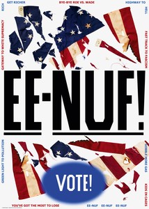
Ed Ruscha, EE-NUF!, 2020 © Ed Ruscha
GJWhat was it about Obama, and about McGovern, that drew artists in?
HWHistorically there have always been great posters, but they’ve been extremely limited. In every election there’s usually half a dozen to a dozen well-done posters. For example, there are a few good ones for Hillary [Clinton], like the one done by Tony Puryear in 2008, but neither Hillary nor Trump cares about posters. Some candidates really don’t care about them.
In the 1960s, Gene McCarthy really fired up the artistic left. Many art schools—at least the one where I taught—had up until then always been culturally to the left, but never overtly. Art students were supportive of political issues but weren’t provoked to get involved in a hands-on manner. McCarthy did that first. He always said he would have won California had there been two more universities. And then the same crew came out for McGovern, big time. Certain candidates can do that, but they’re not usually candidates who are going to do well in the general election [laughs]. The rule has always been, Great posters guarantee defeat.
GJUntil Obama.
HWUntil Obama, exactly. And at first the Obama campaign was very reluctant about bringing the outside artists in. Fairey’s Hope poster, which is so good, initially worried the campaign: Obama has his head up, sort of FDR style, in that poster, and the pose looks like he might be running for a dictatorship. And it’s a Russian Constructivist–style poster with a lot of red. Well, they did some research and found out that most Americans had no idea about Russian Constructivism [laughs]. But still, when they had Fairey do his first official poster for Obama, they had him pull the head down.
GJInteresting.
HWI think it is too. So they were running dual campaigns, the insiders and the outsiders. American youth were on fire for the Obama campaign and eventually, largely Fairey brought a few in. We talked about posters that can bring people in; a lot of people who were left in orientation but not very politically active really got fired up on the poster and the Obama campaign in general.
A good political poster should bypass the rational and hit you right in the stomach or the heart.
Hal Wert
GJSo posters rarely change someone’s mind entirely, but they can turn apathy into excitement.
HWYes, they really can. Obama was certainly a candidate who produced incredible enthusiasm, but you have to keep in mind that 2008 was definitely a Democratic year.
GJRight, the pendulum was ready to swing.
So your campaign-poster journey began with this Obama moment, and then, right after you finished that book, you took a look further back in history at the outpouring of posters for McCarthy and then McGovern. You’ve also written about the beginning of campaign posters, all the way back to the nineteenth century. How does the history of these posters contextualize what we see today? Have there been any overarching patterns or trends in the evolution of campaign posters?
HWFor the epilogue of the Obama book, I wrote an essay on historical posters that went back to 1844, because I thought they needed context. What are posters if they’re not in context? How have previous campaigns influenced those posters? During my research, I’d come across some fabulous McGovern and McCarthy posters. I thought, Nobody has written about these, so I’m going to start to research and find out how they came about. It was the 1960s, and the ’60s counterculture, that produced them; there was a dearth of posters in the 1940s and ’50s. Part of that was the new international style, which was more formal. But then the counterculture came on board with entirely new styles.
I love the way these young artists thought about making posters. Appropriation was the name of the game in the 1960s; they called it “going to the toy box,” or “the image flea market.” They just took any images they wanted, historically or otherwise. The artists who made the stand-out rock ’n’ roll posters—occasionally the same artists who made political posters—would mix colors right as the printing was taking place. Even though they were offsets, they’d run them through the presses four or five times to get those great colors. And then, of course, there were maybe three or four black-light political posters. I’ve found one McGovern black-light campaign poster.
The wonderful thing about political posters is that anybody can make them. But if they weren’t made by the great artists or major manufacturers, nobody knows who did them. Posters currently unknown keep popping up, even ones from the last century.
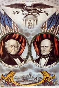
N. Currier, Grand Democratic Free Soil Banner (Martin Van Buren and Charles F. Adams), 1848, lithograph with watercolor, 33 ¼ × 23 inches (84.5 × 58.4 cm)
GJLet’s go back to the beginning. You mentioned 1844 as the year the first American campaign-posters were made, after the advent of the lithographic printing process. You shared with me a few of these posters from the nineteenth century. Will you speak a little about the 1848 Free Soil Party ticket and its iconography? What would the nineteenth-century viewer take away from these posters that we might not?
HWMany of the posters of this time were created by either Kellogg or Currier & Ives. They’d run a monolithic graphic process that just printed the lines, the lithograph, in black, and then the posters were hand colored by women. With this technique they attempted a trompe l’oeil effect, in an effort to add depth to the posters. Currier & Ives had maybe a dozen women who painted posters. Less is known about the Kellogg operation and the posters are a little more obscure; they usually sell for more than the Currier & Ives do because they’re more rare, and often the iconography is more elaborate too. If we look at the bottom of the 1848 Free Soil Party poster, where you’ve got the Free Soiler plowing with the horses, do you think those are laurel leaves or oak leaves?
GJOh, I do not know. Maybe laurel? That’s a wild guess [laughs].
HWIf they’re laurel, they signify something a little different from oak. Oak leaves of course represent strength. Laurel leaves, in classical Greece, meant a person had succeeded on an Olympian level. Either way, the leaves are telling you: these people are the greatest invention since sliced bread. This is 1848, and the Free Soilers are anti-slavery people; the Whigs and antislavery Democrats founded this party. It only lasted for about six years. Most of them joined the Republican Party, which was founded in 1854 and put forth its first candidate, John C. Frémont, in 1856. Frémont didn’t get elected but [Abraham] Lincoln did in 1860. You can see there are storm clouds on the horizon of the poster, and then up above, at the very top, they’ve got “Free Soil, Free Labor, Free Speech.” My great-grandfather was a Lincoln Republican and a Free Soiler and a Free Laborer, as well as an abolitionist and a prohibitionist. If you go up a little bit, you get the Temple of Liberty, with Liberty herself standing under it. She’s holding a spear and on top of it is a Phrygian cap. People wore those in classical Rome and they eventually became a symbol for freedom. If you look a little further up on the poster, you see arrows. On many posters there are thirteen of them, usually bound together, representing the first thirteen states. This comes from the Roman fasces—we throw around the word “fascist” all the time now, but the fasces meant “to be bound together.” In the classical Roman iconography, it was usually wooden rods that were bound together around an axe to represent collective power, the law, and governance, but Americans would often substitute arrows and spears for the rods. The original symbol did show up on campaign posters into the early twentieth century.
Above that are laurel leaves again. At the bottom I think they’re probably oak, but at the top they’re definitely laurel leaves, as a way of leaning over the candidate and anointing them. And then, of course, the American eagle. Coming from the Temple of Liberty are the rays of the sun behind it. Notice the rays of the sun are pushing the clouds down. Above are the stars for the thirty states that existed at the time.
This is a nineteenth-century version of Fairey’s Hope poster made in the American Romantic period, the 1830s to the 1840s. In representations of the famous, togas were in vogue. From the founding of the country on, people worshiped classical Greece and classical Rome.
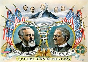
Kurz & Allison, Benjamin Harrison, Levi P. Morton, Republican Nominees, 1888, lithograph, 18 × 24 inches (45.7 × 61 cm)
GJYou can see it in all the references. What’s the next development in American campaign posters?
HWWe should take a look at the poster for Benjamin Harrison and Levi Morton’s presidential campaign in 1888. It’s a Kurz & Allison, a Chicago firm that issued a very popular Civil War print series and in 1888 created exceptional, beautifully detailed campaign prints for the Republicans, the Democrats, and the Union Labor Party. It has George Washington at the top. This poster references the string of Republican presidents who preceded Benjamin Harrison: Lincoln, [Ulysses S.] Grant, [Chester A.] Arthur, and the assassinated [James A.] Garfield.
GJAnd they’re just floating heads.
HWRight, I love floating heads. Some of my favorite posters are floating heads. I’ve spent a good deal of time talking to people about where the design comes from. There’s a 1908 [William Howard] Taft; they show up in Lyndon Johnson for Senate posters, one shows up in 1940, and then by 1944 and on, they sort of become the wave, and in the 1950s, and up to about 1968, floating heads—I mean, no collar at all, just totally floating heads—are everywhere. And then they just disappear. The working theory right now is that jobbers just decided to do it that way. It wasn’t a grand design-school concept.
GJJust a whim.
HWJobbers decided to do it and people liked them. But it’s interesting—do you like them?
GJThey’re certainly funny. They seem to be coming out of the page [laughs]. Actually a disembodied head is a little unsettling. Do you like them?
HWI’ve always thought they were just amazing, but that’s because they’re so kooky [laughter].
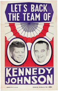
Posters Inc. of Philadelphia, Let's Back the Team of Kennedy Johnson, 1960, jugate-cardboard poster, 14 × 22 inches (35.5 × 55.9 cm)
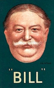
John De Yongh, “Bill”, 1908, color lithograph showing presidential candidate William Howard Taft, 20 × 12 inches (51 × 30.5 cm)
Anyway, back to the 1888 Kurz & Allison. This was a pivotal moment in terms of color. You could do color prints earlier on, in chromolithography, but that was really expensive. And you had to run the print through the press for each color, making it very hard to control the register. If you look at the front of my McGovern book, it shows a screen print from the 1972 Wisconsin primary. They were done quickly, dried, and handed out to hundreds of voters, but see how the white shows up along the edges?
GJYes.
HWThat’s because they haven’t taken the time to really control the register, so when they pull the screen print, it’s not going to be perfect. So to produce color prints commercially was one giant pain in the derrière and extremely expensive, but by 1888, the color-lithography process was good enough that you could do the poster you’re now looking at without hand coloring. It was a whole new world of color, made possible by Jules Chéret in Paris, who invented the three-stone process. Color swept Paris in the belle époque—you’ve seen the posters of Toulouse-Lautrec. Color was sweeping the world, in everything from baseball cards to advertising and an avalanche of circus and Wild West–show posters.
GJIt’s interesting that for the posters before the color revolution, the people doing the hand coloring were women, and they were anonymous laborers. Just like the people who have run for and held office in this country, those making campaign posters have historically been men. Sister Mary Corita Kent’s poster for Shirley Chisholm comes to mind as an exception—not only a female artist but a female presidential candidate before the twenty-first century. Will you tell me more about that poster? Are there any other prominent ones by women artists?
HWSister Corita also did Come Home America for McGovern. I placed it on the back of the McGovern book. I think she made some of the most dynamite posters. The one for Shirley Chisholm is one of my all-time favorites.
GJIt’s beautiful.
HWIt is. It’s extremely well done, with the Langston Hughes poem. She uses a really simple graphic, just black on white. There’s another poster for Chisholm that has largely been ignored, partially because of its rarity. It has the word “Outrageous” printed across it and was made by a couple of guys in a garage in Berkeley—they ran maybe no more than 120 or 140. Very small print run. In the hippie language of the time, “outrageous” meant “really great.” Sometimes posters done by first-timers have more punch, more hit. I think that’s a dynamic poster.
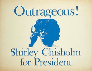
Ed Wong-Lidga, Outrageous, 1972, screen print, 25 ½ × 30 ½ inches (64.8 × 77.5 cm)
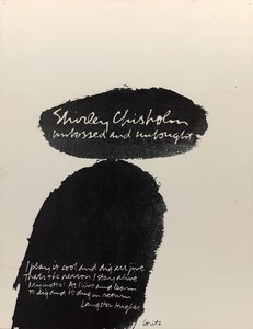
Corita Kent, Shirley Chisholm Unbossed and Unbought, c. 1972, offset lithograph, 22 × 17 inches (55.9 × 43.2 cm) © 2020 Estate of Corita Kent/Immaculate Heart Community/Licensed by Artists Rights Society (ARS), New York, courtesy Center for the Study of Political Graphics, Los Angeles
GJSometimes a poster will come across as being against a particular candidate more so than for one. I think of the iconic Andy Warhol print portraying Richard Nixon as demonic, in bright colors, with the words “Vote McGovern” beneath it. In the current election cycle, many artists have created posters as part of the “Enough of Trump” initiative. We’ve discussed Ed Ruscha, and there are also some by Carrie Mae Weems, LaToya Ruby Frazier, and a handful of others. What role do these anticandidate designs play in the history of campaign posters?
HWThey occur throughout history. There’s a 1948 one that tries to hang the Ku Klux Klan on [Harry S.] Truman. The California street artists who were hanging out with Fairey did some just outrageous posters against John McCain and Sarah Palin in 2008, and they had a place where they posted them; they called it “The Wall of Shame.” They didn’t let them go nationally, they didn’t sell any of them. I chose not to include any of them in my books, because I didn’t want to feature negative posters about any of the candidates I was dealing with.
GJSome are extreme in their negativity or aggression, and others strike a more delicate satirical balance.
HWThe Warhol poster, from my point of view, is absolutely brilliant. It’s been used as a model by other artists. In every campaign, at least after 2008, there are two or three posters out there that use the Warhol as a model. There’s one for Obama with McCain’s image.
GJI think I saw a Deborah Kass poster for Hillary with Trump’s image in 2016—
HWYeah, and Ben Shahn did one too. Have you seen Shahn’s anti-Goldwater posters? One shows Goldwater as a whiny baby in diapers. I mean, it’s really good. The other, and I think Warhol got his idea from this poster, presents Goldwater as diabolical, a Dr. Strangelove, and underneath it reads “Vote Johnson.” And then Shahn did the 1948 poster pro Henry Wallace on the Progressive Party ticket, contra [Thomas E.] Dewey/Truman.
GJOh right! Let’s talk about that one. It falls within the period of dearth in the ’40s and ’50s you were talking about.
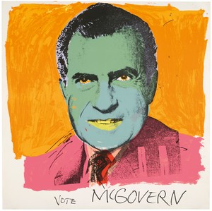
Andy Warhol, Vote McGovern, 1972, screen print, 42 × 42 inches (106.7 × 106.7 cm) © 2020 The Andy Warhol Foundation for the Visual Arts/Artists Rights Society (ARS), New York
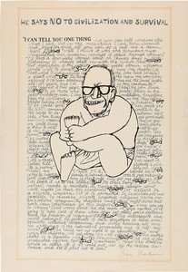
Ben Shahn, I Can Tell You One Thing, 1964, photo screen print on acetate in black, 23 ⅜ × 16 ⅝ inches (59.3 × 42.2 cm) © 2020 Estate of Ben Shahn/Licensed by VAGA at Artists Rights Society (ARS), New York
HWIt’s a brilliant poster; it didn’t do Wallace any good, but it’s still a brilliant poster. Shahn parodied the famous photo of Lauren Bacall atop Vice President Harry Truman’s piano, taken in early 1945, but put Dewey atop the piano. The idea of Tweedledum and Tweedledee has been around for a while. It was a theme George Wallace pushed in his 1968 run as the American Independent Party candidate. There have been some fairly significant third-party presidential candidates in American history—Eugene Debs as a socialist starting in 1900, Theodore Roosevelt’s 1912 Bull Moose effort, I mentioned Wallace in ’68, and Ross Perot in 1992. This 1948 Ben Shahn poster, and other posters by famous artists, get picked up by the art community, which loves them, and they become part of the art world.
GJSome pretty prominent artists have made campaign posters. In addition to Warhol there’s Alexander Calder, and a couple of posters by Roy Lichtenstein, right? There’s the 1988 one for Michael Dukakis?
HWYeah, Lichtenstein did one for the Clinton White House, too, which is the more famous. It’s a great poster. There was some real controversy about the Lichtenstein poster—
GJOh?
HWIt was done for the California Democratic Party, for the Dukakis campaign there, and when they printed it, they printed it with a black border around it, and Lichtenstein was not happy. The one that probably had the most effect on a campaign was the Calder poster that says “McGovern for McGovernment.” That became a campaign slogan.
GJOh, yes. I love that one.
HWI do too. I’ve got it in my collection; I’ve got all the Calder posters.
Thomas W. Benton also did some incredible, powerful posters. He ran around with gonzo writer Hunter S. Thompson; they were buds and worked together. I wrote the introduction for Daniel Joseph Watkins’s book Thomas W. Benton: Artist/Activist. For a leftist artist, Benton was very formal, probably because he was trained as an architect. He did a lot of Color Field painting. But his political posters, they just go right for the gut. His “Bloody Nixon” is outrageous. A good political poster should bypass the rational and hit you right in the stomach or the heart.
GJLike good art, to an extent.
HWLike good art, yes, I mean it really gets you going. As for other artist-made posters, there’s also an Ed Ruscha that he did for Gary Hart. It’s almost exactly the same poster that he did when he was asked to do a poster for the Bicentennial.
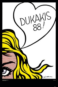
Roy Lichtenstein, Dukakis 88! Poster, 1988, offset lithograph (from four-color process) on 90# Eloquence Gloss Book paper, 36 × 24 inches (91.4 × 60.9 cm), edition of 1,250 © Estate of Roy Lichtenstein
GJAnd he’s still making posters for presidential elections, like the one we discussed earlier. To take our discussion up to the present, have there been any really notable or artistic posters since the 2008 election, in your opinion?
HWThe big question after 2008, with the advent of all the electronic devices, was what would be the future of the poster? The bubble of Obama support broke not too long after he was elected, about a year after the campaign. There was a brilliance in the campaign that I thought led to difficulties in governing for Obama, because the posters said “Hope,” and “Progress,” and “Change.” I like posters that are simple, direct, and use visual language, and these posters really do that well, but the brilliance of the campaign was that they never specified anything with those three words. That’s a great election technique: whatever you hope, whatever you see as the future, you fill in the blanks. But that can lead to difficulties in governing. In any case, by 2012 there was far less energy behind campaign posters.
And then, of course, you know what happens in 2016: Bernie Sanders. There are hundreds and hundreds of Bernie Sanders posters. One of my favorites is the Cheech and Chong poster. And of course, Shepard Fairey and Emek went big-time for Bernie.
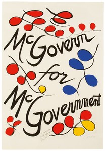
Alexander Calder, McGovern for McGovernment, 1972, lithograph, 34 ½ × 23 ¾ inches (86.4 × 58.4 cm) © 2020 Calder Foundation, New York/Artists Rights Society (ARS), New York. Photo: Calder Foundation, New York/Art Resource, New York
GJWhat about this time around?
HWIn this 2020 campaign cycle, in the primaries, Julián Castro had one or two good posters, Kamala Harris had one good poster, Andrew Yang had one good poster. Joe Biden started out with a really great poster, a yard sign for Iowa and New Hampshire, and then he abandoned it: it used his aviator shades, and looking out of the shades, just in the lenses, you could see scenes from Iowa—cornfields, of course—and from New Hampshire. That’s a great design idea. But overall, during the primaries, even before covid hit, posters were essentially as dead as a pharaoh’s mummy. Plenty of yard signs, but they’re sort of graphic burnouts, there’s nothing to them. There’s a lot of that in every campaign, but there’s always some crème de la crème that rises to the top. I would guess because of covid, and the way we’re shut down, that there’s not going to be much. And it’s late in the game.
One of the reasons I think the poster really prevailed in the 2008 campaign is that they documented everything online. Some of the artists who made really vibrant Obama posters did a run of fifty or a hundred, either offset or screen print, and signed them in limited editions, small numbers, but they were online free to download. You could send them everywhere. Back in 1972, McGovern had 100 signed Thomas W. Benton screen-print posters in his headquarters in Washington for sale for ten bucks, but without the online realm we have today, nine-tenths of the country had no way of knowing they were there. By the time you get to Shepard Fairey, when he announced a poster, if you didn’t get in and buy it in the first thirty minutes, the 300 in the edition were gone. This instant communication of images really changed the ballgame. I’m guessing here, but it would seem to me that it’s covid that’s really hampered posters in this election. There’s no reason to assume they won’t come back.
GJYou think we’ll continue to see a mix of outsider artists, graphic designers, and well-known artists in campaign-poster endeavors moving forward?
HWThe outsider artists only come in on occasion. But unless lightning strikes, you’re only going to have exciting, artistic graphic posters if candidates to the left become nominated. That’s where the energy and the excitement are, that’s where the art community and young artists are, and that’s where the posters are.

Gillian Jakab is an editor of Gagosian Quarterly and has served as the dance editor of the Brooklyn Rail since 2016.
Hal Wert’s extensive writings on American political posters include two books on the subject, Hope: A Collection of Obama Posters and Prints (2009) and George McGovern and the Democratic Insurgents (2015). Readers may enjoy his blog on posters, From the Desk of Hal Elliott Wert. He is emeritus professor of history at the Kansas City Art Institute. Photo: Allison East Hamlin
Ed Ruscha sits down with the author and explorer Erling Kagge to discuss existence.
Avis Berman’s biography of Roy Lichtenstein, Becoming Roy Lichtenstein: The Path to Pop, will be published this fall by Abbeville Press, aligning with a major retrospective at the Whitney Museum of American Art, New York, in October. For the Quarterly she has adapted part of her text to focus on the artist’s formative experiences in New York in the 1920s and ’30s.

The Fall 2025 issue of Gagosian Quarterly is now available, featuring Andy Warhol’s Blue Liz as Cleopatra (1962) on the cover.

Carlos Valladares tracks the artist’s engagements with Hollywood glamour, thinking through the ways in which the star system and its marketing engine informed his work.

Karen Wong charts the journey of Alexander Calder’s Quatre lances (1964) from its intended site at the Fondation Maeght, Saint-Paul-de-Vence, France, to the Centennial Hall in Monaco, and now to its permanent home in a new single-artwork museum designed by Renzo Piano at the Nouveau Musée National de Monaco. Wong examines the sculpture’s interaction with architecture and environment as part of a larger story of the artist’s relationship with architects.
The Fall 2024 issue of Gagosian Quarterly is now available, featuring Andy Warhol’s Mao (1972) on the cover.

Jessica Beck examines Andy Warhol’s return to painting in the 1970s, focusing on the artist’s Mao series.
Michael Ovitz, cofounder of Creative Artists Agency (CAA), looks back to 1989, the year he and the architect I. M. Pei commissioned Roy Lichtenstein to create the Bauhaus Stairway Mural for the then new CAA Building in Los Angeles. Through the experience of working with Lichtenstein, Ovitz formed a meaningful friendship with the artist.
Alice Godwin and Alison McDonald explore the history of Roy Lichtenstein’s mural of 1989, contextualizing the work among the artist’s other mural projects and reaching back to its inspiration: the Bauhaus Stairway painting of 1932 by the German artist Oskar Schlemmer.
The Summer 2024 issue of Gagosian Quarterly is now available, featuring a detail of Roy Lichtenstein’s Bauhaus Stairway Mural (1989) on the cover.

In celebration of the centenary of Roy Lichtenstein’s birth, Irving Blum and Dorothy Lichtenstein sat down to discuss the artist’s life and legacy, and the exhibition Lichtenstein Remembered curated by Blum at Gagosian, New York.
Gagosian and the Art Students League of New York hosted a conversation on Roy Lichtenstein with Daniel Belasco, executive director of the Al Held Foundation, and Scott Rothkopf, senior deputy director and chief curator of the Whitney Museum of American Art, New York. Organized in celebration of the centenary of the artist’s birth and moderated by Alison McDonald, chief creative officer at Gagosian, the discussion highlights multiple perspectives on Lichtenstein’s decades-long career, during which he helped originate the Pop art movement. The talk coincides with Lichtenstein Remembered, curated by Irving Blum and on view at Gagosian, New York, through October 21.