Eileen Costello explores the oft-overlooked importance of paper choice to the mediums of drawing and printmaking, from the Renaissance through the present day.
Eileen Costello is a historian of modern and contemporary art. A specialist in catalogue raisonné scholarship, she is the editor and project director of Jasper Johns Catalogue Raisonné of Drawing (The Menil Collection, 2018), is nearing completion of a catalogue raisonné of Tony Smith’s architecture, and is editing the catalogue raisonné of Arshile Gorky’s complete works.
The sheet on which a drawing is made is rarely a neutral ground; it can often convey as much meaning and purpose as the marks on it. Artists’ choices of substrate can tell us a lot about their creative process, revealing their working practices and reflecting their awareness of their materials—what media will work best on a particular surface, how the support will respond to certain colors, how it can be manipulated, its strength or fragility, resilience or tactility. The properties of a support may also encourage experimentation and innovation, initiating a change of course or direction in an artist’s development. Almost all artists will sometimes work on whatever type of paper is at hand, be it the back of an envelope, a scrap of wrapping paper, or a sheet torn from a spiral notebook. More often than not, though, the choice of substrate has been carefully considered.
Yet the substrates of contemporary drawings are often overlooked, as if they were subordinate to what’s on them. As the paper conservator Margaret Holben Ellis has noted, exhibition-catalogue entries for drawings for the most part make no mention of paper, even if it has something unusual about it. In fact, informative descriptions of paper are rarely found in the literature of art.1 This is not to say that art historians should engage in a pedantic compulsion for exact description or a kind of fetishization; if we’re in need of technical exactitude we can turn to conservation specialists. But the general public often feels a certain fascination with an artist’s methods, materials, and techniques, and since a substrate can be central to a work’s composition, it’s often rewarding to pause and consider the way in which the tone, texture, and weight of a drawing’s surface generate different kinds of visual effects, or to recognize the paper’s role in the work’s making. I’m by no means a paper expert, but I’m still often curious about a substrate: Is the paper made by hand or by machine? Is it vintage, a stock supply, or specially made for the artist? Where does it come from, what type of fibers went into it, and how do they affect the qualities of its surface? All of these questions can lead to a richer understanding of an artwork. For me this has particularly been the case with the drawings of Jasper Johns, whose work I’ve studied in depth for close to a decade and continue to learn more about. I will share here some of the discoveries I made while working on the recently completed catalogue raisonné of Johns’s drawings, but first, some historical background.
it could be argued that paper contributed as much to the emergence of Renaissance art as the development of one-point perspective and the study of classical sculpture.
Paper made specifically for drawing did not appear until sometime after the mid-1400s, following the invention of the printing press and, with its arrival, the expansion of paper manufacturing. While still not inexpensive, paper became more readily available, enabling artists to work more freely and experimentally and stimulating creative thought and new ideas. In fact, it could be argued that paper contributed as much to the emergence of Renaissance art as the development of one-point perspective and the study of classical sculpture. Leonardo left behind over four thousand drawings, in the process establishing drawing as a distinct discipline. Not having a lot of options, he worked mainly with chalk or pen and ink on medium-weight white paper made from hemp or linen—a durable fiber, which is one of the reasons why so many of his drawings have survived. In the early sixteenth century, blue paper made from indigo-dyed rags came to characterize Venetian drawing, largely because Titian exploited the potential of the blue ground to enhance the tonal values of dark ink and white gouache. Albrecht Dürer completed a number of tonal drawings on Venetian blue paper when he traveled to Venice in 1505, and once back in Nuremberg, having exhausted his supply of Venetian paper, he made his own by coating a sheet’s surface with a bluish ground to produce some of his most celebrated drawings, including Praying Hands (1508). Lessons learned from drawing on blue paper also influenced his approach to working on a white ground.
Up until 1757, all paper was handmade and had a ribbed surface of parallel horizontal (laid) lines and vertical (chain) lines resulting from the paper mold’s wire frame. James Whatman the Elder eliminated this distinct surface texture with his manufacture of wove paper, which, it could be said, launched the golden age of British watercolor and established watercolor as an independent art form. The paper historian Peter Bower has shown how technical innovations in the development of wove papers led to the production of medium-specific papers, which transformed J. M. W. Turner’s techniques over the course of his artistic career.2 While Turner experimented with a variety of surfaces, it was a thick bright-white paper, prepared with a water-resistant sizing (a gelatin coating), that gave his watercolors their jewellike luminosity.
With the invention of the mechanized Fourdrinier paper-maker in 1807, and with it the evolution of mechanized papermaking, specialty drawing papers of all types, colors, and finishes began to enter the market, each tailored to suit unique characteristics of drawing media. The availability of these different types of paper increased the allure of drawings as valuable collectibles to be signed, framed, and exhibited in private homes and museums. Artists became increasingly aware of these papers, whether by word of mouth or from art periodicals’ announcements of the introduction of new products. Some of them inspired artists to experiment and at least one led to a new drawing medium. In the early 1880s, a number of the Impressionists, including Camille Pissarro, Pierre-Auguste Renoir, and Claude Monet, began to work on a thick, stiff paper manufactured by Charles Gillot, originally intended for use in photomechanical reproduction. This paper was coated in white pigment over a layer of black clay, with black lines printed vertically and embossed horizontally across its surface. Artists found that they could scratch into the white coating with etching tools or a knife to produce drawings that resembled etchings.
A unique work by Georges Seurat on Gillot paper, Café Singer (1887–88), is thought to have instigated his use of white gouache, white chalk, and pastel to create the effect of an artificially lit stage in his café-concerts drawings. With Café Singer, Seurat first drew on the commercially prepared Gillot paper with a black crayon, pressing more than one layer of the waxy medium into the sheet. He then scraped and scratched into the drawing’s black surface in select areas to expose the underlying coat of white pigment. Areas of cross-hatching etched into the waxy medium suggest atmosphere and convey tonal effects, but the areas in which he scraped away the crayon entirely read as bright light. The luminosity that he achieved in Café Singer clearly intrigued him and he would continue to experiment with dramatic contrasts between light and dark areas, but through the application of white medium rather than the scraping away of black crayon. Of course the pointillist effect that Seurat achieved in his conté crayon drawings was utterly reliant on the Michallet paper that he used as a support, a high-quality rag paper with a conspicuous watermark—a form of copyright and advertising. (Curiously, as Karl Buchberg has pointed out, the origin of Seurat’s Michallet paper is unknown.)3 The paper’s prominent chain and laid lines enabled Seurat to exploit the ridged surface with black conté crayon to produce extraordinarily luminous effects. As Jodi Hauptman has noted, in recording an artist’s medium we typically refer primarily to the mark-making material, but for Seurat, the medium is conté crayon and Michallet paper together.4
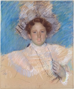
In the 1870s, Seurat’s near-contemporary Mary Cassatt was a catalyst for the resurgence of pastel, which she so fully mastered that her pastel drawings are perhaps even more highly regarded than her paintings. Cassatt favored tinted paper (most of which has now faded to a warm brown) and left large areas of her drawings bare—“non-fini”— so as to reveal the colored sheet below, thus actively engaging the substrate as a chromatic element within the composition rather than a passive pictorial ground. Around 1900, Cassatt’s colleague Edgar Degas also became heavily engaged with pastels, but he opted for tracing paper as his principal support—a counterintuitive choice since it has no “tooth,” or texture, for catching the oil crayon’s pigment. But the translucent support allowed Degas to trace over motifs from earlier drawings, usually of ballet dancers, transferring and varying the images to create new configurations as he developed a theme, a feature of his later pastels.
In the United States, artists largely relied on paper imported from European mills. John J. Audubon, in competition with a group of ornithologist illustrators to represent all of the birds of America in their actual size and scale, achieved his goal only because of the Whatman paper mill, which at that time produced the largest-sized paper calibrated for the medium of watercolor, double-elephant-size sheets measuring 40 by 26 ¾ inches. A review of Arshile Gorky’s 1930s ink-and-graphite drawings from his Nighttime, Enigma, and Nostalgia series reveals a wide variety of relatively expensive papers from European mills, including Michallet, Ingres d’Arches, Bristol, Schoeller-Shammer, and Ingres/Canson/Montgolfier. These were the lean years of the Depression and the artist’s economic situation was poor, yet he remained committed to purchasing only the finest drawing materials. The variety of surfaces indicates that this was a period of intense experimentation for Gorky; the drawings represent a compendium of mark-making techniques—hatching and crosshatching, stippling and scribbling, concise lines and large areas of tonal density. In some instances he washed, scraped, or rubbed the surface of the otherwise completed drawing. His selection of fine papers for this series underscores the significance that these drawings held for him, and indeed, they represent a key moment in his evolution from representational forms to the fully abstract.
Although generally speaking less labor intensive than painting, and involving less expensive materials, drawing still involves an investment of valuable studio time and artistic energy, and one might assume that any artist devoted to it would be picky about the paper he or she chose to work on. But this isn’t always the case, as the paper conservator Judith C. Walsh discovered when she undertook an in-depth survey of the papers that Georgia O’Keeffe used throughout her lifetime. Walsh had expected to find that O’Keeffe worked on a variety of different papers, but after reviewing more than a thousand drawings, she realized that the artist was quite consistent in her choice of unremarkable paper, noting that the sheets were “stunning for their simplicity” and that “they tend to be almost invisible to the viewer.”5 In fact, Walsh reports that O’Keeffe sold a stack of vintage Whatman paper that she had in her studio to a Santa Fe art-supply store in the 1970s.
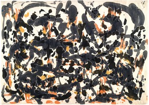
Perhaps due to the ubiquity of machine-made paper, many artists were attracted to working on handmade papers, which, unique themselves, inspired some unique projects. A stack of Japanese rice paper that Tony Smith gave to Jackson Pollock in late 1950 led to the pivotal set of ink drawings that were a catalyst for Pollock’s intensely dramatic 1951–53 black-and-white paintings—drawinglike paintings in which he reintroduced figuration, made solely in black enamel paint on unprimed canvas.
In the early 1950s, Douglass Morse Howell resurrected hand papermaking in America and began to supply artists such as Pollock, Lee Krasner, Helen Frankenthaler, and Anne Ryan with unique papers made from linen and flax, which, in their texture, color, and weight, enhanced both drawing and printmaking. The interest in handmade paper increased in the 1960s and 1970s largely as a result of the printmaking explosion that was taking place at that time in the United States. Kenneth Noland, for example, opened his own paper mill in Vermont, and Robert Rauschenberg tested his papermaking skills at the fourteenth-century mill Moulin à Papier Richard de Bas in Ambert, France. The result was Pages and Fuses (1974), an inventive series of editions in which Rauschenberg transformed pressed paper pulp into sculpture.
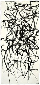
By the early 1980s, hand papermaking had taken on a new role as an independent medium, generating new forms of sculpture and three-dimensional constructions. Of course many artists still embraced its more traditional use. Brice Marden used twigs to make ink drawings, often on handmade paper, which dictated the character of the lines as the ink-dipped stick responded to the paper’s rough and bumpy surface. Marden’s drawings display the physical engagement involved in making them as much as the intellectual one, and the support that he selects for them can be as elegant and expressive as his mark-making. In the 1980s, for an important group of four ink-and-gouache drawings, Couplet Painting Study I–IV (1987–88), he used sheets of Twinrocker handmade paper that have feathery deckled edges, which echo the triangular glyphs that appear in these transitional works.
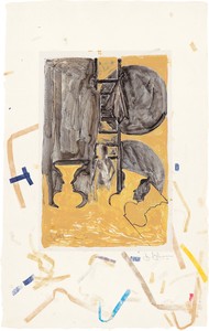
In 1990, when asked about his preferences in specialty papers, Johns responded, “My interest is limited to whatever is made available to me.”6 The Jasper Johns Catalogue Raisonné of Drawing, which documents drawings by Johns dating from 1954, the year he marks as the start of his practice, through 2014, reveals that this would remain his approach for another twenty-five years. Johns’s first extant drawings, from 1954—the only two surviving from that year—display remarkable virtuosity, but the rather plain sheets of now off-white wove paper on which they were made reflect a young artist’s humble beginnings.7 Throughout the 1950s, in fact, Johns seems often to have used what was at hand, including letter-size envelopes, blank pages pillaged from college yearbooks that bear a sorority’s insignia, and Japanese poem cards, or shikishi (in which paper is mounted on a metallic foil-edged board), which he purchased as a US soldier stationed in Japan in the early 1950s. There are highly finished drawings done on sketchbook paper, one edge fringed from the torn perforations, and on tracing paper, which, in one instance, he used to trace a reproduction of his 1955 painting Target with Four Faces when it appeared on the cover of the January 1958 issue of Artnews magazine.
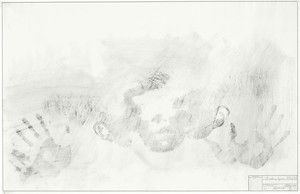
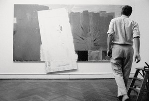
Some of Johns’s best-known early drawings are made on supports not typically associated with fine-art drawing. Out the Window, Device Circle (both 1960), and 0 through 9 (1961) were made on different sizes of slightly textured drafting paper manufactured by Keuffel & Esser, a firm that specialized in architectural and engineering tools and paper. Their retail outlet was on Fulton Street, not far from Johns’s Front Street studio, and just a block down from an art-supply store that he frequented, Fezandie and Sperrle, at 205 Fulton Street. At that time, 0 through 9, at 54 by 41 inches, was Johns’s largest drawing, and one wonders if it was the paper that invited the drawing rather than Johns setting out to find a support large enough to accommodate a drawing he had in mind. At about this time he also made his four charcoal-and-oil Study for Skin drawings (1962), also on drafting paper, in this case manufactured by the Frederick Post Company. The paper’s smooth, anonymous surface was the ideal support on which to make these body impressions. Notably, this engineers’ paper had a preprinted title block in the lower-right corner that Johns incorporated into the work by inscribing his name in it, as well as the day, month, and year of the drawing’s making. This was the first time he’d inscribed the full date and signature in a drawing, and it may have been the title block that initiated a practice that would occur more frequently in Johns’s work beginning in 1973. It was also at this time that Johns came upon some translucent plastic sheets in an art-and-drafting-supply store in Charleston, South Carolina, which inspired him to make his first ink-on-plastic drawing, Disappearance II (1962). Johns liked the way the ink puddled when applied to the nonabsorbent surface and the unpredictable patterns it produced once it dried. He has since made close to two hundred drawings on plastic of varying types, in a variety of both wet and dry media.
In 1960, Johns met Tatyana Grosman, the founder of the ULAE (Universal Limited Art Editions) print workshop on Long Island, and he began what would turn into a lifelong engagement with printmaking. Like all printmakers, Grosman knew that paper is as integral to a print as the material used to make it, and her adventurous spirit led her to seek out unconventional papers, or to commission special papers for individual projects. Johns would recall that his first project at ULAE, the 0–9 lithographs begun in 1960, was kept on hold for three years until they found the ideal paper. Printmaking may have sparked Johns’s interest in working with unfamiliar surfaces: as he ventured into different printmaking techniques, he began to use more traditional artists’ papers in his drawing practice, including Arches, Fabriano, and BFK Rives. He has also worked with handmade papers by Jeff Goodman, Douglass Morse Howell, and Fred Siegenthaler. Some of these handmade papers were made specifically for him, and bear either a “JJ” or “Jasper Johns” watermark. Vintage sheets of James Whatman paper from the 1950s and 1960s also stand out among Johns’s paper selections. One of the most uniquely beautiful supports in Johns’s drawing oeuvre is an exquisite sheet of handmade India paper on which he made Dancers on a Plane (1982), a crosshatch pattern fluidly rendered in graphite wash. Perhaps the most unusual substrate is Shrinky Dinks, a plastic sheet that shrinks to a fraction (about a third) of its size when heated in an oven, on which he has made four ink drawings ranging in size from 2 by 1 ¾ inches to about 4 by 3 inches.
In distinguishing drawing from painting, Johns once said, “The best drawings tend to seem more succinct, more austere, more schematic, more naked, closer to thought, closer to the force from which they arise.”8 This is all true, but to this I would add that a drawing begins as a surface with which an artist interacts. It’s where the work of art takes place. And it is within the collaborative process between medium and surface that one finds the power of a drawing.
1Margaret Holben Ellis, “‘Paper Is Part of the Picture,’” in Ellis, ed., Historical Perspectives in the Conservation of Works of Art on Paper (Los Angeles: Getty Conservation Institute, 2014), p. 159.
2Peter Bower, Turner’s Papers: A Study of the Manufacture, Selection and Use of His Drawing Papers 1787–1820 (London: Tate Gallery, 1990).
3Karl D. Buchberg, “Seurat: Materials and Techniques,” in Jodi Hauptman, Georges Seurat: The Drawings, exh. cat. (New York: Museum of Modern Art, 2007), p. 33, n. 5.
5Judith C. Walsh, “Paper Survey,” in Barbara Buhler Lynes, Georgia O’Keeffe: Catalogue Raisonné, vol. 1 (New Haven: Yale University Press; Washington, D.C.: National Gallery of Art; and Albuquerque, N.Mex.: Georgia O’Keeffe Foundation, 1999), p. 25.
6Jasper Johns, in Ruth Fine and Nan Rosenthal, “Interview with Jasper Johns,” in The Drawings of Jasper Johns, exh. cat. (Washington, D.C.: National Gallery of Art, 1990), p. 80.
7Eileen Costello, Kate Ganz, and Bernice Rose, Jasper Johns Catalogue Raisonné of Drawing (Houston: Menil Collection, 2018), pp. 2–5.
8Johns, in “Flicker in the Work: Jasper Johns in Conversation with Richard Shiff,” Master Drawings 44, no. 3 (2006), pp. 278–79.
Eileen Costello is a historian of modern and contemporary art. A specialist in catalogue raisonné scholarship, she is the editor and project director of Jasper Johns Catalogue Raisonné of Drawing (The Menil Collection, 2018), is nearing completion of a catalogue raisonné of Tony Smith’s architecture, and is editing the catalogue raisonné of Arshile Gorky’s complete works.