Nearly fifty years ago, Samuel Beckett and Jasper Johns met in Paris and began a collaboration on what would become Foirades/Fizzles, a deluxe limited-edition artist’s book published by Petersburg Press in 1976. Now, on the occasion of the Jasper Johns retrospective at the Philadelphia Museum of Art and New York’s Whitney Museum of American Art, Gagosian Quarterly looks back to the genesis of this project with a conversation between independent researcher Anthony Atlas and Gagosian director Bob Monk. Their discussion focuses on the creative encounter between the artist and the writer and on how the book and related works became a generative source in Johns’s art.
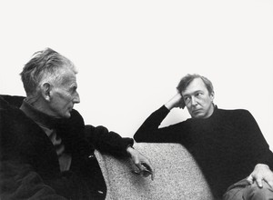
Samuel Beckett and Jasper Johns at Atelier Commelynck in Paris, 1975. Photo: Robert Doisneau/Gamma-Rapho via Getty Images
Samuel Beckett and Jasper Johns at Atelier Commelynck in Paris, 1975. Photo: Robert Doisneau/Gamma-Rapho via Getty Images
Anthony Atlas is an independent researcher based in New York who consults for artists’ estates and foundations. He is the editor of William N. Copley: Selected Writings. Photo: Dan McMahon
Bob Monk was a director at Gagosian, New York, for over twenty years, working closely with Ed Ruscha and Richard Artschwager. He curated numerous Gagosian exhibitions, including the multivenue Ed Ruscha: Books & Co., and worked with the Whitney Museum of American Art, New York, on the production of the artwork it commissioned from Artschwager for the museum’s elevator interiors.
ANTHONY ATLASLet’s start with Jasper Johns recounting his first meeting with Samuel Beckett, which took place in November 1973, while he was in Paris traveling with the Merce Cunningham Dance Company for their performance of Un jour ou deux (set and costume design by Johns):
I met Beckett through the exwife [Verá Lindsay] of an art critic. She wanted me to do illustrations to Waiting for Godot, but I said I’d like to work with Beckett on something new. She didn’t seem to understand and kept sending me other published texts. Then, when I was in Paris with Merce Cunningham and his dance company, I met Beckett. I told him I wanted to illustrate something new. He looked horrified. “A new work?” he asked me. “You mean you want to me to write another book?”1
BOB MONKJasper’s recollection of the events is terrific. After Johns explains that he’d be happy with an unpublished fragment or unused words or phrases, Beckett realizes he has suitable material written in French, but he would first need to translate the texts into English. At that point Johns planned to incorporate whatever text Beckett sent inside his images, or, in his words, as “phrases within the picture.” Perhaps he expected much shorter works than what Beckett eventually sent him!
AAI was surprised to learn that Johns chose the images he would base his work on before he knew what Beckett’s texts were going to be. This project would not be an illustrated edition or collaboration in the usual sense, but something more adventurous.
BMExactly. The results are a spectacular combination of Johns’s etchings and Beckett’s unusual monologues, appearing side by side in both French and English (hence the bilingual title). Although we can say that the texts by Beckett and the images by Johns were not previously related at all, the images work beautifully with Beckett’s dark texts.
AACan you tell me about the source of the images Johns used throughout the book?
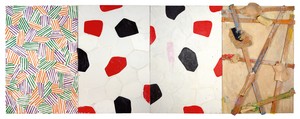
BMThey’re based on elements from Jasper’s painting Untitled, 1972.
AALater, in 1978, Johns told the curator Christian Geelhaar, “I didn’t know what his texts were going to be, but I just knew—what I knew of him and what I know of myself—that I wouldn’t be able to do anything better than that.”2
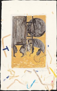
BMFor the collaboration with Beckett, Johns used what he felt was his most successful work at the time, which he had recently completed.3 An understandable decision! But he also said that Untitled provided images that he felt he “could comfortably associate” with Beckett’s writing, which is very interesting to think about.4Untitled—a large painting now in Cologne’s Museum Ludwig collection—consists of four panels with three motifs, two of which had appeared in earlier works.
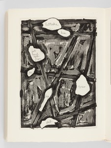
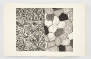
AAThese motifs are the body parts on the right panel, the flagstones in the center two panels, and the crosshatch pattern on the left panel, appearing here in Johns’s work for the first time.
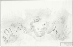
BMBody parts had appeared as cast objects in the early Target paintings from the mid-1950s, and then as actual physical imprints in a series of drawings from 1962, Study for Skin I–V, which relate to the print Skin with O’Hara Poem, 1963–65. Here Johns made the corporal gesture of applying graphite to his face and body, which he then pressed to the paper, creating a ghostlike impression. In the Untitled of 1972, the body parts are three-dimensional plaster-and-wax casts, splintered and bolted onto pieces of wood. Each is color coded with one of seven color names stenciled on its reverse. In the book Foirades/Fizzles, the artist’s face is so deeply etched into the paper that it once again becomes absolutely corporal to the eye. The flagstone motif was introduced in Harlem Light, 1967, and would be returned to in later works.
AAWhat was the critical response to Untitled when it was first exhibited?
BMI don’t believe it was widely discussed at the time. Tom Hess is quoted as observing how Johns in this painting “seemed concerned with preserving memories and re-evoking lost experiences,” something that can certainly be said of works Johns created later in the 1980s.5Untitled was recently on view at the Philadelphia Museum of Art in their part of the Johns retrospective.
AAFoirades/Fizzles wasn’t the first time a Johns work incorporated literary elements. You mentioned the print Skin with O’Hara Poem, 1963–65. What other works from this period interest you in relation to the later project with Beckett?
BMSeveral works from 1961 illustrate a darker side of Jasper’s oeuvre, works with a great sadness and an accusatory tone and thrust: Liar, Disappearance II, Water Freezes, Painting Bitten by a Man, No, Good Time Charlie, and Fool’s House. I think that these paintings relate so well to the tone in Beckett’s works. There’s also In Memory of My Feelings—Frank O’Hara, a tribute to O’Hara’s poem by that title, and Periscope (Hart Crane), 1962.
AAThe titles of these paintings are striking. I’m reminded of Beckett’s great title for a collection of short prose pieces: No’s Knife (1967).
BMWhen the project to make Foirades/Fizzles was agreed to, in 1973, and produced in 1976, artist and writer were well matched to collaborate.
AABeckett sends Johns the first three of five translated prose fragments in 1974 with a letter describing the title: “The general title would be fizzles and subtitles simply, 1, 2, and 3. The shorter Oxford Dictionary defines fizzle as follows: 1. The action of breaking wind quietly; the action of hissing or sputtering. 2: A failure or fiasco.”6 Jasper must have loved this letter. There’s the favorite word of Beckett’s—fiasco—and this emphasis on failure. Given the unfinished nature of Beckett’s texts and this notion of failure, I wonder if Jasper felt liberated to really open up and experiment with new techniques and procedures.
BMPetersburg Press introduced Johns to the printmaker Aldo Crommelynck in 1974. Before then, Johns had mainly worked in lithography when making prints. (He had made a few line etchings at Universal Limited Art Editions in 1967, a portfolio of six intaglios titled First Etchings.) Crommelynck had become well known as Picasso’s etcher for ten years ending in the artist’s death, in 1973. The deep impressions and intense blacks that Crommelynck was able to print were perfect for the intense drama on each page of Foirades/Fizzles. He opened up to Johns so many etching techniques, including aquatint, lift ground, open-bite, stop-out crayon, and burnishing. Johns became immersed in etching and continued to use the technique long after his collaboration with Beckett and Crommelynck. He has an etching press and a dedicated printer at his studio in Connecticut, where he continues to work in this medium.
AAThere were intaglios among the prints and works on paper in his recent series depicting a figure in shadow, a skeleton with a top hat—a variation on a motif in his remarkable Seasons series from the 1980s.
BMIf that dandy skeleton isn’t a good-time Charlie, I don’t know what is!
AAHow exactly did Johns incorporate imagery from Untitled in Foirades/Fizzles?
BMThe panels from Untitled appear there as scaled-down sketches, in repeated scrolling variations of the original sequence. There are also full-page and full-spread images focusing on specific themes from the painting. There are etchings of words, for example, that approximate the fragmented body parts from the painting: buttocks, knee, sock, foot, hand, floor, face, torso, leg, feet. On the right side of the spread, the same words appear in French.
AAIn another of Beckett’s letters to Johns, we learn that he originally disliked the idea of side-by-side French and English texts: “I do not so much like the bilingual setup, but would not oppose it if pleases you.” In the same letter Beckett expresses a vivid opinion about enlarged type but ultimately encourages Johns to use as much of the book as possible for his images: “To blow up type simply in order to occupy space seems very wrong to me and literally to interfere with the reading process. This is surely the main and almost invariable defect of illustrated editions and it would be a relief if we could avoid it here, that is respect the non-image nature of the text, not ask of it what it can’t give and leave the bulk of the book as space to you.”7
BMI find this so wonderful. Ultimately Beckett encourages Johns to maximize the impression of his images in the book. And Jasper does.
AAIt seems Beckett did not like illustrated editions very much.
BMNope!
AAYet he agrees to similar projects with other artists, for example with Robert Ryman (Nowhow On, Limited Editions Club, 1988) and Louis le Brocquy (Stirring Still, Blue Moon Books and John Calder, 1988), though I’m not aware if he was as directly involved as he was with Johns. My sense from Beckett’s letters to Johns is that his deep respect for visual artists extended naturally to Jasper, and others. It was not just his characteristic courtesy on display here, he had a strong sympathy for painters and visual artists.
BMThis is key to Foirades/Fizzles. You get a strong sense of Jasper’s range of imagery and freedom, which Beckett seems to have supported. On an aesthetic level, the book is actually more of a Johnsian object than anything else. It does not have the starkness we might associate with Beckett’s plays.
AAWhat was happening for Johns in the art world in 1976–77, when Foirades/Fizzles was released? The release of this very special, very limited book must have been a major event, perhaps more so in the art world than in the literary world.
BMIt was a very heady time for Johns in New York. In the same year as the publication of Foirades/Fizzles, 1976, his crosshatch paintings were exhibited at Leo Castelli. Art-world intelligentsia were confused and abuzz. (“What in the world does the crosshatch pattern mean exactly? Are these abstract random marks?”) As the critic for New York Magazine, Tom Hess argued that the crosshatch marks were very much a system of thought-out patterns and structures.8Things! in October 1977, a retrospective of Johns’s work, opened at the Whitney Museum. The excitement of both events was palpable. People once again poured over Jasper’s work and discourse filled the air.
It was at this time that Foirades/Fizzles was introduced to the art world. In the Whitney retrospective, the book was installed on the ground floor with a catalogue of its own! At Castelli, we all loved looking through the book and we all had our favorite etchings. We also discovered upon delivery of our copies that the etchings were so dense, with such deep wells of ink printed on the surfaces of the pages, that there was a danger of off-printing (when the heavy ink from one page migrates to the opposite page and leaves a ghost image). We set out to use different papers and archival materials to stop this from happening.
AAThe process behind the crosshatch paintings is so fascinating to learn about.
BMThese are elaborate works, with a complex system of mirrored sections and an implied scrolling movement of vertical sections from right to left. Various sections of marks repeat and change color. The titles are often poetic and expressive: Corpse and Mirror, 1976–77; Usuyuki, 1977–78; and Cicada, 1979. In Foirades/Fizzles, the pattern appears as a color lithograph lining the linen outer box (actually printed at ULAE on Long Island), in the front endpapers, and throughout in various permutations of the sequence of panels from Untitled.
AAI love Johns’s recollection of first seeing the crosshatch pattern, apparently on a passing car: “It had all the qualities that interest me—literalness, repetitiveness, an obsessive quality, order with dumbness, and the possibility of complete lack of meaning.”9 Beckett’s own experiments with repetition and obsessiveness are explored in the novels Watt (1953) and Molloy (1951). I like thinking of the crosshatch paintings through this Beckettian lens of creating an elaborate, obsessive system with no ostensible purpose other than its own creation or expression.
BMAbsolutely. It’s interesting that Johns does not seem to be interested in the abstract quality of the crosshatch marks but in what he could do with them.
Now, we’ve talked about the texts in the book and you’ve mentioned that at least some of the Fizzles were not exactly new when they were published.
AAEach Fizzle is a prose fragment, originally written in French, that Beckett had later titled Foirades (“farts”) and that he translated into English for the book. Scholars date the composition of these works to 1950 to 1960, although Beckett himself dated them to the early 1960s.10 As with many of his writings from the period, an unidentified narrator describes rudimentary or conscious events with no locating or narrative context. Around the time Jasper met Beckett, the French journal Minuit published several of the original Foirades.
BMWhat does Beckett scholarship make of these texts?
AAI’ve wondered the same thing. There is so much great shorter prose by Beckett that I think these texts may be overshadowed by contemporaneous or earlier pieces, such as those collected as Texts for Nothing (1950–52). But rereading the Fizzles now, I can appreciate their context, presenting a type of creative impasse that has its own significance when talking about Beckett’s literary texts, which often stress the “impossibility of completion,” as Beckett scholar Mark Nixon put it.11 But even in these abandoned works we can see the meticulous structure of Beckett’s writing shine through, as well as its humor and power.
BMThe unidentifiable narrators in these stories resonate well with the fragmented, almost claustrophobic images in John’s etchings. There is shared humor, too—in Fizzle no. 5, for example.
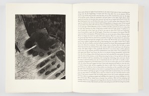
AAAccording to the letters, Beckett gave Johns permission to use all or any one of the five texts he eventually provided to him, and it appears that Johns was also free to decide their order, which gives us insight into his thinking. In no. 5 (“Horn came always at night”), the beleaguered narrator is in an isolated place—a bedroom—but receives visitations from Horn, who reads to the narrator by torchlight. The narrator describes their ailing body and the difficulty of leaving their bed after so many years of sporting: “What ruined me at bottom was athletics.” What image does Johns use here?
BMOn the facing page is one of the Johns images perhaps more analogous to Beckett’s text: an imprint of a foot and a hand on the floor, with a sock—an interpretation of a striking detail from the fourth panel of Untitled—all in a sumptuous range of black tones. You can read the grain of the skin in this etching. Johns also adapts his numbers to function as title pages for each Fizzle.
AADo other references to Beckett appear in John’s work after the release of Foirades/Fizzles?
BMThe first is in End Paper of 1976, in the collection of New York’s Museum of Modern Art. It’s an oil-on-canvas diptych with crosshatching on the left panel and flagstones on the right. It’s similar to the full-spread etching Hatching and Flagstones preceding Fizzle no. 3 in the book, and of course it’s a reflection on the book project itself. In 2005, Johns creates the painting Beckett, a tribute to the writer.12
AAMuch later, after the Catenary paintings of the late 1990s and early 2000s, Johns returned to the flagstones theme again in this new series, and with that the collaboration with Beckett comes back to mind.
BMYes, and these are all such poignant works, the Catenary series and what came after.
AAOn the surface there’s an obvious connection to Beckett: the color gray, a major theme for both the artist and the writer. But the flagstones in Beckett are more particular, bringing to mind the story of his interactions with Beckett.
BMI believe Johns had met Beckett at the Atelier Crommelynck to show him his work in progress on the book, and Beckett’s response focused on the flagstones. Both the 1976 painting End Paper and the 2005 Beckett tell that story.
AAOk, so we can end where we started, with Johns’s great account of collaborating with Beckett, since this is the subject of these paintings.
BMIt’s a perfect ending. The memory of Beckett’s response to the work stayed with Jasper.
When I showed the etchings to Beckett he held them very close to his face and scrutinized them for ages, scanning up and down (his eyesight is very bad). I was terrified he’d hate what I had done. I said, “Sam, I’ll be happy to explain—” “No, no,” he said, “It’s perfectly clear,” and he made approving noises. Then I showed him the endpapers. He said he hoped that I would place the cross-hatching design at the front of the book and the flagstones at the back. I asked him why. He said, “Here you try all these different directions but no matter which way you turn you always come up against a stone wall.”13
1 Jasper Johns, quoted in Edmund White, “Jasper Johns and Samuel Beckett,” Christopher Street 2, no. 4 (October 1977), repr. in Jasper Johns: Writings, Sketchbook Notes, Interviews, ed. Kirk Varnedoe (New York: Museum of Modern Art, 1996), pp. 152–53.
2 Johns, quoted in Christian Geelhaar, “Erfahrungen auf ‘anderen Ebenen,’” Jasper Johns: Working Proofs, exh. cat. (Basel: Kunstmuseum Basel, 1979), repr. in Jasper Johns: Writings, p. 197.
3 Working at Gemini G.E.L. in Los Angeles, Johns had already begun a suite of prints, Four Panels from Untitled 1972 (1973–74), based on the painting when he decided to use the same imagery for the collaboration with Beckett. See ibid.
4 Johns, in Roberta Bernstein, “An Interview with Jasper Johns,” January 18, 1980, in Lawrence D. Kritzman, ed., Fragments: Incompletion and Discontinuity (New York: New York Literary Forum, 1981), 8–9:279–90, repr. in Jasper Johns: Writings, pp. 200–211.
5 Thomas Hess, quoted in Fred Orton, “Present, the Scene of . . . Selves, the Occasion of . . . Ruses,” Foirades/Fizzles: Echo and Allusion in the Art of Jasper Johns, exh. cat. (Los Angeles: Grunwald Center for the Visual Arts, Wight Art Gallery, University of California, Los Angeles, 1987), p. 170.
6 Samuel Beckett, letter to Johns, February 7, 1972, in The Letters of Samuel Beckett, vol. 4, 1966–1989, ed. George Craig et al. (Cambridge: Cambridge University Press, 2016), p. 359.
7 Beckett, letter to Johns, March 31, 1974, in ibid., p. 363.
8 See Thomas Hess, “On the Scent of Jasper Johns,” New York, February 9, 1976, and Mark Rosenthal, Jasper Johns: Works since 1974, exh. cat. (Philadelphia: Philadelphia Museum of Art, 1988), p. 20.
9 Johns, quoted in Sarah Kent, “Jasper Johns: Strokes of Genius,” Time Out (London), December 5–12, 1990, repr. in Jasper Johns: Writings, p. 259, and in Bernstein, “Relationships of Parts and Wholes,” in Bernstein, Jasper Johns: Catalogue Raisonné of Painting and Sculpture, vol. 1, Jasper Johns’s Painting and Sculpture, 1954–2014: Redo an Eye (New York: The Wildenstein Plattner Institute, and New Haven and London: Yale University Press, 2017), p. 181.
10 See entry for “Foirades” in C. J. Ackerly and S. E. Gontarski, The Grove Companion to Samuel Beckett: A Reader’s Guide to His Works, Life, and Thought (New York: Grove/Atlantic, 2004).
11Mark Nixon, Samuel Beckett’s German Diaries 1936–1937, Historicizing Modernism series (London and New York: Continuum, 2011), p. 34.
12 The 2005 painting is notably elegiac in tone. Bernstein points out that Johns created a drawing based on this painting in 2006, the centenary of Beckett’s birth. See Bernstein, “Something Resembling Truth,” in Bernstein, Redo an Eye, p. 311 n. 60.
13 Johns, quoted in White, “Jasper Johns and Samuel Beckett,” repr. in Jasper Johns: Writings, p. 153. The final layout of Foirades/Fizzles follows Beckett’s suggestion on the endpapers: hatching at the front, flagstones at the back.
Anthony Atlas is an independent researcher based in New York who consults for artists’ estates and foundations. He is the editor of William N. Copley: Selected Writings. Photo: Dan McMahon
Bob Monk was a director at Gagosian, New York, for over twenty years, working closely with Ed Ruscha and Richard Artschwager. He curated numerous Gagosian exhibitions, including the multivenue Ed Ruscha: Books & Co., and worked with the Whitney Museum of American Art, New York, on the production of the artwork it commissioned from Artschwager for the museum’s elevator interiors.