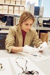
As part of an ongoing collaboration, Gaia Repossi, creative director for the Paris jewelry house Repossi, has created a collection of pieces inspired by Robert Mapplethorpe’s art practice and jewelry. Speaking with Michael Ward Stout, president of the Robert Mapplethorpe Foundation, and the Quarterly’s Wyatt Allgeier, Repossi recounts the origins of this project and details her deep admiration for the artist’s precision and eye for composition.
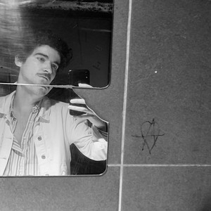
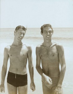
Robert Mapplethorpe wearing a selection of his jewelry, New York, 1971. Photo: Valerie Santagto
Robert Mapplethorpe wearing a selection of his jewelry, New York, 1971. Photo: Valerie Santagto
Wyatt Allgeier is a writer and an editor for Gagosian Quarterly. He lives and works in New York City.
Growing up in Turin, Italy, in a family of jewelers, Gaia Repossi absorbed her father’s and grandfather’s passion for jewelry and early on developed a taste for visual art. In 2007 she joined her father in the family business, the Maison Repossi, taking on the role of artistic and creative director. Photo: Antoine Doyen
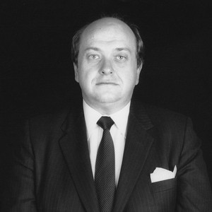
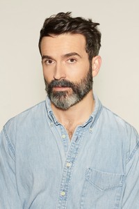
Michael Ward Stout is president of the Robert Mapplethorpe Foundation. He founded a legal practice focused on image-based issues and the rights of visual artists in 1974 and has represented a number of painters, sculptors, photographers, choreographers, and fashion designers, as well as arts foundations, museums, and artists’ estates.
Wyatt AllgeierGaia, I know that art and architecture have held an important place in your life, even from a young age. You’re referencing Robert Mapplethorpe in this special collection—I’m curious when you first encountered his art and what impact it made on you.
Gaia RepossiHis early work is particularly interesting to me, but like most everyone, I knew his iconic photography first. And it was through his photography that I first engaged the Repossi house with his art. His photography, especially his later photography, made absolute sense immediately, because of the elegance, the sharpness, the detail, and the perfectionism. I found it extremely severe but at the same time elegant and young. Strong values came through its subject matter. While being formally rigorous, his later work contained these ideas of a new woman, a new era, a new femininity, a new gender. This message behind the elegance resonated deeply with what I was working toward.
The first image I wanted to use for the house was a photo of a palm tree; I had purchased that work a while back, and it’s a source of continual inspiration. And since then, we’ve used a lot of Mapplethorpe’s photography in various forms, asking permission from the foundation for invitation cards, launches, beautiful images to send to clients as prints, and so forth.
Beyond the photography, I learned of the jewelry and other work through the foundation. I hadn’t been aware of it, and they reached out with the idea of engaging this less-known aspect of Mapplethorpe’s creative life.
WAMichael, before we speak about Gaia’s project, could you talk a little about Mapplethorpe’s jewelry?
Michael WARD StoutI knew Mapplethorpe in the 1970s as an acquaintance, but I didn’t start working with him as his lawyer until probably 1980 or 1981. We became good friends, so I started to learn about his background. The first thing that was apparent was that everything in his life from a young age onward was a creative act; he was always making things, be they jewelry, photography, assemblages, interiors, and so on. His father was an engineer and had some carpentry skills, and I know together they built a box for his pet snake [laughs].
When Mapplethorpe moved to Manhattan in 1969, he began making collages and working with a Polaroid camera. He was also very interested in jewelry, which he made for himself, mostly out of found objects. The idea, later, of producing jewelry on a larger scale fascinated him. Because I had been Salvador Dalí’s lawyer, and Dalí had many licensing deals for watches, Mapplethorpe would show me sketches for watches in the hope that I could see this through. So it was a lifelong interest of his.
WADoes the foundation have many of his pieces in its archives?
MWSWe have quite a few. In 2014, we completed a major gift to the Getty Research Institute and the Los Angeles County Museum of Art. The Getty Research Institute, which Gaia knows well—she’s spent a lot of time there—was eager to acquire all of his earliest works: Polaroids, collages, what we call his unique works, and handcrafted jewelry and objects. But we held quite a bit back.
WAGaia, I’m curious about the order of operations—how you established contact with the foundation and how that collaboration developed.
GRWe were in touch regularly because I was using a lot of Mapplethorpe images, and I think there was a reciprocal fascination. The link between the house and the foundation makes sense in terms of independent spirit; we’re both less conventional. So three or four years ago the foundation actually reached out to me. I was extremely honored but I immediately realized I didn’t know enough about the early work, especially the jewelry. So that’s when I took the trip that Michael mentioned to the foundation in New York and the Getty Research Institute in Los Angeles, where I was given access to all the early works. I’d seen pictures of Mapplethorpe wearing the jewelry when he was young, but to have access to the actual objects, and to photographs of them, and be able to touch them was, for my profession, one of the biggest honors I could be given. The task to remake them and give them a new life with fine materials was an incredible challenge, one that I value deeply.
WAMichael, on your end, did the foundation have any specific concerns or hopes when this partnership began?
MWSWell, we learned about Repossi through Artestar, the foundation’s licensing representative. In the thirty-plus years since Mapplethorpe died, we’ve been very conservative and strict about licensing, mostly only licensing his works for paper products. We felt that when an artist dies, the people left behind simply don’t have the creative possibility he or she had, and if they’re creative, it’s not in the same way as the artist they represent. However, through our research, it became clear to us that Repossi’s approach to jewelry design would work well with Mapplethorpe’s works. I don’t think this arrangement would work as successfully with any of the major institutional luxury-jewelry producers. Gaia took a lot of time researching and exploring. This reassured us. Often, when people do this type of work, they work from a photograph or a JPEG or something like that. Gaia actually did this research in California and in New York, and whatever she could do in Paris and other places, to learn as much as could be learned about Mapplethorpe’s design process.
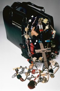
Jewelry by Robert Mapplethorpe spilling out of a doctor’s bag, promotional image, New York, 1971. Photo: Valerie Santagto
WAGaia, when you were in the archives handling the objects, was there anything specific about the jewelry pieces or other objects that really struck you in terms of his techniques or materials?
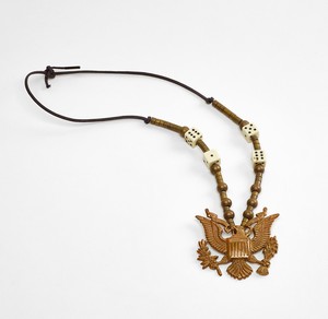
GRWhat really struck me was the consistency of Mapplethorpe’s language, which evinces an extreme ability in terms of composition. It’s impossible not to be sensitive to this aesthetic that he has, where the symmetry is always on the side. In the objects archived and filed, you can already see all the themes of his work across his career—they were all there, all the seeds. He was obsessed by certain themes that were probably haunting him aesthetically, visually, that really spoke to him, and you can find them in all these objects: the devil, homosexual objects, feminine things, hardware, American symbols.
Beyond those themes that compose his vocabulary, you have his aesthetic. His pure capacity of composition is gorgeous. There’s also a palette that goes from dark red to black to gray—it’s very masculine, a little bit dark. There’s not a lot of softness in the objects. And in an era when everyone was a hippie, they were also prepunk. They’re piled a little bit with feathers, like hippies, but there are a lot of skeletons before they were in fashion. And the skeletons are there not just because they’re cool but because of his relationship to death, to the darker side of life.
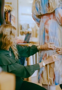
Gaia Repossi at the Robert Mapplethorpe Foundation, New York. Photo: Jeremy Everett
WAI understand there are different installments in this project: there was a first collection in the spring of 2021, and in 2022 you’ll be releasing a second. Are there differences between these two collections, or is it more of a continuation?
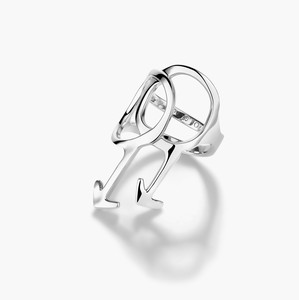
GRIt’s a continuation, and each comprises a variety of types of pieces, from very straightforward to more complex, refined items. We have, for instance, a crab claw entirely sculpted by hand by Maître Cirier. We have a ring, the Mechanic ring, inspired by a necklace made with chunky elements, like car-engine parts; we made that idea into refined small engines that move.
WAMichael, do you have a favorite piece? Do you have a piece that, having known Mapplethorpe, you think he would have treasured?
MWSHe certainly would have liked the Flag ring. It’s very clever.
GRI remember when I presented some of the research to Michael, you and the members of the foundation said that, because you’re always so focused on the photography, you had not been as aware of some of the jewelry. I think it’s an important side that the public will now get to see.
MWSI wasn’t familiar with most of it. When Mapplethorpe died, I’d never represented a photographer before, nor an estate. And then most things were packed up, the early things. An auction house came in and appraised everything and they thought that all of his Polaroids were just test shots, so they valued the total lot at some ridiculously low number. They didn’t realize, and I didn’t realize, but people who knew him through his art believed that his history with Polaroids was a very important part of his development. And as Gaia just said, when you really get to know the jewelry, you see that his entire aesthetic and development can be seen through that.
GRIt’s great that you’re mentioning the Polaroids, because I was fascinated by the photography that was contemporary to the jewelry, which was all Polaroids. And they’re gorgeous. The campaign images we took for this collection were really inspired by the Polaroids.
MWSThere are beautiful Polaroid images of objects like a striped mattress or a vacuum cleaner hose, all very formally arranged. Mapplethorpe was obsessed with formality, and particularly the formality he learned from the Catholic Church. His loft on 23rd Street had so many religious objects arranged in extremely formal tableaux.
GRYes. They look like altars, definitely. The Polaroids themselves are very pure. They’re very minimal. They’re very modern already.
Wyatt Allgeier is a writer and an editor for Gagosian Quarterly. He lives and works in New York City.
Growing up in Turin, Italy, in a family of jewelers, Gaia Repossi absorbed her father’s and grandfather’s passion for jewelry and early on developed a taste for visual art. In 2007 she joined her father in the family business, the Maison Repossi, taking on the role of artistic and creative director. Photo: Antoine Doyen
Michael Ward Stout is president of the Robert Mapplethorpe Foundation. He founded a legal practice focused on image-based issues and the rights of visual artists in 1974 and has represented a number of painters, sculptors, photographers, choreographers, and fashion designers, as well as arts foundations, museums, and artists’ estates.