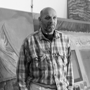
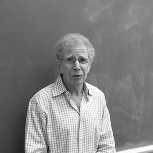
A Conversation Between Peter Doig and Richard Shiff
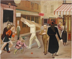
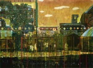
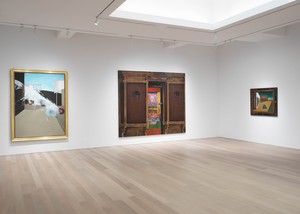
A New York exhibition conceived and curated by the artist Peter Doig takes as its point of departure Balthus’s 1933 painting The Street, in the collection of the Museum of Modern Art, New York. Ahead of the show, Doig and art historian Richard Shiff met up to look at Balthus’s painting together in person.
Peter Doig was born in Edinburgh in 1959 and grew up in Trinidad and Canada before moving to London to study at Saint Martin’s School of Art and the Chelsea School of Art. Since 2002 he has divided his time between London and Trinidad. His work is represented in major public and private collections worldwide.
Richard Shiff is Effie Marie Cain Regents Chair in Art at the University of Texas at Austin. His recent book Sensuous Thoughts: Essays on the Work of Donald Judd collects his various writings on the artist over a twenty-year period. For Gagosian he recently wrote “Haunting,” a text for the catalogue of David Reed’s exhibition of new paintings in 2020.
Richard ShiffFrom conversations over the years, I know that many people really like this painting. But to think of it in relation to your art specifically: the figural quality reminds me of your work, as does the complexity of the urban environment. These figures are iconic. They’re frozen in gesture, and the gestures are precise and enigmatic and meaningful all at once.
Peter DoigThat’s the mystery of the painting, and that’s why it has such a lasting resonance, because it presents a puzzle. It has a mixture of the real world, the world of painting, and the world of painting in the real world. When The Street was made, pretty much all shop fronts and their corresponding signs would have been hand painted; there would have been no photographic signage, et cetera. And I think Balthus was obviously aware and in some ways inspired by this painted world.
RSThese figures have the character of the type of Renaissance painting that is defined as linear, where the shape of the body is very distinctive and essentially geometrical.
PDIt’s as though he had absorbed almost everything that happened in painting from the Renaissance up to the Bauhaus. There’s an earlier version of this painting that Balthus made when he was twenty-one and that feels quite different, almost impressionistic, in the way it’s made.
RSHonestly, this work has always reminded me, vaguely but insistently, of Seurat’s [A Sunday on] La Grande Jatte [1884]. It’s a similar size. The figures are stiff. They’re very clearly outlined. But I’m also impressed by how it’s crisp and blurry at the same time.
PDIt’s not afraid to look like a sign painting.
RSYeah.
PDFifteen years later, Balthus famously made a painting called The Mediterranean Cat—a cat sitting at a table with a fish on its plate, a rainbow over its head, and the sea behind it. It was like a painting you’d see in a restaurant. It has a similar sense of directness. In fact I think it was painted for a restaurant.
RSYeah, now that you say that.
PDIn a way, he was making a painting that wasn’t about being an expert painter. A lot of painters at that time would have thought The Street was, let’s not say amateurish, but a bit callow in its making. Not callow in its subject, though. And let’s not forget that he was in his twenties when he made this, he was a very young painter.
RSThat’s right, but it doesn’t look like a young person’s painting. It’s too ambitious.
PDYeah, it’s very ambitious.
RSThere’s a figure on the left that resembles a signboard figure, the mannequin with the tall chef’s hat. All that’s missing is the menu. And the gesture of the central figure—
PDHe looks like a bandleader, maybe of a marching band.
RSExcept the other members of the band aren’t there. We simply have a bandleader. I just noticed that the curbing on the left side of the canvas disappears as it recedes into space behind the figures. It doesn’t turn the corner—a little bit of a liberty there. But Peter, in your painting—not to belittle what’s going on by calling it artful, but you’ve got artful remains of underpainting in your paintings, and that’s true here as well.
PDWell, I do enjoy that. Not just in this painting but in other artists’ paintings as well.
RSWhy do you gravitate to this picture? It seems like you’ve been fascinated with it for a while.
PDI’m not the only one, by any means. It’s just a painting that I find endlessly beguiling. It needs to be seen. You feel like you’re witnessing something unfold before your eyes. It’s a kinetic painting that required a lot of decision-making on Balthus’s part. There’s a certain geometry to the painting as well, the underpinnings of a grid. You almost feel the presence of a T-square in its construction. A bold painting to have made, a street scene full of incidents from life both witnessed and imagined.
RSCompositionally, it’s full of geometric relationships. The girl’s elbow is virtually a right angle. And the shadow on the white pants of the worker carrying the wood, that’s a geometric curve. And the tilt of the hat on the boy being carried, and the scarf of the nurse against the check pattern on her blouse. It’s rendered somewhat indistinct, because she’s in the background, but it’s a pretty skillful thing.
PDThe hands are also very important. Every figure’s hands, except for the mannequin, remain active.
RSYeah, they’re all gesturing or pointing in some way.
PDIn looking at the green detailing that carries across the awning of the building on the center left, above the figures, you can see evidence of little spheres that he then painted out with one gestural stripe. And further down he hasn’t painted them all. They just cease to exist.
It’s just a painting that I find endlessly beguiling. It needs to be seen. You feel like you’re witnessing something unfold before your eyes.
Peter Doig
RSAs if that’s a way of indicating depth. Or maybe he just stopped. There are lots of areas of incompletion that don’t seem to damage the painting, though you can’t see what’s being described there. It’s a bit of genius to put the pink in that green sign as a diagonal above the boy being carried, and it fits with everything else that’s happening on that side of the picture.
PDI had the opportunity to see the earlier version of this street scene this morning, which is compositionally similar but painted in such a different way. There’s so much more brushwork in that version. And it looks as though Balthus used the same brush to describe the boy’s face in the foreground as he did to paint a horse that’s in the background. He still allows himself quite a bit of looseness in this version, however; I guess because of its more ambitious scale, he wanted to turn this into more of a formal painting. The sketchy elements in the previous version are congealed into dark forms and silhouettes. Possibly the most-described passages in the painting are the two heads on the far left.
RSYeah. It’s interesting to think about taking out the elements that would be too sketchy to get away with at this scale, but leaving everything very sketchy in the background, which matters less at this scale. By the way, what is this main figure wearing?
PDLooks like very high-waisted moleskin trousers.
RSBalthus produced a torso and legs in that figure with a minimal amount of articulation.
PDAlmost the same color as the piece of wood.
RSYeah. The wood is better described. That’s good sign painting, so to speak.
PDTo be viewed from a distance.
RSThere are all kinds of choices being made. For instance, the way a hand appears, the articulation of the fingers, seems to be a device to make the painting interesting in that place.
PDThere seem to be a lot of devices used to make the painting, to make it right, as it were, to tie it together, to make it feel like it’s done. It’s a very open painting. It’s not pretending to be anything else.
RSYeah. But I mean, we say the same about what you do.
PDI would hope so. There was an exhibition at the Musée Marmottan Monet in Paris recently, I don’t think Balthus was in it, but it included figurative artists he was associated with, such as the Berman brothers, Christian Bérard, and others. It was called Neo-Romantics: A Forgotten Moment in Modern Art 1926–1972. There was a movement in figurative painting at the time that resisted the flow of modernism, and while Balthus was very much his own person, he remained connected to some of these other artists. He was part of the avant-garde, but he didn’t jump on any bandwagon. It was a great period for painting.
RSHe’s a bit like Alex Katz is to us now, in terms of producing large-scale reductive and abstractive representational paintings.
PDI was in the National Gallery the other day in London to see this fantastic little show they had based around Degas’s Miss La La [at the Cirque Fernando, 1879], you know, the acrobat, and they had gathered all of these studies, lots of really interesting works. Also on view was a small display of David Hockney’s responses to Piero della Francesca, specifically his Baptism of Christ painting [c. 1437–45]. There’s a figure in the background of the Piero painting that’s quite similar to the figure in the Balthus painting of the man carrying a piece of wood. In Piero’s painting, the man is bathing in the background, and he appears almost timeless. He looks like he’s wearing contemporary underpants, and then there are formal oddities—the reflection just doesn’t really make any sense at all. But the picture as a whole sings. There’s nothing realist about it but there are enough signs for us to believe it and want to enter it. And I think the Balthus painting has a very similar quality.
There seem to be a lot of devices used to make the painting, to make it right, as it were, to tie it together, to make it feel like it’s done. It’s a very open painting. It’s not pretending to be anything else.
Peter Doig
RSThere was a real interest in Piero amongst British painters in the ’40s and ’50s, and I remember from my early art-historical education that a couple of generations before me, people I was instructed to read when I was a student, they were comparing everything to Piero. I mean, every modern painter had some connection to Piero. And there were certainly statements that connected Seurat to Piero. Some of it seemed tenuous to me, but the sensitivity was so strong that everything got compared to Piero or Poussin, one or the other, or to both. Do you think The Street could have been made by a British artist?
PDI don’t think so. It’s too French in the way it’s made—not just the scene, because British artists have painted Paris and all sorts of other places, but it feels like the painter is connected to France.
RSToo studied, maybe. Too logical. The way it’s organized.
PDI mean, this is an ambitious painting. It’s an ambitious scale. And he must have been thinking about contemporary paintings that he was seeing, perhaps ones made by the likes of Picasso and Matisse and Bonnard, who he was connected to. He would have been motivated by the size of those paintings. He wasn’t going to resign himself to make paintings to hang above mantelpieces, let’s say. And I think the writers that he’s connected to, Georges Bataille among them, the kind of writing that was being published in their circles and being published in magazines like Minotaure—he wasn’t going to be making paintings that were tame or restrained.
RSYou’re making me think that, of course, Surrealism is all over the place in this year, and this is the surreal of the commonplace, of the ordinary street, including the salacious scene of adolescent sexuality at the left.
PDThe surrealism of The Street is maybe more surreal than that of Yves Tanguy or Max Ernst.
RSExactly. More enigmatic because it isn’t fantastical. Because these are real people, but they don’t look real.
PDIt’s not contrived in that respect.
RSSo it’s Surrealism that’s more interesting than doctrinaire Surrealism.
PDI think he tried for and achieved a sense of timelessness with his work. What he was doing, which is clever, is looking at and taking cues from paintings he admired from the past and then tweaking aspects of them to use in his own work. And this made them believable in his time.
RSYeah, some of those figures certainly look like they’re coming out of a nineteenth-century French painting, not a twentieth-century French painting. He returns to this scene in the early 1950s in Le Passage du Commerce Saint-Andre.
PDYes, that work is hanging at the Fondation Beyeler [in Riehen, Switzerland]. It’s often called his masterpiece but I actually prefer The Street.
RSWhy?
PDI find it more mysterious. It feels more filmic. More connected to the world of theater or dance rather than that of “pure” painting. I heard Federico Fellini was a huge admirer of Balthus and actually wanted to make a film about him.
RSWell, he was a bit of a Fellini character. The people around him, also.
PDSomething I read connected this work to his interest in [Lewis Carroll’s] Alice in Wonderland [1865].
RSWhen I first read that, I thought, Yeah, that makes sense. Other scholars seemed to reject it, though. And there’s also his remark that this is all about children, right?
PDWell, the adults have either got their faces hidden or are walking away. The only faces you see are the faces of children.
You know, he altered this painting. The two figures on the far left were originally more provocative. Balthus changed the position of the boy’s hand at the request of the owner, who later donated the work to the Museum of Modern Art. And apparently he had no reservations about altering it. In response to being asked to make the changes to the painting, he said something along the lines of, When I was younger, I wanted to shock, but with the passage of time, that urge subsided.
It seems that, at this point in time, he wasn’t afraid to invent a way of depicting figures. They don’t seem particularly natural, which is similar to the way that I draw, actually. He was quite content with finding a figure that acts as a stand-in for his idea, for instance his chef figure, who, as you suggested, might be a mannequin outside a restaurant. It feels very worked out, almost as if he used silhouettes or cutouts to form the figures, which interests me and is something that I like to do.
RSYou often reproduce, or take as a subject, sign painting or somebody painting on a wall.
PDOr sometimes I even pay homage to sign painters.
RSMaybe it’s in the literature somewhere, but the little girl on the lower left is a dwarfish figure, which connects her to Velázquez. The complexity of this image is not only in Poussin and Seurat, it’s also Velázquez.
PDWhat about Oskar Schlemmer? Balthus spent time in Germany when he was a teenager. He claimed that he took no influence from German artists, but he would have been aware of them because of the circles he moved in and the people who came to the house.
RSAs a painter, what do you think about the way Balthus made the painting?
PDI love the way it’s made. I love how open the painting is. The window frames and the signs, for instance: there’s a shoddiness to the way they’re rendered, but it’s very, very effective. He uses paint in a luscious way. I like what happens when he makes the paint quite thin, sort of bloodlike, like in the stripes on the pink-and-white awning. To me that’s very exciting. It seems that what’s most important for him is not making a perfect painting, like Christian Schad, for instance, whose work I also like very much, but it’s so much more refined. This is like a pub sign as a fine-art painting.
RSHe’s playing with transparency and opacity quite a bit, and there’s only enough opacity in there to produce a set of rhythmic highlights. There’s a spectrum that goes from opacity to transparency, different grades of it all the way through.
PDHe wasn’t afraid to use devices. The highlighting on the little girl’s collar is irreverent in the way it’s made, in that he does attempt to conceal that it is in fact a device.
I think ultimately what’s interesting about this painting is that although he’s aware both of the history of art and of his contemporaries, Balthus paves his own course. It’s his own myth that possesses its own poetry. I think people will continue to try to decipher its many mysteries. And that’s why it still has life after so many years.
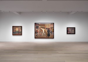
The Street, Gagosian, 980 Madison Avenue, New York, November 1–December 18, 2024
Peter Doig was born in Edinburgh in 1959 and grew up in Trinidad and Canada before moving to London to study at Saint Martin’s School of Art and the Chelsea School of Art. Since 2002 he has divided his time between London and Trinidad. His work is represented in major public and private collections worldwide.
Richard Shiff is Effie Marie Cain Regents Chair in Art at the University of Texas at Austin. His recent book Sensuous Thoughts: Essays on the Work of Donald Judd collects his various writings on the artist over a twenty-year period. For Gagosian he recently wrote “Haunting,” a text for the catalogue of David Reed’s exhibition of new paintings in 2020.