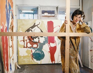
A line, color, shapes, spaces, all do one thing for and within themselves, and yet do something else, in relation to everything that is going on within the four sides [of the canvas]. A line is a line, but it is a color.”
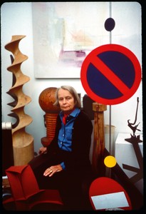
—Helen Frankenthaler
Gagosian is pleased to announce an exhibition of paintings by Helen Frankenthaler.
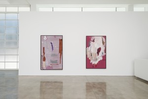
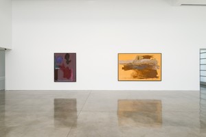
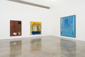
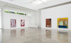
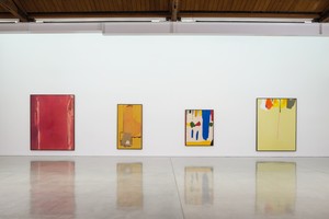
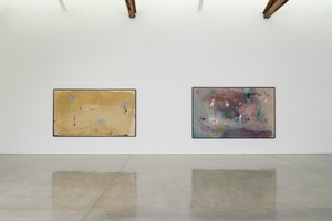
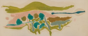
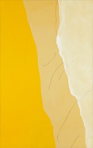
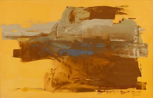
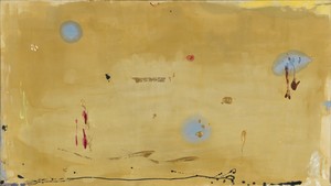
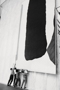
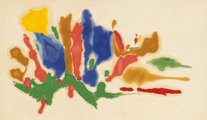
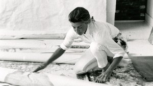
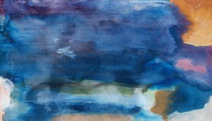
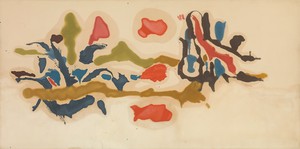
The exhibition comprises seventeen canvases by Frankenthaler from a twenty-five-year time span, selected to reveal how the renowned abstract painter articulated the relationship between drawing and color during this period. In her pioneering work of the 1950s, inspired by Jackson Pollock, Frankenthaler had poured both linear tracks and spreading areas of thinned paint onto unprimed canvas. She continued with this approach in the early 1960s, but with a difference: in paintings like Pink Field (1962), broad areas of color combine with linear elements so narrow as to seem drawn, resulting in canvases with no sense of division between the drawn and the painted. In such works as Parade (1965), she set aside the landscape association that had aided the cohesion of her earlier compositions in favor of an abstract parade of colored lines and areas. The contours of these areas, vividly contrasted against white canvas, look as much drawn as do the narrow, cursively shaped lines of paint.
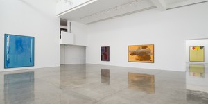
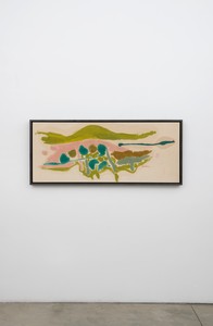
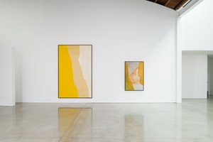
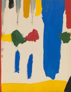
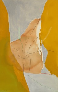
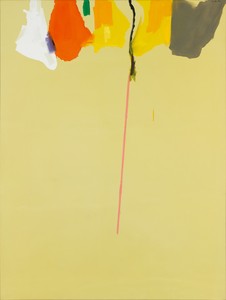
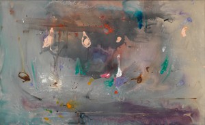
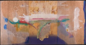
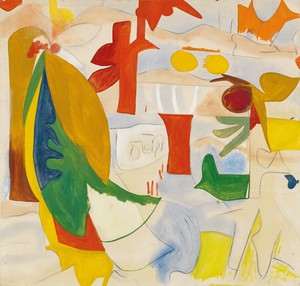
In 1970, Frankenthaler reintroduced individual elements of drawing into her work. In paintings such as Mornings and Barbizon, she began by setting down large areas with drawn contours, before running slender graphic filaments across them. In later works of that decade, such as Rapunzel (1974), she carried this further by pre-painting the entire canvas with one color before setting down the drawing, together with color patches, on top. Then, in a group of paintings from 1976, which includes Blue Bellows and Sentry, she created the drawn elements by masking out strips of bare canvas close to the vertical edges of the works before applying a single color over them in a looser, more painterly fashion. Later that decade, in works like Mineral Kingdom (1976), she gave prominence to richly varied applications of paint, drawn over the surface with a variety of spreading tools. By the early 1980s, this led to the extraordinarily complex, visually stunning surfaces of Grey Fireworks (1982) and Brother Angel (1983), composed of swathes, areas, and clumps of paint, with drawn elements snaking among them.