In this second installment of a two-part essay, John Elderfield resumes his investigation of the proliferation of dots in modern and contemporary art. Part one addressed how dots have been used to make the surface of a painting disappear. The focus here is on how dots affirm the surface, and on their associations as a result: skin, touch, decoration, disfigurement, or, simply, the labor—or boredom—of producing them.
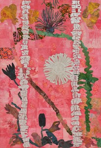
Image: Graphic Thought Facility
Image: Graphic Thought Facility
John Elderfield is chief curator emeritus of painting and sculpture at New York’s Museum of Modern Art and was formerly the inaugural Allen R. Adler, Class of 1967, Distinguished Curator and Lecturer at the Princeton University Art Museum. He joined Gagosian in 2012 as a senior curator for special exhibitions.
Dots have long been ubiquitous in non-Western art, famously so in African and Aboriginal Australian cultures. Their appearance in the West has been more recent. In medieval Europe, the technology to create clear, uniformly spaced dots on clothing did not yet exist, and the dotted fabric that was available was considered taboo because its untidy, semirandom blotches resembled the skin rashes caused by contagious diseases. To see, for example, the skin lesions in Matthias Grünewald’s Isenheim altarpiece (1512–16) in Colmar, France, makes one understand why nobody wanted to be reminded of them by someone’s clothes. The critic Elaine Scarry has pointed out how the translation of skin into clothing is but one example, although an important one, of how a made object is a projection of the human body, extending its powers and acuity.1 Medieval Europe was alarmed at the sight of that particular projection.
Much later, with the neoclassical aesthetics of the eighteenth and early-nineteenth centuries, visible brushstrokes that called attention to themselves within figure paintings were often taken to be blemishes, signs of ugliness if not of disease, and again associable with disfiguring marks on human skin. Even later, a common joke in the reception of Impressionist paintings was to profess similar alarm at the representation of dappled light dotting naked skin.2 Such a painting by Pierre-Auguste Renoir, exhibited in 1876, led the critic Albert Wolff to remark sarcastically, “Go ahead and try to explain to Renoir that a woman’s torso is not a heap of decomposing flesh covered with the purplish-green splotches that denote the final stage of putrefaction in a corpse.”3
By then, fabric with perfectly round, evenly spaced dots had been in production for some quarter of a century, made possible by sewing machines, invented in 1790, coming into commercial use by clothing manufacturers. The Impressionist painter Frédéric Bazille’s Réunion de famille (Family reunion) of 1867 shows two women wearing fashionable dresses made of such fabrics. Their connotation was utterly opposite to that of skin anxiety, complementing as it did the polka dance craze that swept through Europe in the mid-nineteenth century, giving the dots its name.
To my knowledge, no discussion of Georges Seurat’s invention of pointillism in the mid-1880s mentions polka-dot dresses: reasonably so, since the dots on the dresses do not optically dissolve the surface of the fabric, as Seurat’s do the surfaces of his paintings, but mark it, conveying with varying boldness the shape of the body beneath. However, as mentioned in the first part of this essay, pointillism did emerge in a period of ever-increasing mechanical mass-production, and the comparison of pointillist paintings to textiles was common: Félix Fénéon, for example, Seurat’s principal critical supporter, spoke of the artist’s Un Dimanche après-midi à l’Île de la Grande Jatte (Sunday Afternoon at the Grande Jatte, 1884–86) as “a monotonous and patient tapestry.”4 Fénéon was not speaking disparagingly, but Paul Gauguin probably was when he called the Neo-Impressionist painter Paul Signac a “voyageur en petits points,” meaning that he was at work on a kind of needlework—a remark the more pointed since Signac was married to a milliner.5 Also unmentioned in the context of Neo-Impressionism were the new innovations in printing of the period, but these had to be influential.6 They included the inexpensive halftone mass-printing device known as “Benday dots,” from their invention in 1879 by Benjamin Henry Day, Jr., of West Hoboken, New Jersey. In blown-up form, these dots appear often in Roy Lichtenstein’s paintings of the 1960s, although his were usually handmade.
In any case, surface-accentuating dots on fabrics, on the one hand, and Seurat’s surface-dissolving ones, on the other, are associated in the industrial means of the former and the scientific basis of the latter. And they are linked in the very opposition of how they are perceived to have been applied to the surface: on the one hand mechanically, on the other by hand.
The Prolonged Repetition of Certain Acts
This contrast of means, which remains in play in artistic practices today, was the subject of a reminiscence written by the critic Paul Valéry in 1936. Some twenty or more years earlier, he had visited the Louvre with the then-aged painter Edgar Degas. The two men found themselves standing together before a landscape by the Barbizon artist Théodore Rousseau, who had painted a mass of foliage in very minute detail—“to a degree,” Valéry recalled, “that suggested endless labor.” “How superb,” he said to Degas, “but what a bore, to make all those leaves. . . . it must have been fearfully tedious.” “Rubbish,” replied Degas, “if there were no tedium, there’d be no enjoyment in it.”7
Degas’s response raised the question: does a tedious process necessarily produce a boring result? The lesson that Valéry took from their exchange had two parts. First: “The fact is that it is scarcely possible to enjoy that kind of labor any more; and all I had done was to express naïvely the increasing dislike we generally feel for a work of a monotonous nature, or involving prolonged repetition of certain acts that vary hardly at all. Machinery has put an end to patience.” But second, he acknowledged to himself, “The business of an artist’s life is . . . ceaseless and unremitting labor,” and “the labor of the artist is of a very old-fashioned kind, the artist himself a survival, a craftsman or artisan of a disappearing species, working in his own room, following his own homemade empirical methods.”8
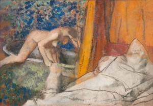
Edgar Degas, Le Bain (The Bath), c. 1895, oil on canvas, 33 × 45 ¾ inches (83.82 × 116.20 cm), Carnegie Museum of Art, Pittsburgh; acquired through the generosity of Mrs. Alan M. Scaife
Degas was such an artist, as he (and Valéry) readily acknowledged, and by the mid-1890s he had been making paintings with passages of repetitively, tediously applied, painterly dots—with far from boring results. While not unexpected within the sequence of his continuously adventurous technical methods, these dots may owe something to the science of pointillism and its confining tidiness. Degas’s mark-making effectively returns to the approach, influential on pointillism, that Eugène Delacroix had learned from John Constable: of filling areas not with a uniform tint, but with a multitude of different, related hues—yet not with the pointillist aim of their fusing at a distance, but to give freshness and energy to the surface itself. Also wanting that, Degas favored at this time subdued tones with few or no strong lights and darks to disrupt the effect, which if chromatically dull was very far from pictorially so. And such was his skill, learned from long practice, that the disposition of the marks has a look of inevitability. They appear to have drifted of their own accord within and sometimes across the compositional dividers Degas set down, like flotsam left on a beach by a receding tide—yet at the same time, they are conspicuously the record of the “prolonged repetition of certain acts” performed by this particular artist’s guiding hand.
Degas’s painterly dots may well have influenced those that Édouard Vuillard made in his small interiors of the last decade of the nineteenth century. Very much later, they made Howard Hodgkin envious when I had the pleasure of taking him to see the great Degas canvas, Le Bain (c. 1895), in Pittsburgh showing a female nude climbing into a bath with a randomly dotted wall behind her. He spoke admiringly of Degas’s repetitively marked surfaces, which he described as “the classical wall of expressed feeling that [Degas] has built for us.”9
Hodgkin also said that he wanted to avoid the “autograph mark” and to “be as impersonal as possible,” which I take to mean that he disliked Abstract Expressionist self-signatures yet also acknowledged that his unusually large, patently handmade painterly dots could not but be somewhat personal.10 They are very much so: their materiality presses upon us, and with it a strong sense of the artist’s hand. And because they are handmade, we know that they may be the result of endless monotonous labor, yet we nonetheless sense, and I think do see, that there was enjoyment as well as tedium in it.
The same is true of other paintings belonging to the late afterlife of Degas’s painterly and otherwise surface-affirming dots, whose exemplary practitioners include artists different and variously known, including Jennifer Bartlett, Chuck Close, Andrew Forge, Howardena Pindell, Ian Stephenson, Hannah Wilke, Terry Winters, and Joe Zucker. But rather than follow that long and distinguished line, we need to record an even bolder repudiation of the Neo-Impressionist approach than Degas’s, and a more influential one—one that turned pointillism against itself.
Pointillism Repurposed
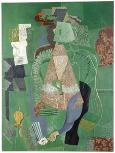
We know the precise place and moment at which this new pointillism was invented: at Avignon, in the South of France, in the summer of 1914. It was there and then that Pablo Picasso offered yet another example of the philosopher Isaiah Berlin’s conclusion that no idea can ever be implemented without adulteration or distortion: he began to use silhouetted planes of positive color covered with pointillist stippling, not to produce flickering patterns that caused surfaces to dissolve but—ironically, perhaps—to do the very opposite, to flatten these areas as if collaged onto the surface.11 In fact, to do even more.
What the German art historian Heinrich Wölfllin called the “linear” painting of the Renaissance had set its drawn compartments as strata parallel to the picture plane, conveying an overall “will to the plane.”12 Paul Cezanne, in his later landscapes, had reimagined that compositional method, with its geological reference. In 1912, Georges Braque and Picasso literalized this layering technique in what the critic Clement Greenberg rightly called “the pasted-paper revolution” of collage;13 and the so-called Synthetic Cubism that Picasso created early in 1914 engaged and exaggerated the forward spatial push learned from his use of overlapping pasted papers. As a result, the pointillist stippling of silhouetted planes in Picasso’s Avignon paintings is right up on the surface to an unprecedented extent. And such was the influence of surface-defining Synthetic Cubism that surface-dissolving Neo-Impressionism soon fell almost entirely out of favor.
In the later teens, Sophie Taeuber-Arp translated her geometric abstract designs into tapestries, unwittingly, I suppose, literalizing Fénéon’s textile analogy with Seurat’s pointillism but in works of a vivid, allover, tactile presence.14 Her contemporaneous beaded bags may be imagined, more adventurously, as planar pointillist surfaces folded into paraboloid or ellipsoid volumes. But it is fair to say, I believe, that until recent times, the only later pointillist-type paintings of major achievement are the small group of such canvases that Paul Klee made in the early 1930s; and his dots too are coterminous with their surfaces.
It was in 1936, we will remember, that Valéry compared the machine-made to the handmade in relation to artists such as Degas. This contrast had long been one of Klee’s thematic interests, and we may reasonably wonder whether it informed these otherwise unexpected works in his oeuvre, a question with a bearing on the future development of our present subject. The answer is: not necessarily, for Klee’s canvases also belong to a broad decline in confidence in the utopian, machinist implications of European geometric abstraction of the 1920s, an undercurrent expanding with the growth of Surrealist tendencies on both sides of the Atlantic in the 1930s. Alfred H. Barr, Jr.’s two famous 1936 exhibitions at New York’s Museum of Modern Art, Cubism and Abstract Art and Fantastic Art, Dada, Surrealism, tidily separated the two streams. And while the former seemed more in tune with that decade’s diaspora abstraction in New York, even as it was moving south to Latin America, the latter would soon become more influential in the north, feeding, of course, the next decade’s development of Abstract Expressionism.
By this time a gulf had opened between the perception of an increasing flood of mass-produced objects—often identified as American in origin—as culturally inauthentic and the valorization of art objects as possessing authenticity because visibly handmade.15 And while the “prolonged repetition of certain acts,” producing visibly handmade marks, was central to the Abstract Expressionist aesthetic, identifiably separate marks, even painterly dots, spoke more of the factory than of the artist’s studio. In 1957, at the apogee of that style, the art historian Meyer Shapiro would claim that “paintings and sculptures are the last hand-made, personal objects within our culture. Almost everything else is produced industrially in mass.”16 Five years later, he was proved wrong.
Polka Redux
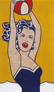
The year 1961 saw Lichtenstein’s Girl with Ball, her exposed flesh a screen of tiny dots. It also saw Walt Disney’s release of the hugely popular animated film One Hundred and One Dalmatians, whose plot revolved around the villainous Cruella de Vil’s attempt to harvest their delightfully dotted fur to make into coats. (2021’s filmic Cruella revival is perfidiously catty, not canine, with very few dots in sight.) Also in 1961, Disney provided a new polka-dot outfit for Minnie Mouse. She had worn her first one in 1928, and soon, in 1934, with Shirley Temple’s help in the film Stand Up and Cheer!, the polka-dot dress had become a symbol of sweet and happy wholesomeness, ideal for American children. In 1949, Little Dot (aka Dorothy Polka) made her appearance in Harvey Comics, obsessively preoccupied with dots and dotty in her behavior as well as in dress. But by then dotted dresses were becoming popular again with adult women, carrying with them into their subjects’ representation of femininity an echo of sweet childishness, which was often, of course, a disguise: in the 1950s, Marilyn Monroe and Lucille Ball; in the 1960s, Twiggy, Goldie Hawn, and others wearing clothes at once girly and groovy, with dotted designs copied from paintings by Bridget Riley.
In that decade, Riley’s canvases were using what do in fact look somewhat like the polka dots used in fashion. So were works by other artists represented in the Museum of Modern Art’s 1965 Op art exhibition The Responsive Eye, notably Larry Poons, as well as by artists not so represented, notably Lichtenstein and Yayoi Kusama. All inevitably carried the association of fashion, whether or not the artists desired it: Riley, certainly not; Kusama, not yet, but Louis Vuitton was waiting.
The critic Barbara Rose, reviewing The Responsive Eye for Artforum, did not make the connection with fashion, but did say that Op art, like Pop art, was bound to be fashionable because “it satisfies the same appetites as . . . forms of popular entertainment.” Effectively, Rose was asserting that Shapiro had been wrong, and that these kinds of paintings affect us no differently from “almost anything else . . . produced industrially in mass”:
Our affluence, leisure, and rising literacy will call for more and more art of this kind, which should be colorful, decorative, and easily experienced. . . . So, though we will not have folk art in our mass society, we will surely have art low in content and high in technique, which appropriately enough to the terms of modern life deals with sensations and not with feeling. Op art, however, goes Pop art one better by being considerably more mindless. . . . And here is the crux of the matter: Op art has no expressive content. It is expressively neutral, having to do with sensation alone.17
Tough words, accompanied by some MoMA-shaming for having presented, Rose said, an “irresponsible and dangerous” exhibition of “art that is sensational, hip, swinging, kicks, far-out;” not “steady and enduring.” There were, of course, novelty items produced at that time under the cover of both Op and Pop art, as well as boring, far-from-enduring ones within the steady framework of contemporaneous abstraction. As we are continually reminded, there will always be art with a short shelf-life. Still, categorical critical statements have a short shelf-life, too, and while Rose’s reference to art like folk art now reads very differently—indeed, presciently—compared to how it did in 1965, her talk of encroaching mindlessness soon turned out to be misjudged. For a start, not polka dots but Polke dots had already begun to appear, namely the Rasterbilder of the German artist Sigmar Polke, paintings titled after the raster-dot technique of halftone printing.18 These were far from expressively neutral works, as evidenced by the first of them, which was based on a 1963 newspaper photograph of Lee Harvey Oswald; and Polke’s subsequent works are sardonically critical of the “sensational, hip, swinging, kicks, far-out” sources that he frequently used.
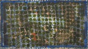
The dots of Polke’s earlier Rasterbilder, made with an eraser at the end of a pencil dipped into what looks like printer’s ink, are without much substance; later ones sit on the surface like blobs of plastic. Many constitute layered matrices of dots set down over mottled backgrounds that together manage to be both pointillist transparent and of artisanal materiality, and are both high in content and extraordinarily laborious in technique. Rather than satisfying the same appetites as do forms of popular entertainment, they have been said to embrace the boredom of their creation in escape from the incessant stimulation of external attractions in modern life.19
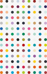
Jumping to the late 1980s, when dotted outfits continued to be popular (Prince, Princess Diana, soon Julia Roberts), Damien Hirst’s assistants began making his more-than-a-thousand so-called Spot paintings of perfectly regular, evenly spaced dots, their titles based on the names of chemical compounds. The name of the first and most prolific set of them, the Pharmaceutical paintings, associated them with medicinal pills, while the uniformity of the size and spacing of the dots placed them within the context of dotted fabrics and other objects “produced industrially in mass”—which they, in turn, have shaped. “These paintings have entered popular culture,” Larry Gagosian told the critic and journalist Carol Vogel. “You see them in advertisements, on clothes, on cars. They’ve become part of our visual vocabulary.”20 And while they were handmade, the anonymity of those who painted them—Hirst made only five of them himself—also places them in the context of the machine-made.21 For better or worse, they negate everything particular to painting in the work of the artists I have discussed here, except setting down dots on a plane surface and the “ceaseless and unremitting labor,” to recall Valéry’s words, that that can take.
“You gasp at the labour, if little else,” wrote the British critic Adrian Searle in January of 2012, informing us that Hirst’s assistants were working on a painting with a million spots that was going to take over nine years to complete.22 What would Valéry have had to say about that? Well, perhaps a little more: he would likely have thought of the ceaseless and unremitting labor that had gone into them, as well as of their anonymous creation, neither of the “very old-fashioned kind” of which he had spoken. And it is fair to say that Valéry would have been dismayed by Hirst’s subject, the ceaseless and unremitting pharmaceutical industry.
Pleasure and Pain
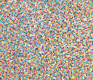
Unlike Hirst’s Spot paintings, his faux-pointillist, so-called Colour Space paintings, begun some five years ago, do engage the pictorial history I have described here. In an online feature for the Quarterly, the critic Blake Gopnik sketched a provenance for them: he effectively proposed that their dense fields of jostling, sometimes overlapping, sometimes messily painted dots of varying size allude to, only to negate, everything in the history of representation. And when he says, rightly I believe, “They are portraits of noise, not of communication,” he adds that their failure to communicate associates them with much of modern art “from Picasso on down” that “likes to set up grand schemes and goals that it can never fulfill, and to revel in the ambition and especially the absurdity of its failure.”23 If he is thinking of Guernica, this may seem a reach. Nonetheless, his argument speaks to what Greenberg, writing in 1948, called “the optimistic positivism” of early modernism, “its trusting and self-confident indifference to politics and ideology, its faith in the powers of reason and its certainty of the ultimate comfort of existence,” all of which “were becoming exhausted in the middle thirties.”24
More recent authors have proposed that the failure of this utopian promise, collapsing under the weight of mechanization and regulation, is what led to the continuous call for the stimulation of novelty and innovation of which Rose had complained; and, at the same time, to a new concept of leisure in finding peace and quiet enough to escape and be bored.25 Greenberg was in fact writing of the compensatory, decorative hedonism of Joan Miró’s art, a pessimistic escape into the playful. This description may also seem apt for Hirst’s Colour Space paintings, as may escape into the pleasures of boredom.
The same applies to Kusama’s crowd-pleasing installations, which have been cited by the promotional website Japan Inside as being just as stress-reducing as a visit to the great Santuario di Vicoforte in northern Italy. This is the gist of an encouraging report described there on how before-and-after saliva samples taken at the Santuario by a Professor Enzo Grossi, Professor of Quality of Life and Promotion of Health at the University of Bologna, show them to lower cortisol levels and sharply decrease anxiety.26 It seems hard to believe that a visit to the largest elliptical cupola in the world is going to replace medical marijuana; and even harder that being surrounded by Kusama’s dots might do the same. However, Japan Inside tells us that while at first these dots may seem “like measles spots infecting everyday objects and even people,” visitors will soon be “catapulted into her obsessive world, experiencing her feelings, anxieties and at the same time her relief.”
A less-strenuous, healthy alternative would be to associate Kusama’s dots with the traditional Mameshibori (“bean-squeeze”) dot patterns on Japanese tenugi (hand towels), whose lines of little indigo beans symbolize vigorousness and longevity. But are wearers of Vuitton’s Kusama line of clothes going to benefit similarly? Yes, according to Japan Inside, because purchasers can take home a pattern of dots “and feel it on their skin every day.”
The question, then: is there room in the world of dots not only for pleasure—or boredom, for that matter—but also for what Greenberg called the “cold, resolute, static and complete” hedonism of early modernism?27 Probably not, but perhaps there is for something that trades a part of their inherent decorativeness as the price for making more demands on the viewer. This is an issue much larger than can be confined to this or indeed any discussion of paintings with dots. Looking back on Hirst’s Spot paintings, though, we are invited to wonder why he chose that generic name for them. After all, the word “spot” means a blemish or flaw, unlike the more neutral “dot.” “Hitting the spot,” meanwhile, means satisfying a need, and perhaps Hirst needed an ironic term for what were extremely carefully painted canvases. Still, the connotation of damage or disfigurement sticks to their title.
Earlier, we learned that dotted clothing was considered taboo in medieval Europe because its semi-random dots evoked rashes caused by contagious diseases; and, recently, that Kusama’s dots may at first seem like the spots of measles. When Hirst began his Spot paintings, polka dots—which is what these are—were appearing fairly often in queer culture as a signifier that put “aids in Plain Sight,” as the title of critic Ted Kerr’s discussion of the phenomenon has it. Among his examples is how, in the 1980s, British performance artist Leigh Bowery often posed in polka-dotted suits and hoods in “an aestheticizing of Kaposi Sarcoma, a cancer associated with HIV/aids,” that causes visible blotches of abnormal tissue to grow under the skin. Kerr also cites works with constellations of dots reminiscent of the Center for Disease Control’s attempts to map the spread of HIV/aids by tracking sexual encounters.28
Such mappings are now familiar to us, of course, in tracking the progress of the plague from which we continue to suffer; and it is fair to say that the spike-adorned globes of the covid-19 virus will be the dots—innumerable, infinite—that we will likely remember most from our present moment.
1 See Elaine Scarry, The Body in Pain. The Making and Unmaking of the World (New York and Oxford: Oxford University Press, 1985), p. 282, within a discussion of other objects, pp. 281–86.
2 See Barbara Maria Stafford, “Characters in Stone, Marks on Paper: Enlightenment Discourse on Natural and Artificial Taches,” Art Journal 44, no. 3 (1984): pp. 233–40, and Stafford, “‘Peculiar Marks’: Lavater and the Countenance of Blemished Thought,” Art Journal 46, no. 3 (Autumn 1987): pp. 185–92.
3 Albert Wolff, Le Figaro, April, 3, 1876, quoted in Charles C. Moffett, The New Painting: Impressionism 1874–1886, exh. cat. (San Francisco: Fine Arts Museums of San Francisco, 1986), p. 184.
4 Félix Fénéon, “The Impressionists in 1886,” quoted in Norma Broude, ed., Seurat in Perspective (Englewood Cliffs, NJ: Prentice Hall, 1978), p. 38. The passage from which this comes is given in Øystein Sjåstad, A Theory of the Tache in Nineteenth-Century Painting (London and New York: Routledge, 2017), p. 119 n. 22, and discussed on p. 108.
6 In the first installment of this essay I referred to chromotypogravure, unique to France in this period, on which see Broude, “New Light on Seurat’s ‘Dot’: Its Relation to Photo-Mechanical Color Printing in France in the 1880’s,” Art Bulletin 56, no. 4 (December 1974): pp. 581–89. On the increasing use of dot-based halftone printing processes for newspapers and lithography in the 1880s see Dusan C. Stulik and Art Kaplan, Halftone: The Atlas of Analytical Signatures of Photographic Processes (Los Angeles: Getty Conservation Institute, 2013), pp. 4–5.
7 Paul Valéry, “Degas, Dance, Drawing,” 1936, repr. in Valéry, Degas Manet Morisot, vol. 12 of The Collected Works of Paul Valéry, Bollingen Series 45 (Princeton: Princeton University Press, 1989), p. 50. I refer to this passage, and to those cited in notes 15 and 16 below, in discussion of another dot-maker, “Three Sides of Joe Zucker, and His Homemade Aesthetics,” in Joe Zucker (New York: Thames & Hudson, 2019), pp. 11–13. Earlier, in 1924, Siegfried Kracauer spoke of boredom as a consequence of the Protestant work ethic, only to imagine a “radical boredom” into which we might escape from the noisy world of attractions. See Kracauer, “Boredom,” The Mass Ornament: Weimar Essays, trans. Thomas Y. Levin (Cambridge, MA.: Harvard University Press, 1995), pp. 331–32. I was alerted to this essay by discussion of it in Lanka Tattersall, “Eight Days a Week,” in Kathy Halbreich, Alibis: Sigmar Polke 1963–2010, exh. cat. (New York: The Museum of Modern Art, 2014), pp. 101–2.
9 Howard Hodgkin, in “John Elderfield and Howard Hodgkin: An Exchange,” in Howard Hodgkin Paintings, exh. cat. (Fort Worth: Modern Art Museum of Fort Worth, 1995), p. 75.
11 John Gray, “Foreword: Children of Two Worlds,” in Isaiah Berlin, The Roots of Romanticism, 1965 (2nd ed. Princeton and Oxford: Princeton University Press, 2013), p. xiii. I refer to an earlier proof of Berlin’s principle in the first installment of this essay.
12 Heinrich Wölfflin, Principles of Art History: The Problem of the Development of Style in Later Art, 1915, Eng. trans. M. D. Hottinger (New York: Dover Publications, 1950), p. 73.
13 Clement Greenberg, “The Pasted-Paper Revolution,” 1958, repr. in Clement Greenberg: The Collected Essays and Criticism, ed. John O’Brian, vol. 4., Modernism with a Vengeance, 1957–1969 (Chicago and London: University of Chicago Press, 1993), pp. 61–66.
14 See Anne Umland and Walburga Krupp, Sophie Taeuber-Arp: Living Abstraction, exh. cat. (New York: The Museum of Modern Art, and Basel; Kunstmuseum, 2021), illustrations on pp. 43–49, 70–89. The pointillist associations of these works go unmentioned, either here or in T’ai Smith’s fine short essay, pp. 35–38, on the artist’s beaded bags, with additional illustrations of them on pp. 68–69, 73.
15 This is a major theme of Philip Fisher, Making and Effacing Art: Modern American Art in a Culture of Museums (Cambridge, Mass.: Harvard University Press, 1991), esp. pp. 146–48, 161–68.
16 Meyer Schapiro, “The Liberating Quality of Avant-Garde Art: The Vital Role that Painting and Sculpture Play in Modern Culture,” Artnews 56, no. 4 (Summer 1957).
17 Barbara Rose, “Beyond Vertigo: Optical Art at the Modern,” Artforum 3, no. 7 (April 1965).
18 The earliest of the Rasterbilder were entirely handmade, but Polke soon began to use a stencil to lay down an overall pattern of dots and then to fill in the spaces between them by hand. See Tattersall, “Eight Days a Week,” p. 98, in a fine essay on these works, pp. 94–116.
24 Greenberg, Joan Miró (New York: The Quadrangle Press, 1948), p. 41.
25 See Tattersall, “Eight Days a Week,” pp. 101–2, for reference to Barbara Dalle Pezze and Carlo Salzani, eds., Essays of Boredom and Modernity (Amsterdam: Rodopi, 2009), and Elizabeth Goodstein, Experience without Qualities; Boredom and Modernity (Stanford, CA.: Stanford University Press, 2005).
John Elderfield is chief curator emeritus of painting and sculpture at New York’s Museum of Modern Art and was formerly the inaugural Allen R. Adler, Class of 1967, Distinguished Curator and Lecturer at the Princeton University Art Museum. He joined Gagosian in 2012 as a senior curator for special exhibitions.