This year marks the twenty-fifth anniversary of This Is Hardcore, the sixth album by the band Pulp. A new book by Paul Burgess and Louise Colbourne celebrates the occasion by bringing together behind-the-scenes imagery and anecdotes from the creation of the album and its music videos. Author Young Kim reflects on the album’s impact, both musical and visual, on the late ’90s and speaks with the primary collaborators—Pulp lead singer Jarvis Cocker, art director Peter Saville, and artist John Currin—behind the iconic imagery.
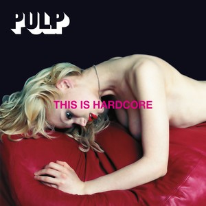
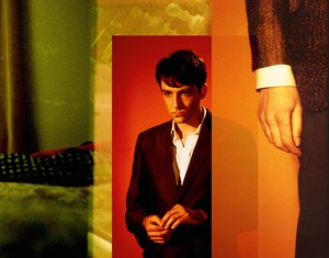
The album cover for This Is Hardcore, 1998. Art direction by John Currin and Peter Saville; photography by Horst Diekgerdes; design by Howard Wakefield and Paul Hetherington; cover model: Ksenia; casting by Sascha Behrendt; styling by Camille Bidault-Waddington
The album cover for This Is Hardcore, 1998. Art direction by John Currin and Peter Saville; photography by Horst Diekgerdes; design by Howard Wakefield and Paul Hetherington; cover model: Ksenia; casting by Sascha Behrendt; styling by Camille Bidault-Waddington
Young Kim is a writer who works in art, fashion, film, music, and literature while managing the estate of Malcolm McLaren, her late boyfriend and creative/business partner. Her first book, A Year on Earth with Mr. Hell (2020), is distributed by Omnibus Press. She is currently finishing a book on her years with McLaren. Photo:Penny Slinger/Young Kim
The blonde caught my eye. She looked like an intriguing casualty from a film noir. There was something unnatural and slightly wrong about her: a kind of fallen angel, creamy skinned, with full makeup including cherry-red lipstick that matched the cherry-red leather pouf she lay over, face down in profile. She was semisupported by her arm, revealing only deep cleavage. There was a weirdness in the angle of her neck and an awkwardness in the position of her hand. She was wearing nothing other than a thin chain around her throat and three words, in harsh bold hot-pink Helvetica type stamped cruelly over the side of her face and arm as if to warn you off, yet by doing so lure you in: “This Is Hardcore.” In the top-left corner, jumping out of the black background, was the name of the people responsible: Pulp. I loved it.
I found her in Paris, at the giant Virgin record store that was on the Champs Elysées in 1998. Remember those? It was a huge space—one of the biggest record stores I’ve ever been to—and somehow completely filled with records, CDs, cassettes even, books, and videos galore. It’s hard to imagine now but it used to be a normal pastime to trawl through a record store, looking to discover or rediscover audible and even possibly visual delights. You’d pick up an album and judge it by its cover before you took it home to actually listen to.
The seductive power of this blonde might have seemed simple enough, but unknown to me, behind her perfect veneer was the conscious effect of layers of artistry. Only now, twenty-five years later, upon the forthcoming occasion of a wonderful book documenting this album and its artwork—Hardcore: The Cinematic World of Pulp, by Paul Burgess and Louise Colbourne—did I peek under the covers to discover the cast of incredible talent (some whom I know personally, I realized) in just the album artwork alone: the renowned art director Peter Saville, the great painter John Currin, the magical stylist Camille Bidault-Waddington, and the acclaimed photographer Horst Diekgerdes, all masterminded by Jarvis Cocker, the brilliant lead singer of Pulp.
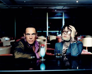
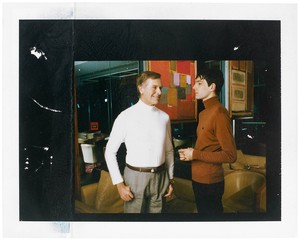
John Huntley and Jarvis Cocker, Hilton Hotel, London, 1998. Photo: Horst Diekgerdes
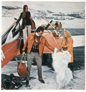
I bought the CD and excitedly examined the insert on my way home. It was as gorgeous as the cover had promised. More louche images of men and women lounging about in a hotel—at the bar, in a room, in an elevator, all exquisitely dressed but slightly off, what Saville calls “so wrong that it’s right.” Everything and everyone was fashionably cool but also a bit thrillingly lurid with that late ’90s decadence.
When I played the music, I was enthralled. It was so sexy and lush, with an undercurrent of glamorous danger. I listened to the cover track over and over again. The album came together from all directions—the music, the imagery, the mood.
This was the era of CDs yet record artwork still mattered, unlike today, where it’s nonexistent. I don’t mean it doesn’t actually exist, it just doesn’t exist in the awareness of the generations growing up in the virtual world, who see just a tiny variegated square they ignore on a screen. In Anton Corbijn’s documentary Squaring the Circle (2022), about Hipgnosis, the influential graphic-design company behind many iconic record covers, Noel Gallagher of Oasis realizes that when he mentions a record’s artwork his daughter has no idea what he’s talking about.
How sad. They are missing out, as album art can be great, and for a while, during its heyday, the latter half of the twentieth century, it was “like the poor man’s art collection,” as Gallagher puts it. Or as Saville explains, “Covers were the contemporary art medium for young people.”
Even so, it’s not every day that the album artwork jives so well with the music or is so aesthetically pleasing. Saville notes, “The scope of a record cover is limited by the bandwidth of the principal artist—the aesthetic awareness of a musician.”
So perhaps it’s fitting that Cocker originally planned his band, Pulp, by imagining his stage outfits and went to London’s Saint Martin’s School of Art even after he’d been working in music for quite a long time. He explains poignantly, “I was desperate to escape Sheffield and I managed to get onto the Saint Martin’s film course with two pieces of work I’d made with a camera I’d found in a jumble sale. I was extremely lucky to be able to do that. That gave me a second chance at life, coming to London.”
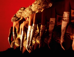
Dancers — “This Is Hardcore” video shoot, directed by Doug Nichol, Pinewood Studios, London, February 1998. Photo: Paul Burgess
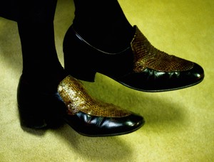
The Shoes of Jarvis — “This Is Hardcore” video shoot, Pinewood Studios, London, February 1998. Photo: Paul Burgess
Indeed, one can feel Cocker’s connection to film not only in the album artwork but of course in the song’s fabulous video, which is beautifully detailed in Burgess and Colbourne’s book. Its pages contain many previously unseen photographs of the group that Burgess took on set, using an analogue camera, just as the video was shot on celluloid film.
The team behind the record art started, surprisingly enough, with the figurative painter John Currin. I say surprisingly because Currin’s paintings, which are generally highly erotic and delightfully perverse, verge closer to kitsch and caricature, rather than pop and cool, which is what This Is Hardcore is. In 1996, Currin had yet to have the enormous success that he’s had since, so it was astute of Cocker to pick up on his work. But then again, it was his world: “Having been at St. Martin’s with other artists I became aware of what was going on at that time,” Cocker explains:
Because Pulp was around the same time as when the YBA thing happened, we would socialize together, so I got to know them. And still, a lot of the people I know socially are from the art world, maybe more than other musicians. . . . I developed a kind of border[line] obsession with [Currin] I suppose. I’d seen some of his work and I bought an orange catalogue from an exhibition that he did in France. It’s got the picture [The Neverending Story] that was used for the single of ‘Help The Aged’ on the cover. I was reading the introduction and it mentioned his date of birth. His date of birth is the same as mine, the 19th of September, but he’s one year older than me. For some reason that struck me as a big deal. Also he’s got the same initials as me. I liked his work. It had a connection to me.
Not long after, Cocker was struck by Currin’s Martini Man series. These were collages using ads that had appeared in Playboy magazine to attract advertisers—photographs of powerful men being admired by women with the slogan “What kind of man reads Playboy?,” with catchlines such as “40% of them buy stereo equipment.” Currin mischievously changed the admirers’ faces with gouache: “I made it so everyone hates him,” the artist recalls. “There’s one where even the dog is frowning at him.” This resonated with Cocker: “I was feeling like that [man in the ad]. I’d achieved success, but I felt a bit of an idiot. I don’t know. It didn’t work out the way I thought it was going to. I was going through a dark time.”
Steve Mackey — “This Is Hardcore” video shoot, Pinewood Studios, London, February 1998. Photo: Paul Burgess; montage: Louise Colbourne
At first, Cocker only wanted to use The Neverending Story for the cover of “Help The Aged,” and to use further paintings in the video for that song, but then he had the inspired idea of enlisting Currin to work on the artwork for This Is Hardcore, the album that “Help The Aged” would appear on. Less surprising is his engaging Saville, a legend in the world of record sleeves, especially those for Joy Division and New Order during his years at Factory Records. But it wasn’t Saville’s design skills that initially drew Cocker to him for This Is Hardcore, but Saville’s Apartment. Cocker had noticed the Apartment in Elle Decoration (“I’ve always been obsessed with pictures of interiors”) and phoned Saville up.
The Apartment was a live/work/salon space designed in 1995 by Saville and his friend the interior architect Ben Kelly, with whom he had worked with during the Factory Record years. (Kelly designed the famous Hacienda nightclub, part of Factory Records.) With the support of Peter’s colleague Mike Meiré, the two refurbished the former “shag pad” of an overseas millionaire in Mayfair, around the corner from the Playboy club. It came with a magnificent floor-to-ceiling Verner Panton chandelier, smoky mirrors, tinted glass, and midnight-blue-suede walls. The two touched up the flat’s 1970s look and turned it into a den of sensual chic. It was, in fact, a style that was returning to vogue, with the likes of Tom Ford at Gucci, Paul Thomas Anderson’s film Boogie Nights (1997), and Pulp’s work-in-progress This Is Hardcore.
“[Cocker] told me he was working on a cover for an album called This Is Hardcore (a title which I liked very much) and that he was working with John Currin,” says Saville. “Problem was that they had a meeting of minds of ideas—Jarvis knew what he was writing about and John had an interpretation of that—but neither knew how to go about a photo shoot to bring their vision to life. My job was to bring the idea into reality.” So Saville joined the group.
Although Currin and Saville might seem very different, Cocker had picked up on something. Currin and Saville discovered that their sensibilities converged. Both had an “unhealthy awareness of mainstream porn,” as Saville put it, and they were able to get on the same wavelength quickly. The Apartment was the inspiration.
Any plans for a painting were abandoned for creative reasons. Saville explains, “There was an obligation for some members of the group to be on the sleeve. . . . Had John done a painting, there would have been a slightly uncomfortable dichotomy, like, ‘Here is the painting, here is the band,’ which is not the kind of polarity I would have wanted. I wanted it to be one coherent work.” So Saville organized a photo shoot around the corner at the Hilton Hotel, which was a sort of time capsule that had not changed since the ’70s and ’80s, not unlike the Apartment, and put together the team of Bidault-Waddington and Diekgerdes.
Cocker explained, “It was kind of luxurious but not very nice. That was the brief. I wanted it to look like it was expensive, but it wasn’t pleasant. And at some point, in the middle of while we were actually taking the photographs, I thought, Why? Why are we doing this? It cost a lot of money to do the whole sleeve. Why are you spending money on something unpleasant? We could have spent the money doing something that made somebody happy.”
When I met Currin to interview him about This Is Hardcore, he looked happy remembering the experience. “It was a superexciting time to be in England. . . . The funny thing about England is that you meet everyone right away. You walk into a bar and all the people you’ve heard about in the art world are there. . . . Damien Hirst said something like, ‘You better not fuck this up. This is the best opportunity since Peter Blake got Sergeant Pepper!’ I’m like, Shit!”
“It was a totally fascinating thing to be involved in, but I did the least amount of work,” Currin insisted. When I told him that I’d read that he’d done the casting, he said that he and Saville had done it together and laughed, “I established a certain kind of sleazy mood. I cast some of the less-glamorous people. Peter was able to come up with the superglamorous sleazy people. . . . This guy [the man sitting next to Cocker at the bar in one photograph], I thought he was the perfect alter ego—opposite of Jarvis . . . a kind of Tom Jones . . . a different English type. He was supposed to have the ‘perfect’ back or something. I didn’t cast the girl [on the cover]. What I did was cast all the older people. . . . Sadly the girl showed up after my session. . . . my idea was much less attractive. If it was up to me, I would have destroyed the album. I liked the shot of the man in the elevator [wearing a white turtleneck] with [Pulp bassist] Steve [Mackey]. . . . There was a strange formality to that, and Steve was so handsome as well. . . .[The record company] said it would be 20 percent off sales right there!” Interestingly, Saville had wanted the same photo of the two men for the cover: “It was great—Steve and the older guy. It was brilliant combined with the words ‘This Is Hardcore.’ But Steve said no, for obvious hetero reasons.”
Steve Mackey and man in white turtleneck, Hilton Hotel, London, 1997. Photo: Horst Diekgerdes
Another shoot was scheduled without Currin or Cocker at Saville’s Apartment to do the pickup shots. “We ended up with this very misogynistic shot of Steve with Ksenia [the blonde cover model] on the pouf. . . . When I look back, it’s so questionable,” says Saville. “But Ksenia looked wonderful on the red pouf, so we also shot her [alone] on the pouf and that ended up being the cover.”
A filter called “Smart Blur” was used to flatten the photographs, giving them a pseudo-painterly feel. Saville chose the typography carefully to mimic government warnings like “adult material.” As Currin puts it, “It’s weirdly offensive without figuring out why. Just the way the words sit on there is both very elegant and strangely provocative. And the ugly Helvetica.”
Though it wasn’t consciously intentional, the image foreshadowed Currin’s artistic path: “Funny thing is this is way before I did paintings [in this way] . . . like the odd hand—it’s the kind of thing I would do. This is before any kind of Photoshop. . . .Peter’s styling and Camille anticipated where my work was going.”
Cocker didn’t see the image until it was finished.
I wasn’t there because I had to go to Japan [to do] publicity. The first I saw the cover for the sleeve was it being sent through on a fax. . . . I was kind of surprised. But then I knew it was right because it had what we had been trying to go for in the pictures—like I say, in the hotels was the feeling of something supposed to be glamorous but [with] something wrong with it. It doesn’t make you feel good. . . . Like the guy I sat next to in the gatefold . . . he kept telling me two things: he had the most flawless back in London and when one of [the notorious London gangsters] the Kray Twins died, he had led the funeral procession. He kept showing me a picture of that so I [felt] kind of awkward when I was having my picture taken as I didn’t have anything in common with him at all. Which fitted in with the whole thing, really. Similarly, the picture of the woman on the pouf is kind of sexy, but also she looks like she could be dead or not even a real person. It needed to be an image that superficially seemed to be attractive, but also there was something a bit repulsive about it. So as soon as I saw that, I knew that that was a good cover.
Obviously when it was used it got quite—some people said it was degrading to women and stuff like that. But I’ve always felt the sleeve wasn’t that because the whole point of it [was] it was supposed to be something that you felt was wrong—there was something wrong with it. I had my own reasons wanting it to be like that, but I knew that it had the similar effect on other people when they saw it. It wasn’t just a cheesecakey sexy image. It’s got something dark about it. You can’t quite say why, but it makes you feel very strange.
In fact, Transport for London refused to allow their buses to be wrapped with the intact cover image. Pulp could choose either the image of the girl and the name of the band or the album title and the name of the band, but not the girl, the album title, and the name of the band.
The image and album are obviously a nod to porn, visually and aurally, from the album’s title to the seductive crooning of the cover track, whose lyrics refer explicitly to porn: “You are hardcore, you make me hard.” But at the same time, they don’t necessarily celebrate it. As Saville points out, the context has to be taken into consideration. This Is Hardcore has irony. Much as Currin’s Martini Men subverts Playboy, making fun of preening male chauvinists, This is Hardcore portrays in sound and image the dead emptiness and, one could even say, the kind of patheticness of pornography: “Then that goes in there/And then it’s over.”
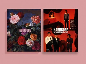
Two book covers for Hardcore: The Cinematic World of Pulp by Paul Burgess and Louise Colbourne (Volume Publishing and Thames & Hudson, 2023)
To me—and I have never watched more than a few snippets of porn in passing—the cover looks like a still from a film noir, a character from a Raymond Chandler story: beautiful, sexy, mysterious, and going perfectly with the dark, sexy music. I don’t see why we have to assume the worst: the model could just as well be focusing intently on a pleasurable sexual moment, or playing make-believe, as Cocker sings, “I want to make a movie, so let’s star in it together.”
Despite the darkness of that period in his life, Cocker was positive when reflecting on the experience of making the artwork:
I didn’t have a clear idea, but it was good to work with both John and Peter. They both have amazing ideas about images because that is what they work in. That was actually quite educational for me—for them to take my vague idea and turn it into something that was real. I’m glad to say that I still am friends with them now all these years later, and I’d say both of them probably taught me more about art than I learned in art school. Because John was not that well known [at the time], but was becoming better known and would talk about pictures that he liked, and Peter obviously was very well known and [had] done things like the Joy Division covers and all the Factory thing. I’d never really met somebody with such an attention to detail before. At first, we used to go for meetings and I’d think, Why are we talking so much? We just should get it done. But then I started to enjoy the conversations—a lot. That was one of the pleasurable parts of that time, getting to know those two people.
When I ask Cocker how he feels about it today, he says, “It still looks good now so that’s the most you can hope for, really!” Hear hear!
Young Kim is a writer who works in art, fashion, film, music, and literature while managing the estate of Malcolm McLaren, her late boyfriend and creative/business partner. Her first book, A Year on Earth with Mr. Hell (2020), is distributed by Omnibus Press. She is currently finishing a book on her years with McLaren. Photo:Penny Slinger/Young Kim